Power BI OKR dashboard examples and reporting templates
Connect sales pipeline, revenue, and e-commerce data to track progress against business objectives in Power BI. Coupler.io automates data loading and scheduled refresh from your CRM, accounting platform, and online store to keep your Power BI OKR dashboards up-to-date.
Power BI OKR dashboard examples for every need


about your case. It doesn't cost you a penny 😉
Choose your Power BI OKR dashboard template to kick off
What is a Power BI OKR dashboard?
Coupler.io connects these sources to Power BI and refreshes the data on a schedule you choose. That removes the gap between "what happened" and "what's in the dashboard," which is the gap where most OKR tracking breaks down. The result is a Power BI OKR reporting dashboard that stays aligned with your objectives without manual intervention.

What reports should be included on a meaningful Power BI OKR dashboard?
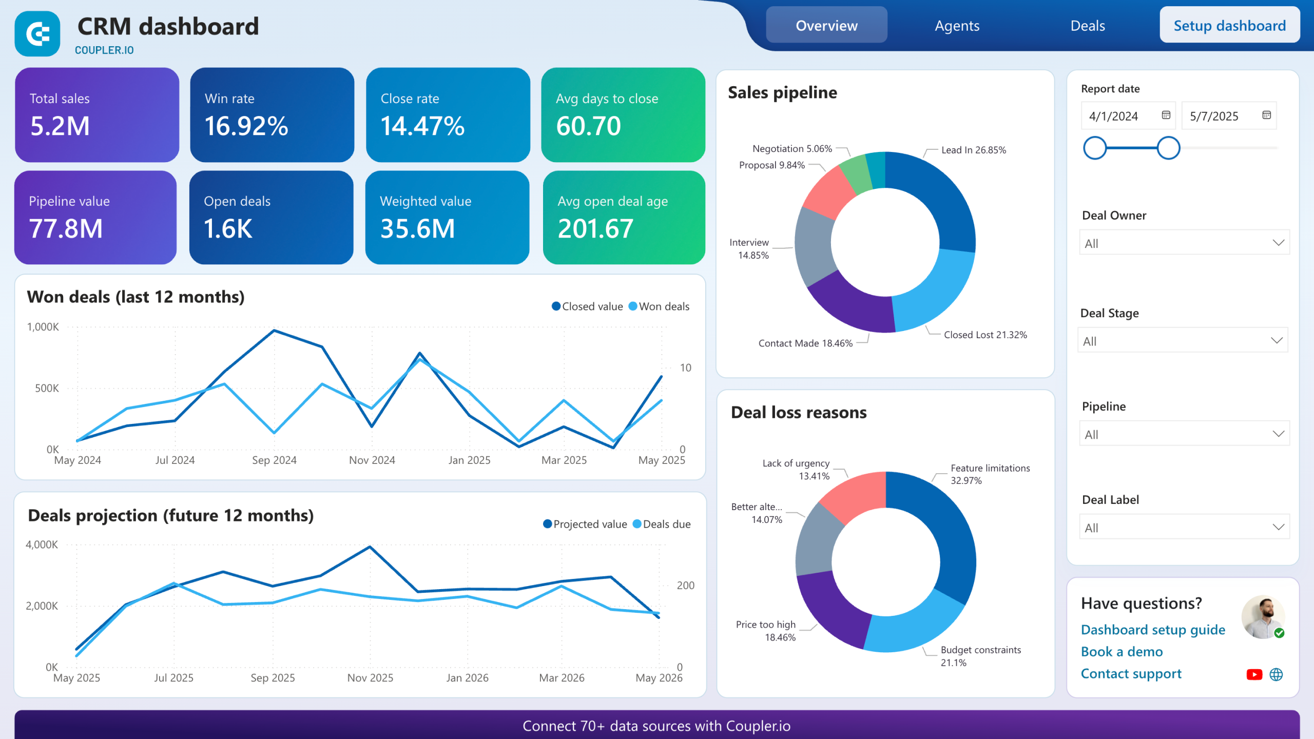
Tracking objectives requires more than a single summary number. These five reports form the backbone of Power BI OKR reporting dashboards, surfacing the operational details behind each key result so you can diagnose problems before a quarterly review reveals them.
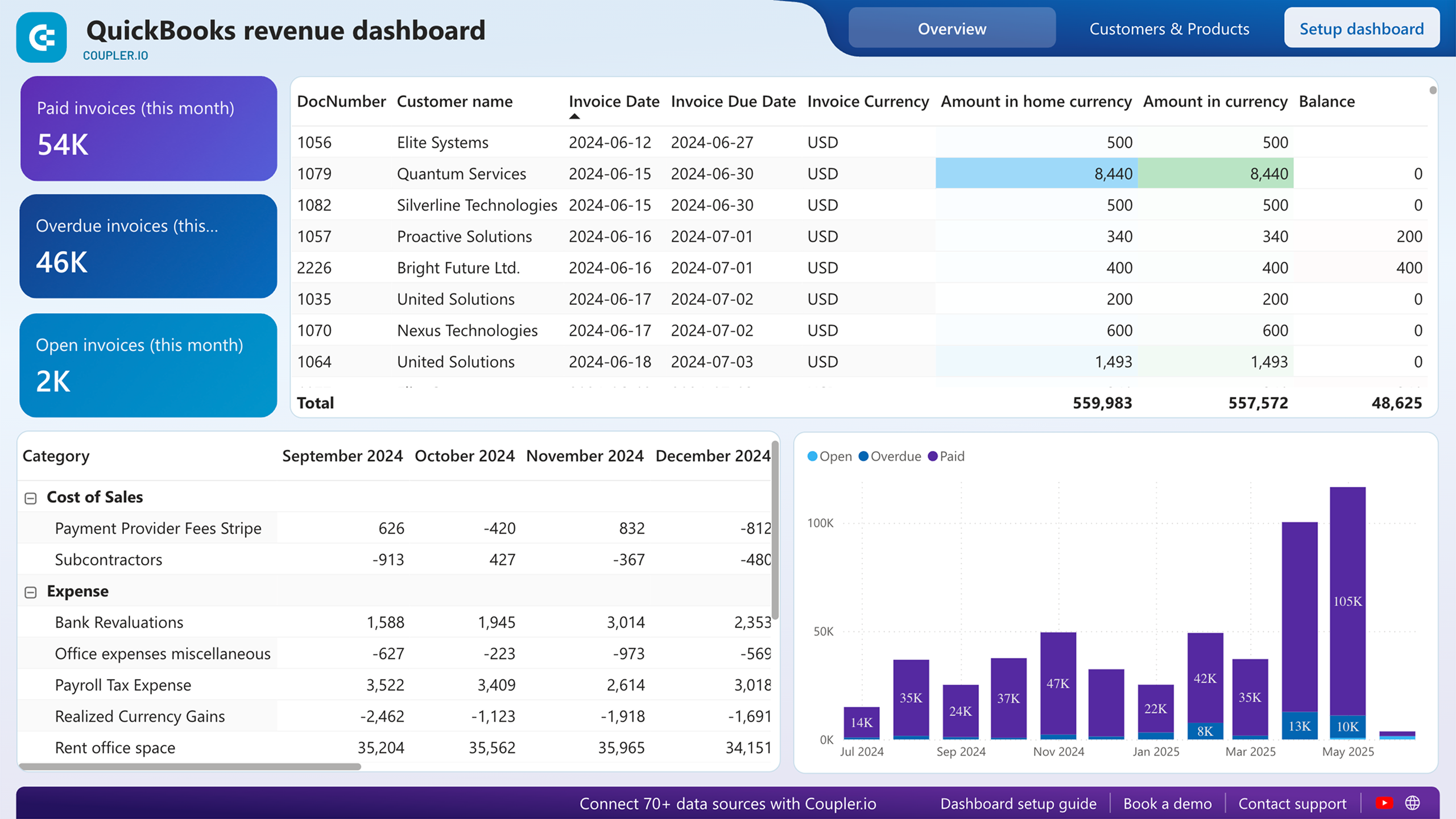
Twelve months of income data, plotted alongside expenses and net income, show whether your revenue objective is trending toward or away from target. The report also ranks customers by contribution and breaks down product performance. That second layer matters: a team hitting its revenue number through a single large account has a different risk profile than one with revenue spread across dozens of buyers.
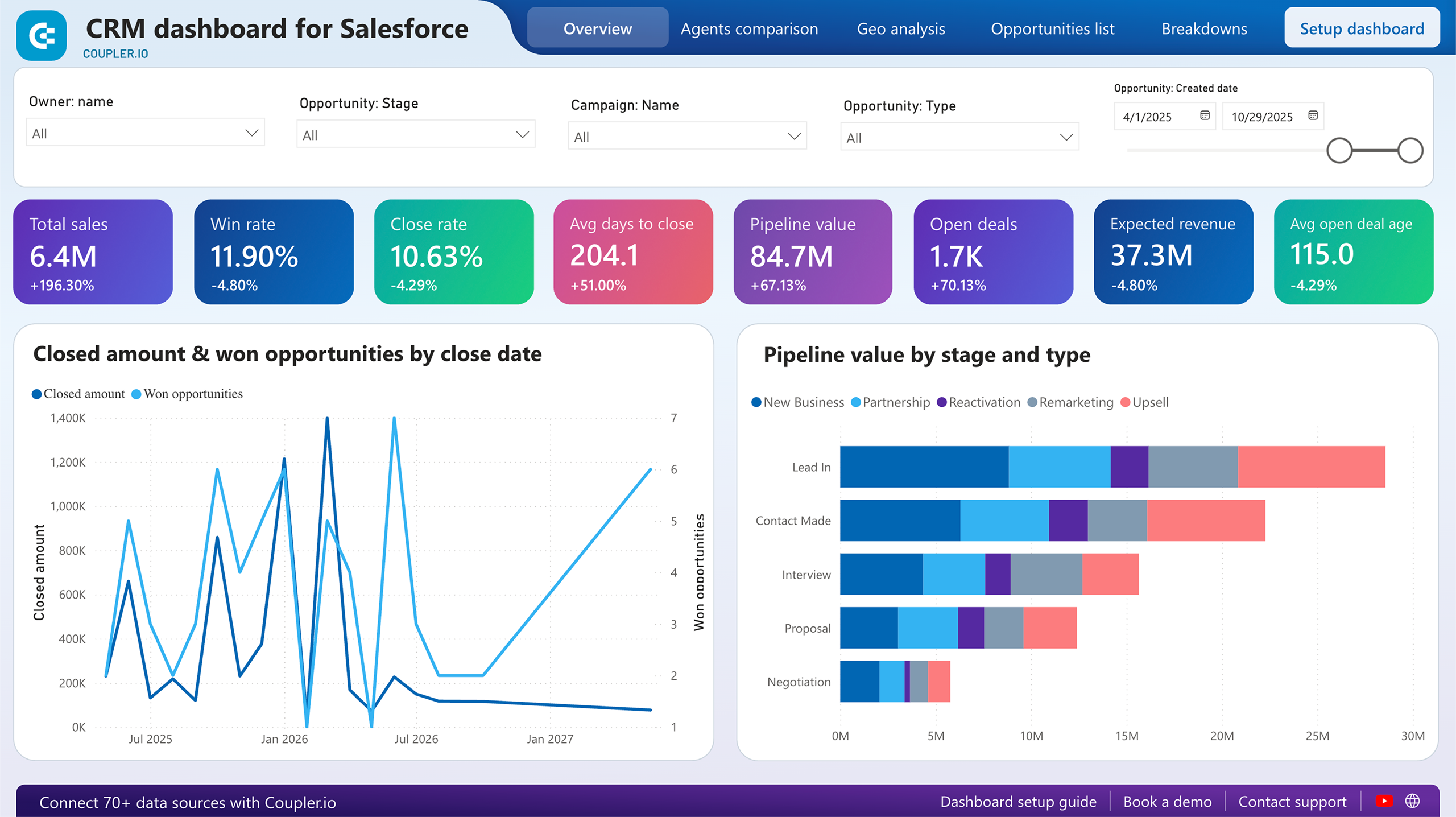
Unclosed deals sorted by owner, type, stage, and win probability reveal where pipeline objectives are stalling. The report also highlights best-won deals — which company types, industries, and decision-makers produced the highest revenue. A separate analysis flags deals that have remained inactive beyond a set threshold, giving managers a concrete list of at-risk opportunities to act on before the quarter closes.
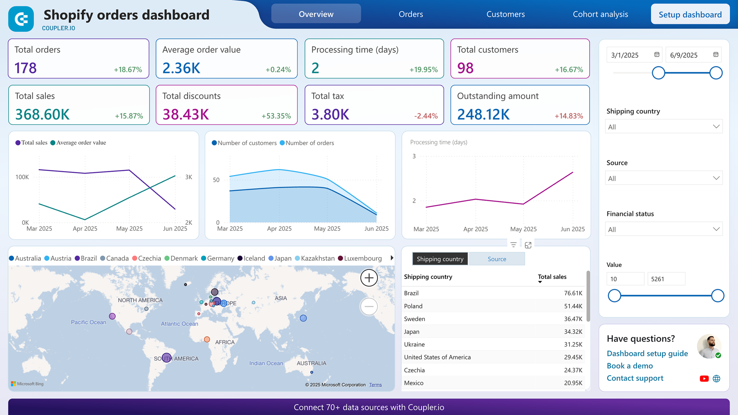
Geographic breakdowns, order status filters, and marketing source attribution let you measure e-commerce key results from multiple angles. The financial status filter isolates pending and refunded orders, connecting payment problems to specific regions or products. A cohort view on a separate page separates new from returning customers, which is the distinction that matters most when your objective is growth versus retention.
Rather than showing a single pipeline snapshot, this report tracks how deals move across stages over time. It maps unclosed deals by stage and win probability, identifies the company types and industries that produce the highest-value wins, and calculates how many days of inactivity signal a deal is unlikely to close. Sales leaders can set stage-specific targets as key results and measure weekly movement against them.
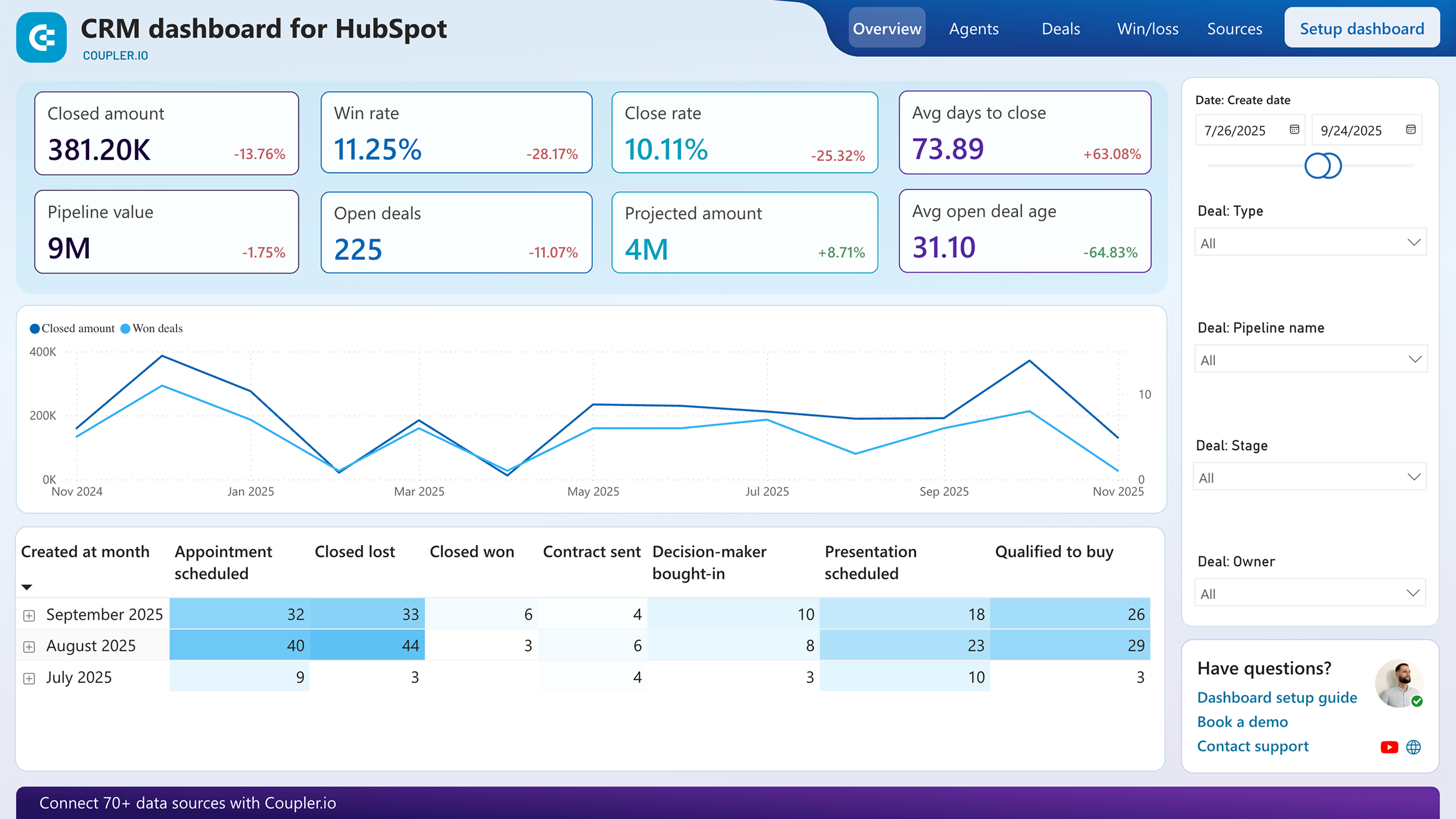
Two line charts compare generated revenue against won opportunities and projected revenue against upcoming opportunities, making it visible whether the pipeline supports next quarter's targets. The owners comparison table adds a human dimension: win rate, close rate, and average time to close per rep. When an OKR involves improving sales efficiency, this report shows exactly which part of the process and which team members need attention.
What insights you can get with the Power BI OKR dashboard
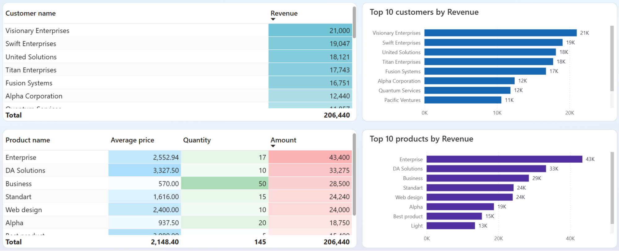
Pinpoint which customers and products account for the largest share of income by reviewing the customer and product overview breakdowns. If two clients represent 60% of revenue and one is overdue on payments, your quarterly revenue objective carries more risk than the top-line number suggests. Adjusting targets or diversifying the pipeline early prevents a missed OKR from becoming a surprise.
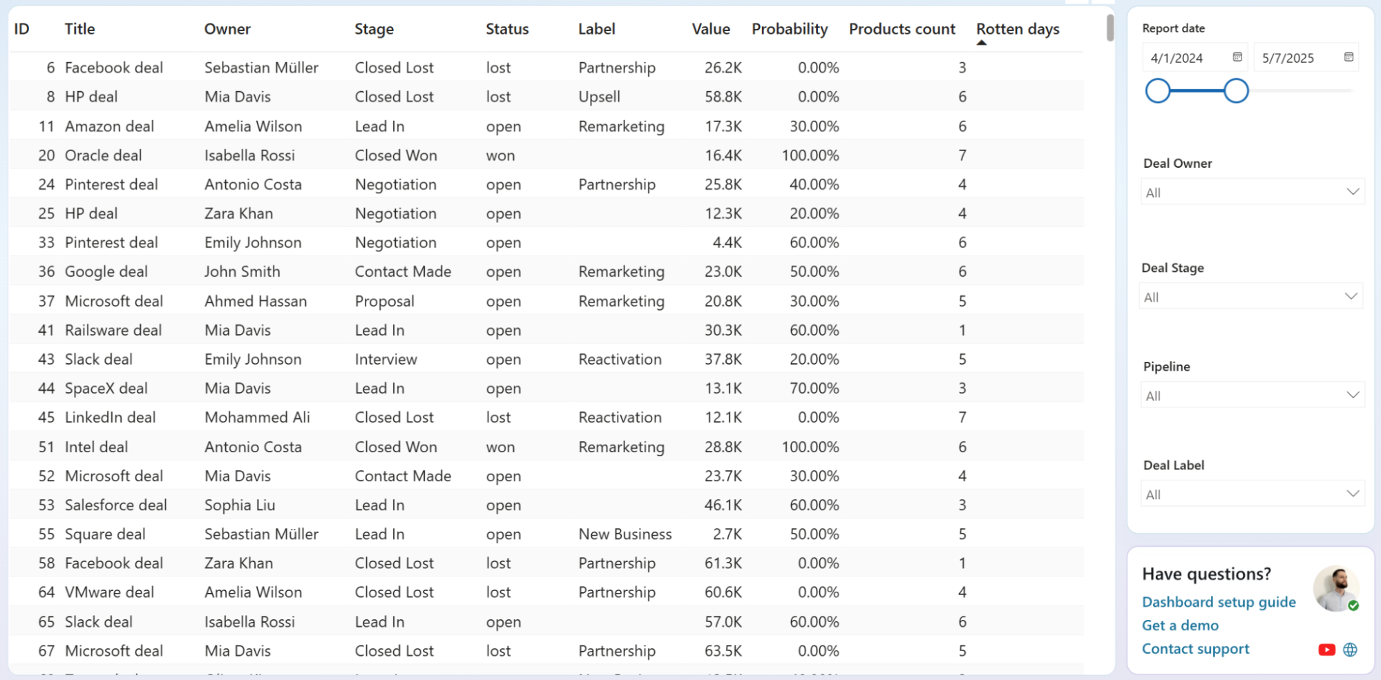
Evaluate rotten days across open deals to spot which opportunities are aging past the point of recovery. Sort the deals table by this column and compare against closed-lost deals to find the threshold where inactivity typically leads to a loss. That number becomes a measurable key result: any open deal crossing it triggers immediate follow-up.
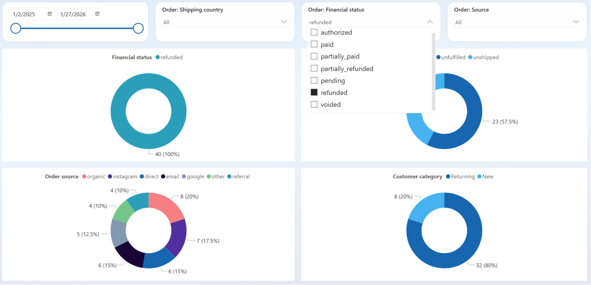
Isolate pending and refunded orders using the financial status filter, then cross-reference results with the geographic map and top-selling products chart. A cluster of blocked orders from one country or tied to one product line points to a fixable root cause: payment gateway coverage, shipping restrictions, or product-specific defects. That specificity beats treating it as a general performance problem.
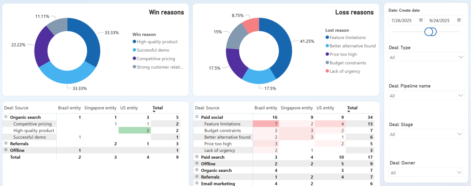
Compare win reasons and deal sources across entities to find which acquisition channels produce wins for the right reasons. If organic search wins cite "high-quality product" while paid social losses cluster around "feature limitations," the problem is targeting, not the product itself. Use the loss reasons breakdown to set a specific reduction target as your next key result.
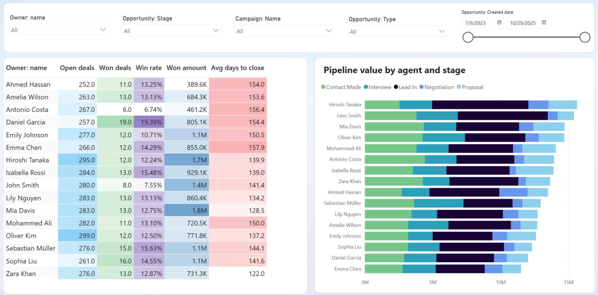
Filter opportunities by owner and stage to compare how deals progress across team members. If three out of five reps have deals piling up at Negotiation, the bottleneck is likely a process or pricing issue. If only one rep shows that pattern, it signals a coaching need. This distinction changes whether you revise the playbook or schedule a one-on-one.
How to create a Power BI OKR dashboard?

Metrics you can track with the Power BI OKR dashboard
Monthly and annual income totals tracked over a 12-month window. Plotting revenue against a target line shows whether you are pacing toward your objective or falling behind, and pinpoints exactly when the trajectory shifted.
Revenue minus expenses for a given period. A team can hit its revenue OKR while net income declines if costs grow faster. Tracking both prevents celebrating a top-line win that masks a profitability problem.
Total monetary value of closed-won deals. This metric ties directly to sales pipeline OKRs and separates deal count from deal quality — ten small wins may look productive but fall short of a revenue-based key result.
The percentage of opportunities that result in a closed-won outcome, tracked per rep in the owners comparison table. Useful as a key result when the objective is improving sales effectiveness rather than simply adding more pipeline volume.
The proportion of deals that reach a final resolution (won or lost) versus remaining open indefinitely. A low close rate signals that the pipeline is bloated with stale opportunities, which distorts forecasting and masks the true health of your sales objective.
Average number of days from opportunity creation to closed-won status. Shortening this metric is a common sales efficiency OKR. Tracking it per rep reveals whether speed improvements are team-wide or concentrated in a few high performers.
Count of orders placed in your e-commerce store during a selected period. Order volume, independent of revenue, shows whether growth is coming from more transactions or higher prices. That distinction shapes operational and inventory objectives.
Gross e-commerce revenue before discounts, returns, or adjustments. Comparing total sales against net revenue key results highlights how much gross volume is lost to refunds and promotions, which often go unmeasured until they erode margins.