GA4 dashboard examples and reporting templates
Gain complete visibility into your website performance with automated Google Analytics dashboard templates that consolidate data from multiple properties. Track traffic sources, analyze user behavior, monitor key events, and make strategic decisions based on real-time insights from your GA4 data.
Google Analytics dashboard examples for every need


 +6
+6

 +5
+5
 +6
+6


 +4
+4
 +4
+4
 +5
+5
 +4
+4
 +5
+5
 +5
+5
 +1
+1
 +3
+3
 +3
+3
 +1
+1
 +1
+1
 +2
+2
 +3
+3
 +4
+4
about your case. It doesn't cost you a penny 😉
Choose your white label GA4 dashboard to kick off
What is a Google Analytics 4 dashboard?
Modern GA4 dashboards allow you to monitor multiple websites simultaneously, track conversion paths, analyze user behavior patterns, and identify optimization opportunities without switching between reports. By consolidating metrics like traffic sources, user engagement, and conversion events, these dashboards provide a comprehensive view of your digital performance. With automated data refreshing through Coupler.io, your Google Analytics 4 dashboard always displays current information without manual exports or data processing, creating a reliable, real-time view of your analytics across websites and campaigns.

What reports should be included on a Google Analytics dashboard?
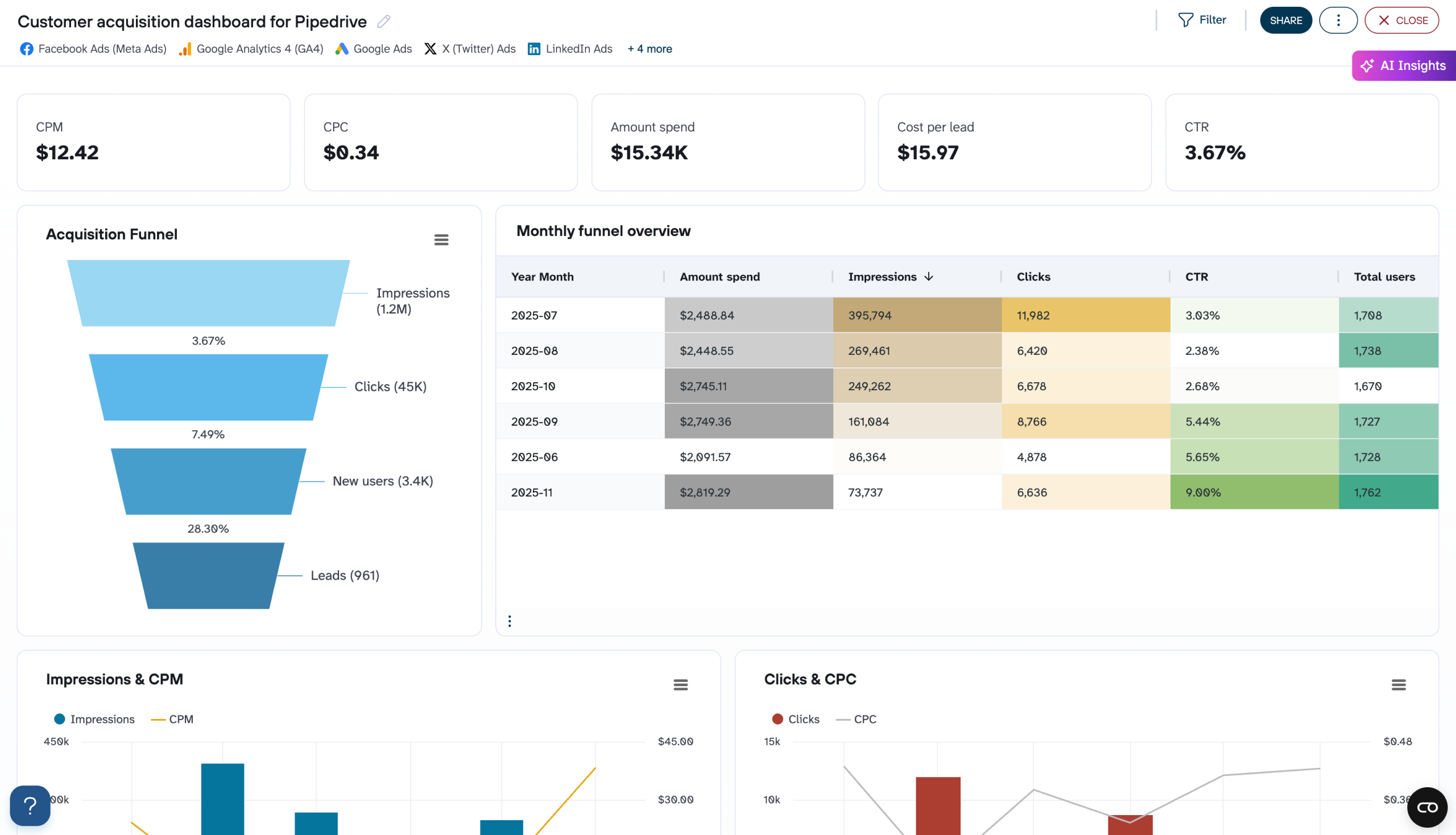
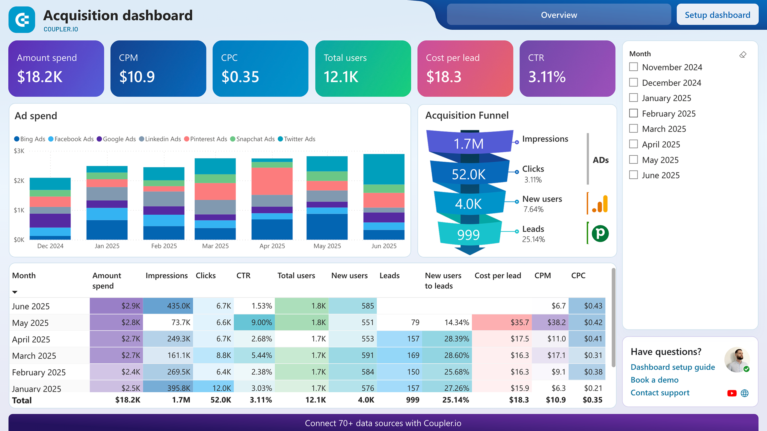
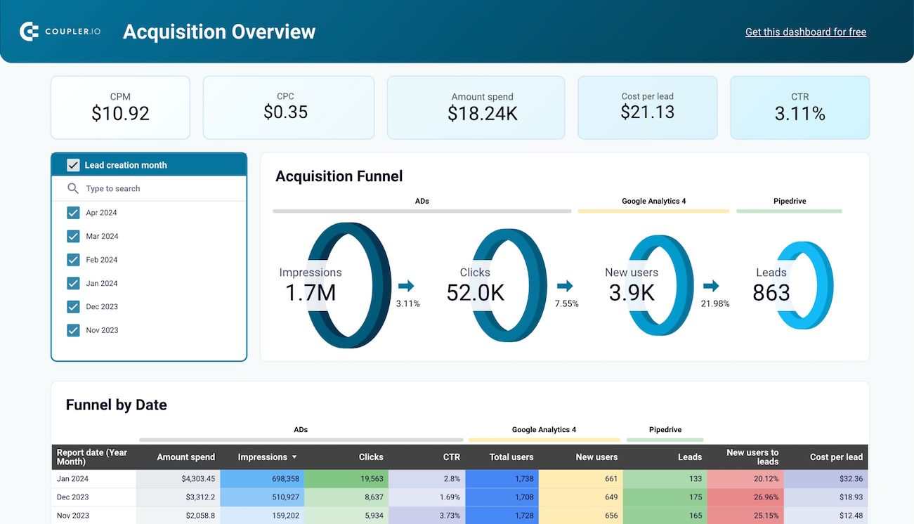
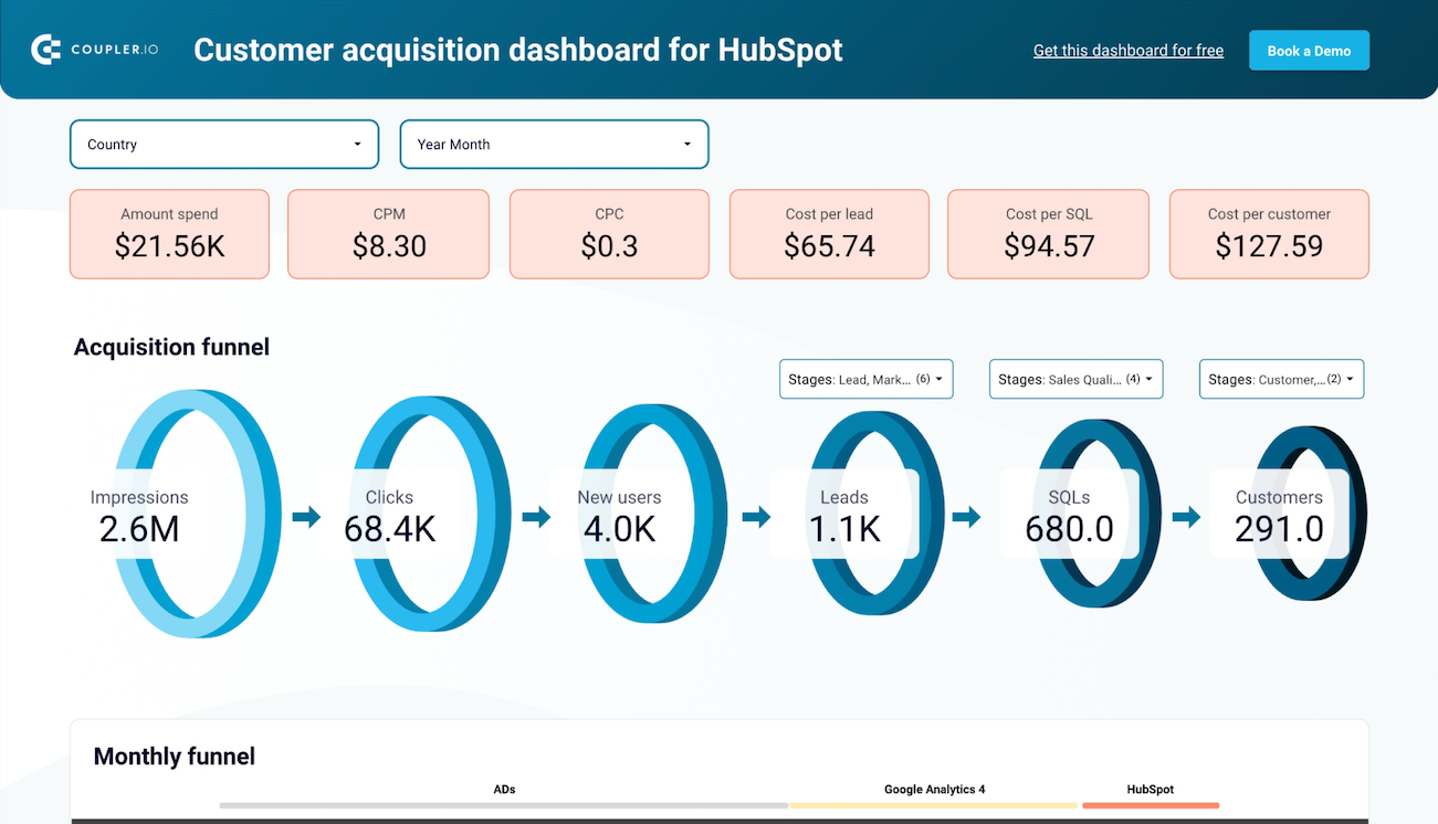
A comprehensive Google Analytics 4 dashboard should include several key reports that provide complete visibility into your website's performance. Based on our analysis of GA4-based dashboards, we recommend incorporating these four essential report types.
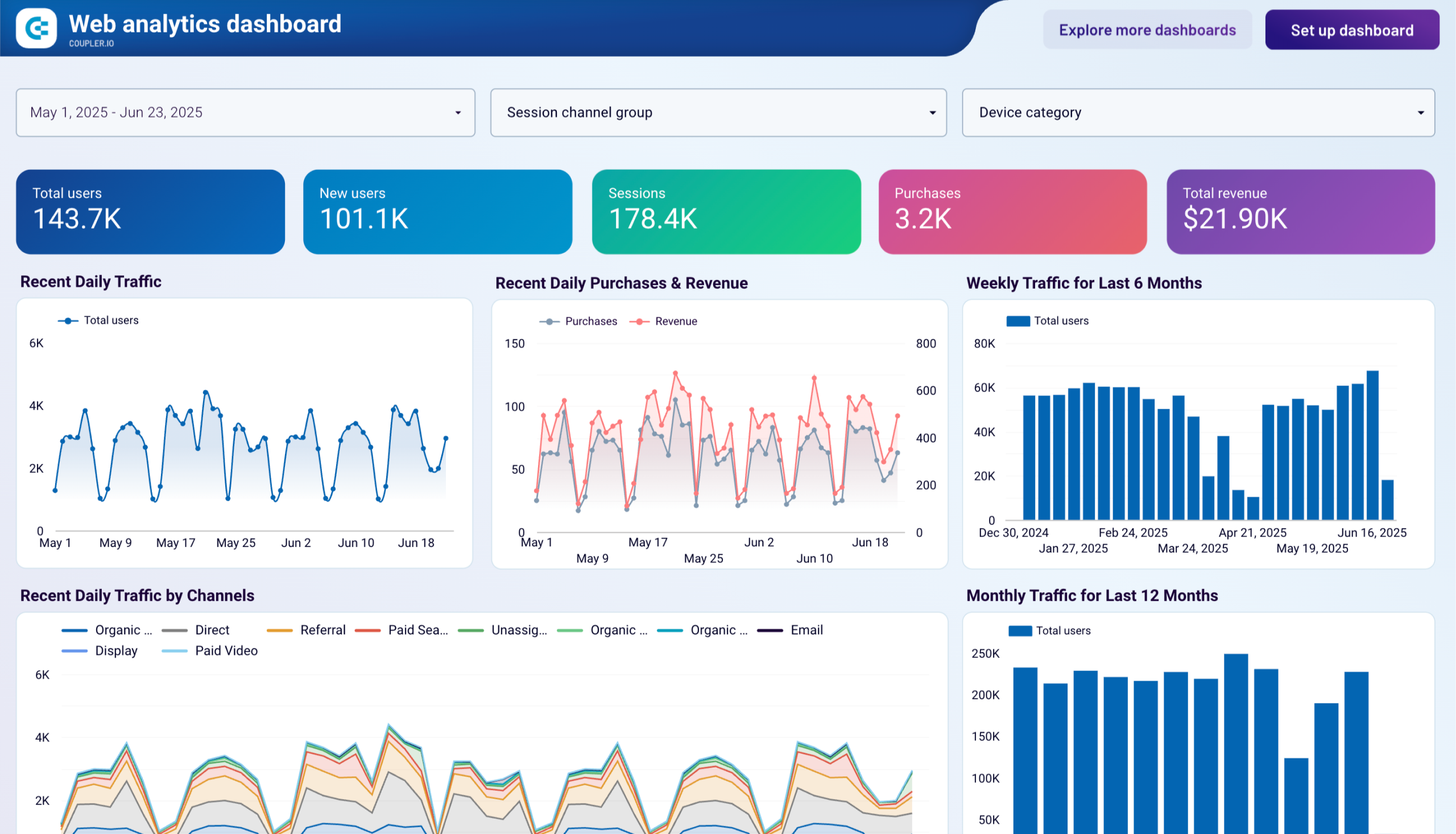
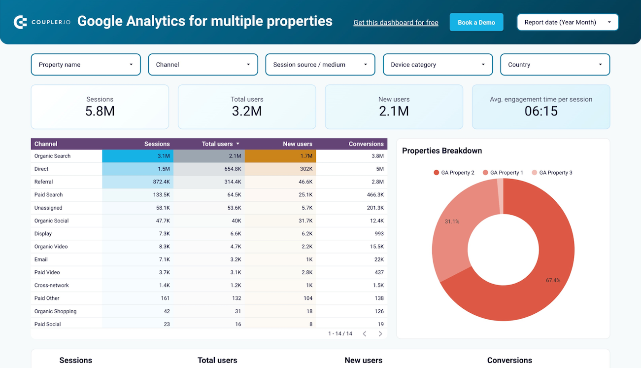
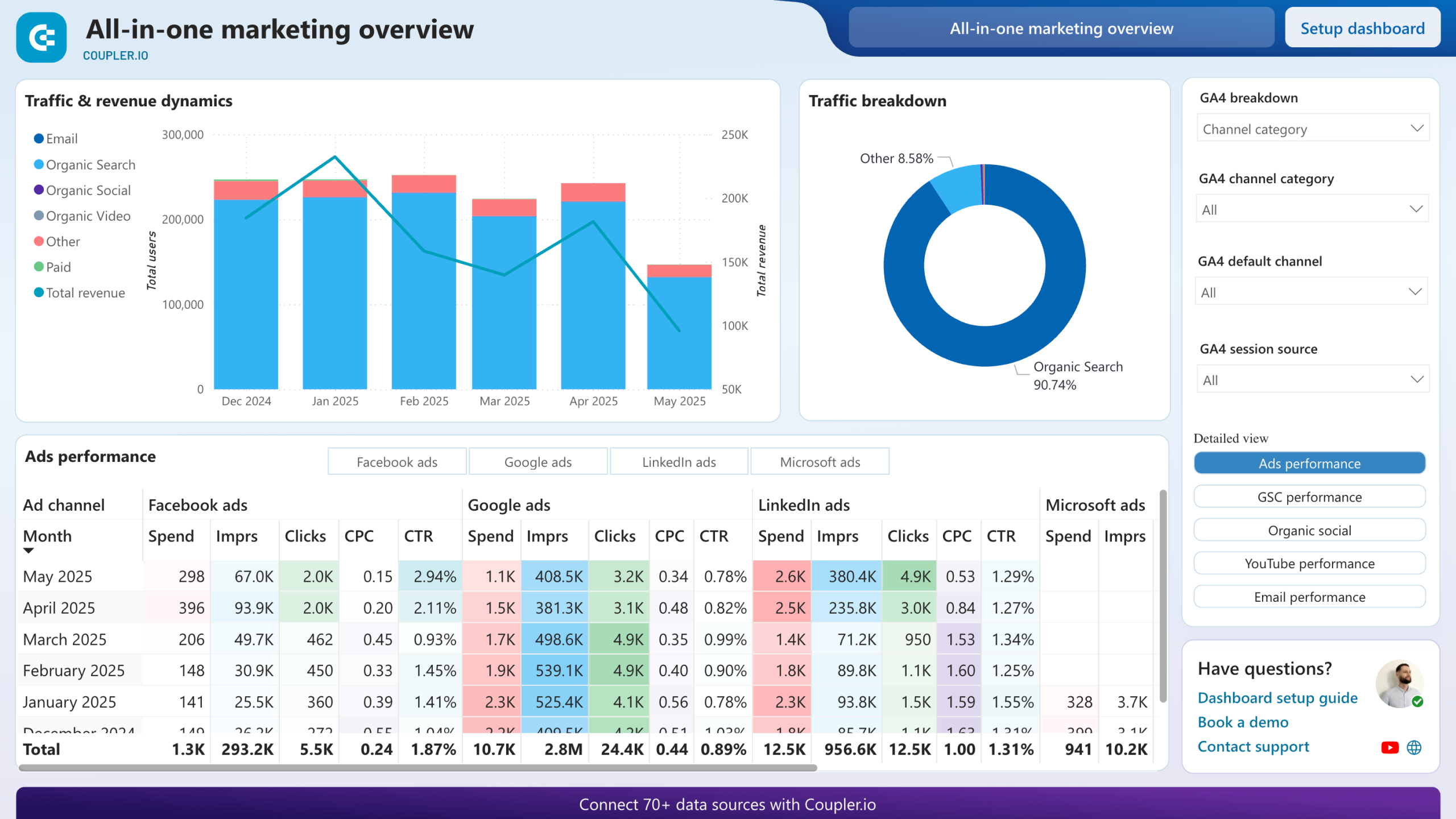
The multi-property traffic report offers a consolidated view of performance metrics across multiple websites. It provides aggregated data on total users, new users, sessions, and engagement rates with powerful filtering options by properties, channels, and custom criteria. This report helps you identify traffic trends, spot underperforming sites, and allocate resources effectively across your digital portfolio. The monthly performance dynamics section allows you to monitor progress over time and make data-driven decisions about your marketing strategy.
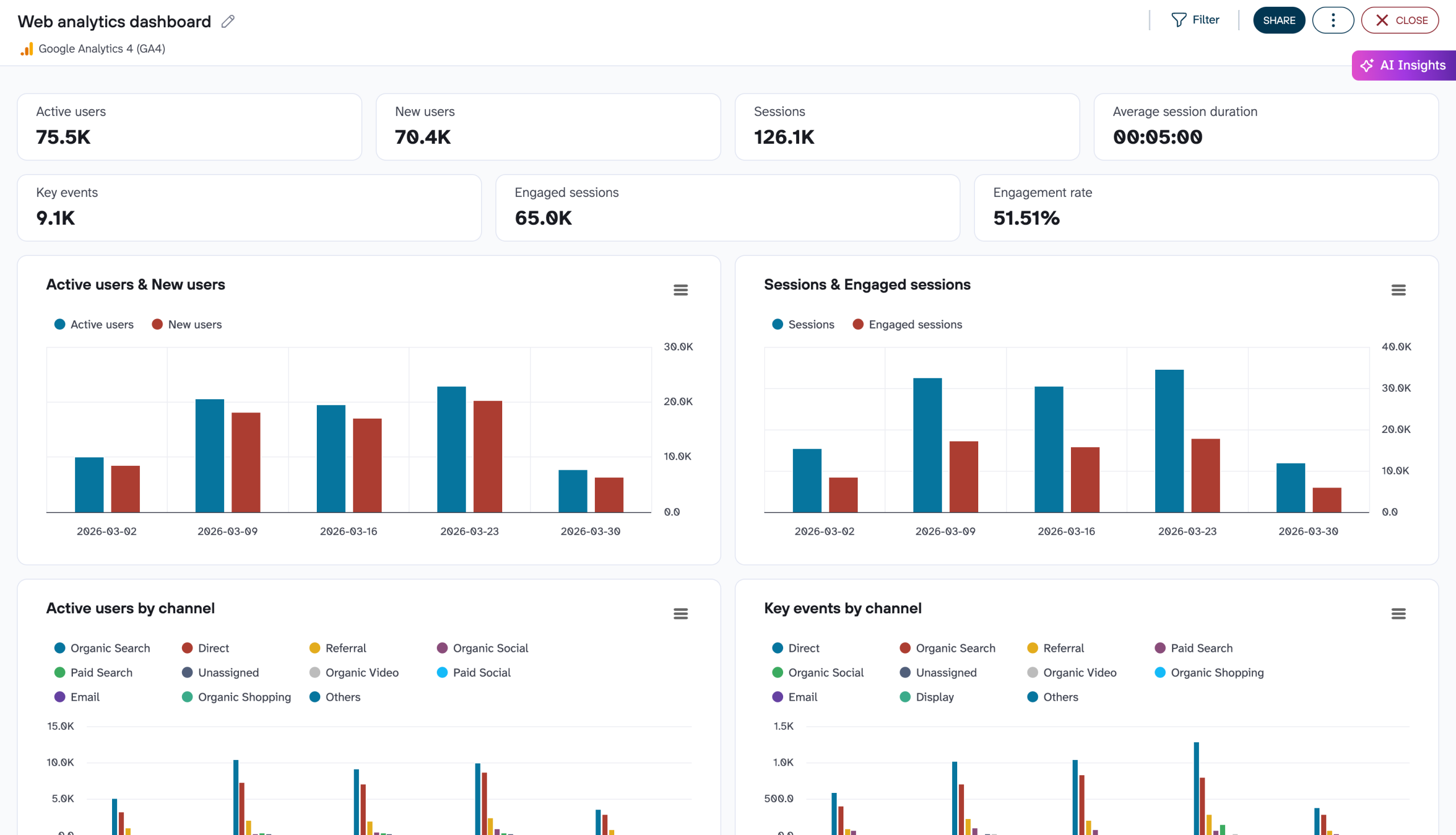
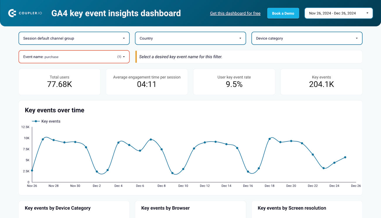
The key events analysis report focuses on tracking user actions that matter most to your business. It moves beyond basic pageviews to show how users engage with critical touchpoints like sign-ups, downloads, or purchases. The report segments these events by device type, browser, screen resolution, and traffic source to provide a comprehensive view of user behavior patterns. By understanding which platforms and channels drive the most valuable conversions, you can optimize your website experience and marketing investments for maximum impact.
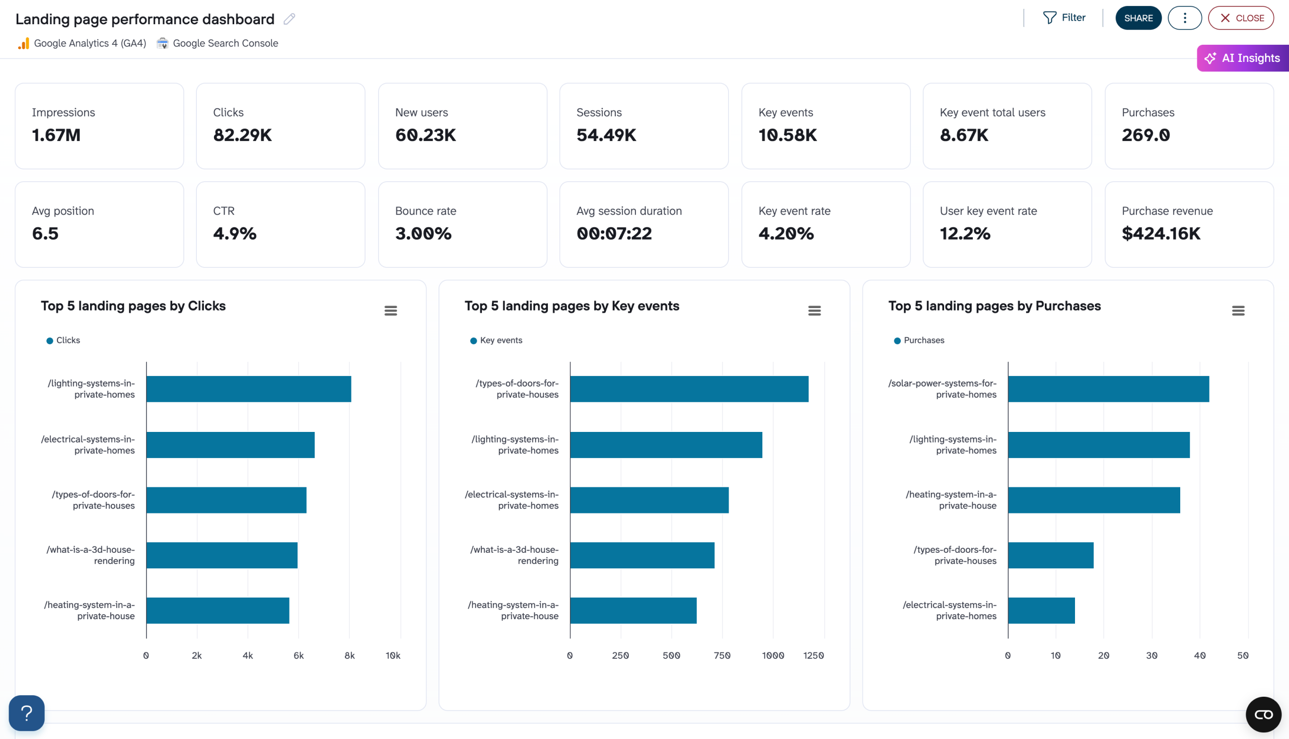
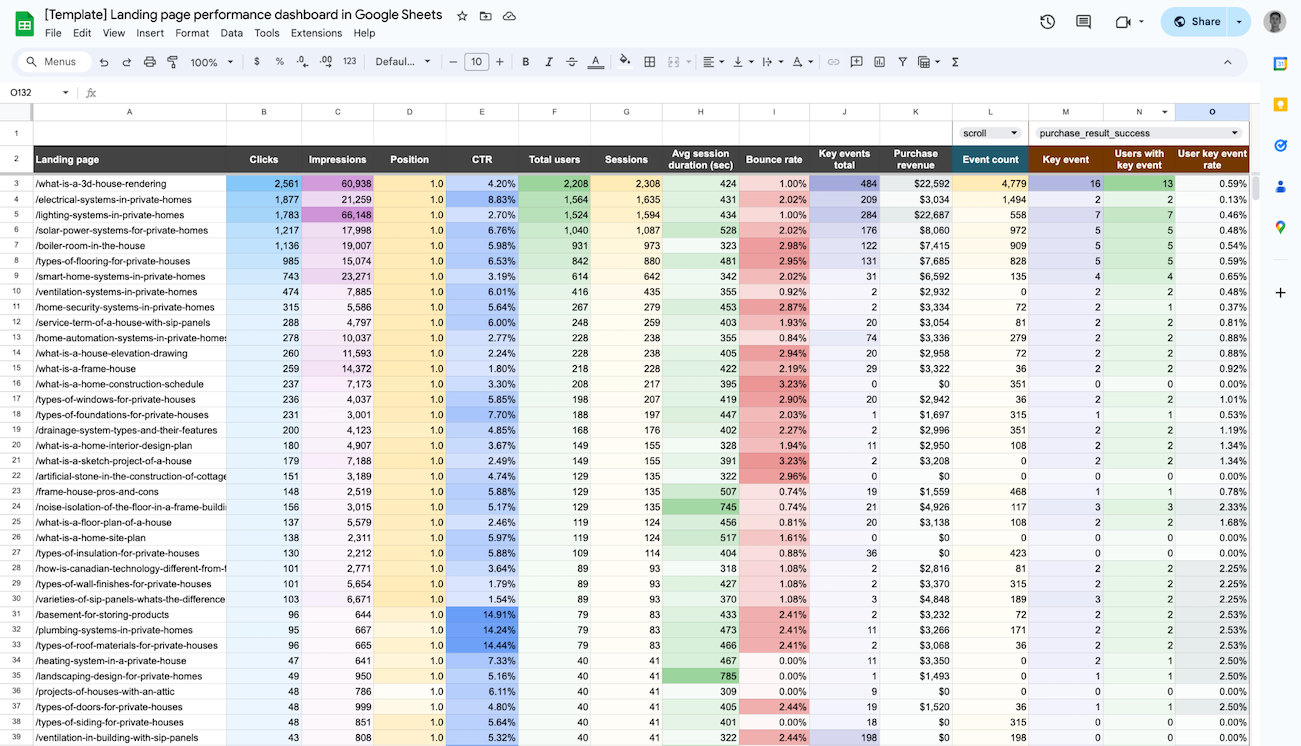
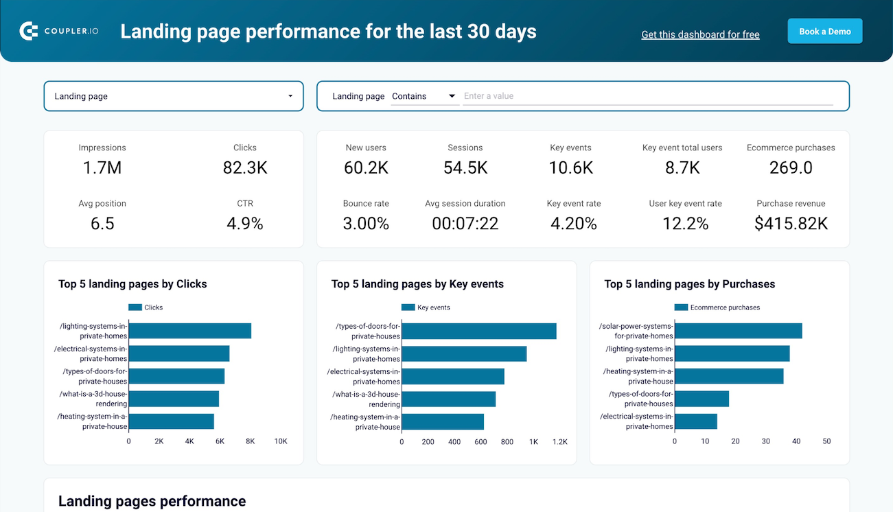
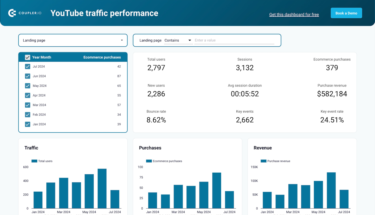
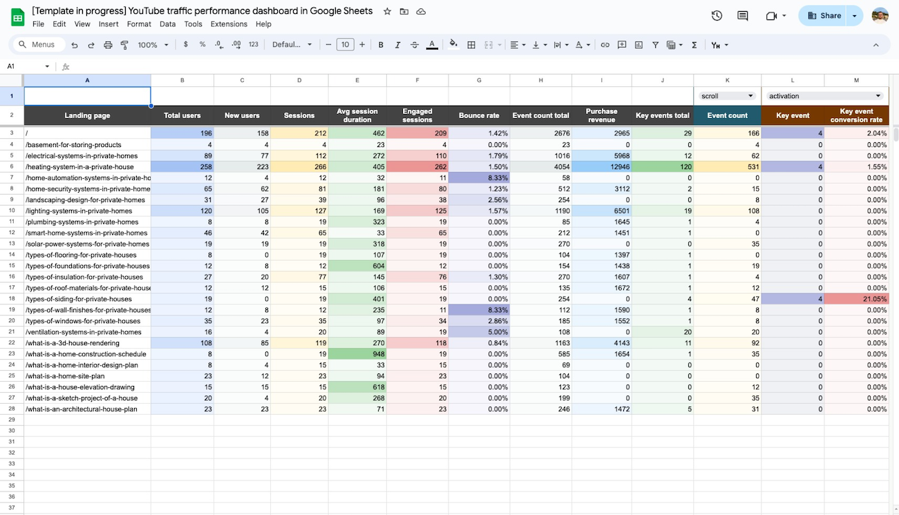
The landing page performance report delivers detailed analytics on how specific pages are performing in terms of engagement and conversions. It combines GA4 metrics like new users, bounce rate, and session duration with Search Console data on impressions, clicks, and average position. The interactive filtering allows you to select specific landing pages or analyze batches of similar content to identify patterns. With this report, you can easily spot your highest-converting pages and understand why they outperform others.
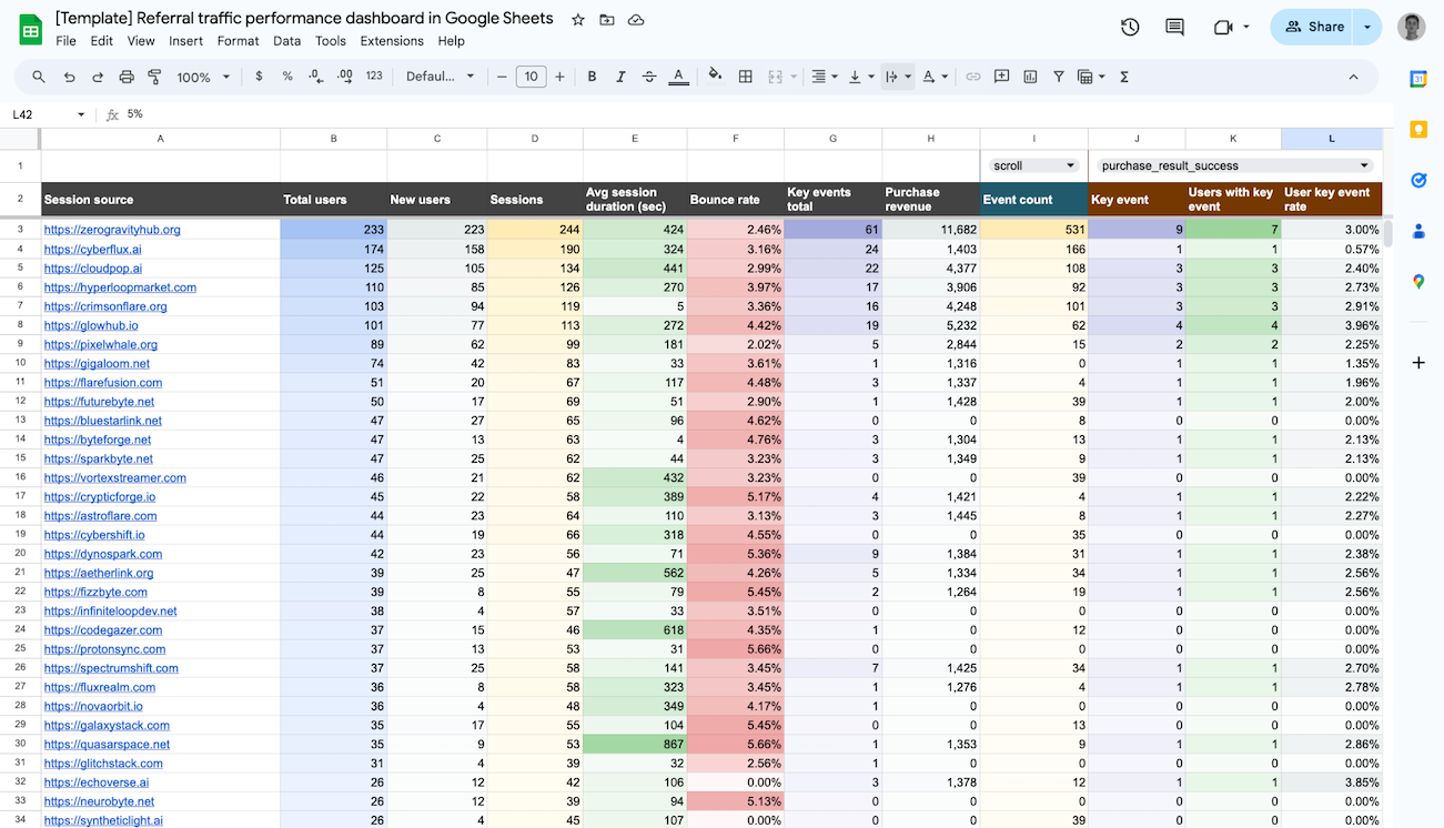
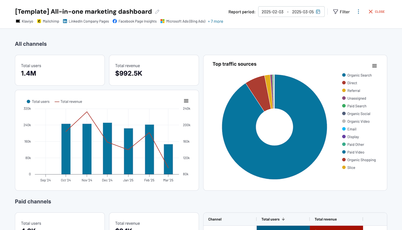
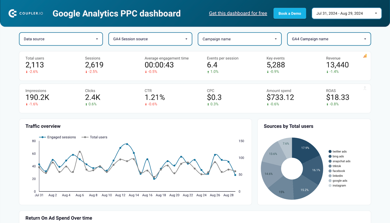
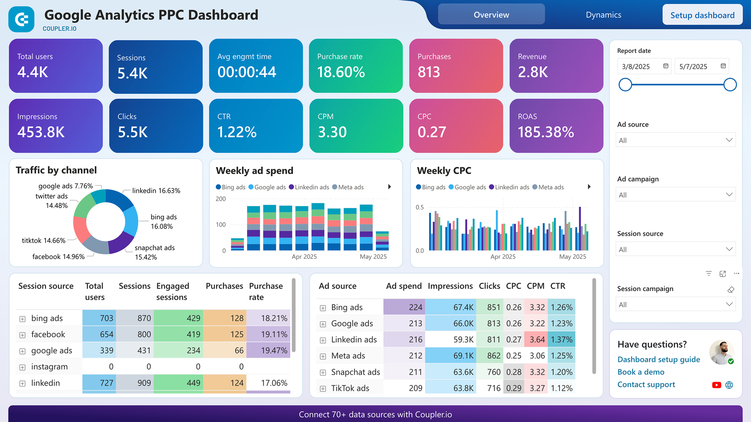
The traffic source intelligence report provides deep insights into where your visitors come from and how they behave. It evaluates multiple traffic channels including organic search, paid campaigns, social media, referral sites, and even emerging sources like AI tools. For each source, you can analyze engagement metrics, conversion rates, and revenue generation to understand which channels deliver the highest ROI. This comprehensive view helps you allocate your marketing budget more effectively and optimize campaigns across all digital touchpoints.
What insights you can get with the GA4 custom dashboard
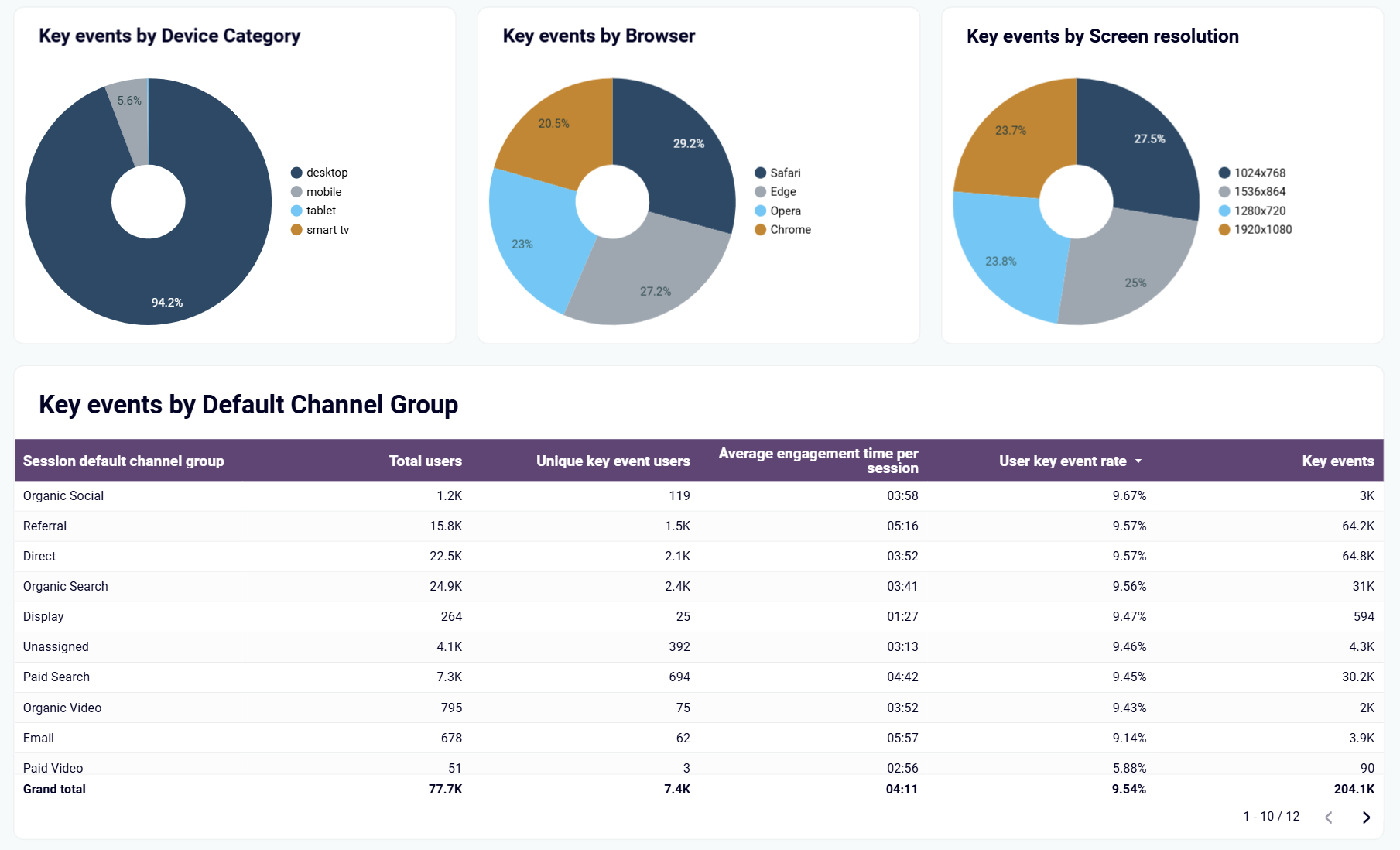
The key events GA4 dashboard template offers a multidimensional view of how users interact with your most important conversion points. You can see which devices (mobile, desktop, tablet) are preferred by converting users, which browsers they use, and how screen sizes affect engagement. The dashboard also clearly identifies which marketing channels drive the most valuable conversions, allowing you to prioritize platforms that deliver real business results rather than just traffic volume. These insights help you focus development and marketing efforts where they'll have the greatest impact on your bottom line.
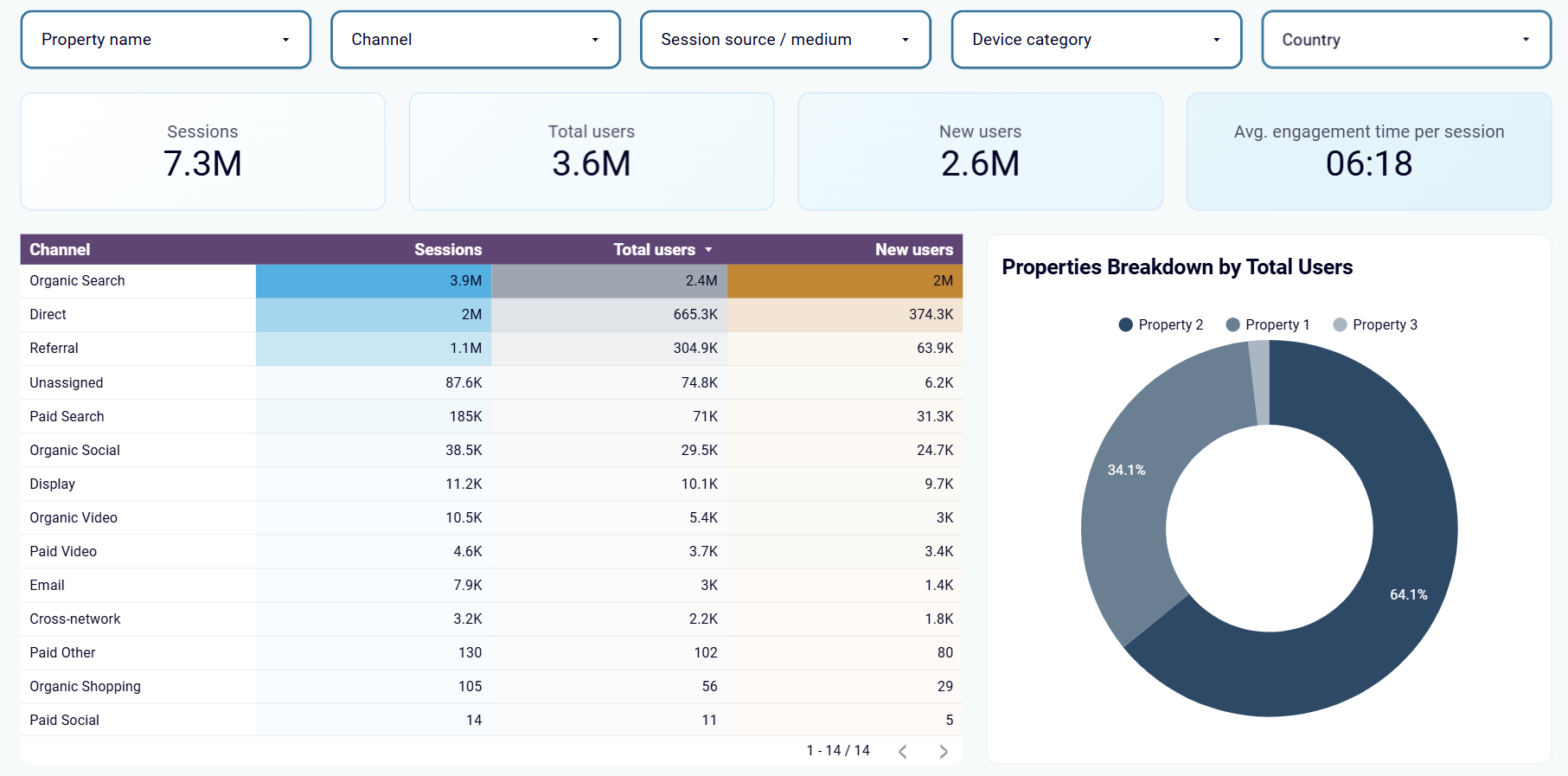
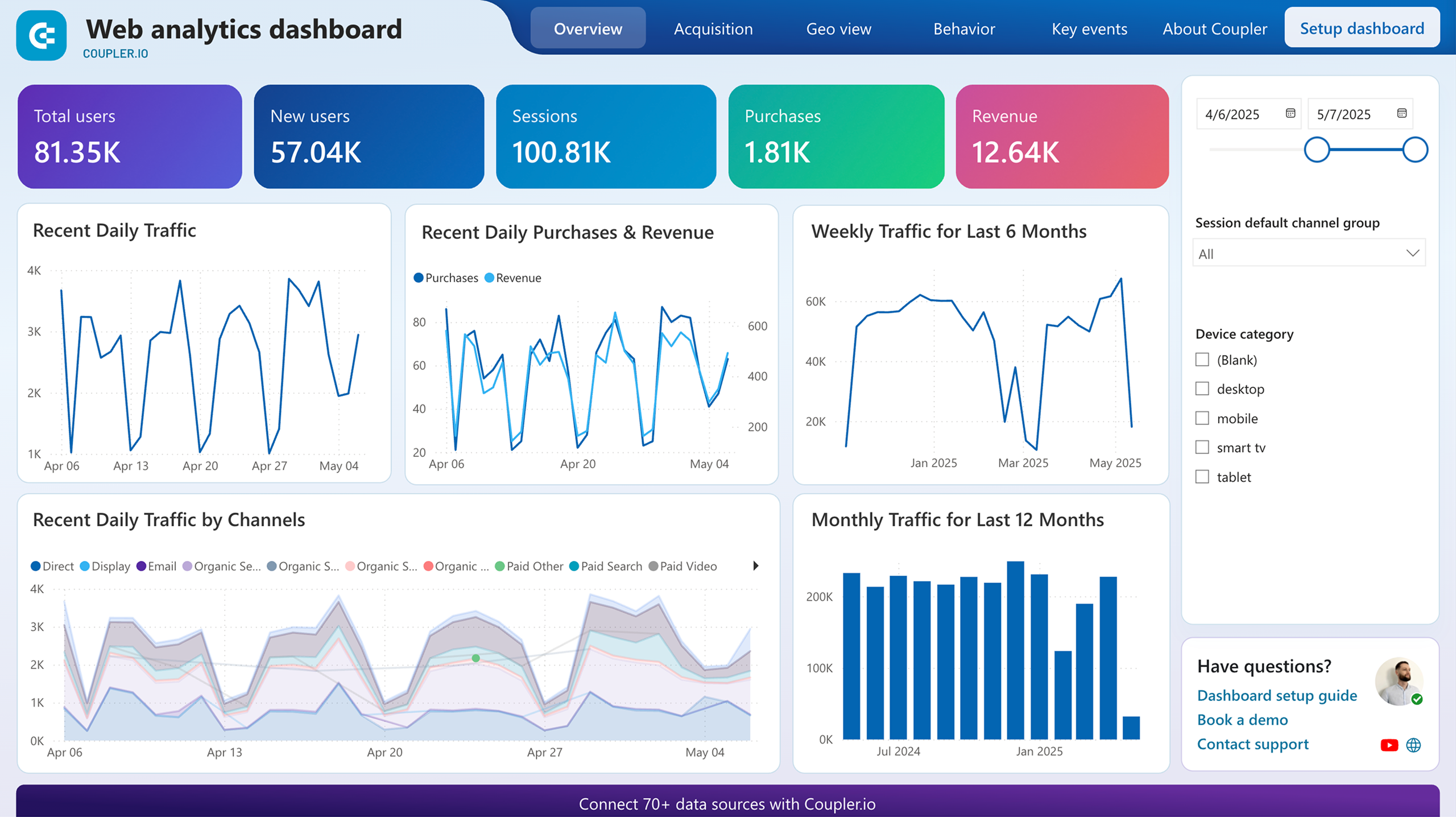
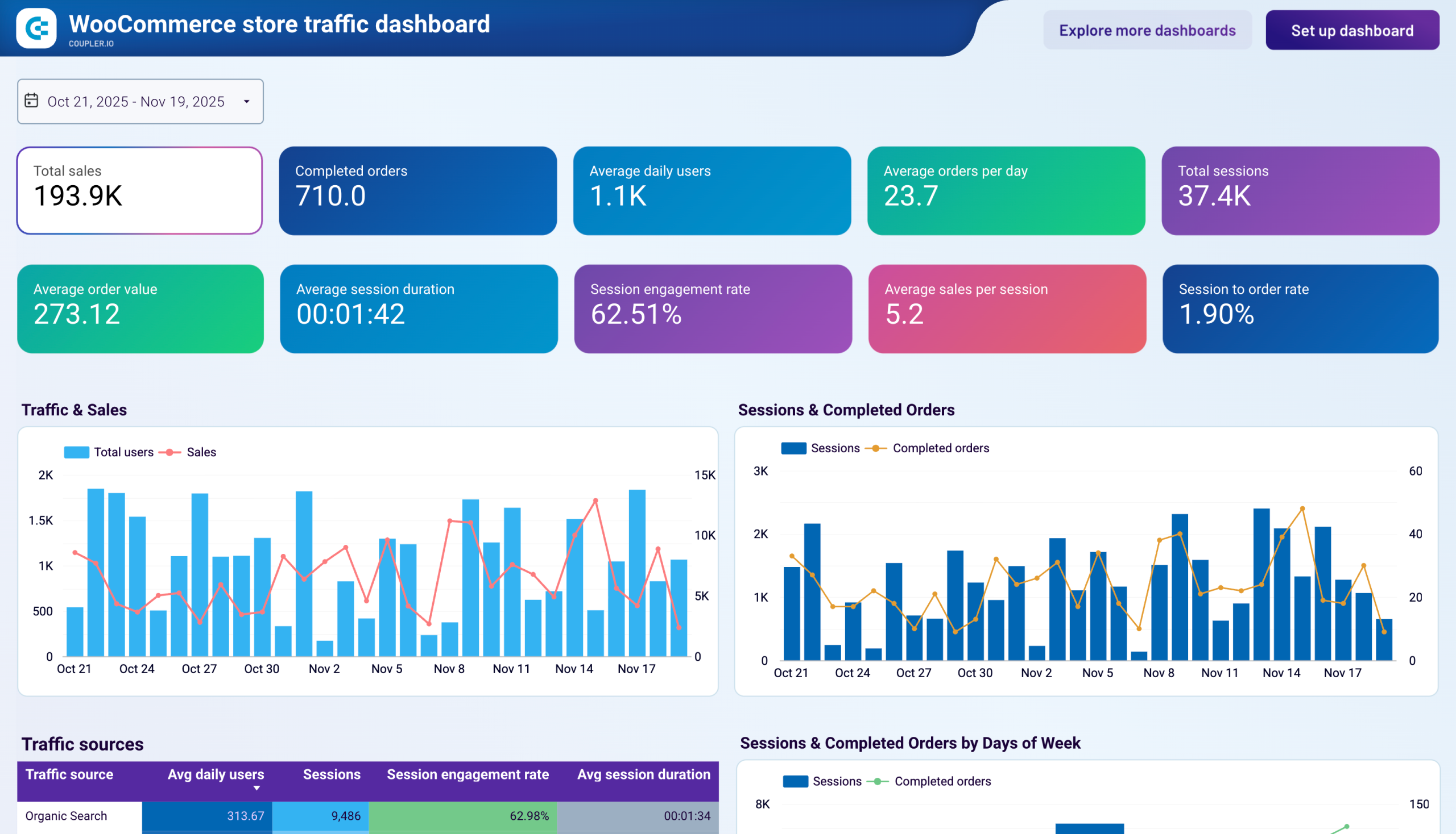
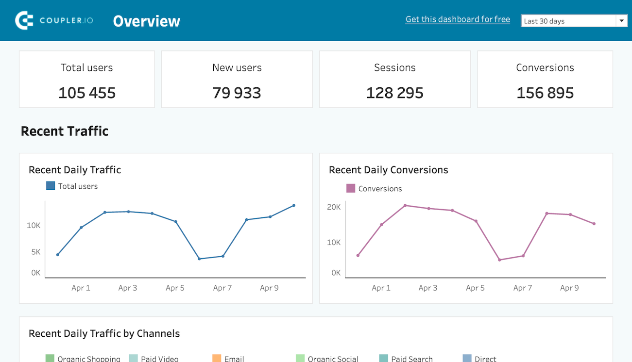
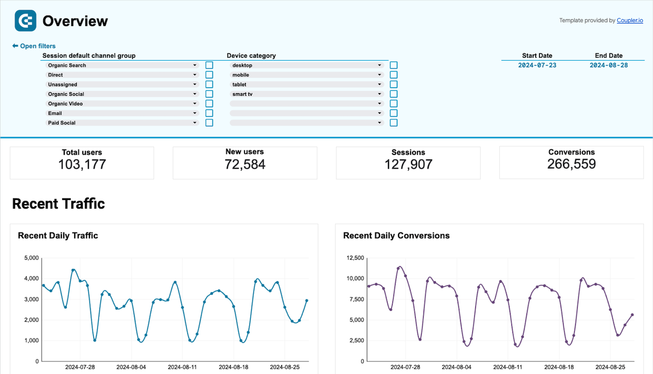
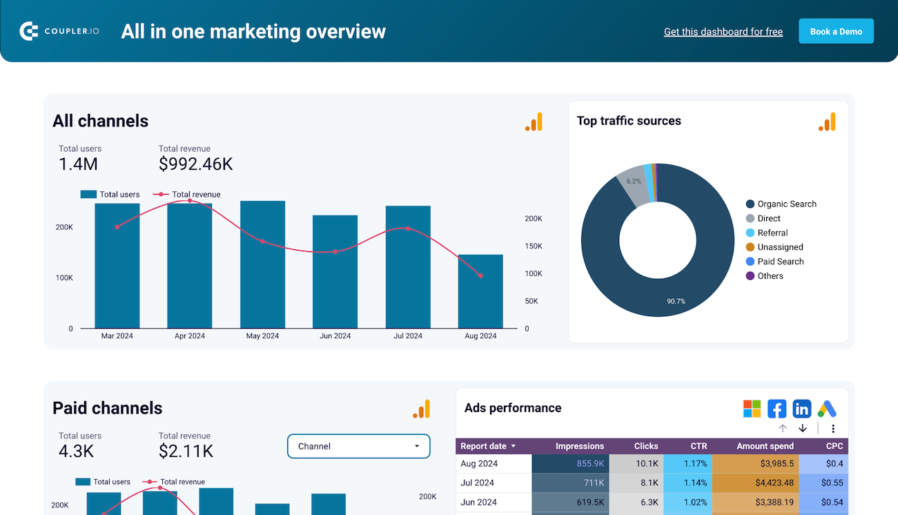
Monitor the aggregate performance of all your websites in one place with a consolidated view of traffic and engagement metrics. This unified Google Analytics dashboard template eliminates the need to switch between multiple GA4 properties, saving significant time and providing a holistic view of your digital ecosystem. The logical set of filters allows you to segment data by properties, channels, and other criteria to uncover valuable patterns across your entire web portfolio.
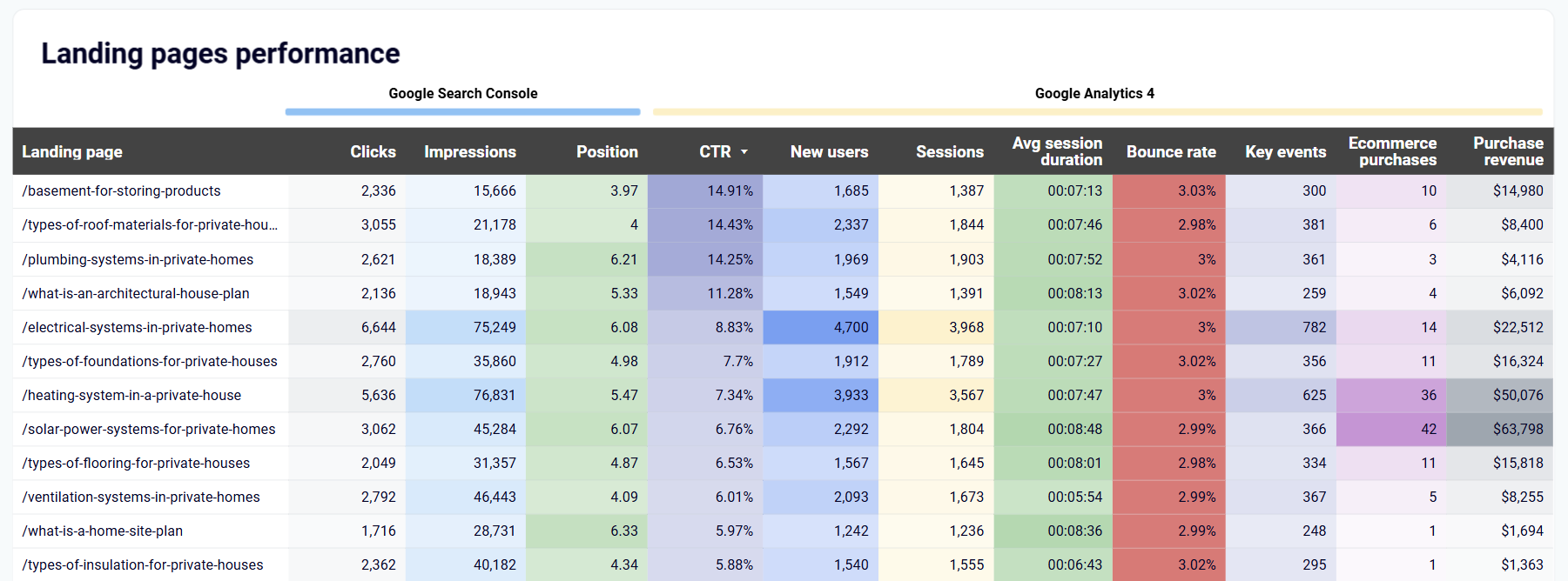
Quickly identify your best and worst-performing landing pages with a comprehensive breakdown table showing key performance metrics for each page. The dashboard highlights metrics like impressions, clicks, average position, CTR from Search Console alongside GA4 data including new users, sessions, key events, bounce rate, and average session duration. This side-by-side comparison makes it easy to spot pages that drive traffic but fail to convert, or high-converting pages that need more visibility.
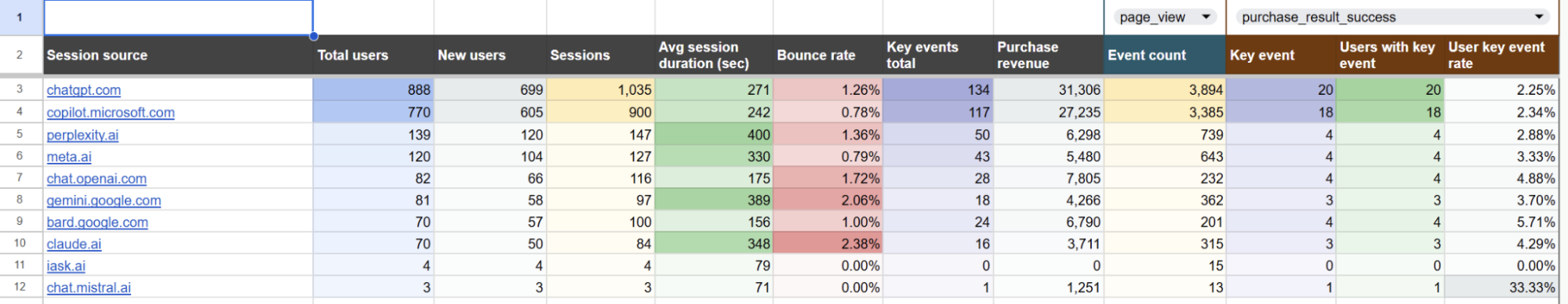
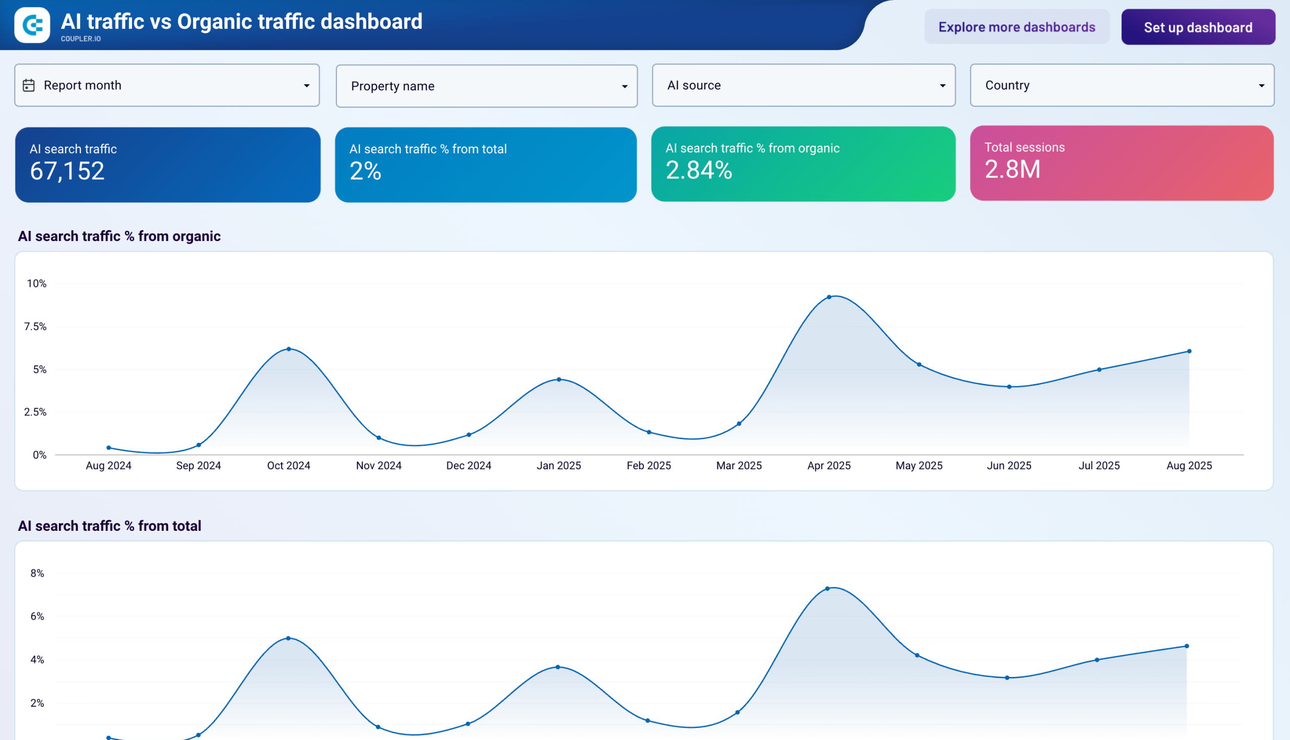
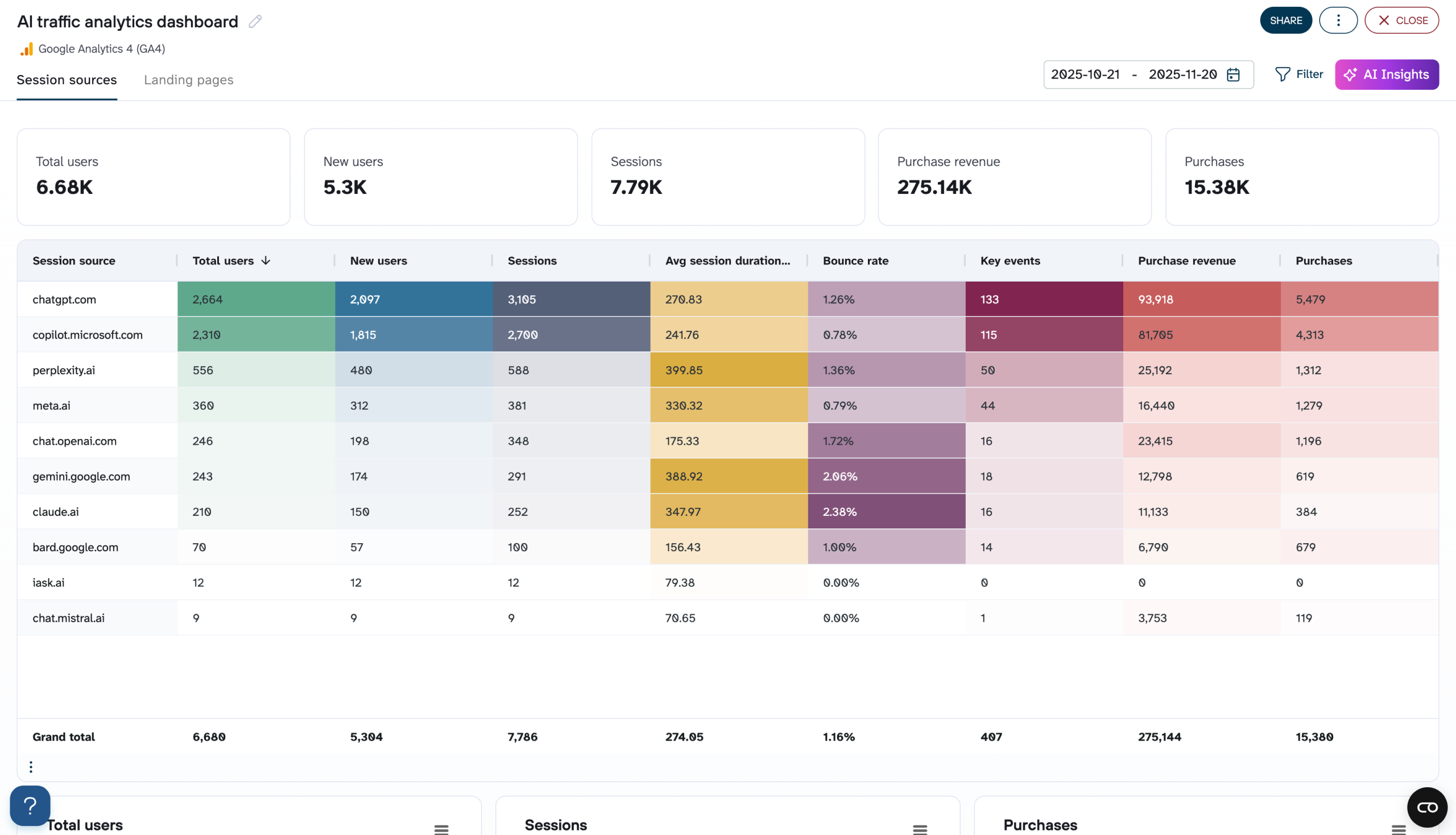
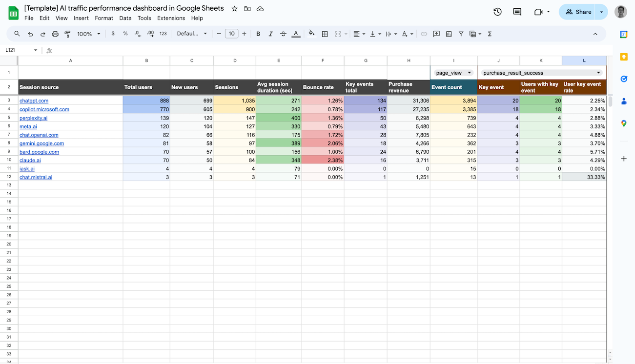
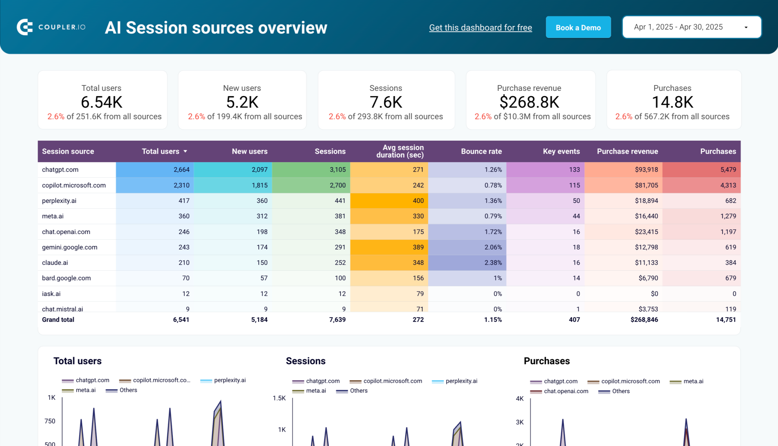
Track and analyze website visitors coming from emerging AI tools like ChatGPT, Bard, and other AI assistants. The dashboard compares traffic volume, engagement metrics, and conversion rates across different AI platforms to help you understand this growing traffic segment. By identifying which AI tools drive the most valuable traffic to your site, you can develop targeted strategies to optimize for these new channels and capitalize on AI-driven discovery.
How to create a GA4 dashboard?

Metrics you can track with a GA4 dashboard template
Monitor both overall traffic volume and first-time visitors to your site across multiple properties. The GA4 dashboard displays these metrics with day-by-day trends and percentage changes compared to previous periods. Understanding the ratio between total and new users helps you assess audience growth, retention, and the effectiveness of acquisition strategies across different marketing campaigns.
Track how long users actively interact with your content, rather than simply having the page open. Unlike the traditional session duration metric, GA4's engagement time measures actual interaction, providing a more accurate picture of content quality and user interest. The dashboard visualizes this data across different time periods, pages, and user segments to help identify your most compelling content.
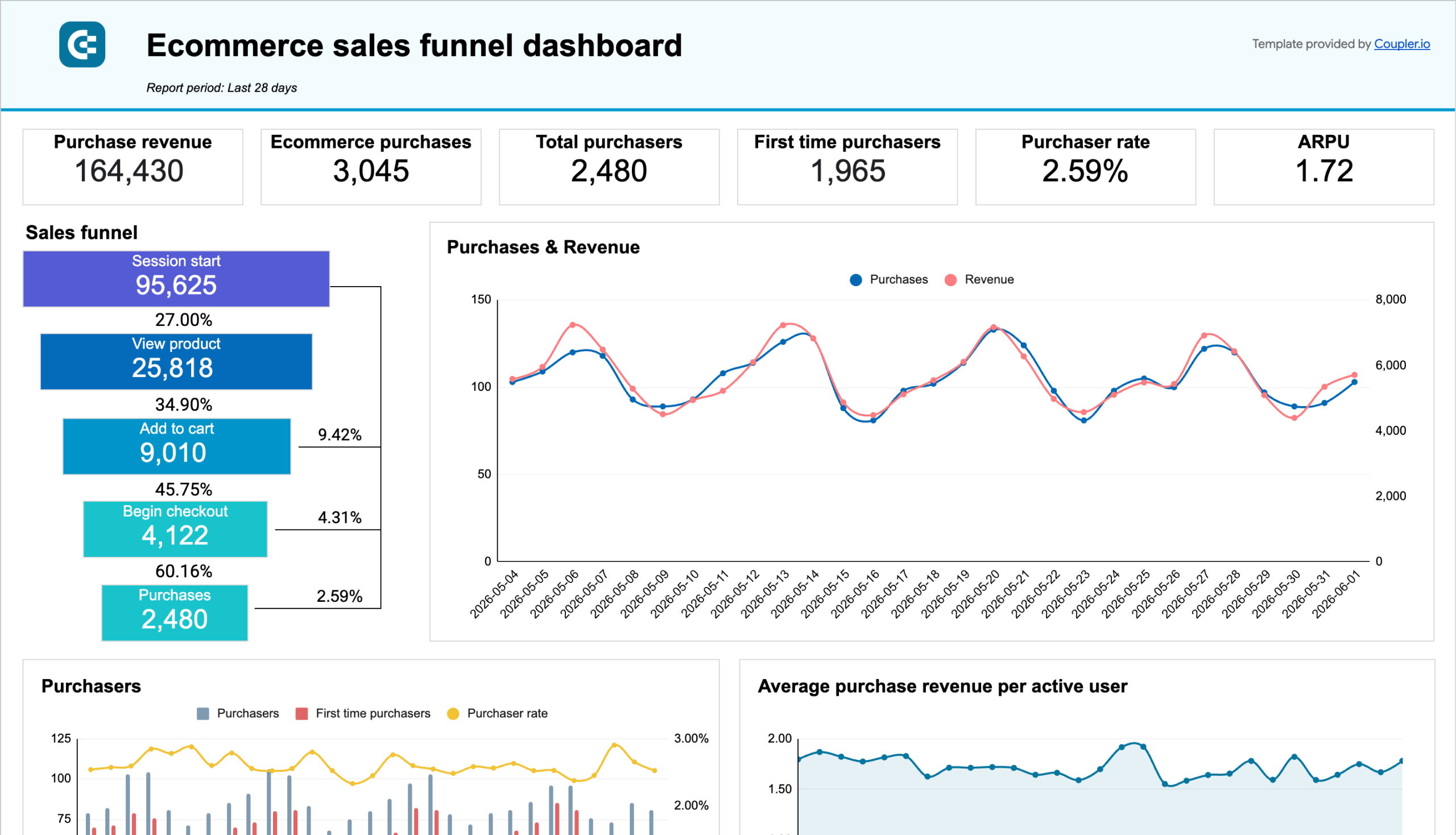
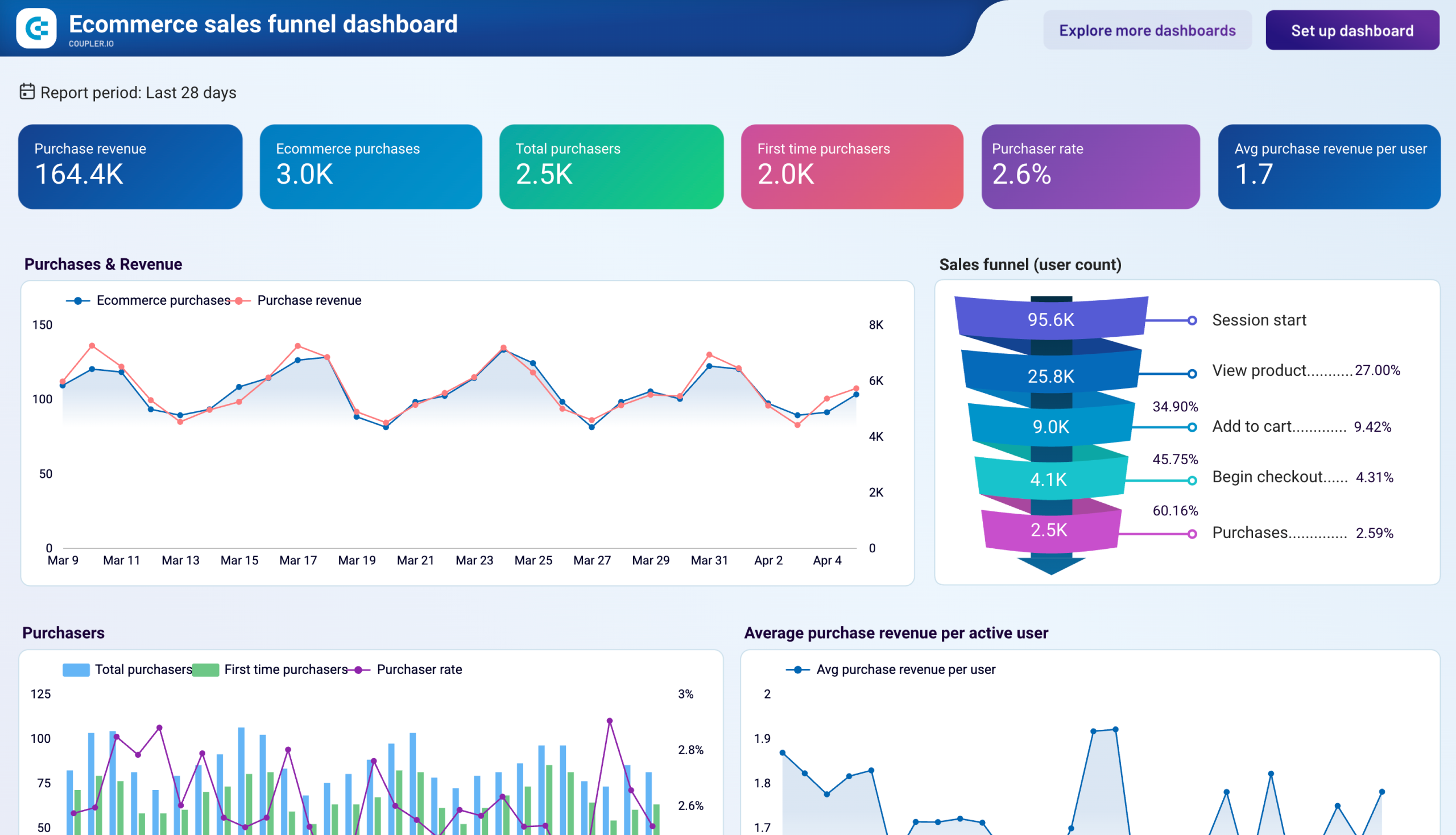
Measure how often users complete specific actions that matter to your business, from video plays to form submissions and purchases. The dashboard calculates the key event rate (percentage of users who complete a designated important action), helping you understand conversion performance across different segments. This metric is crucial for evaluating how well your site turns visitors into customers or leads.
Track the number of user visits and how many pages they view during each visit. The dashboard presents this information alongside engagement time and bounce rate to provide a complete picture of user behavior. Analyzing how these metrics vary across devices, channels, and content types helps identify opportunities to improve user journeys and maximize engagement with your site.
Measure the percentage of users who leave your site after viewing just one page without any interaction. The GA4 dashboard visualizes bounce rate trends over time and across different segments, helping you identify problem areas that need attention. High bounce rates on specific pages or from particular traffic sources indicate opportunities to improve content relevance, page design, or targeting strategy.
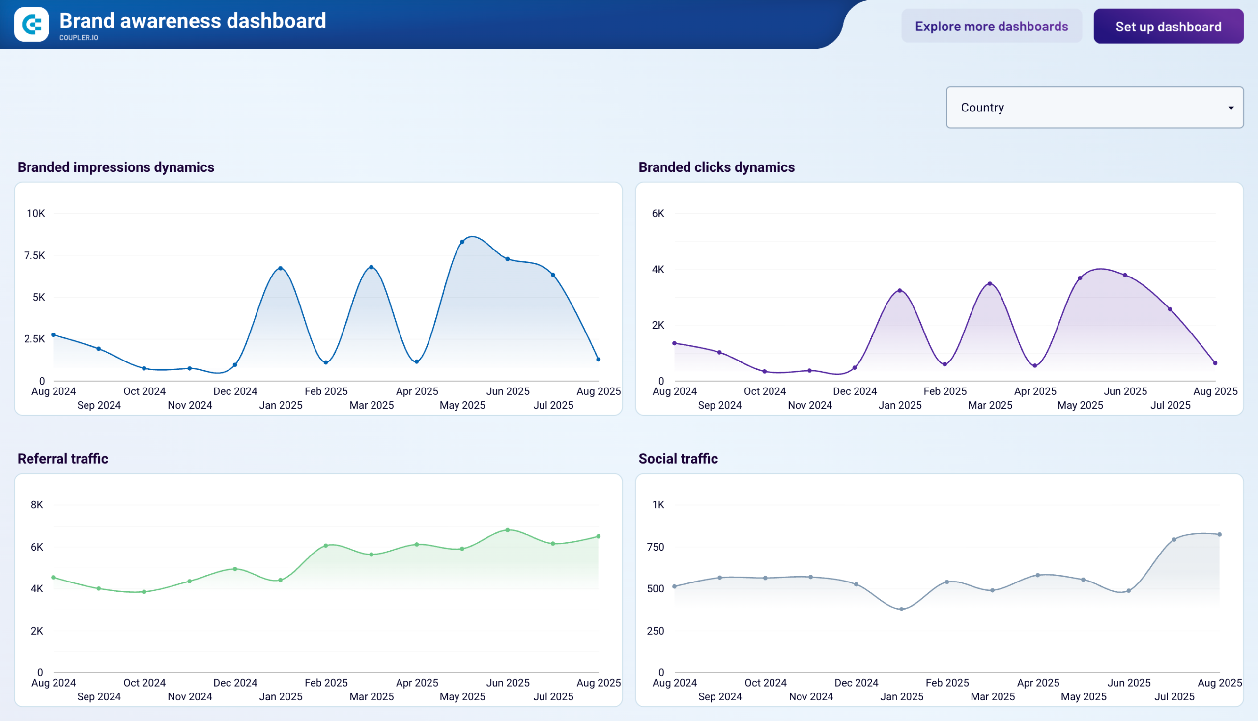
Analyze where your visitors come from with detailed categorization of traffic channels including organic search, paid campaigns, social platforms, direct traffic, referrals, and email. The dashboard provides visual comparisons of volume, engagement, and conversion metrics across these sources, helping you identify your most effective marketing channels and opportunities for optimization.
Visualize user location data with interactive maps and regional breakdowns that show which countries, regions, and cities generate the most traffic, engagement, and conversions. The dashboard allows you to compare performance across regions to inform international marketing strategies, content localization efforts, and regional campaign targeting.
Compare how users on different devices (desktop, mobile, tablet) interact with your site. The dashboard presents side-by-side metrics on traffic volume, engagement time, and conversion rates across device types. These insights help prioritize responsive design improvements and identify opportunities to enhance the user experience for specific device categories.