Xero dashboard examples and reporting templates
Transform your financial data into actionable insights with automated Xero dashboard templates. Monitor revenue metrics, track accounts payable and receivable, analyze cash flow, and make strategic business decisions with real-time reporting dashboards that connect directly to your Xero accounting platform.
Xero dashboard examples for every need


about your case. It doesn't cost you a penny 😉
Choose your Xero dashboard template to kick off
What is a Xero dashboard?
With automated data connections through Coupler.io, Xero reporting dashboards eliminate manual data entry and ensure you're always working with the most current financial information. They enable finance teams and business owners to track revenue trends, monitor aging accounts, analyze customer and vendor relationships, and identify payment priorities—all from a centralized interface. By providing a comprehensive view of your financial position, Xero dashboard templates help drive more informed business decisions and strategic planning.

What reports should be included on a meaningful Xero dashboard?
A well-designed Xero reporting dashboard should include several key financial reports that provide complete visibility into your company's performance. Based on our analysis of effective Xero dashboard examples, we recommend incorporating these four essential financial report types:
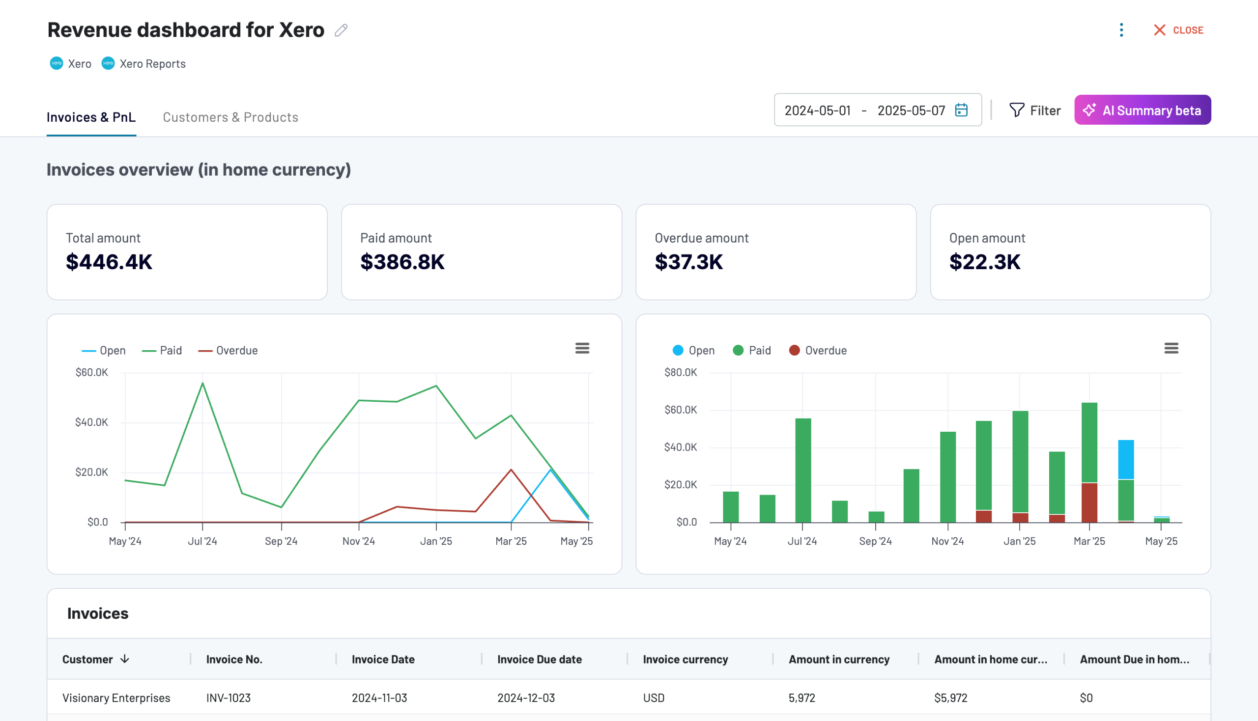
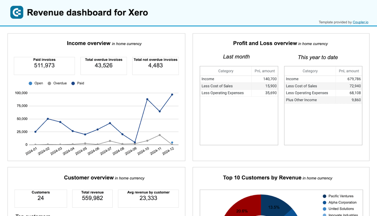
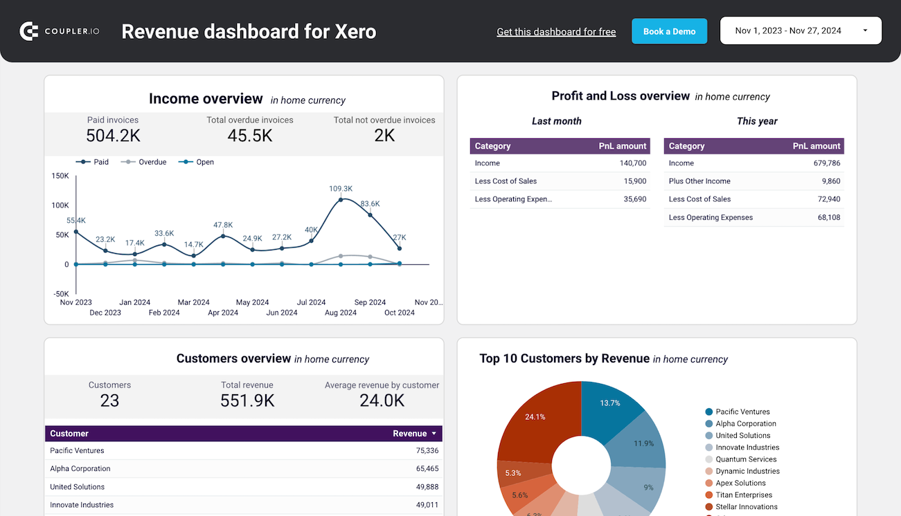
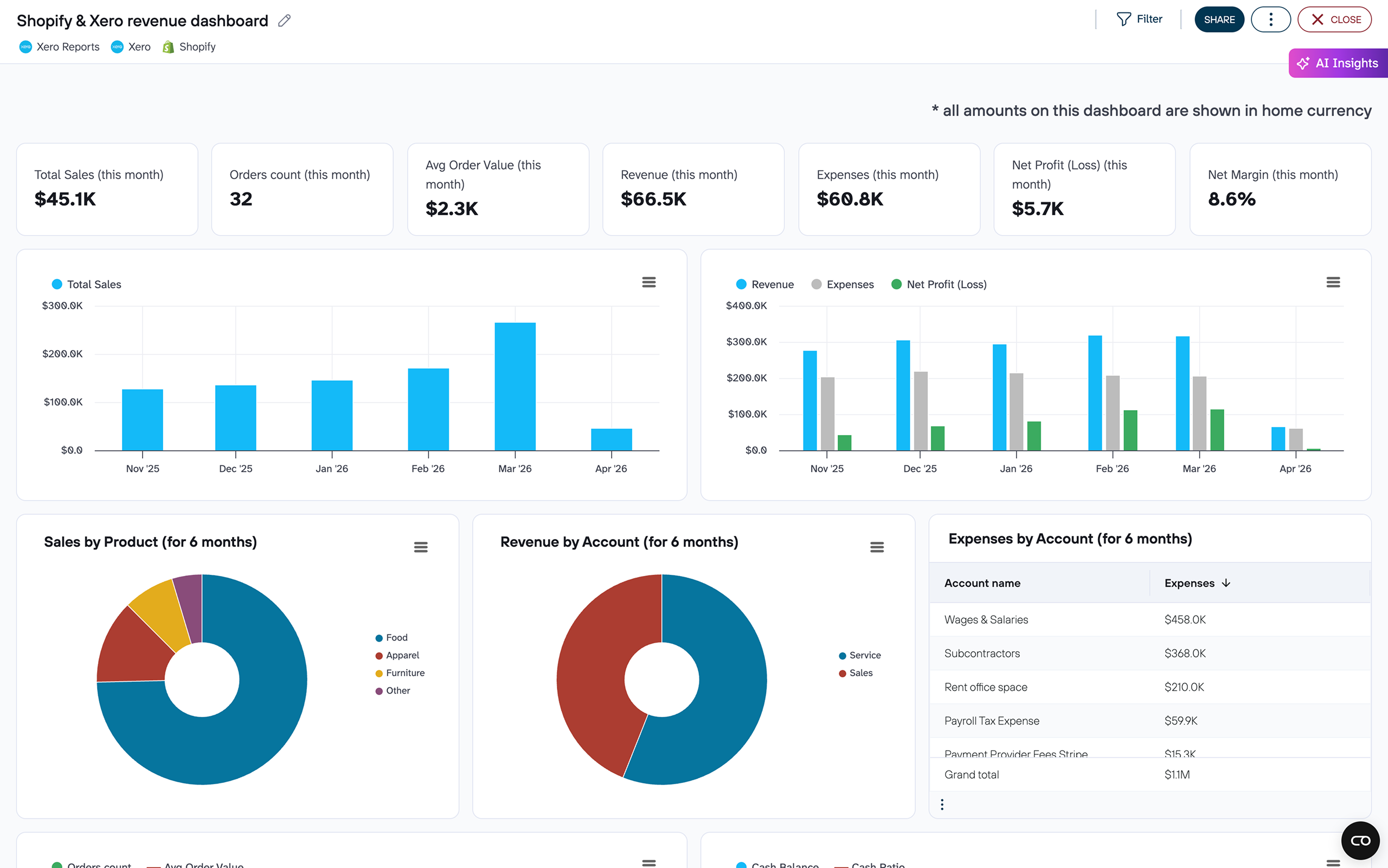
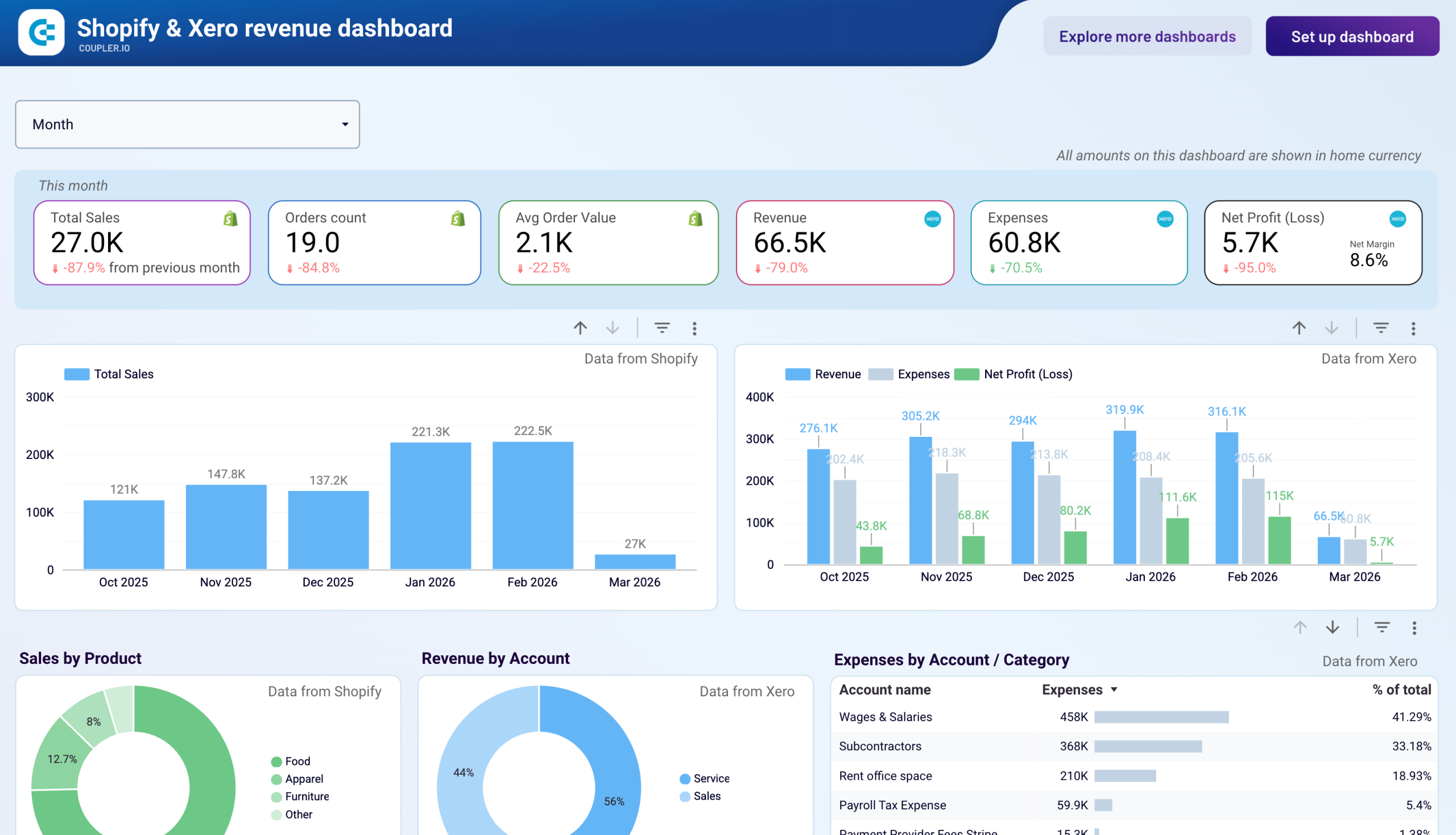
The revenue report provides a comprehensive overview of your income streams. It allows you to track revenue trends over the past 12 months. This helps identify seasonal fluctuations, peak revenue periods, and unexpected dips. The report includes a customer analysis showing your most valuable clients by revenue contribution. It should also contain product performance metrics highlighting your best-selling offerings. Visual breakdowns of top customers and products by revenue enable you to focus your sales and marketing efforts on where they'll deliver the greatest returns.
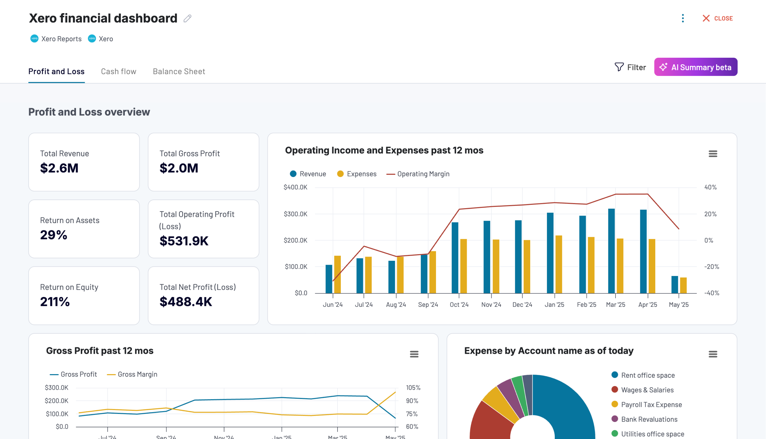
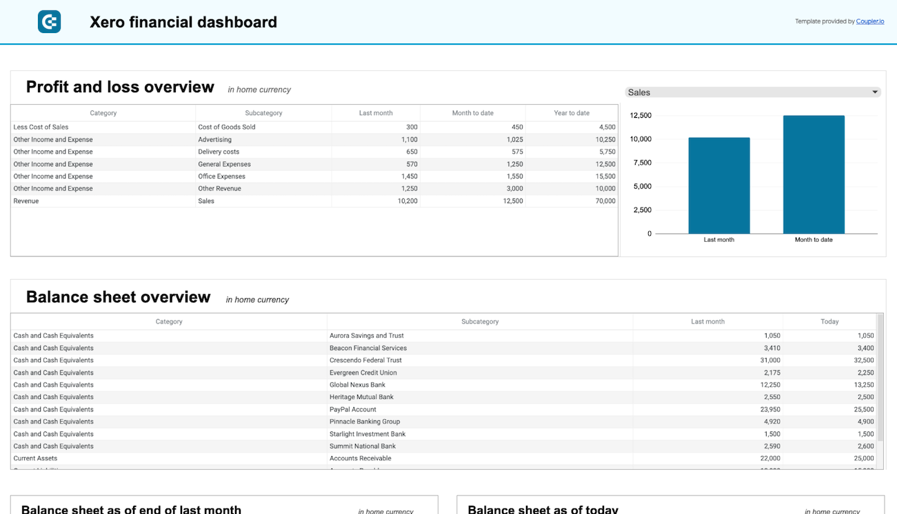
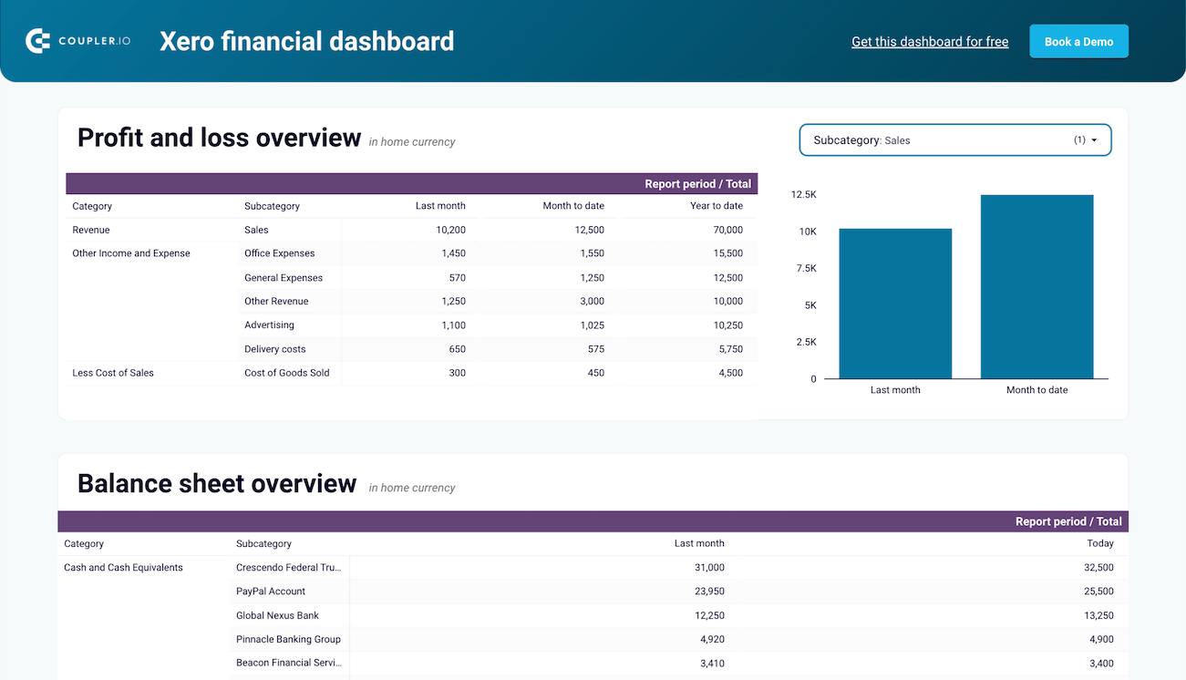
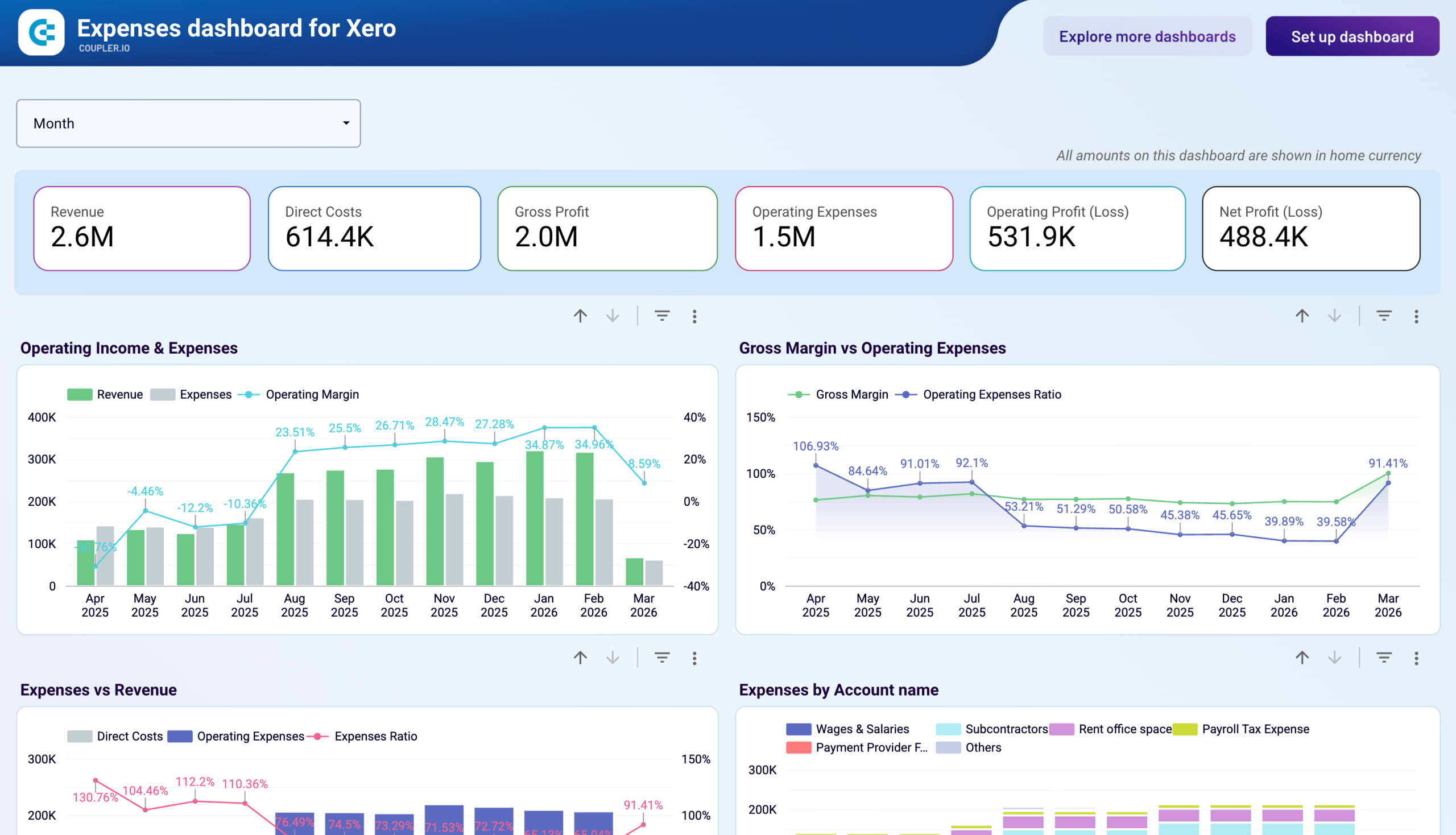
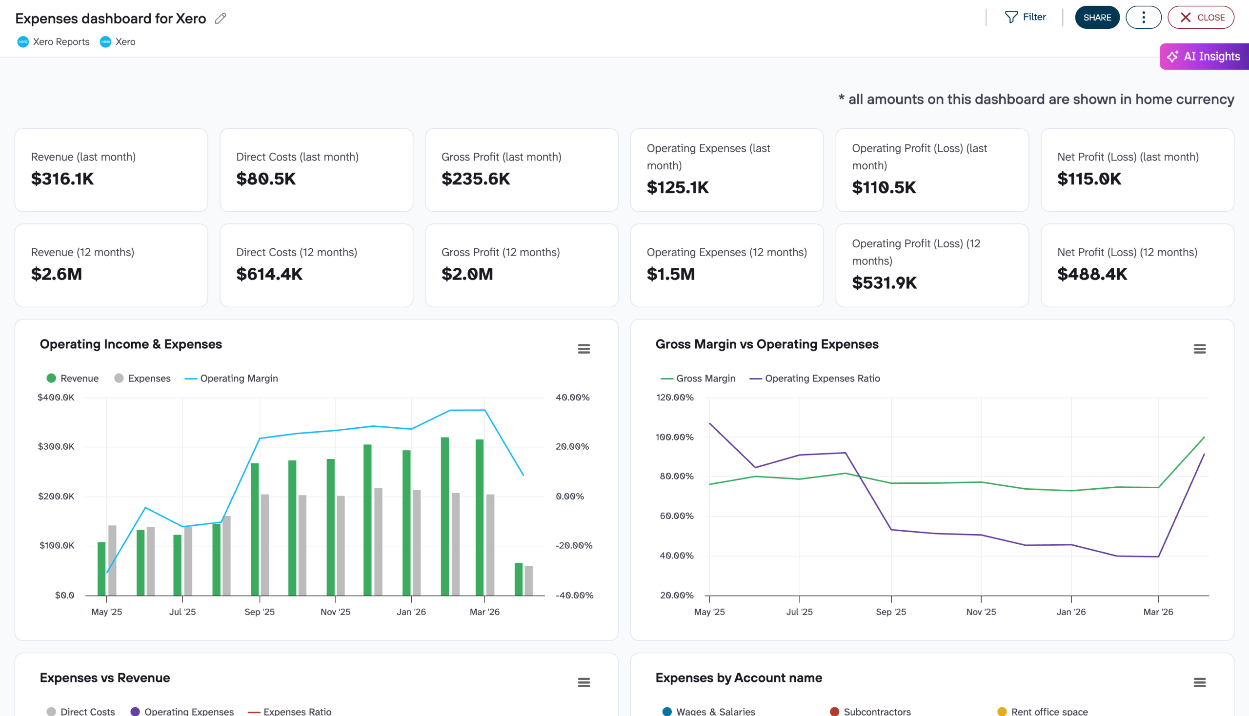
The financial report delivers critical performance monitoring through profit and loss overviews. They compare revenue against expenses across multiple time periods—last month, month to date, and year to date. The report includes balance sheet visualizations with clear assets versus liabilities comparisons. It also displays cash flow monitoring with movements across all bank accounts. The report highlights net cash changes over the reporting period, giving you a clear picture of your financial stability and liquidity position to ensure effective financial management.
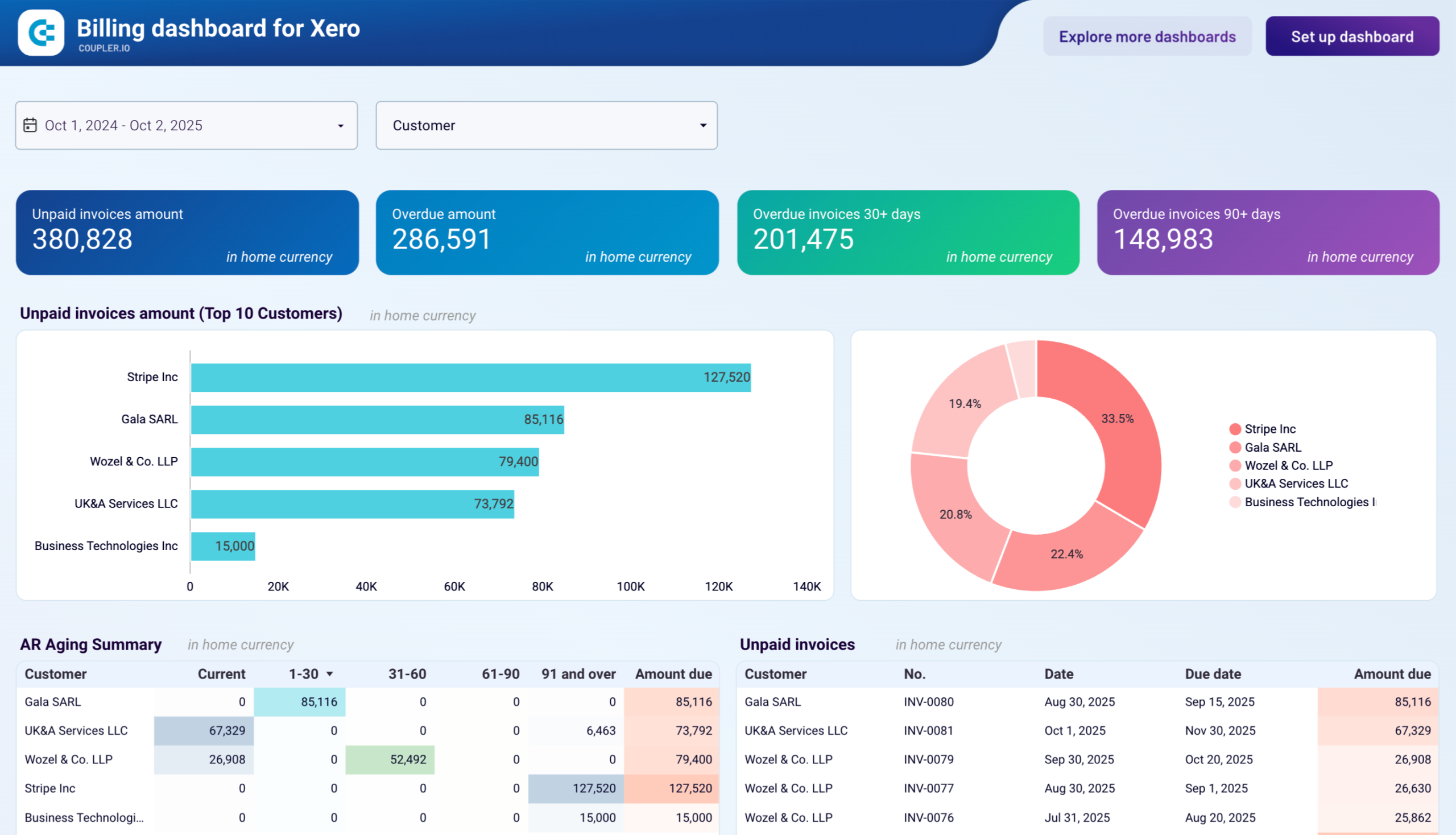
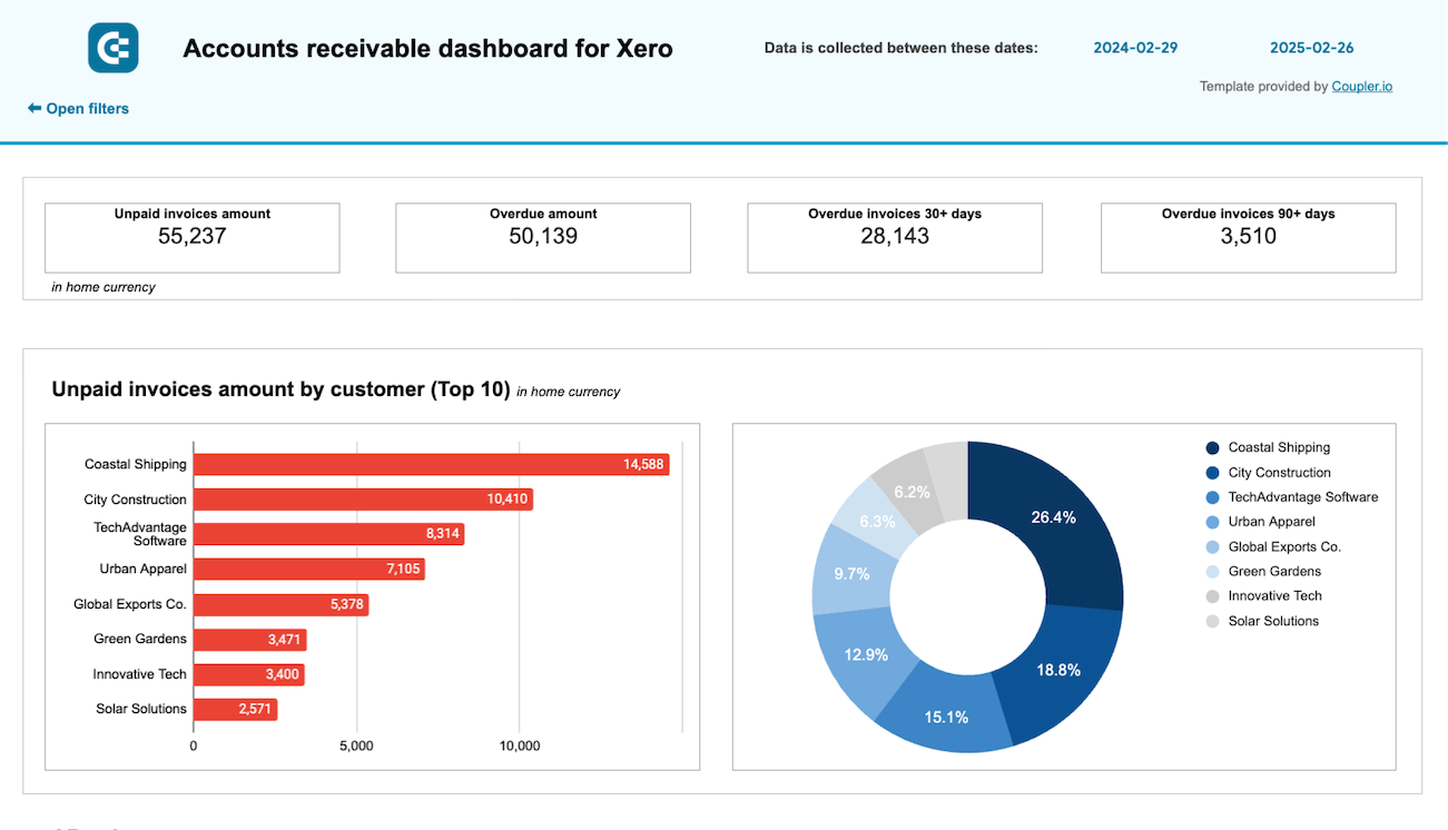
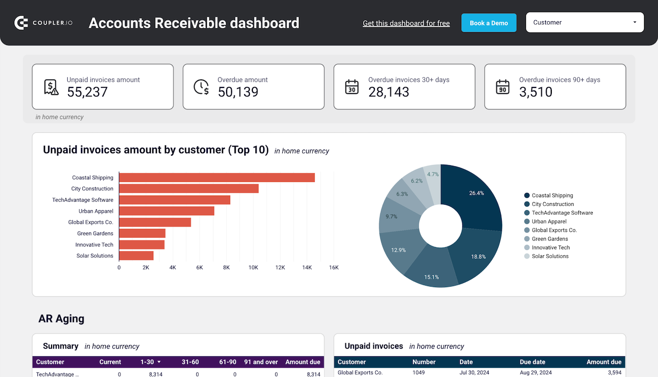
The accounts receivable report provides a clear overview of your unpaid and overdue invoices. It helps you understand who your main customers (debtors) are and how much they owe. The report shows the distribution of overdue amounts by customer and time period (current, up to 30 days, 30-60 days, 60-90 days, and 90+ days). It enables you to track the monthly dynamics of both paid and unpaid invoices. With these insights, you can make data-driven decisions on customer communication and activities aimed at settling outstanding debts. Ultimately, this helps prevent cash flow gaps.
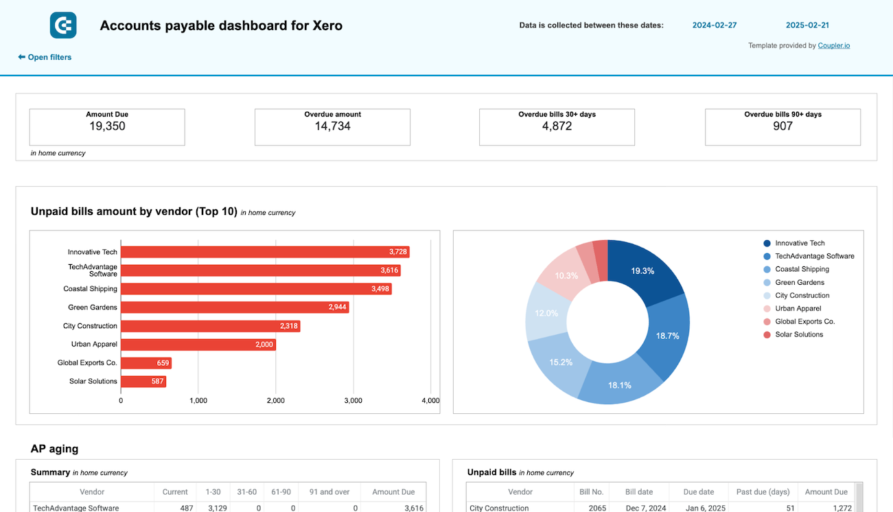
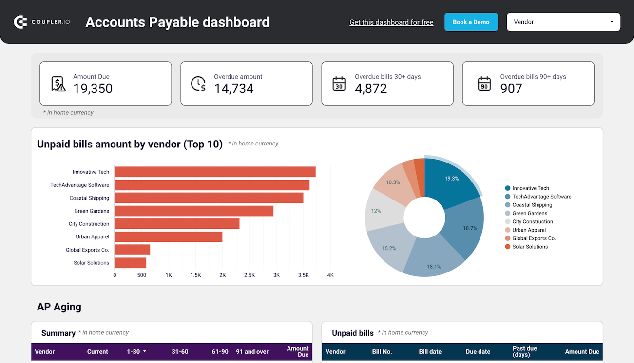
The accounts payable report offers an overview of your bills and vendor relationships, so you can understand who your main creditors are and how much you owe them. It displays unpaid and overdue bills by vendor and aging period, allowing you to identify your major creditors and prioritize payments effectively. The report also includes a paid bills analysis to help evaluate vendors by payment history. It should also contain a detailed breakdown of all vendor bills for the past 12 months. These insights enable better cash flow management and more strategic vendor relationship decisions.
What insights you can get with the Xero dashboard
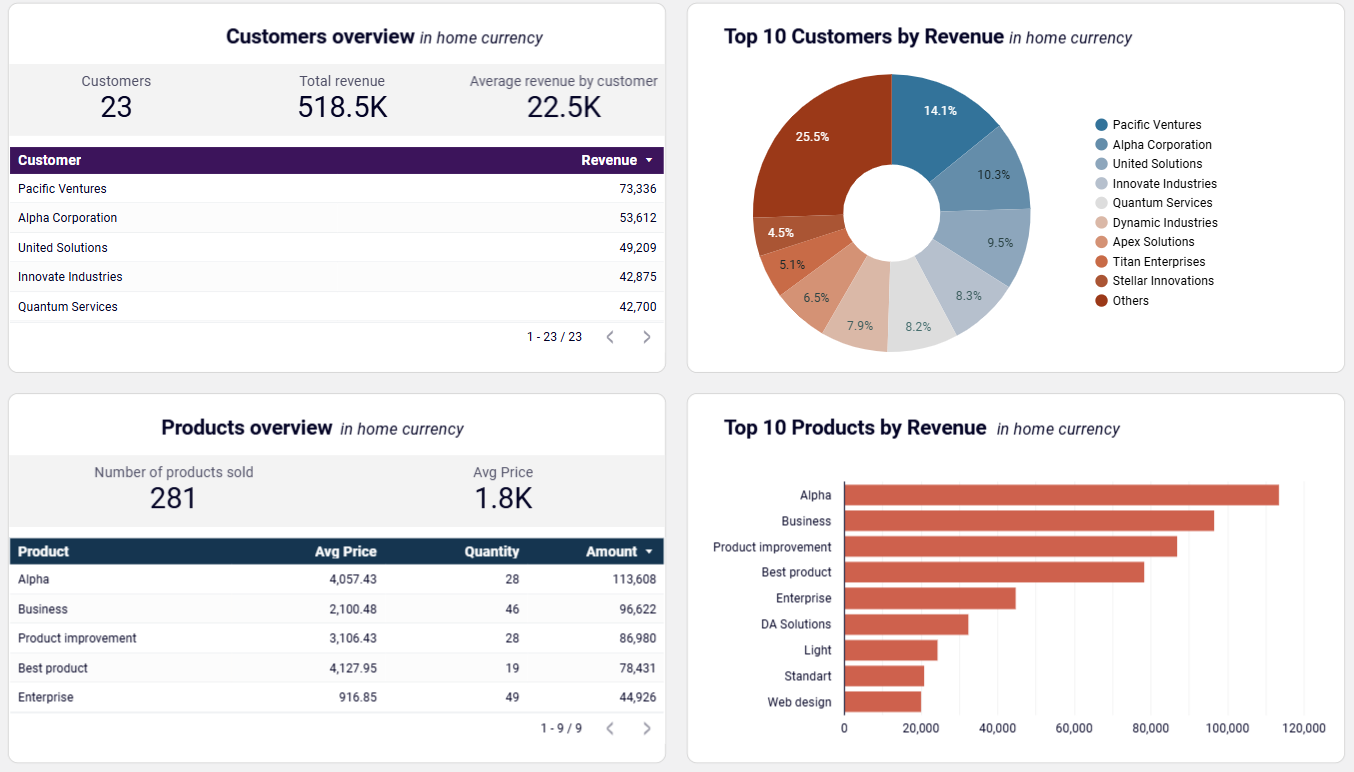
Xero revenue dashboard provides a clear visualization of your revenue distribution across customers and products. You can see your most valuable customers ranked by revenue contribution and identify which products or services generate the most income. This insight helps you target marketing efforts, develop customer retention strategies, and allocate resources to the most profitable aspects of your business. For example, you can offer loyalty incentives to high-value customers and adjust your inventory or service offerings based on performance data.
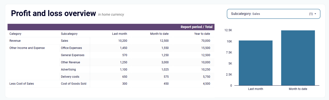
Xero financial dashboard delivers a comprehensive profit and loss overview that summarizes your company's revenue, expenses, and net income across multiple time periods—last month, month to date, and year to date. Accompanying charts provide visual comparisons of your earning trends, allowing you to quickly spot growth patterns or areas needing improvement. This insight is essential for monitoring profitability, controlling costs, and assessing how well your business is managing expenses relative to income.
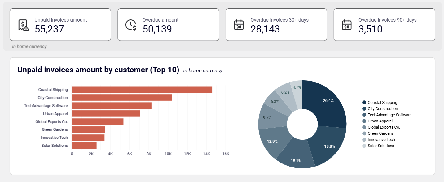
Xero accounts receivable dashboard offers a detailed breakdown of your unpaid and overdue invoices. It shows the top customers by debit debt and visualizes each customer's share in your accounts receivable through intuitive charts. With this information, you can identify your major debtors, understand how much they owe, and prioritize your collection efforts accordingly. The dashboard also tracks monthly dynamics of both paid and unpaid invoices, helping you prevent cash flow gaps and make data-driven decisions about customer communications.
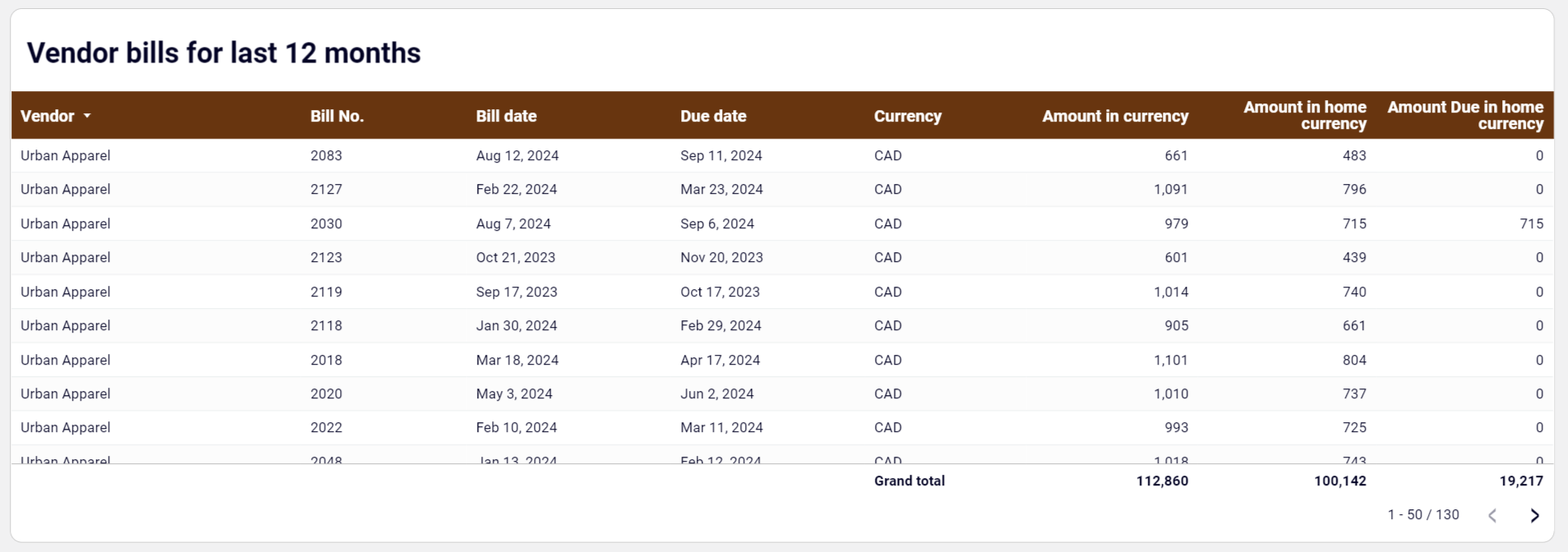
Xero accounts payable dashboard provides a comprehensive historical view of all your vendor bills over the past 12 months. This detailed table includes both paid and unpaid bills across all currencies, allowing you to track payment history, identify spending patterns, and analyze vendor relationships over time. Each entry contains essential details like bill number, date, due date, currency, and amount, giving you complete visibility into your payment obligations and history. This long-term perspective is valuable for vendor negotiations, budget planning, and optimizing payment terms.
How to create a Xero dashboard?

Metrics you can track with the Xero dashboard templates
Track the trends in your revenue with column charts showing monthly values for both paid and unpaid invoices. This time-based analysis helps you identify patterns in your business cycle, detect seasonal fluctuations, and highlight unexpected dips or increases. By understanding these revenue patterns, you can make more accurate business forecasts and adjust your strategies to accommodate predictable fluctuations.
Monitor unpaid customer invoices categorized by specific time periods: current, up to 30 days, 30-60 days, 60-90 days, and 90+ days. The dashboard presents this information in summary tables, helping you identify at-risk receivables that require immediate attention. This metric is crucial for managing collection priorities and maintaining healthy cash flow by addressing potential payment issues before they impact your financial position.
Identify your most valuable clients through clear visualizations showing your top 10 customers ranked by revenue contribution. The Xero dashboard provides both bar charts and pie charts showing each customer's proportion of total sales. This metric allows you to focus relationship management efforts on your most important clients and develop targeted retention strategies for these key revenue sources.
Gain a clear snapshot of your company's financial position with visualizations comparing assets, liabilities, and equity. The dashboard presents charts depicting balance sheet components as of the end of last month and currently, allowing you to track changes and identify trends over time. This metric provides a fundamental understanding of your business's financial health and stability at a glance.
Monitor available funds across all your linked bank and cash accounts with a consolidated view that's updated with your latest financial data. The dashboard also displays account balances by currency, which is particularly valuable for businesses handling multi-currency transactions. This metric simplifies day-to-day cash management and helps ensure you maintain sufficient liquidity for operational needs.
Track how your cash position evolves over the reporting period with visualizations that highlight increases and decreases in your available funds. This metric helps you understand cash flow patterns, identify potential liquidity concerns, and ensure effective management of your financial resources. Monitoring net cash changes is essential for maintaining financial stability and making informed decisions about the timing of expenses and investments.
Analyze your payment history with a summary chart showing bills previously paid to each vendor. This metric helps you evaluate suppliers by payment volume and understand your spending patterns across different vendors. By tracking this information, you can make more informed decisions about vendor relationships, negotiate better terms based on historical spending, and optimize your procurement strategy.
Identify your best-selling offerings through a ranking of products or services by revenue generation. The Xero dashboard provides clear visualizations that highlight which items contribute most significantly to your income. This metric supports more effective inventory management, marketing focus, and product development decisions by showing you exactly where your revenue is coming from at the product level.