Sales Funnel dashboard examples and reporting templates
Track every prospect's journey from first impression to final conversion using sales funnel reporting dashboards that connect your CRM, analytics, and advertising platforms. Visualize drop-off points, measure channel effectiveness, and accelerate revenue growth by understanding exactly how leads move through your acquisition process with data-driven insights from HubSpot, Pipedrive, and marketing platforms.
Sales funnel dashboard examples for every need


 +1
+1


 +3
+3

 +3
+3


 +1
+1
 +2
+2
 +3
+3

 +1
+1
about your case. It doesn't cost you a penny 😉
What is a sales funnel dashboard?
Rather than examining isolated metrics, these dashboards map the complete path from initial awareness through final purchase, highlighting exactly where potential customers engage or abandon the process. The result transforms fragmented data points into a cohesive narrative about your acquisition effectiveness, powered by automated data synchronization through Coupler.io that keeps insights current and actionable.

Choose your white label sales funnel dashboard templates to kick off
What reports should be included in sales funnel dashboards?
An effective sales funnel reporting dashboard requires specific report types that work together to provide complete visibility into your prospect acquisition process. Drawing from successful implementations across HubSpot, Pipedrive, and integrated marketing platforms, these four essential reports address the most critical aspects of funnel analysis and conversion optimization.
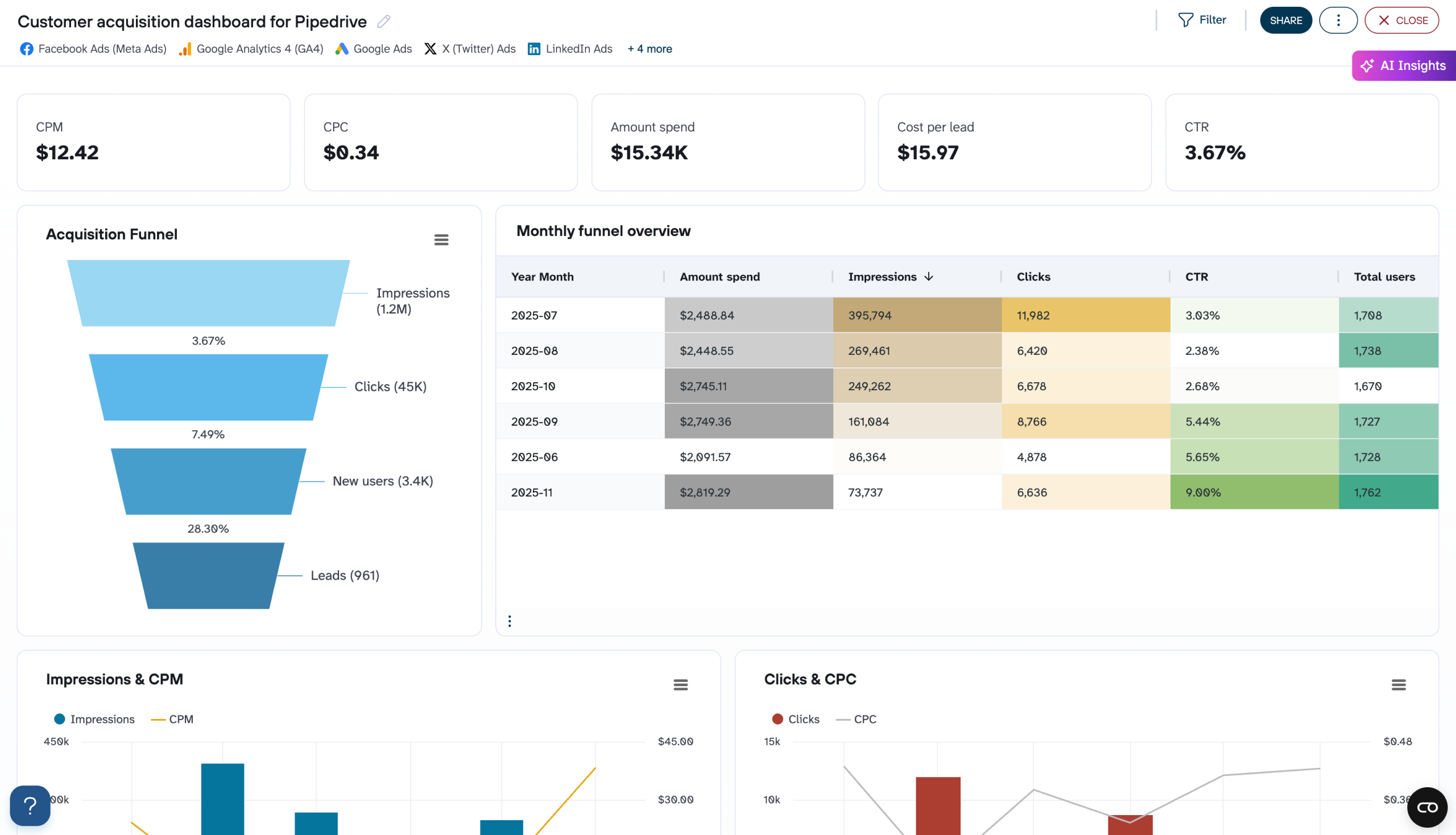
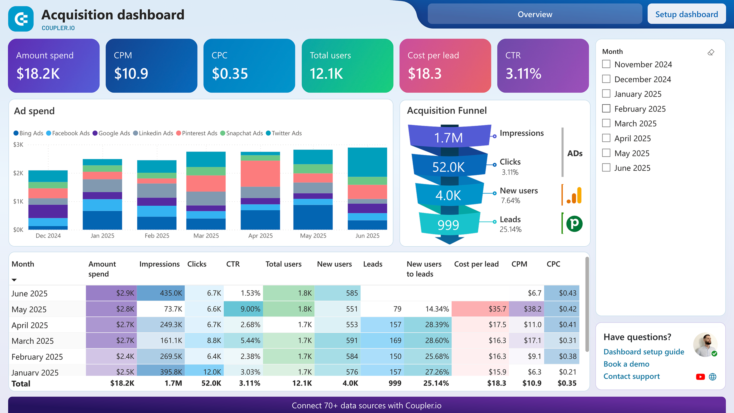
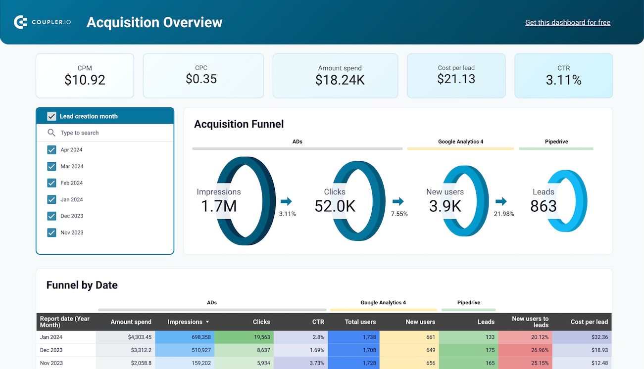
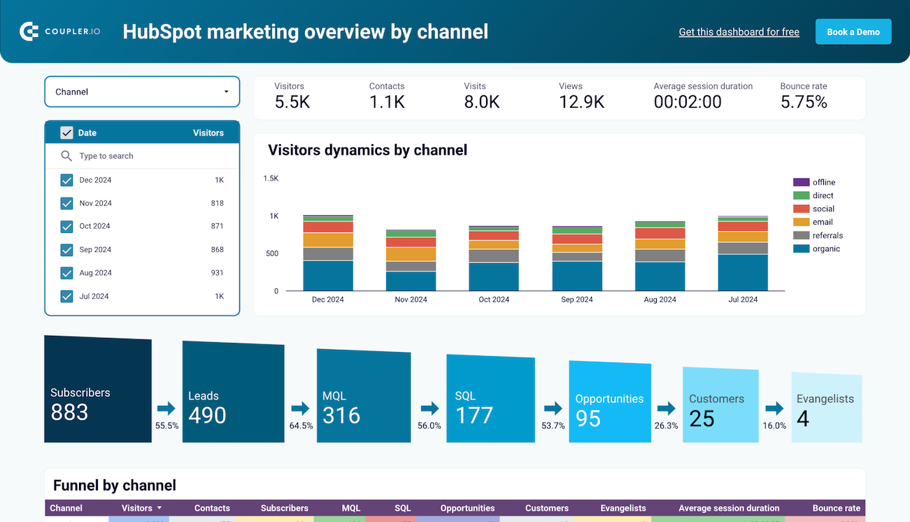
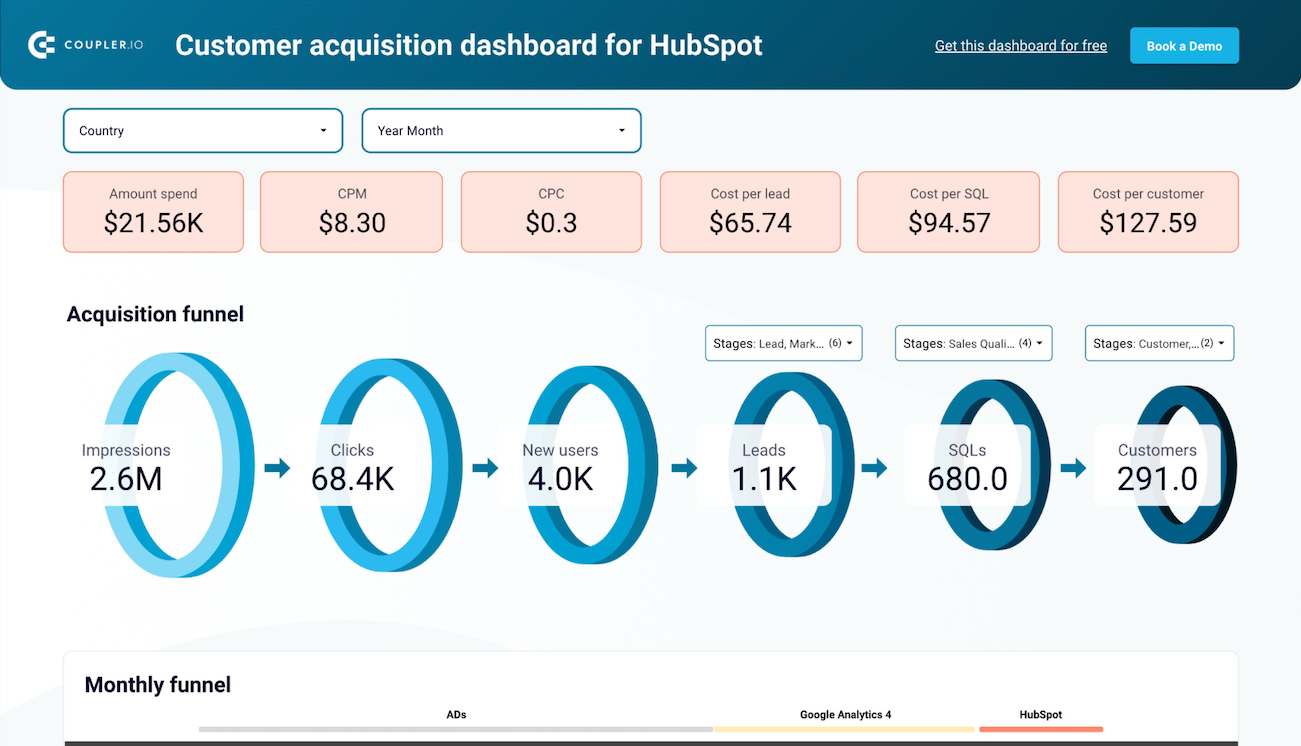
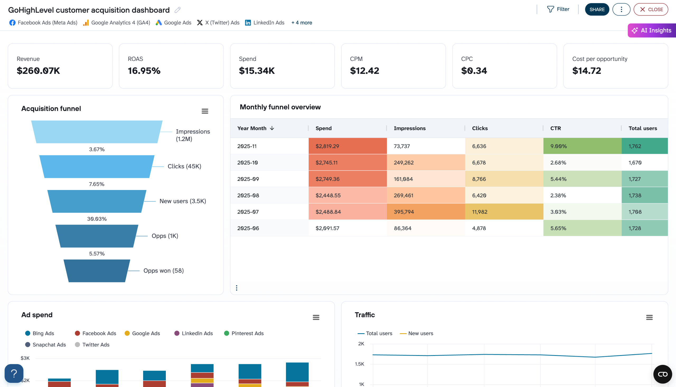
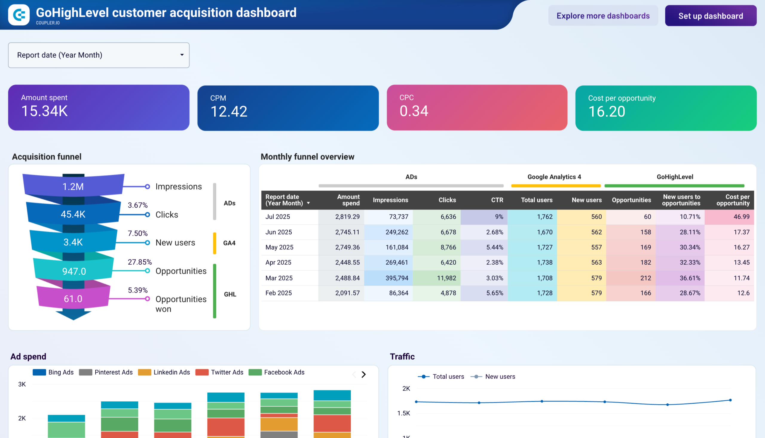
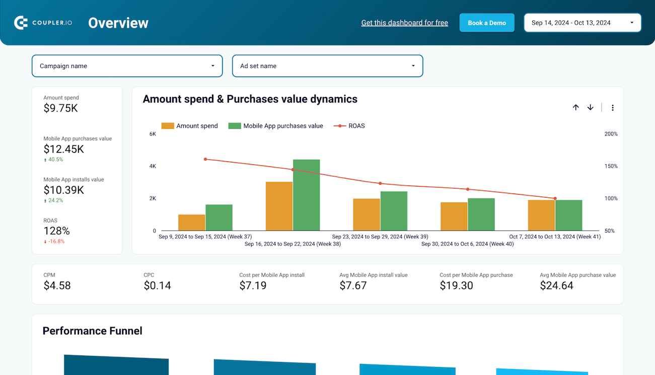
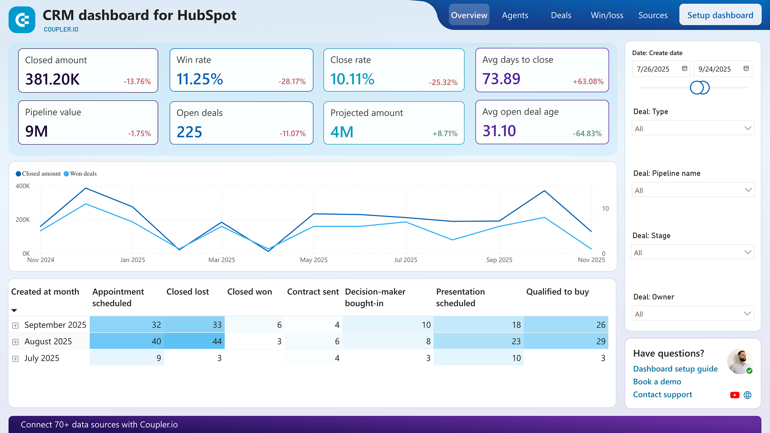
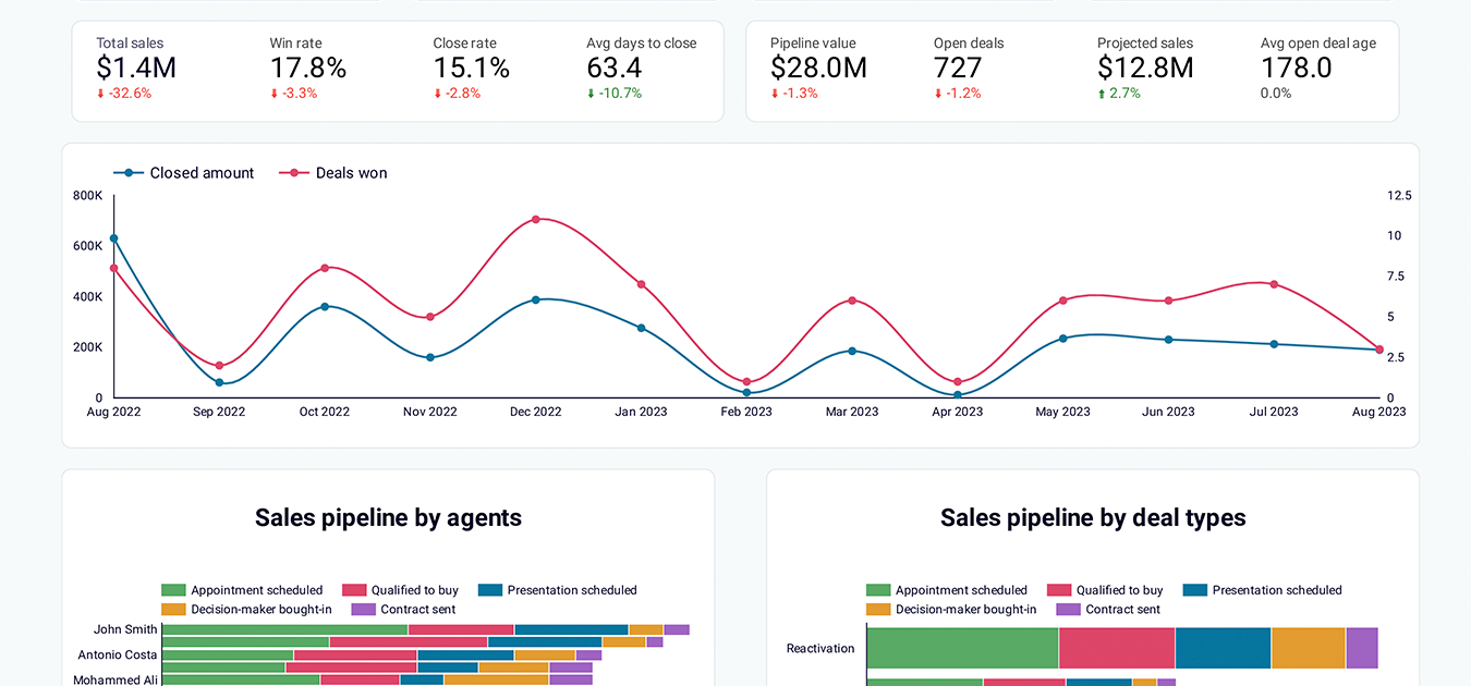
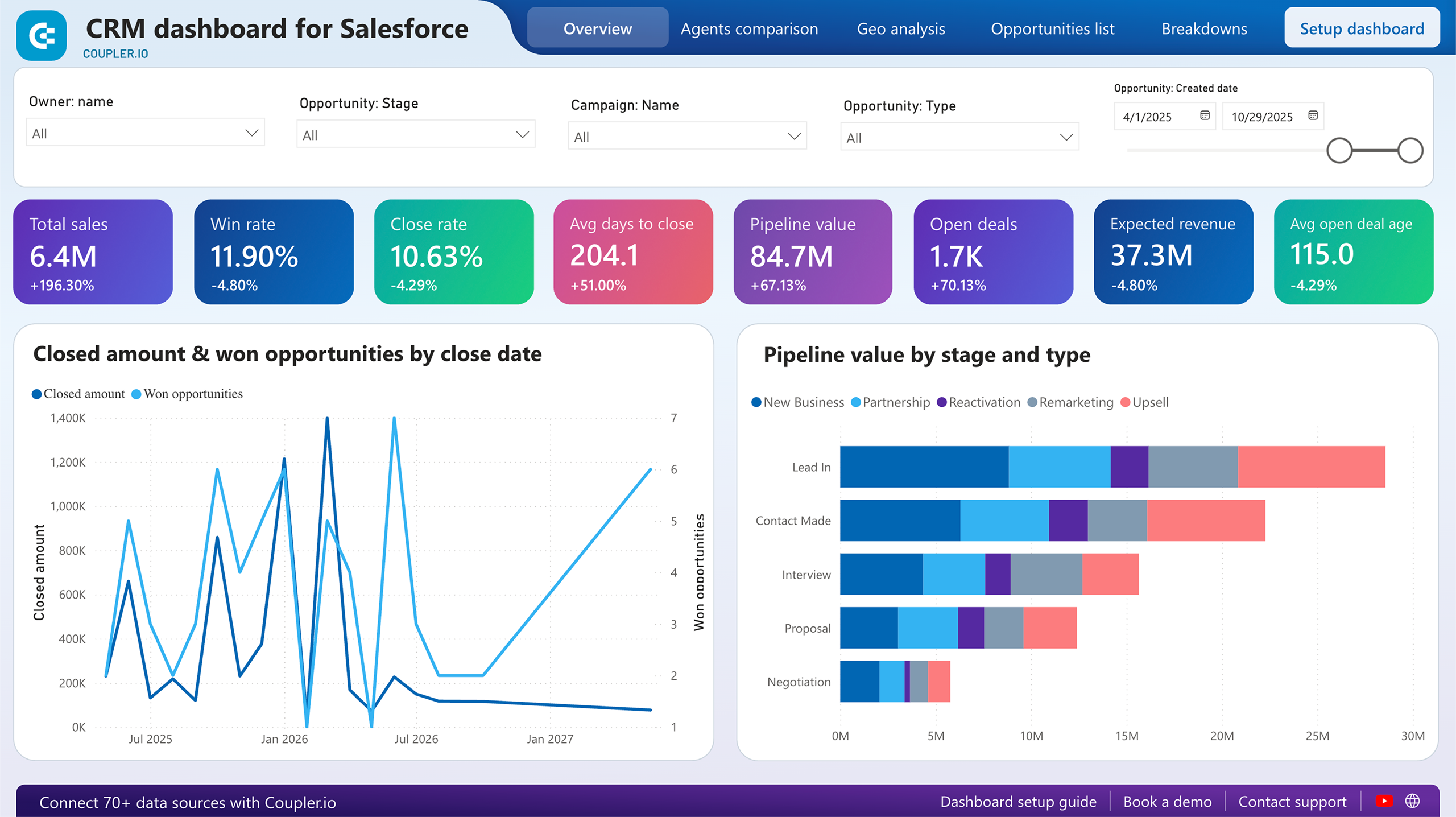
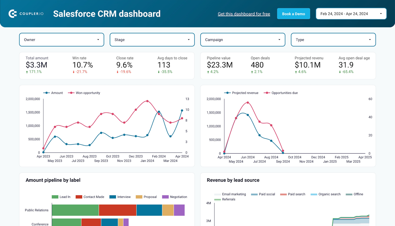
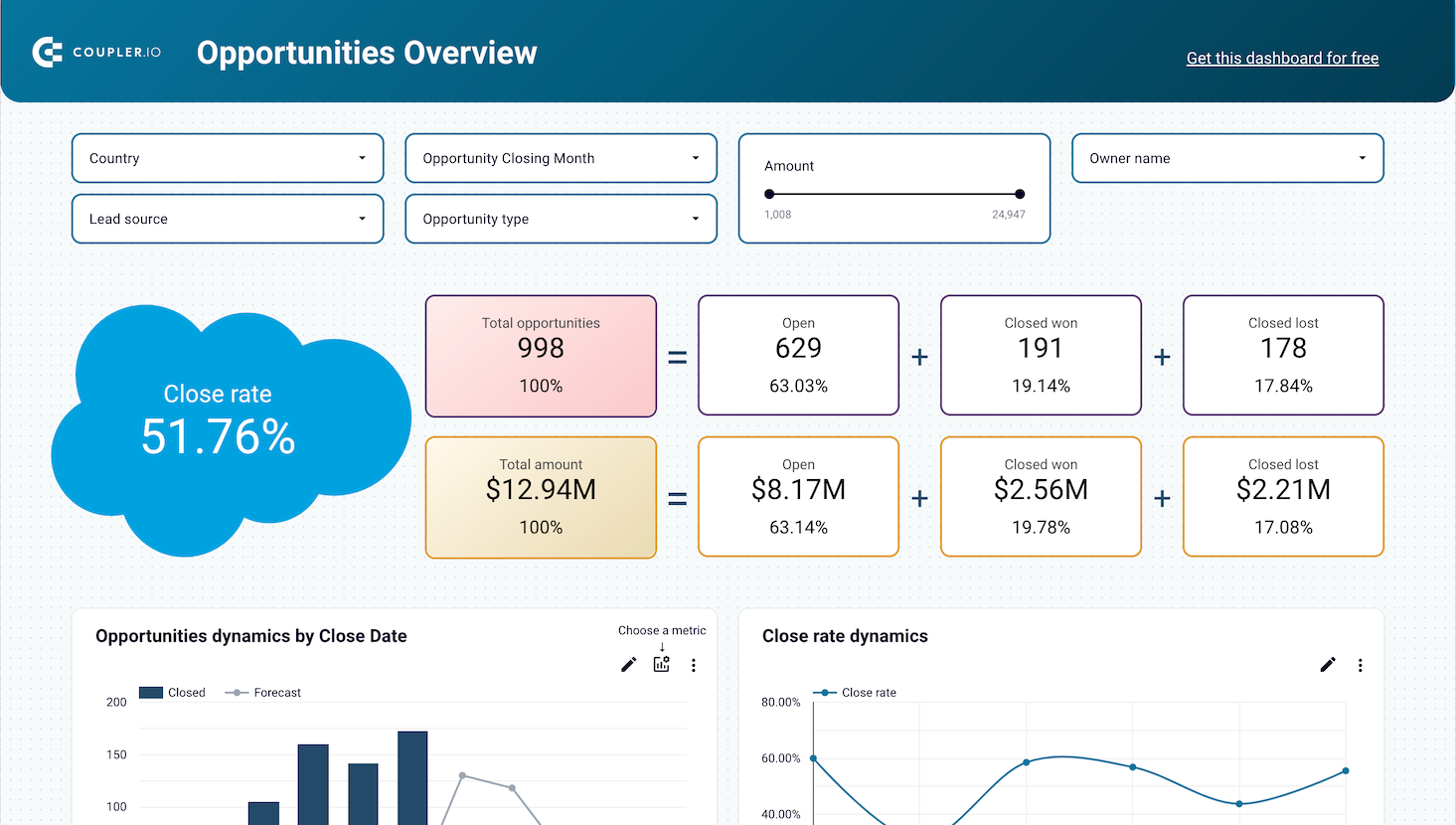
This foundational report maps prospect movement through each phase of your acquisition process, from initial marketing touchpoints to final CRM conversions. The visualization connects advertising impressions and website visits with lead generation and sales outcomes, revealing precise conversion rates at every transition point.
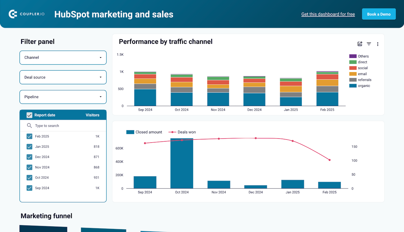
Channel attribution analysis reveals which traffic sources generate the most valuable prospects by connecting marketing activities directly to revenue outcomes. This report segments funnel performance across organic search, paid advertising, social media, email campaigns, and referral traffic, showing both volume and quality metrics for each source.
Geographic analysis examines how location influences funnel conversion rates, revealing regional opportunities and challenges that impact acquisition strategy. This report breaks down prospect behavior by country, state, or city, showing how geographic factors affect conversion likelihood and customer acquisition costs.
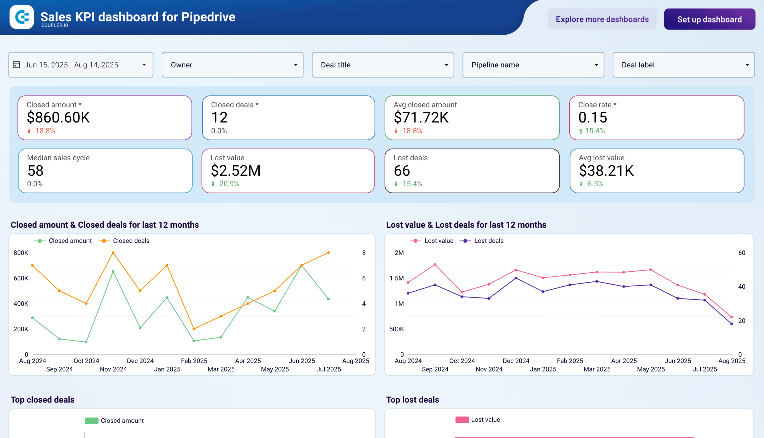
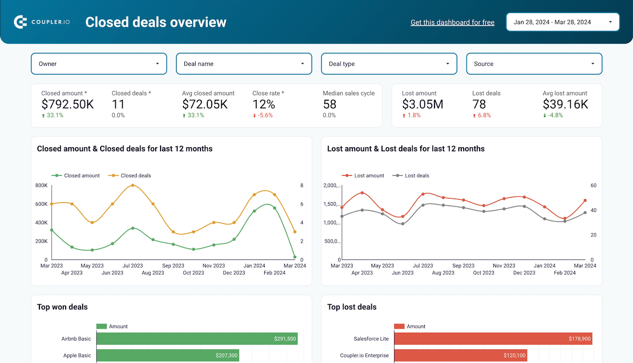
The revenue correlation report connects funnel activity directly to business outcomes by tracking how conversion improvements translate into actual revenue growth. This analysis shows the relationship between marketing investments, funnel optimization efforts, and resulting revenue changes over time.
What insights you can get with the sales funnel dashboard
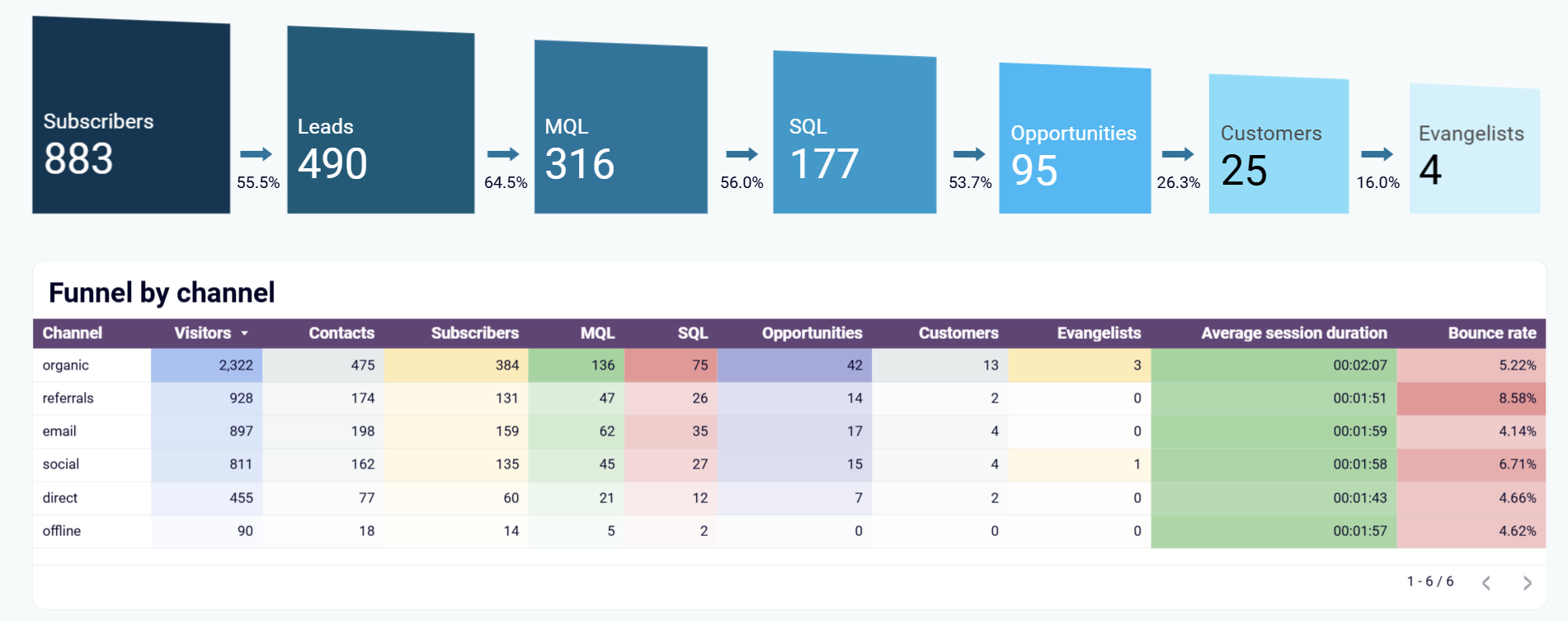
Examine detailed 7-step prospect progression from initial contact through customer conversion, with the ability to filter by specific traffic sources. This analysis reveals which channels—organic, referral, paid social, email, or direct—generate prospects who advance furthest through your acquisition process and convert at the highest rates.
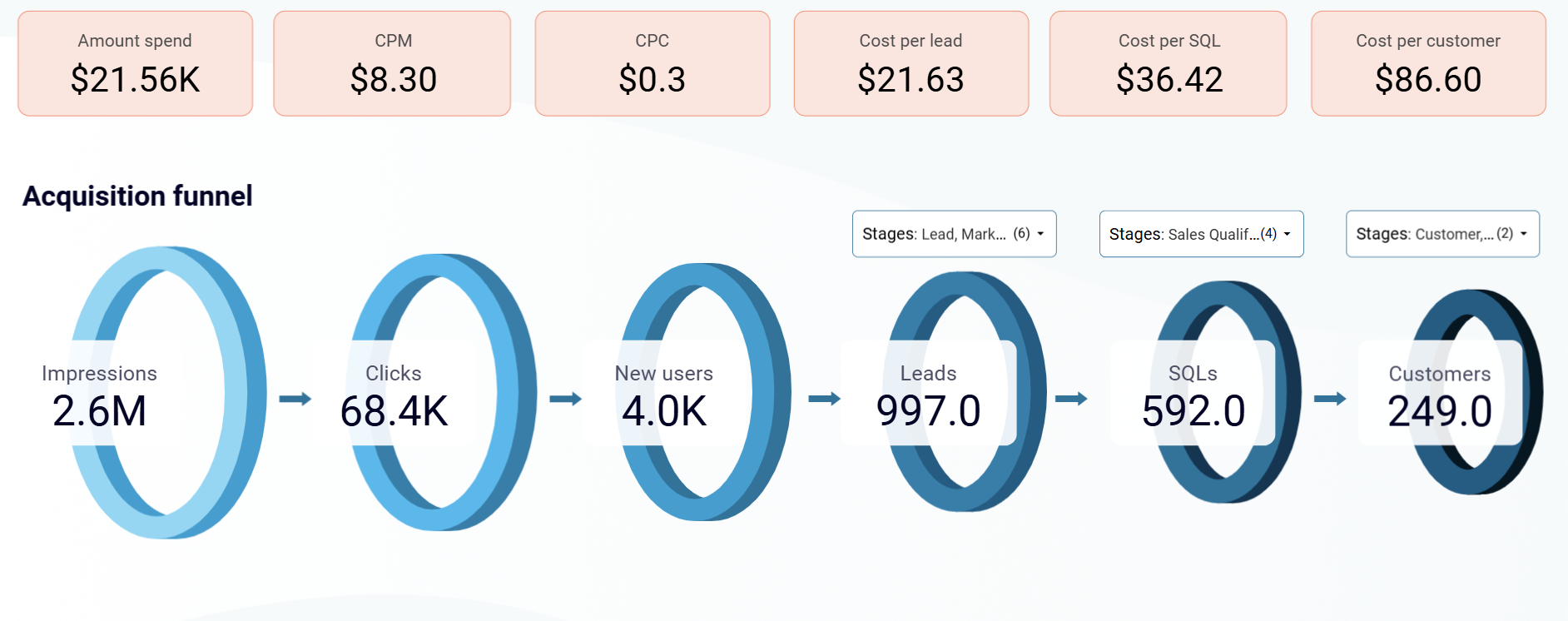
Map the complete prospect journey showing how advertising impressions convert to website visits, then to CRM leads, with benchmark comparisons throughout the process. Identify conversion bottlenecks and optimization opportunities by understanding exactly where prospects disengage from your acquisition process.
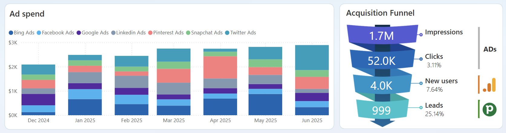
Evaluate marketing investment effectiveness by comparing advertising costs across Google Ads, Facebook Ads, and other platforms with actual lead conversion outcomes. Discover which platforms deliver the best cost-per-conversion ratios and where budget reallocation could improve overall acquisition ROI.
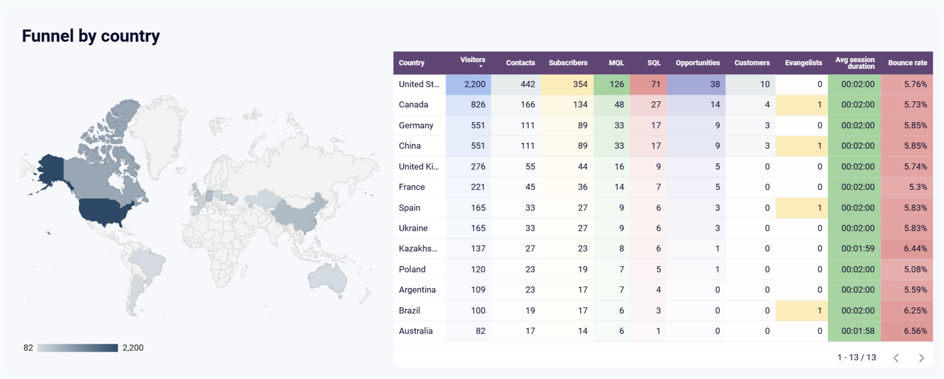
Study how location impacts prospect conversion behavior using geographic segmentation to reveal regional performance variations. Identify high-converting markets for expansion while understanding geographic challenges that require localized acquisition strategies.
How to create a sales funnel dashboard?

Metrics you can track with a sales funnel dashboard template
More Sales funnel Dashboards
Request custom dashboard
From building custom dashboards to setting up data analytics from scratch, we're here to help you succeed. Contact us to discuss your case and possible solutions
Contact us