Power BI KPI dashboard examples and reporting templates
Track performance across your sales pipeline, revenue, and orders with automated Power BI KPI dashboards connected to your business tools. Coupler.io pulls data from QuickBooks, Shopify, HubSpot, Pipedrive, and Salesforce on a schedule, so your numbers are always ready when you need them.
Power BI KPI dashboard examples for every need


about your case. It doesn't cost you a penny 😉
Choose your Power BI KPI dashboard templates to kick off
What is a Power BI KPI dashboard?
Sales managers use Power BI KPI dashboard examples to track pipeline health and deal progression. Finance teams rely on them to monitor revenue trends and profit margins. E-commerce operators check order volume, channel performance, and customer behavior.
Whether you need Power BI KPI reporting dashboards for your sales team or your finance function, Coupler.io loads data automatically on a schedule. You connect your source once, configure the refresh, and the dashboard stays current without any additional effort. No manual exports, no stale reports.

What reports should be included in Power BI KPI dashboards?
The right reports depend on what you need to track. For businesses managing sales pipelines, revenue, and orders, four report types form the core of a useful Power BI KPI reporting dashboard setup.
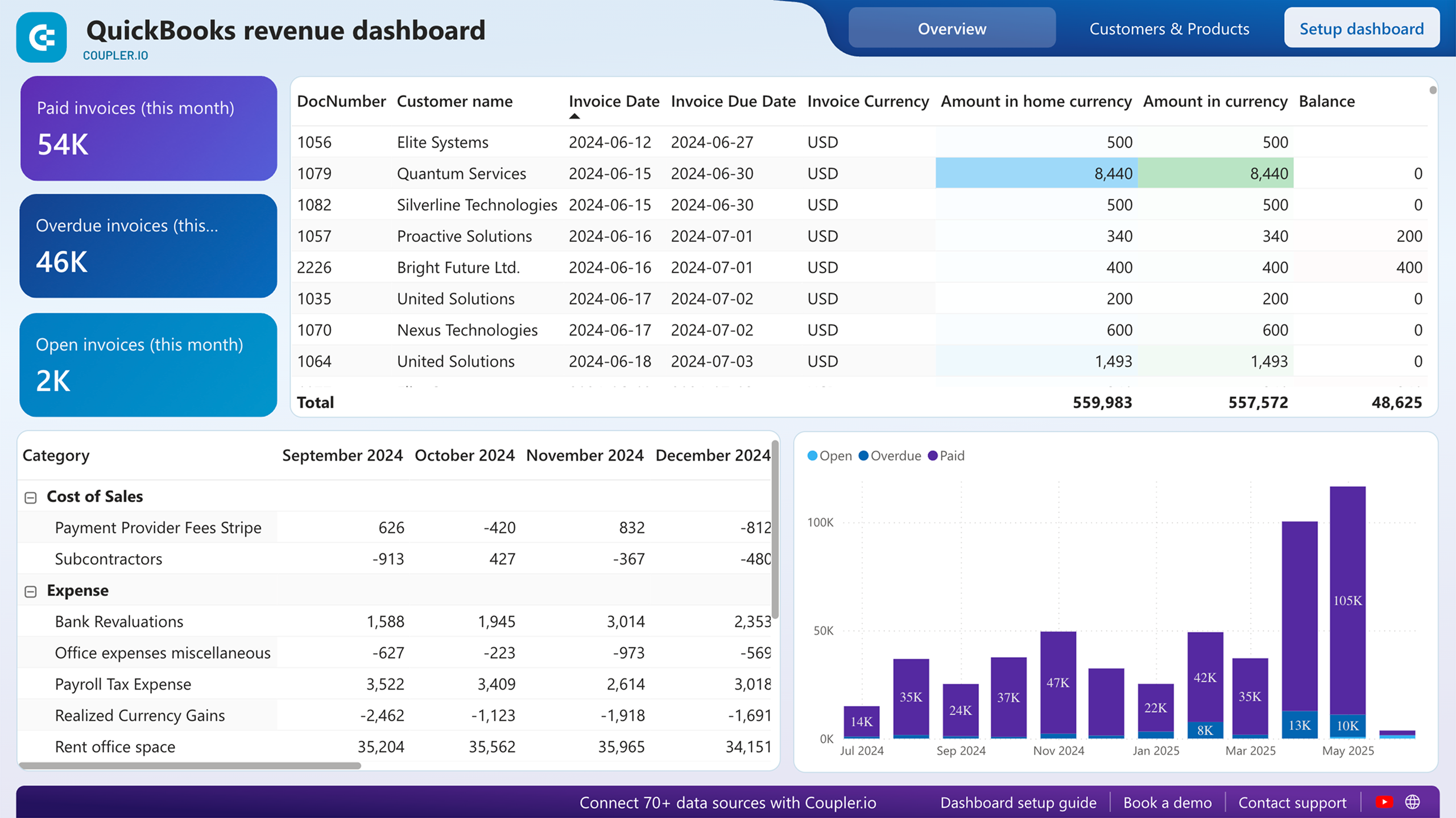
This report tracks revenue trends across the last 12 months, giving you a clear picture of how income moves over time. You can spot seasonal fluctuations, identify your strongest periods, and catch unexpected dips before they become larger problems. It breaks down revenue by customers and products, so you can see not just how much you earned, but where it came from. For small business owners and finance teams using QuickBooks, this report is the starting point for understanding what drives income and what doesn't.
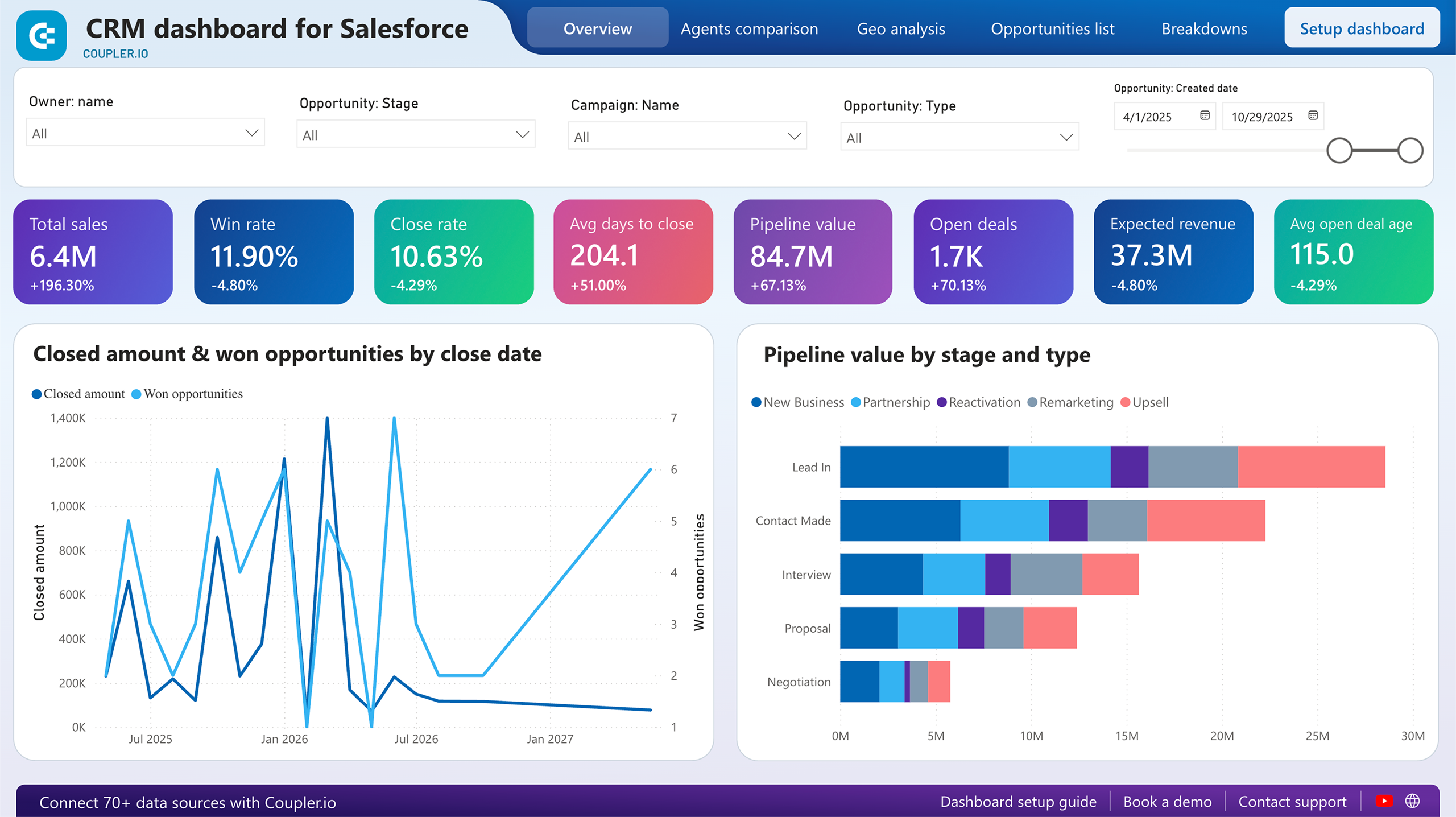
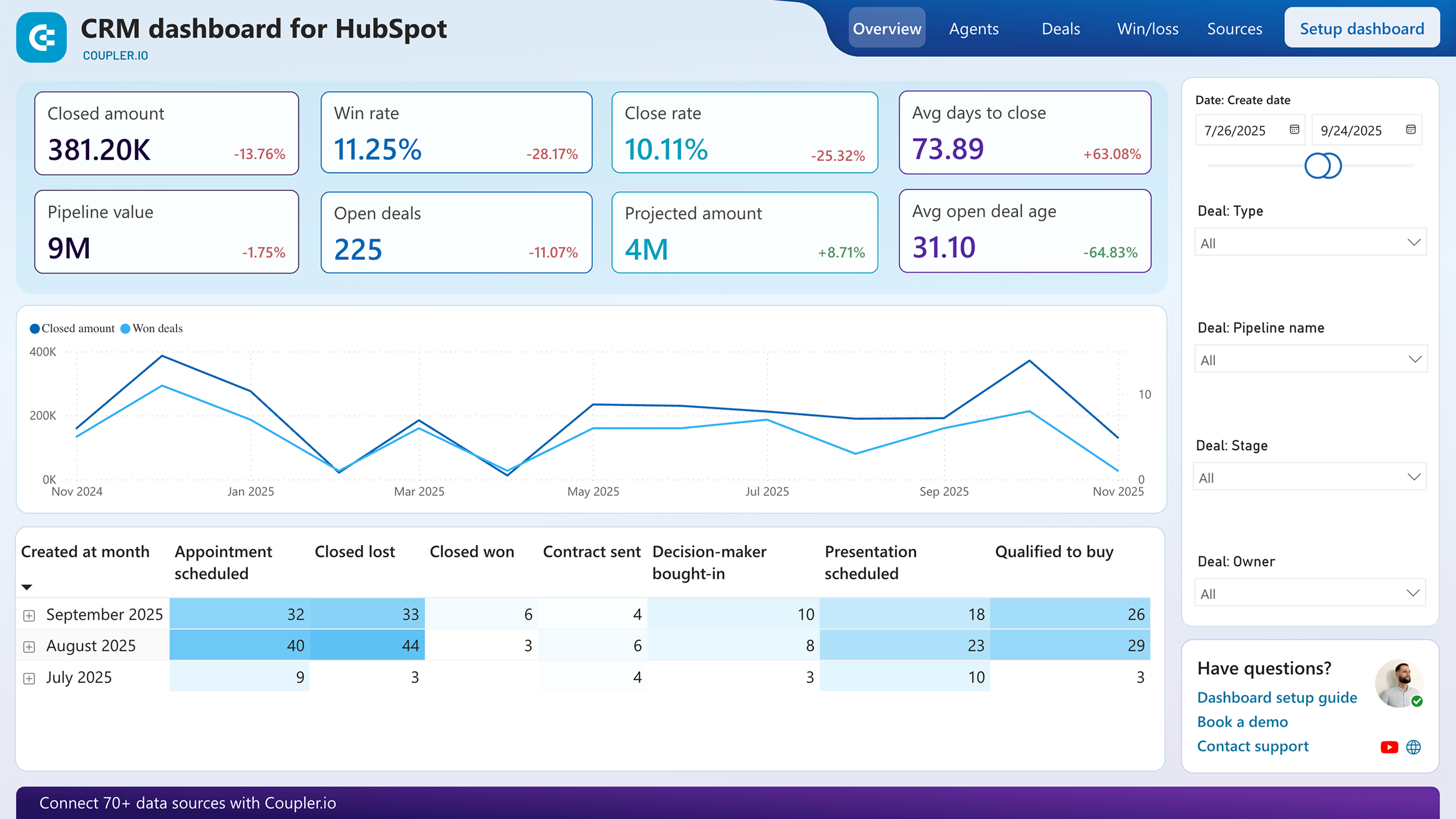
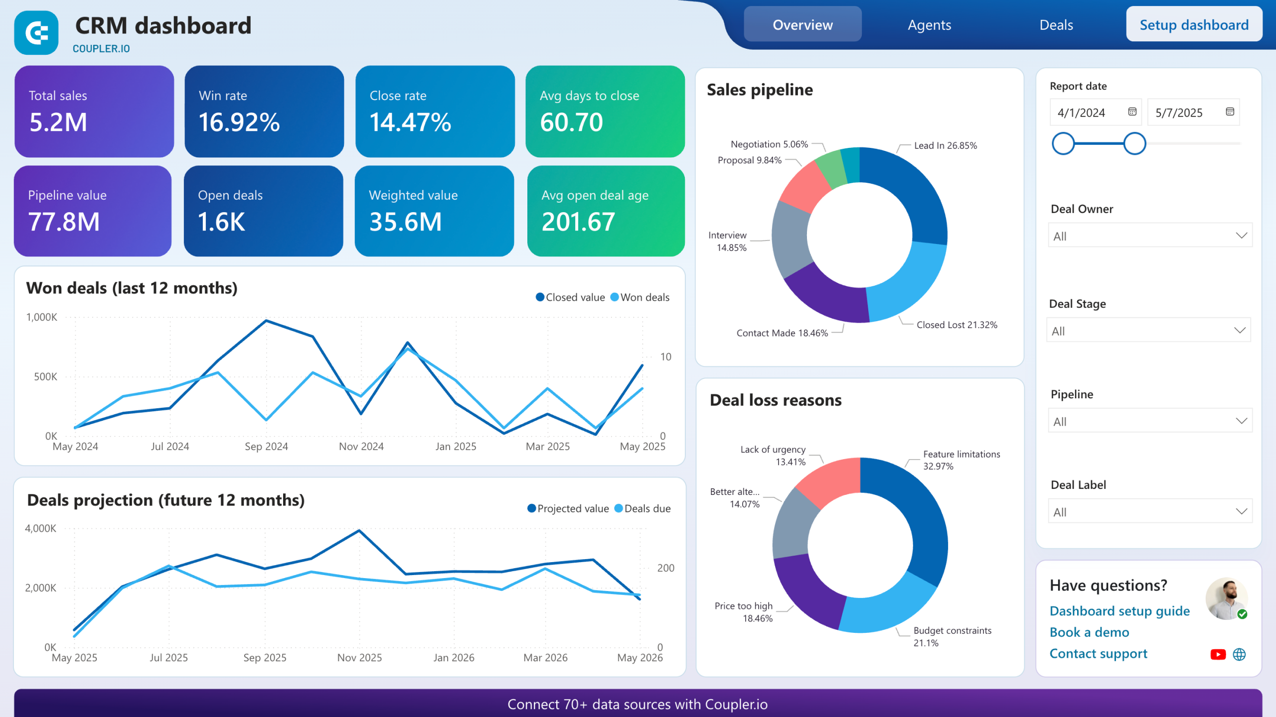
This report shows how opportunities are distributed across every stage of your sales process: from the first contact to closed won or lost. You can assess whether deals are progressing at a healthy pace or piling up at a specific stage that signals a bottleneck. With filters by owner, type, and stage available across the CRM dashboards for Pipedrive, HubSpot, and Salesforce, you can move between a high-level pipeline view and the specifics of individual deals or team members without switching tools.
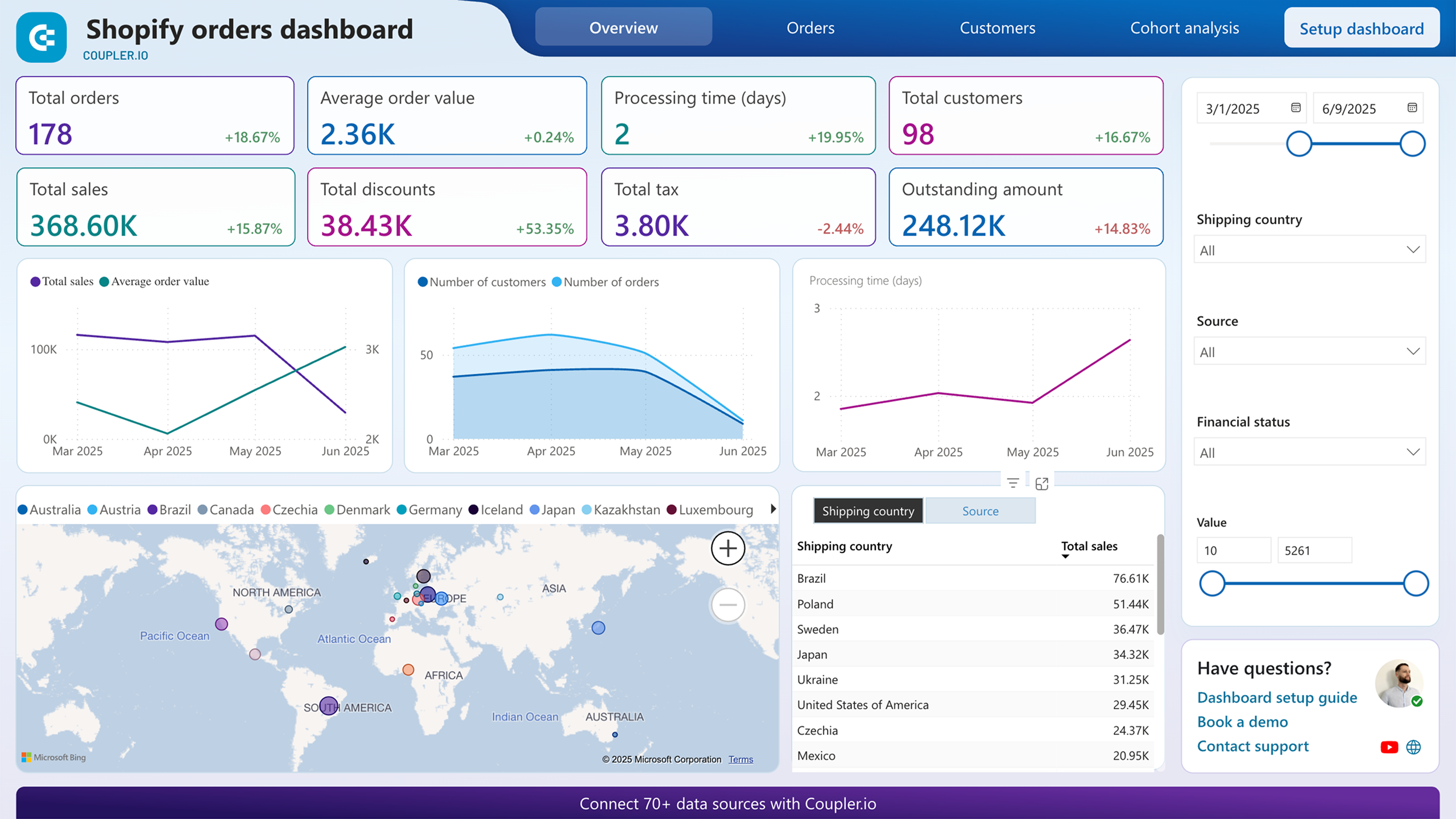
This report breaks down your Shopify orders by geography, financial status, value range, and marketing source. It answers questions that order lists alone can't, such as which regions generate the most revenue, which channels drive actual purchases, and which products appear most frequently in high-value orders. Applying filters to layer these dimensions lets you uncover correlations, for example, between blocked payments and specific products or geographies.
This report compares sales outcomes across individual team members, covering win rates, close rates, and time to close. It highlights which reps consistently close high-value deals and which may need support at certain pipeline stages. This insight is directly useful for deciding how to allocate deals, where to focus coaching, and which patterns from top performers can be replicated across the team.
What insights you can get with a Power BI KPI dashboard
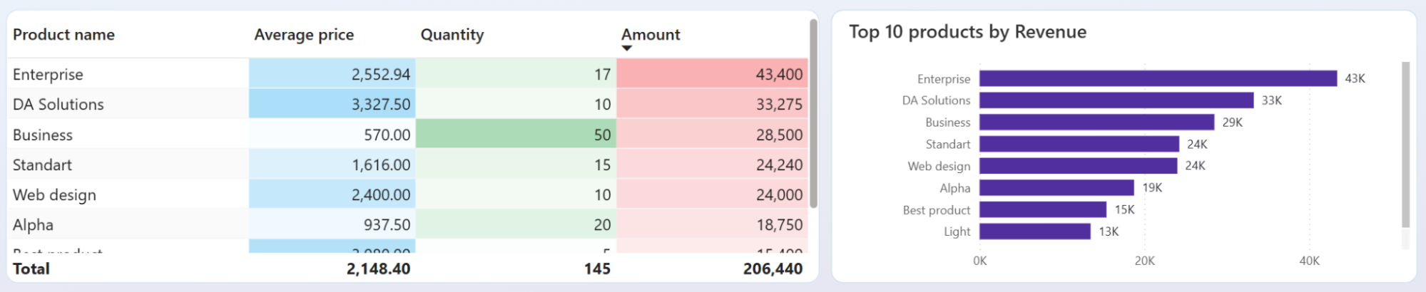
Some products generate most of your income while others quietly drain margin. Use the QuickBooks revenue dashboard to see the exact revenue contribution of each product or service, spot what's underperforming, and shift your sales focus and inventory decisions based on actual data.
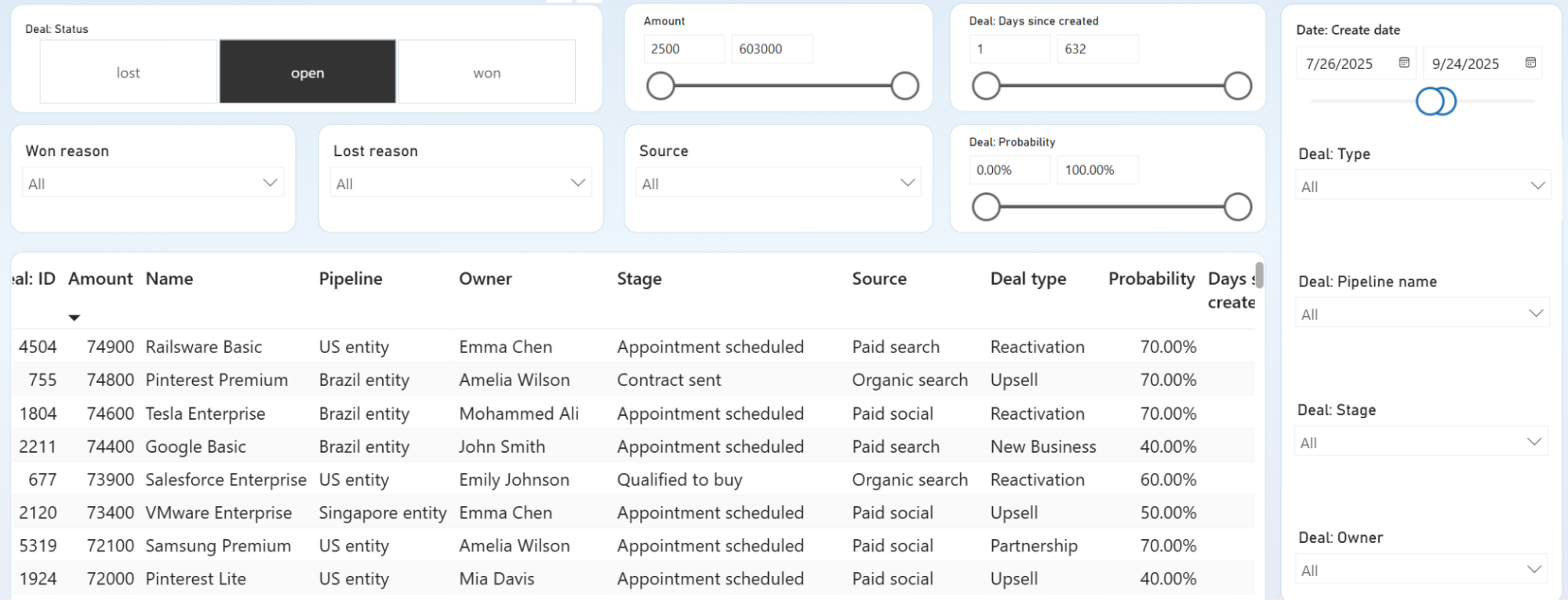
Deals that stall long enough almost always end up lost. Pinpoint the exact pipeline stages where negotiations stop moving, identify which owners have the most stuck deals, and intervene before opportunities become unrecoverable.
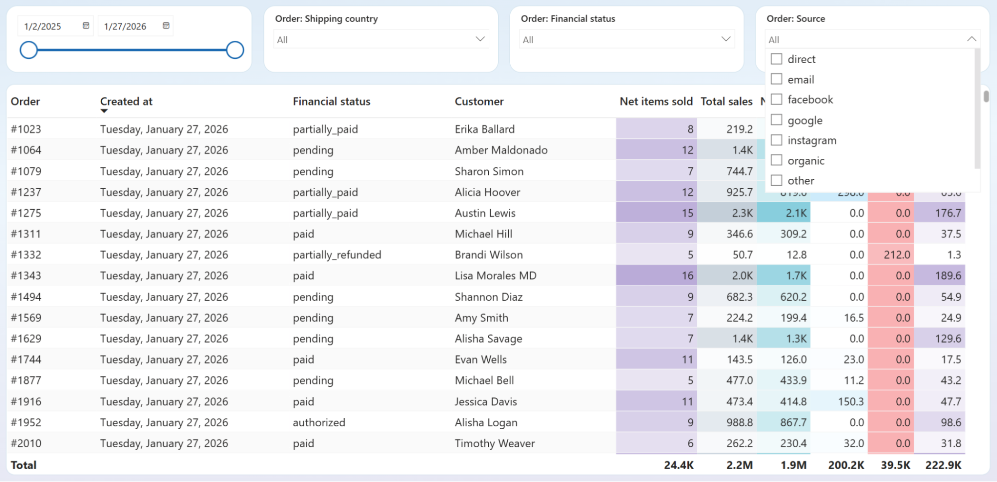
Not every source that drives traffic drives sales. See the order volume and revenue each marketing channel actually delivers, then decide what to scale and what to cut based on results, not assumptions.
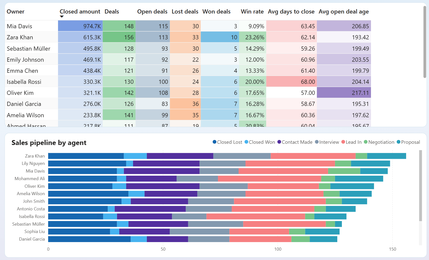
Compare win rates, average days to close, and open deal age across every sales rep in one view. Spot who is closing efficiently and who is sitting on deals that have aged well past a healthy threshold — then act on it before those opportunities are gone.
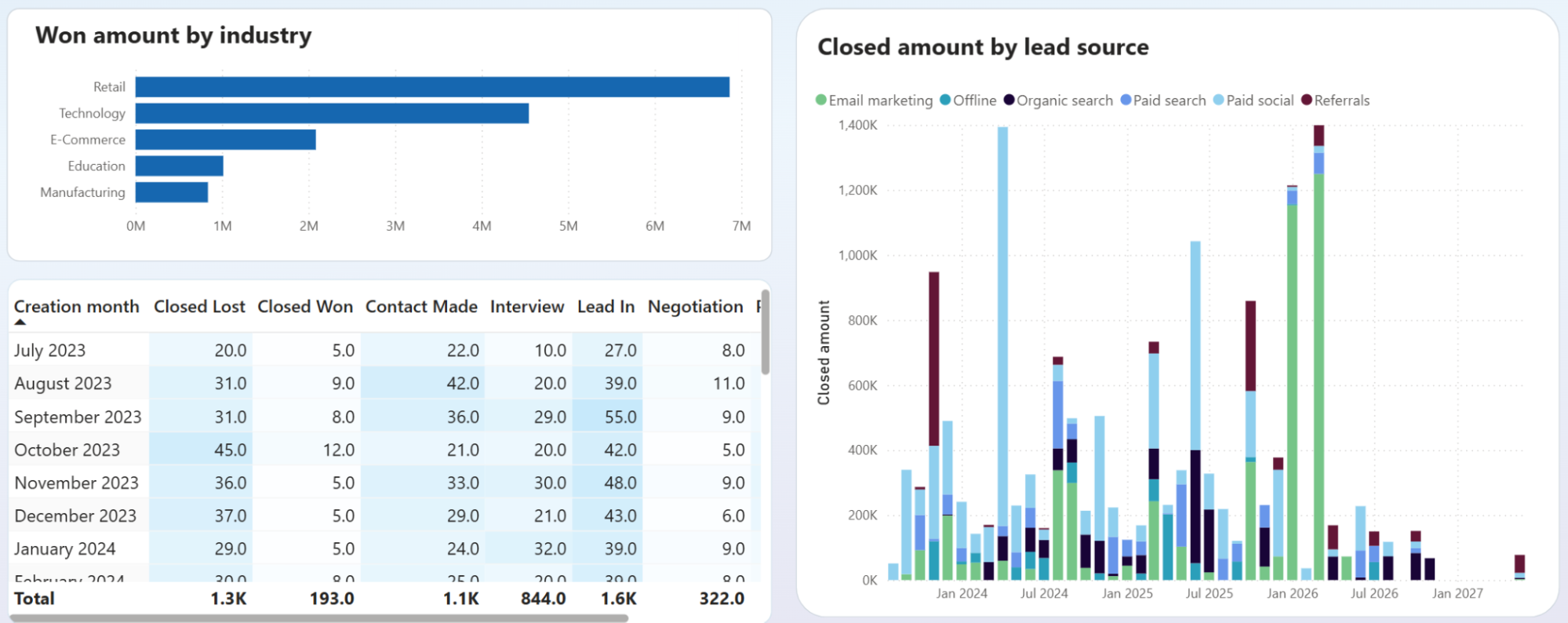
See which industries generate the highest closed amounts. Identify which lead sources (organic search, paid social, referrals, email marketing) contribute most to won revenue over time. Reallocate your sales and marketing focus toward the segments that consistently close at the highest value.
How to create a Power BI KPI dashboard?

Metrics you can track with a Power BI KPI dashboard template
The total income recorded across your connected sources for the selected period. Tracks top-line business performance and forms the baseline for profitability analysis. Compare it against expenses or prior periods to assess growth direction.
Revenue minus total expenses for the reporting period. Shows whether the business is generating profit after accounting for all costs. Useful for month-over-month profitability monitoring and budget control decisions.
The count of opportunities that reached a closed-won status in your CRM. Measures sales output independently of revenue size. Tracking this over time reveals the pace of your team's conversion activity and helps identify seasonal patterns.
The percentage of closed deals that resulted in a win, calculated as won deals divided by total closed deals. A core indicator of sales process effectiveness and team performance across pipelines and individual reps.
The revenue amount associated with won opportunities in your CRM pipeline. Tracks how much closed business is worth in aggregate or per rep. Helps prioritize which deal types and segments to focus on for maximum revenue impact.
Total revenue divided by the number of orders placed in Shopify. Measures the typical size of a customer transaction. Shifts in this metric can signal changes in purchasing behavior, product mix, or the effectiveness of upsell efforts.
The number of orders placed in Shopify during the selected period. Tracks transaction volume independently of revenue. Useful for spotting demand fluctuations and understanding how volume changes relate to shifts in average order value.
A comparison of revenue against expenses across reporting periods — last month, month to date, and year to date. Shows whether costs are being managed relative to income and highlights periods where margins contracted despite stable or growing revenue.