Power BI Google Analytics dashboard examples and reporting templates
Monitor website performance, advertising ROI, and audience behavior in Power BI with automated Google Analytics dashboard templates. Coupler.io connects your GA4 data alongside ad platforms, social media, and search console sources, then refreshes everything on a schedule so your reports stay up to date without manual exports.
Power BI Google Analytics dashboard examples for every need


 +5
+5


 +4
+4

 +5
+5
 +3
+3
about your case. It doesn't cost you a penny 😉
Choose your Google Analytics dashboard template for Power BI to kick off
What is a Power BI Google Analytics dashboard?
Coupler.io handles the data pipeline. It pulls information from GA4, ad platforms, and social accounts on a schedule you set, loads it into Power BI, and keeps every chart refreshed automatically. Whether you need a single or multiple Power BI Google Analytics reporting dashboards for executives or multiple broken out by team, the setup takes minutes. Instead of spending Monday mornings rebuilding last week's numbers, you open a dashboard that already reflects the latest data.

What reports should be included in Power BI Google Analytics dashboards?
The reports below cover five angles of website and marketing performance, drawn from the Power BI Google Analytics dashboard templates listed above. Together, they connect traffic patterns with advertising spend, social reach, and cross-channel attribution.
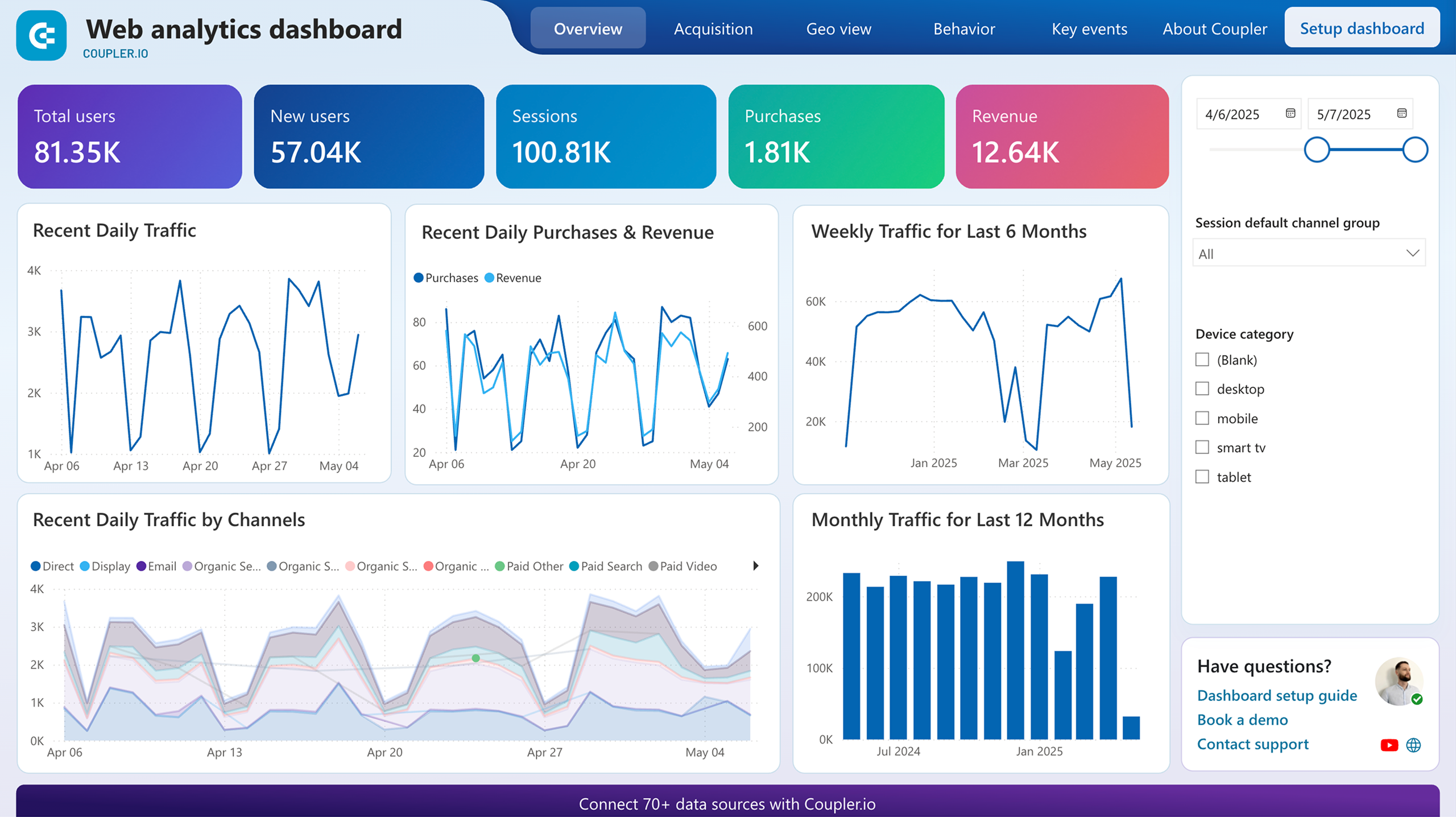
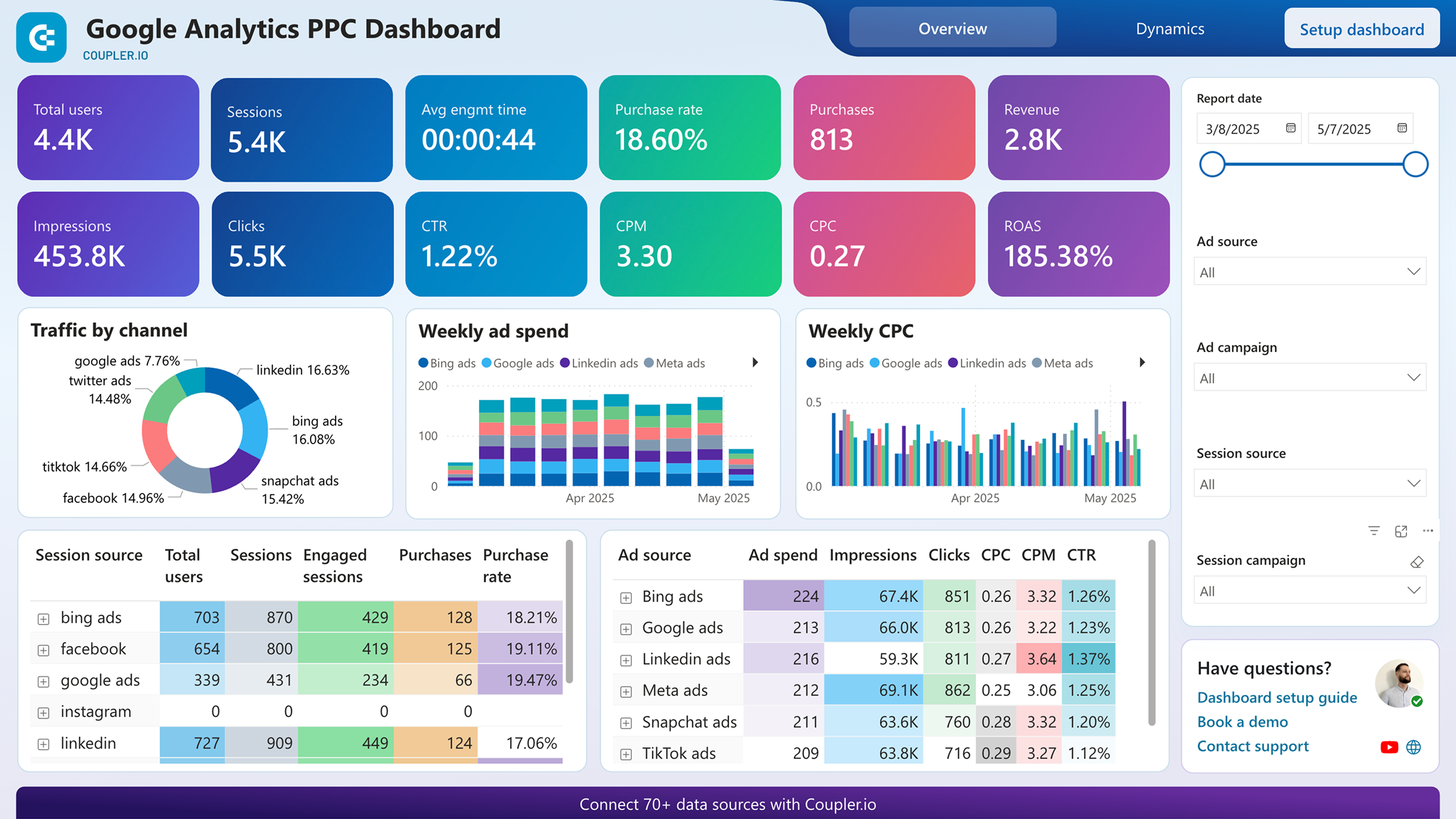
A daily check on sessions, users, and conversions answers one question fast: is traffic growing or shrinking? But the second layer matters more. The acquisition breakdown splits visitors by source and country, so you can tell whether a spike came from organic search or a paid campaign. Behavior metrics like engaged sessions per user and average engagement time separate quality traffic from inflated page views. The conversions page ties all of it together by showing which visitors actually buy.
Ad platforms report clicks and spend, but they cannot tell you what happens after the click. This report bridges that gap by combining ad metrics with GA4 behavior data. ROAS trends over time reveal whether campaigns are becoming more profitable or slowly bleeding margin. The source-specific performance table ranks each ad platform by impressions, clicks, CPC, and CTR side by side. A second page matches campaign names from ad platforms to their GA4 engagement and purchase data, so you can see which campaigns generate traffic that converts.
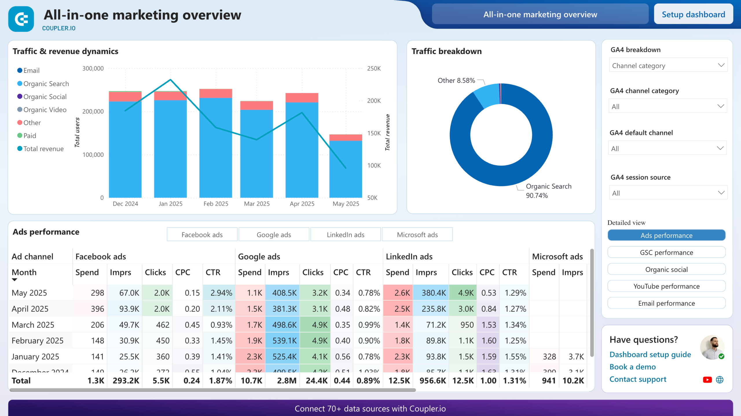
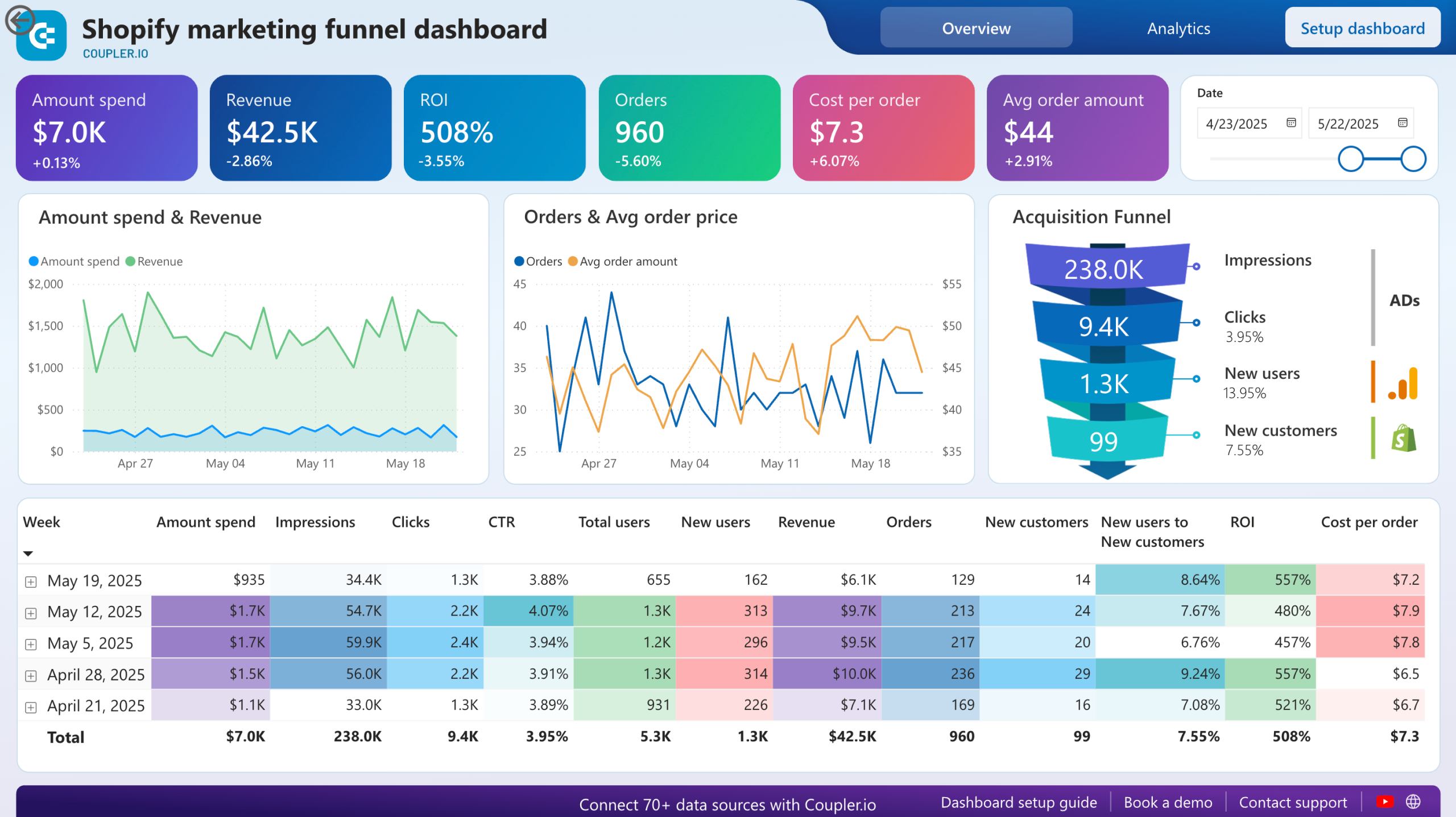
Paid ads, organic search, social media, YouTube, and email rarely get reviewed on the same screen. Among the Power BI Google Analytics dashboard examples on this page, this report stands out for placing every channel's metrics into a single monthly view. A pie chart shows each channel's share of total traffic. Below it, individual sections break out ad spend and CPC, search impressions and average position, social page views, YouTube watch time, and email open rates. Filtering by a specific channel narrows the view without losing the cross-channel context.
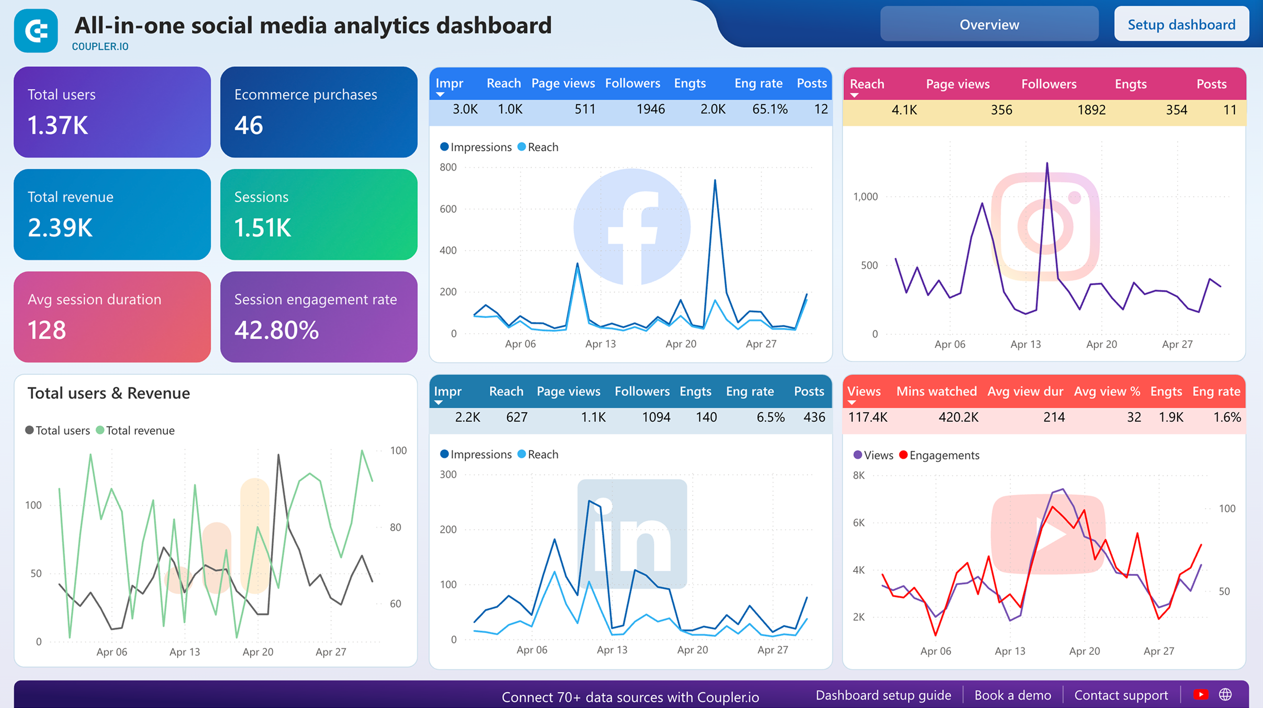
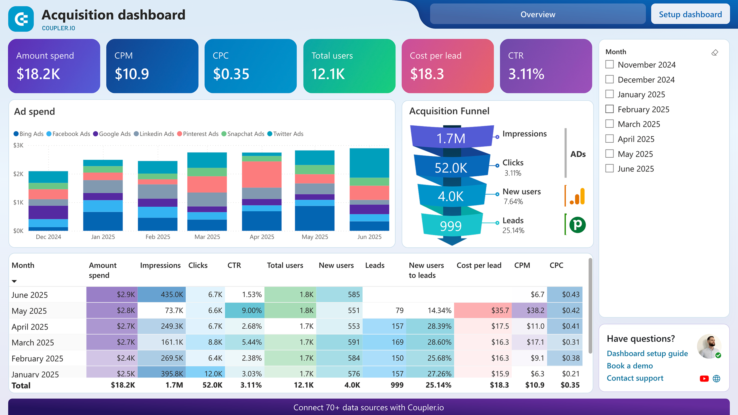
Facebook, Instagram, LinkedIn, and YouTube each have native analytics, but comparing them means opening four separate interfaces. This report pulls performance data from all four platforms alongside GA4 traffic numbers. Month-over-month dynamics per platform show whether engagement is growing or declining. The combined view also reveals which social channel drives the most website visits, a perspective that standalone Power BI Google Analytics dashboards for individual platforms cannot provide.
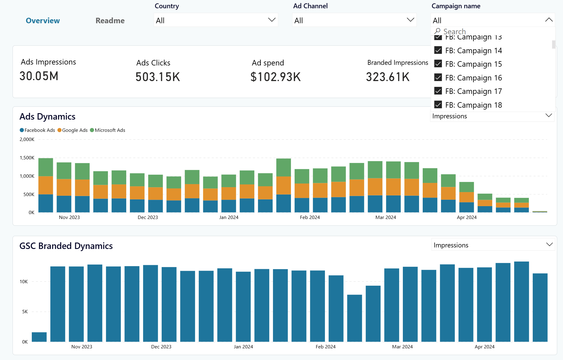
Advertising spend should eventually increase the number of people searching for your brand name. This Power BI Google Analytics dashboard template tests that assumption by charting ad impressions from Facebook, Google, and Microsoft Ads alongside branded keyword data from Google Search Console. Two side-by-side graphs let you spot whether impression spikes correlate with increases in branded searches. The lag between ad activity and search behavior often stretches weeks, so the time-period selector helps you match the right windows.
What insights you can get with the Google Analytics dashboard for Power BI
Filter by a specific campaign from any advertising platform and compare its impression trend against the branded keyword search graph. Some campaigns generate millions of impressions without moving brand searches at all. Others trigger a noticeable uptick two to three weeks after launch. Spotting this pattern lets you reallocate budget toward the campaigns that build lasting recognition.
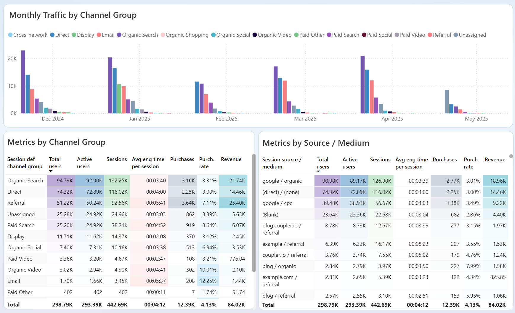
Compare acquisition sources side by side using the breakdown of traffic origins and the conversions page. A source that delivers 40% of your sessions but under 5% of purchases is costing you attention without revenue. Shift budget or content effort toward the channels where visitors complete transactions instead of bouncing after one page view.
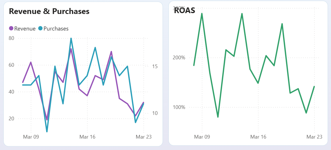
Overlay the ROAS trend chart with the revenue and purchases timeline. When ROAS declines across three or four consecutive periods while spend stays flat or grows, the platform is delivering diminishing returns. The source-specific performance table then shows exactly which platform's CPC is climbing fastest, giving you a clear candidate for budget reallocation or creative refresh.
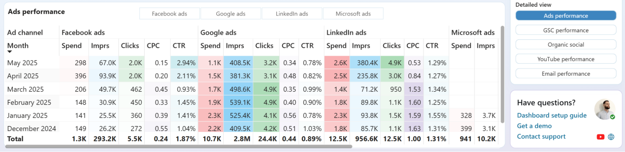
Scan the Ads performance table for months where CPC climbs across Google Ads or Facebook Ads while CTR stays flat. Then switch the detailed view to GSC performance and check whether organic clicks grew during those same months. If organic search already drives most of your traffic and paid costs keep rising, the budget may work harder behind content that strengthens rankings.
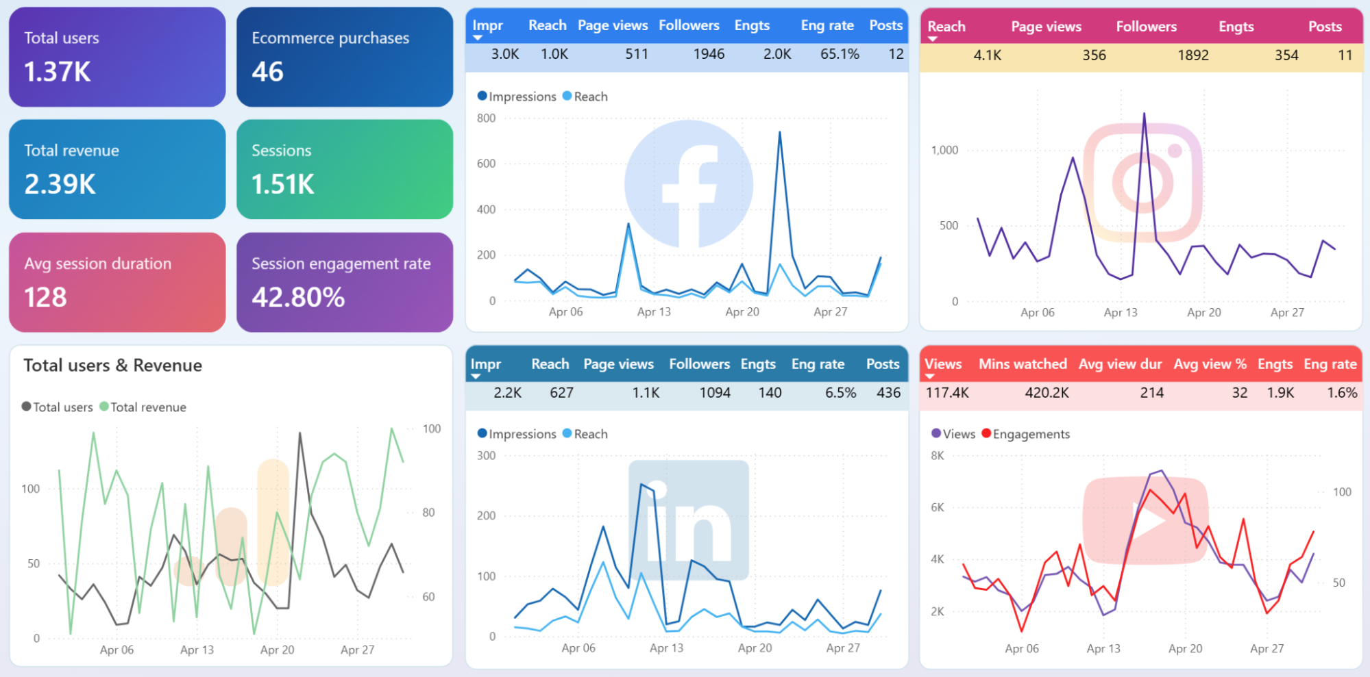
Review the month-over-month performance breakdown across Facebook, Instagram, LinkedIn, and YouTube. One platform might show steady impression growth while another's metrics have flattened for three months. Cross-referencing this with GA4 traffic data reveals whether growing social engagement actually translates into more website visitors or stays contained within the social platform itself.
How to create a Power BI Google Analytics dashboard template?

Metrics you can track with the Google Analytics dashboard for Power BI
Counts every unique visitor who interacted with your website during a selected period. Comparing this number week over week shows whether your acquisition efforts are growing the audience or stalling. A sudden drop often signals a broken tracking tag or a lost traffic source.
Measures the number of individual browsing sessions on your site. One user can generate multiple sessions, so a widening gap between users and sessions suggests high return-visit rates. Tracking session volume alongside conversion rate reveals whether more visits actually produce more outcomes.
The percentage of sessions that result in a completed goal or purchase. A high conversion rate on low traffic can be more profitable than massive traffic with poor conversion. Watching this metric after landing page changes or campaign launches shows the immediate effect on visitor behavior.
The sum of all purchase values recorded in GA4 during a period. Revenue viewed alongside ad spend and ROAS in your Power BI Google Analytics dashboard tells you whether marketing investment pays for itself. Tracking revenue by month highlights seasonal patterns that should inform budget planning.
Divides revenue attributed to advertising by the amount spent on ads. A ROAS below 1.0 means the ads lose money before operating costs. Monitoring ROAS over time across ad platforms highlights which channels remain profitable and which need intervention.
The ratio of clicks to impressions across ad campaigns or search results. A declining CTR with stable impressions often means ad fatigue or increased competition. Comparing CTR across platforms identifies where your creative and targeting resonate most.
The average price paid each time someone clicks your ad. Rising CPC without a corresponding increase in conversion rate erodes margin. Tracking CPC by platform and campaign pinpoints where competition or poor quality scores are inflating costs.
The mean duration users spend actively interacting with your site per session. Short engagement times on high-traffic pages suggest the content fails to hold attention. Comparing this metric across traffic sources separates channels that bring curious visitors from those that attract disengaged clicks.