Power BI executive dashboard examples and reporting templates
Connect advertising, financial, and social media data in Power BI executive dashboard templates automated through Coupler.io. Track ad spend, revenue trends, marketing channel results, and social media engagement in Power BI without manual exports or switching between platforms.
Power BI executive dashboard examples for every need


 +5
+5


 +2
+2
about your case. It doesn't cost you a penny 😉
Choose your Power BI executive dashboard templates to kick off
What is a Power BI executive dashboard?
Coupler.io automates the data flow by connecting these sources and loading transformed data into Power BI on a schedule. Instead of compiling numbers from multiple tools, you open one dashboard and see how campaigns perform, where revenue comes from, and which channels deliver results. Power BI executive reporting dashboards built this way stay up to date and eliminate the manual work behind cross-platform reporting.

What reports should be included in Power BI executive dashboards?
An effective Power BI executive dashboard combines reports that cover paid advertising, financial performance, full marketing funnel visibility, and social media activity. The four report types below address the key areas executives need to monitor across business functions.
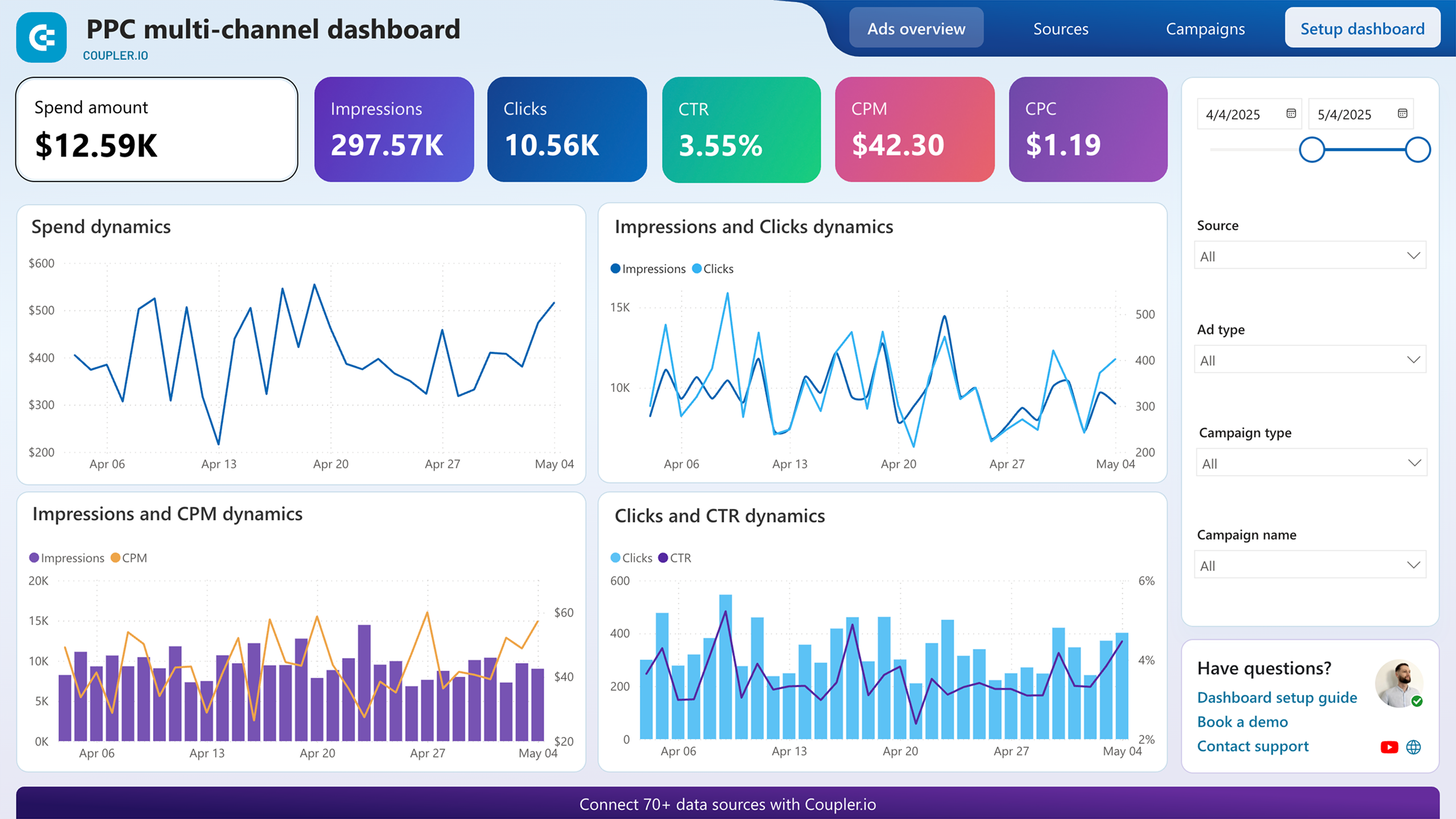
When advertising runs across Google Ads, Facebook Ads, LinkedIn Ads, TikTok Ads, and other platforms simultaneously, each channel produces its own set of numbers in its own interface. This report eliminates the need to hop between them. It brings spend, click, and impression data from all connected ad accounts into a unified view so you can evaluate which platforms deliver results at a reasonable cost.
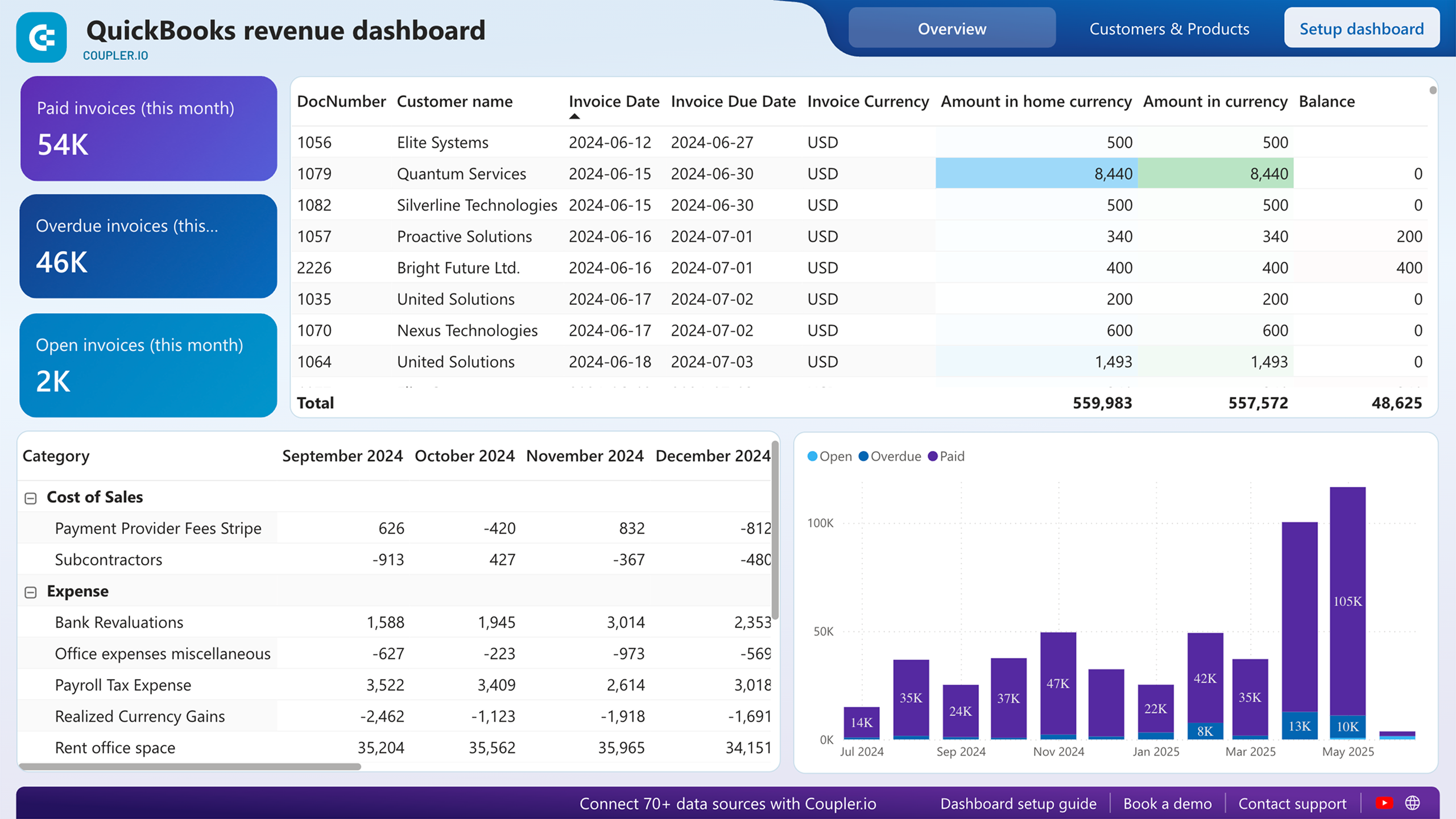
Marketing spend means little without a clear picture of what the business actually earns. This report, built on QuickBooks data, connects income trends over the past 12 months with a profit and loss breakdown so executives can see whether revenue growth keeps pace with rising costs. It also surfaces your most valuable customers and best-selling products.
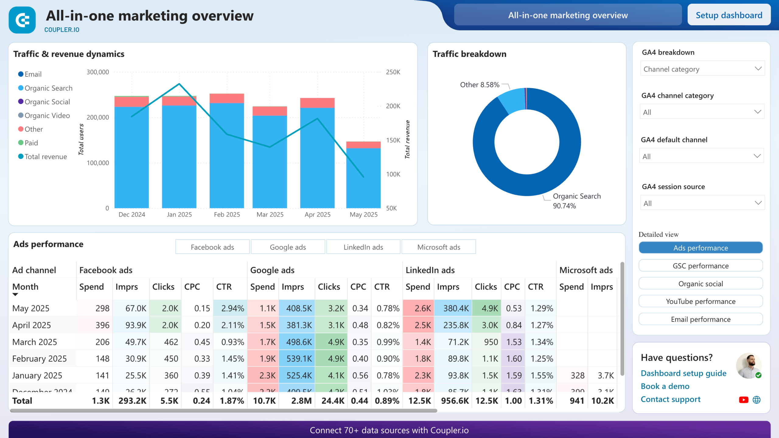
Most marketing teams run paid ads, invest in SEO, post on social media, publish YouTube content, and send emails. Each channel has its own analytics tool. This report merges all of them with GA4 data so you can see which efforts actually drive users and revenue. It answers the question executives ask most often: where should we spend more and where should we cut back?
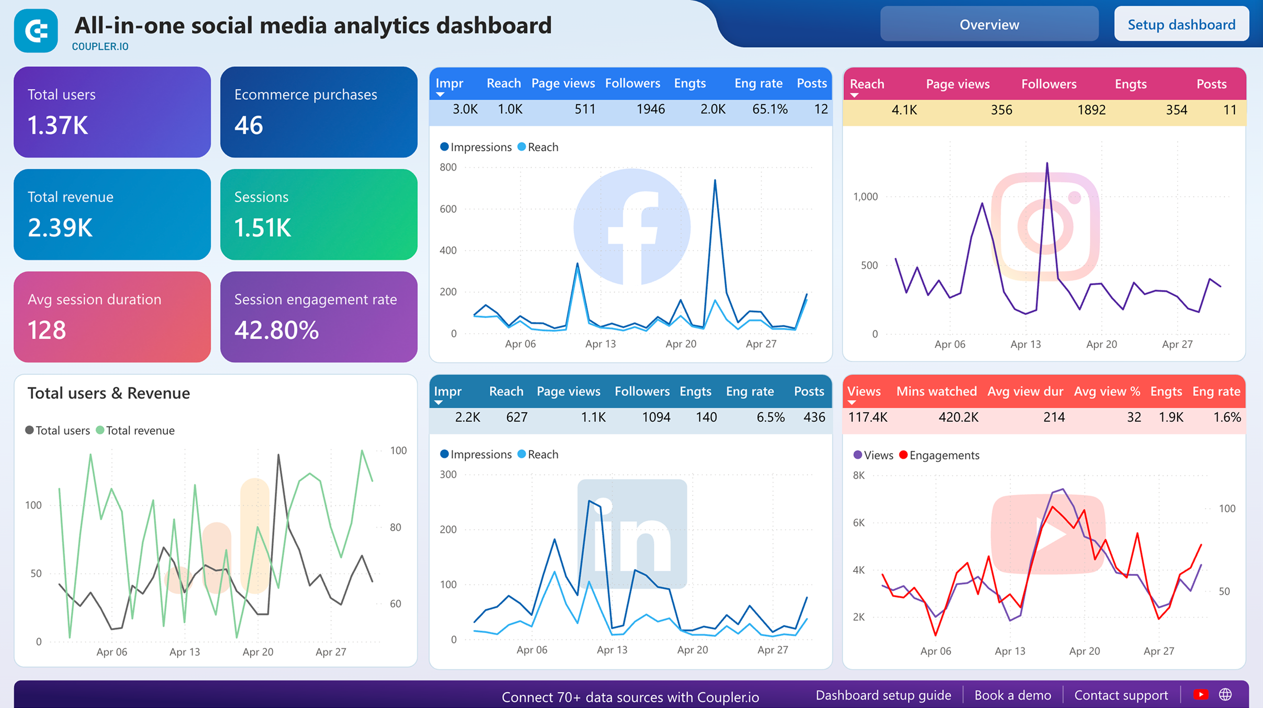
Social media activity is easy to overlook when it sits inside native platform dashboards that nobody opens regularly. This report pulls Facebook, Instagram, LinkedIn, and YouTube data alongside GA4 traffic figures so you can see which platforms send visitors to your site and how engagement changes month over month. It helps executives understand whether social efforts translate into measurable traffic or remain isolated vanity metrics.
What insights you can get with a Power BI executive dashboard
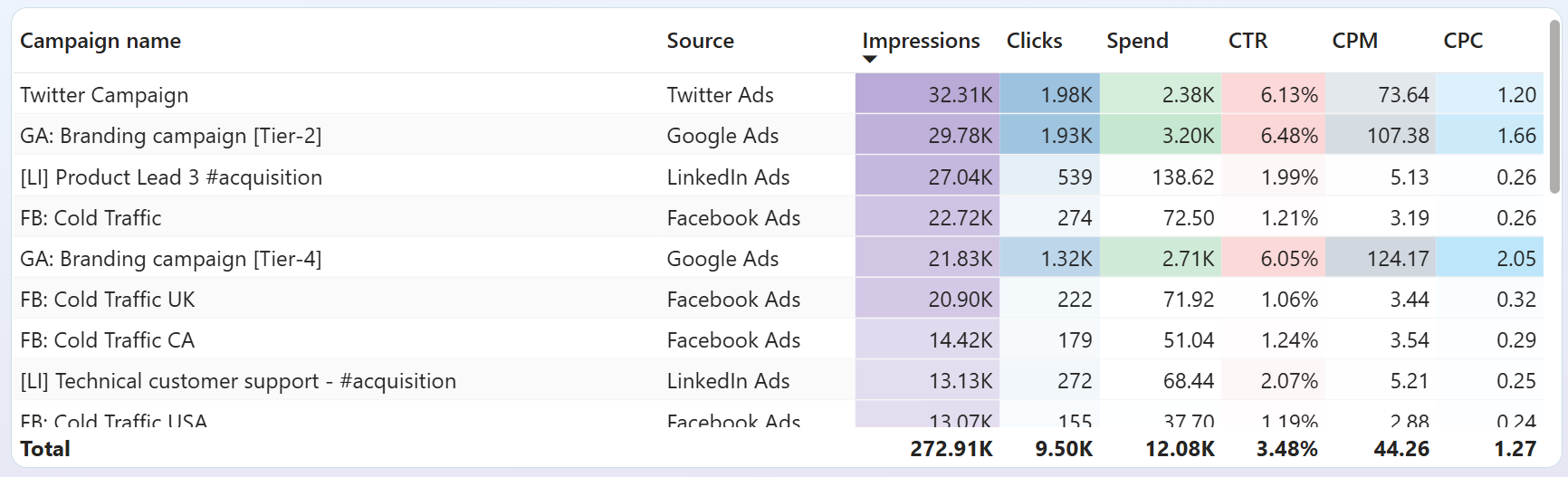
Compare cost per click across Google Ads, Facebook Ads, LinkedIn Ads, TikTok Ads, and other connected platforms in a single table. Sort by CPC to immediately see where you pay the most per visitor and where clicks come at a lower cost. Use this to shift budget toward channels that generate traffic efficiently. This is one of the most actionable views a Power BI executive dashboard can provide for ad spend optimization.
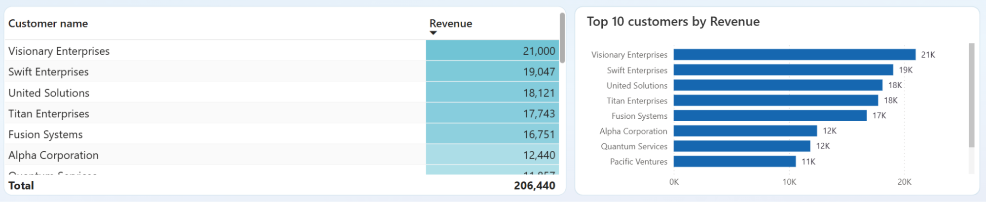
Review the customer overview to see each client's contribution to total income. If a few accounts generate most of your revenue, that signals concentration risk. If revenue is distributed more evenly, your income base is more stable. Power BI executive reporting dashboard templates like this one help executives decide where to invest in retention and where to diversify.
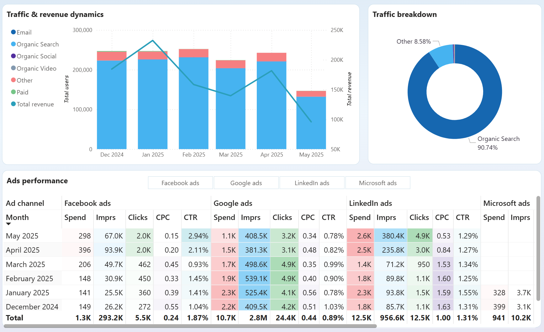
Open the all-channels performance overview to see a traffic share breakdown by channel. The pie chart shows the proportion of users coming from paid ads, organic search, social media, email, and YouTube. Match this against revenue data from GA4 to decide which channels deserve more investment and which underperform relative to their cost.
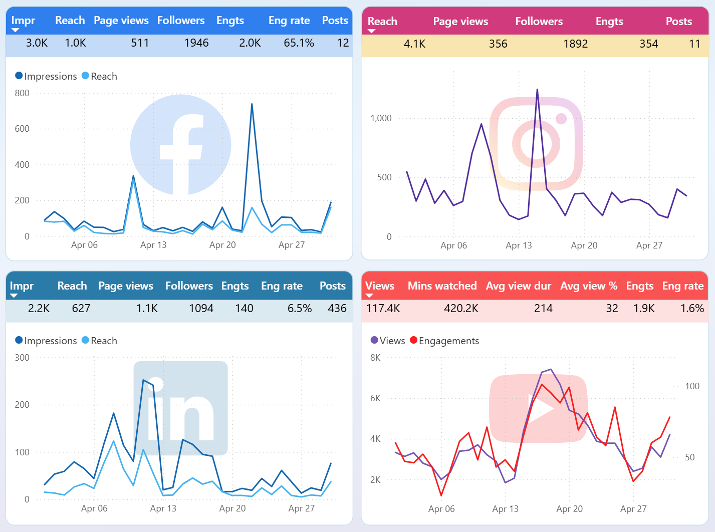
Track month-over-month changes in Facebook, Instagram, LinkedIn, and YouTube performance within a single report. The per-platform dynamics section highlights where audience activity is rising and where it drops. Catching these shifts early lets you adjust content strategy or reallocate resources before a declining channel affects overall marketing results.
How to create a Power BI executive dashboard?

Metrics you can track with a Power BI executive dashboard template
The average amount you pay for each ad click across connected advertising platforms. CPC varies by channel and campaign, so tracking it in one place helps you spot which platforms deliver traffic at a reasonable cost and which need budget adjustments.
The percentage of ad impressions that result in a click. A low CTR may signal weak ad copy or poor audience targeting. Monitoring CTR across channels in Power BI executive dashboards helps identify underperforming campaigns quickly.
The total advertising budget consumed across all connected ad platforms during a selected period. Tracking spend alongside performance metrics like clicks and conversions prevents overspending on channels that deliver limited results.
Total income recorded in QuickBooks over a selected time frame. This metric shows the top-line financial result of your business and provides context for evaluating whether marketing spend translates into actual earnings growth.
Revenue minus expenses as reported in QuickBooks. It reflects the profitability of your business after all costs. Executives use this metric in Power BI executive dashboard examples to assess whether increasing ad spend actually improves the bottom line.
The total number of times your ads were displayed across all connected platforms. Impressions measure campaign reach and visibility. Comparing impressions against clicks and spend reveals how efficiently your budget generates audience exposure.
The percentage of delivered emails that recipients opened. This metric, available through the all-in-one marketing report, indicates how well your subject lines and sender reputation perform. Declining open rates may require changes to email frequency or content.
The number of visitors to your website as tracked by GA4. This metric appears across marketing and social media reports, showing how paid, organic, and social channels contribute to overall site traffic. It is a core metric for any Power BI executive dashboard template focused on marketing visibility.
The cost of generating one thousand ad impressions. CPM helps evaluate brand awareness campaigns where the goal is visibility rather than direct clicks. Power BI executive reporting dashboards that include CPM alongside CPC give a fuller picture of advertising efficiency.