Power BI CRM dashboard examples and reporting templates
Connect your CRM data to Power BI and turn scattered deal records into a single reporting view. These Power BI CRM dashboard templates pull pipeline metrics, deal history, and team activity from your CRM platform, then refresh on a schedule through Coupler.io so every report stays accurate without manual exports.
Power BI CRM dashboard examples for every need


 +3
+3
about your case. It doesn't cost you a penny 😉
Choose your Power BI CRM dashboard template to kick off
What is a Power BI CRM dashboard?
Coupler.io handles the connection between your CRM platform and Power BI. It extracts deal records, contact data, and activity logs, transforms them where needed, and pushes everything into a dashboard you can share with stakeholders. No CSV downloads, no broken formulas. You get a set of ready-made Power BI CRM dashboard examples that cover pipeline analysis, deal breakdowns, and team comparisons.

What reports should be included in a Power BI CRM dashboard template?
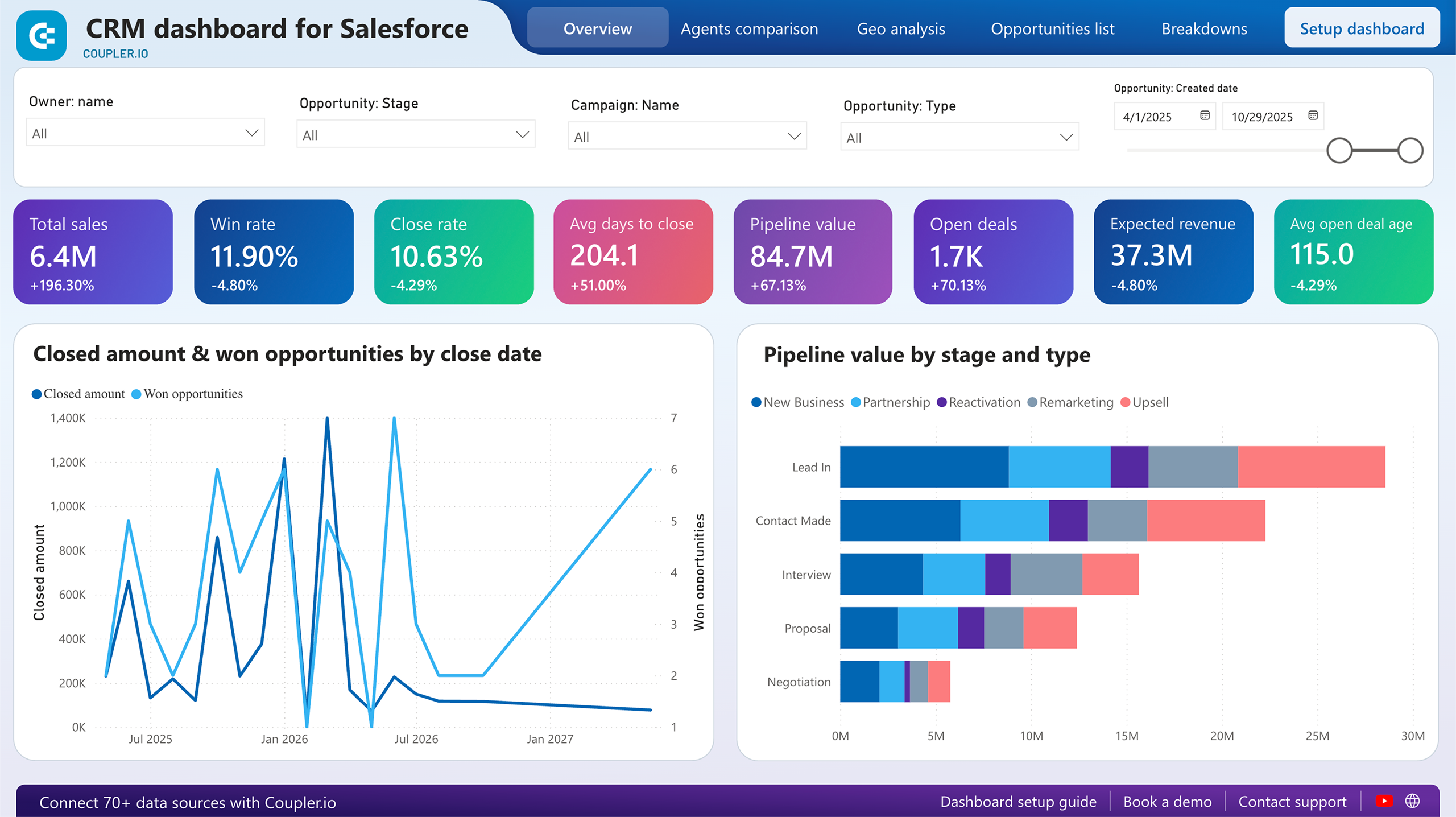
Four report types cover the ground between high-level pipeline status and granular deal-level investigation.
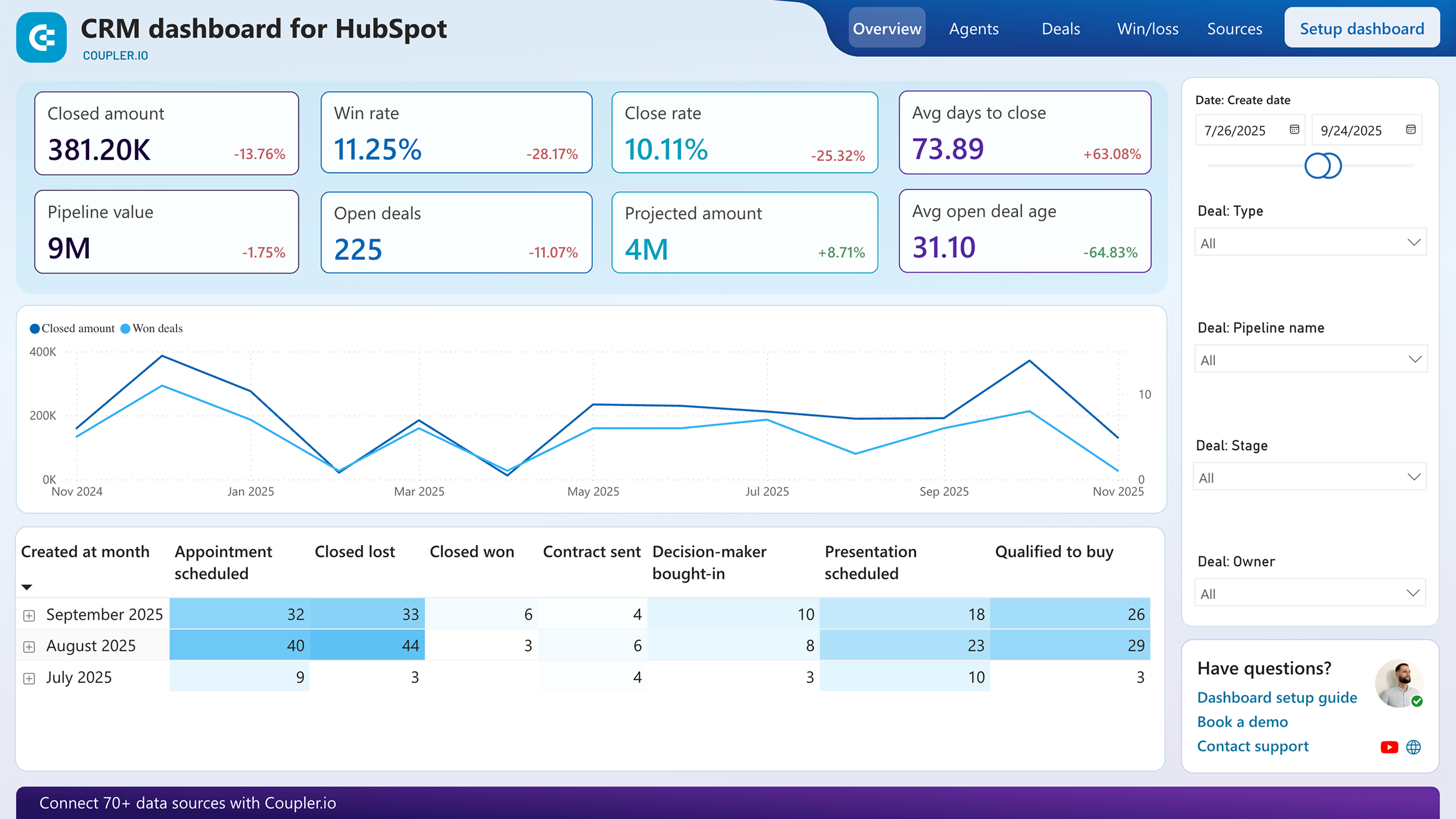
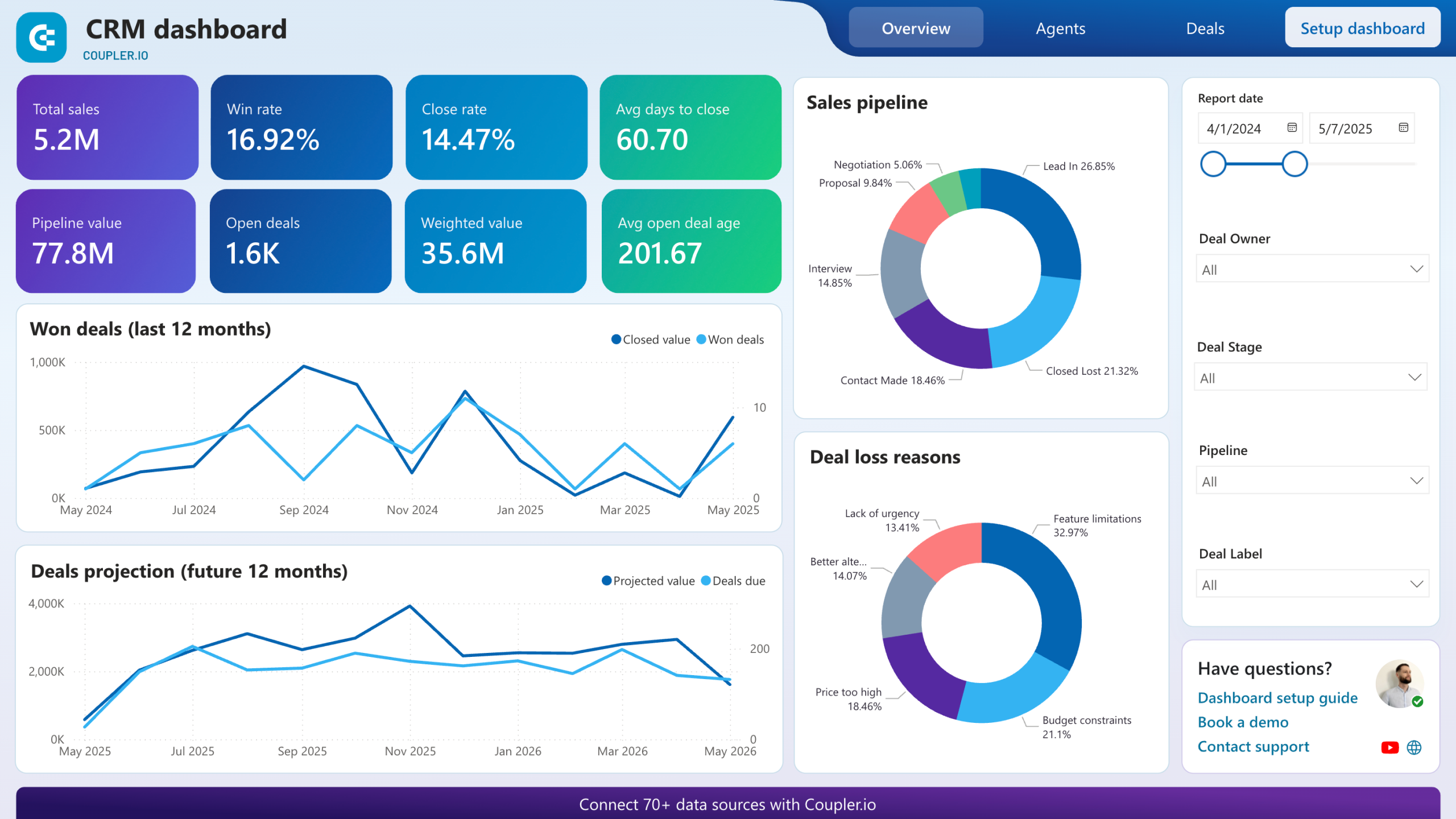
Scorecards for total sales, won deals, win rate, average days to close, pipeline value, and open deal count give you the headline numbers at a glance. Below them, a 12-month won-deals trend line shows whether closed revenue is climbing or flattening. A separate projection chart extends the view into the next 12 months using expected deal values and close dates. These are the first charts most Power BI CRM reporting dashboards display because they answer the question every sales leader asks on Monday morning: are we on track?
Won deals are broken down by company type, industry, and decision-maker role so you can profile what successful closes have in common. A revenue-by-industry bar chart highlights which verticals generate the most value. Paired with a lead-source stacked chart, this report reveals whether your best industries also come from your best channels, or whether high-value wins arrive through paths you haven't deliberately invested in.
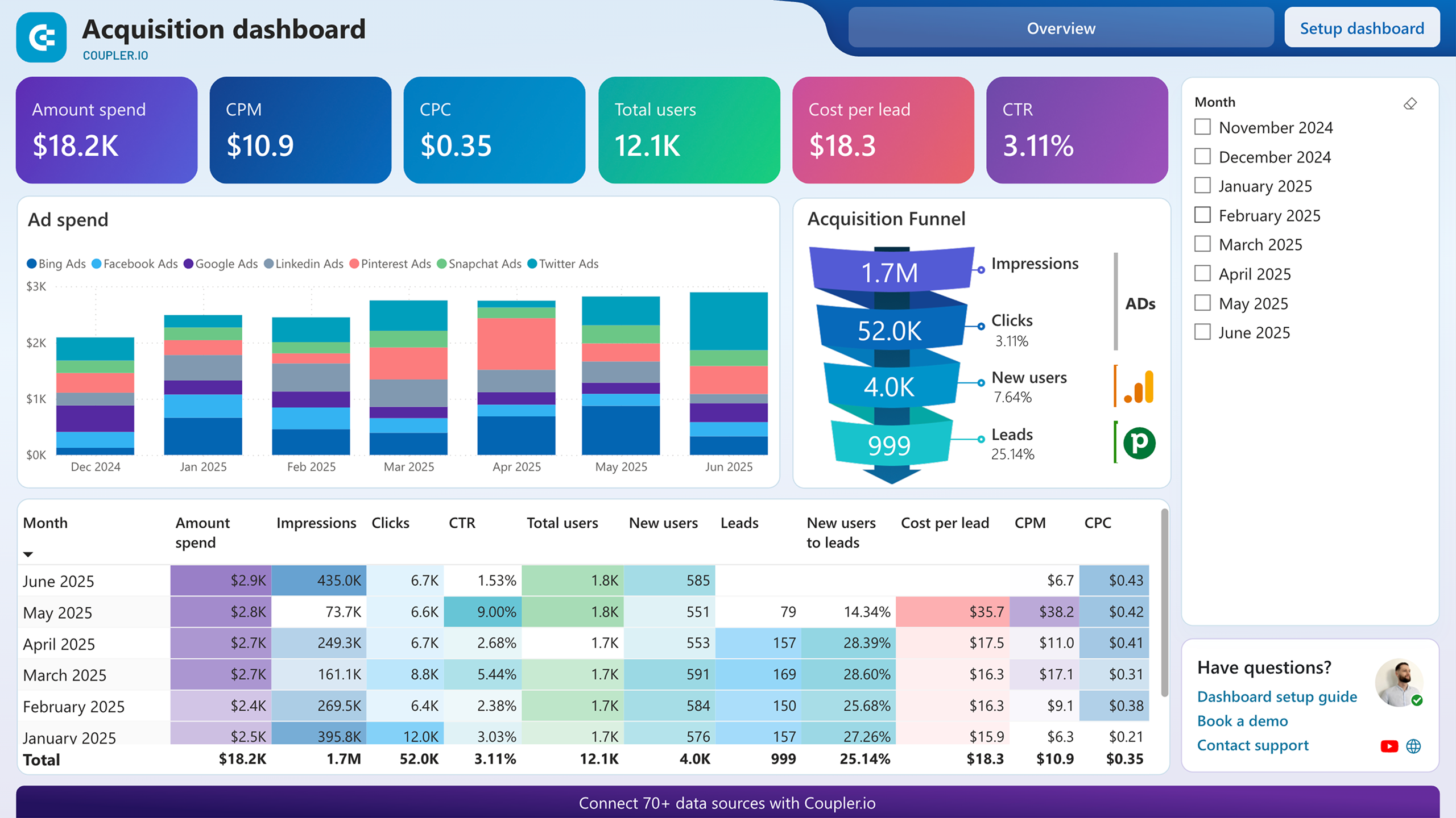
This report maps the journey from ad impressions through clicks, website visits, and CRM conversions in a single funnel visualization. Conversion rates appear at every stage, benchmarked against industry averages. A monthly funnel table underneath adds the time dimension, showing whether last month's campaign changes moved the needle on lead-to-opportunity ratios or just shifted traffic volume without improving quality. Use it to connect marketing spend directly to pipeline outcomes.
Two donut charts separate the reasons deals were won from the reasons they were lost. Win reasons might cluster around product quality and competitive pricing. Loss reasons might split between feature gaps and budget constraints. The source breakdown tables below each chart connect these outcomes to specific deal sources and entities, making it possible to trace a pattern like paid social driving high volume but also the highest loss rate to feature limitations.
What insights you can get with Power BI CRM dashboards
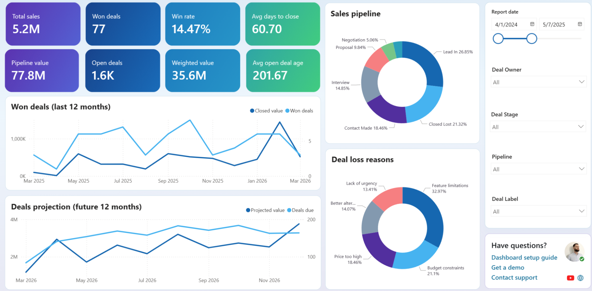
Filter unclosed deals by owner, deal stage, or pipeline and watch the scorecards recalculate. Compare one rep's weighted value and average open deal age against the team total to spot who carries disproportionately stale deals. That gap narrows your coaching conversation to the specific stages and deal types where momentum consistently drops off.
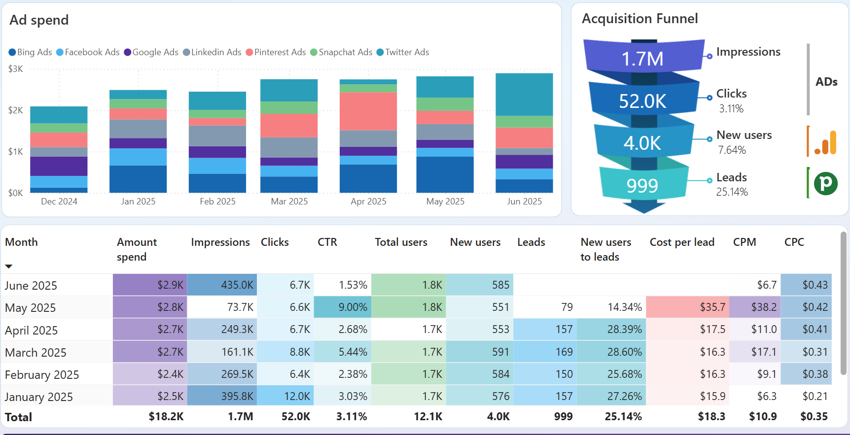
Compare month-over-month conversion rates from impressions to CRM leads to isolate which periods produced the strongest lead-to-opportunity ratios. Overlay those high-performing months with campaign launch dates or budget shifts to confirm what actually drove the improvement. Without that cross-reference, you risk attributing pipeline gains to seasonal luck rather than replicable decisions.
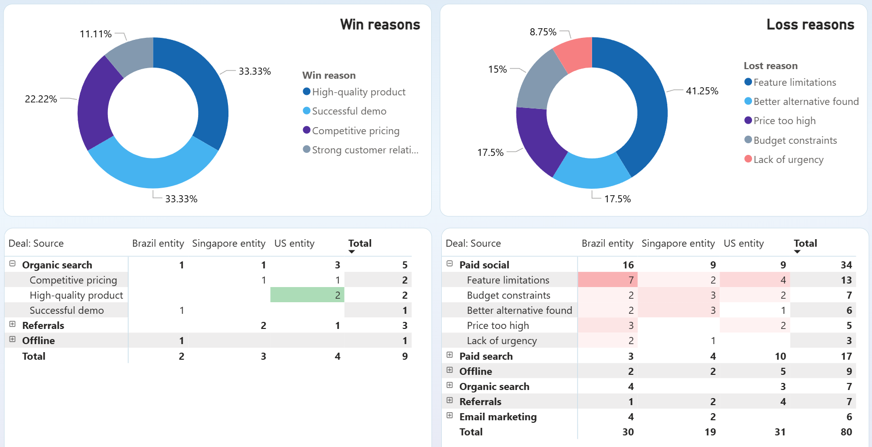
Cross-reference the loss reason donut with the source breakdown tables to find which acquisition channels produce deals that fail for specific reasons. If paid social delivers volume but loses disproportionately to feature gaps, the problem sits in audience targeting or lead qualification rather than in the product. Fixing that mismatch before scaling spend saves budget and pipeline capacity.
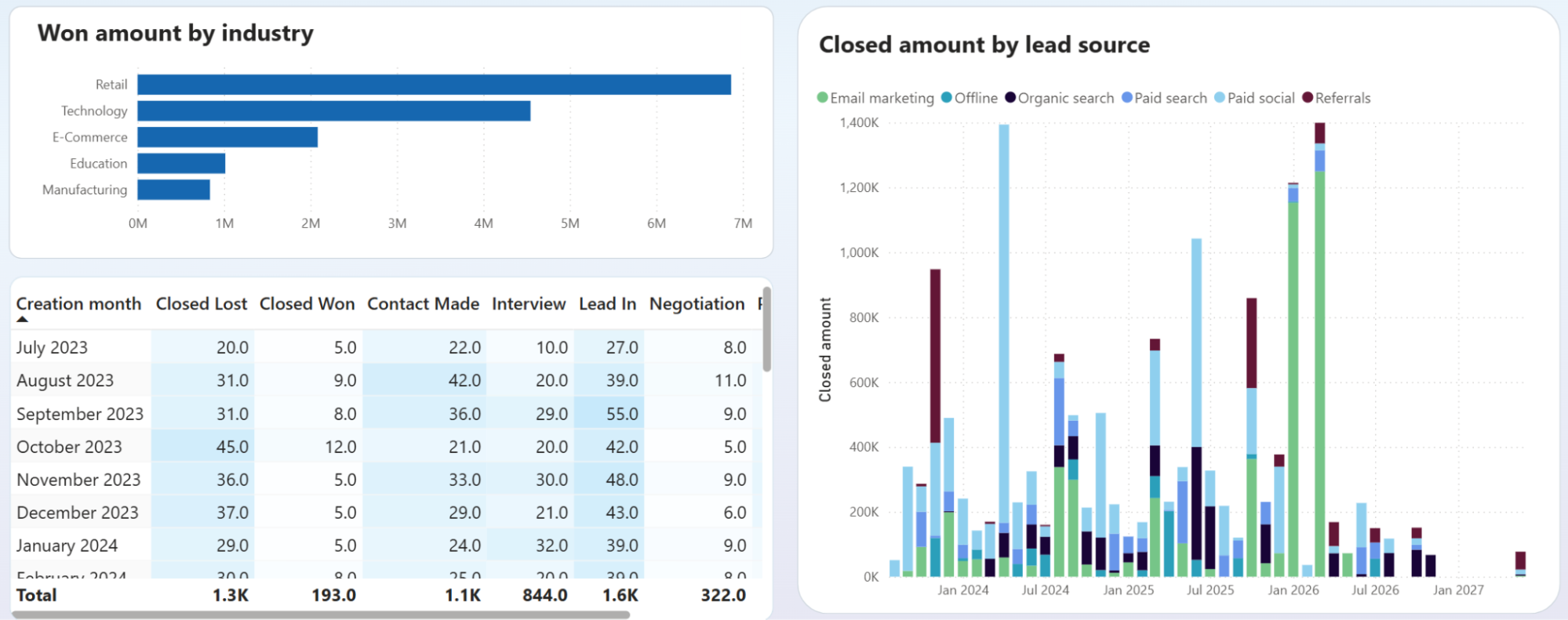
Compare the won-amount-by-industry chart against the deal stage table to check whether your top-revenue verticals also carry the most deals stuck at Lead In or Contact Made. A vertical that closes big but bleeds heavily at early stages points to a qualification gap. Tightening entry criteria for that segment protects rep time and improves close rates.
How to create a Power BI CRM dashboard?

Metrics you can track with the Power BI CRM dashboard
The sum of all closed-won deal values over a selected period. Tracking this number month over month reveals revenue momentum and helps you gauge whether pipeline improvements translate into actual bookings or just inflate open deal counts.
The percentage of deals that close successfully out of all deals that reached a decision stage. A falling win rate alongside rising deal volume suggests your team is chasing lower-quality opportunities.
The mean number of days between deal creation and close. Spikes in this metric often correlate with specific deal types or stages where approvals slow down, making it a useful diagnostic for process bottlenecks.
The total monetary value of all open deals at any point in time. Comparing pipeline value against your revenue target shows whether the team has enough active opportunities to hit quota, even before factoring in close probability.
Each open deal's value multiplied by its win probability, then summed. This gives a more realistic forecast than raw pipeline value because it discounts early-stage deals with low historical close rates. Most Power BI CRM dashboards display it next to pipeline value as a reality check.
The number of deals that remain in active pipeline stages. A sudden drop without a matching spike in won or lost deals means opportunities are going stale rather than progressing to a decision.
The mean number of days open deals have been sitting in the pipeline. When this number rises, deals are aging without resolution. Segment it by stage to find exactly where velocity breaks down.
The ratio of leads that become qualified opportunities in your CRM. Tracking this across channels in a Power BI CRM dashboard template shows which sources deliver prospects that actually enter the pipeline rather than generating form fills that go nowhere.