SaaS dashboard examples and reporting templates
Track your marketing performance with automated SaaS dashboard templates that consolidate data from Google Analytics, advertising platforms, Search Console, and CRM systems. Monitor channel effectiveness, analyze conversion funnels, measure key events, and optimize revenue impact through a unified view of your customer acquisition metrics.
SaaS dashboard examples for every need


 +1
+1


 +3
+3


 +6
+6


 +3
+3
 +3
+3

about your case. It doesn't cost you a penny 😉
Choose your white label B2B SaaS dashboard to kick off
What is a SaaS dashboard?
The SaaS reporting dashboard eliminates manual data compilation by automatically refreshing information on a schedule, giving teams instant access to traffic sources, conversion rates, customer lifetime value, and channel performance. Built on platforms like Looker Studio and powered by Coupler.io's data integration, an SaaS metrics dashboard transforms scattered data points into actionable insights that drive growth decisions.

What reports should be included in SaaS dashboards?
Subscription businesses need visibility across the entire customer journey, from initial awareness through conversion and retention. Based on analysis of successful SaaS marketing dashboard implementations, we recommend four critical report categories that provide complete performance visibility.
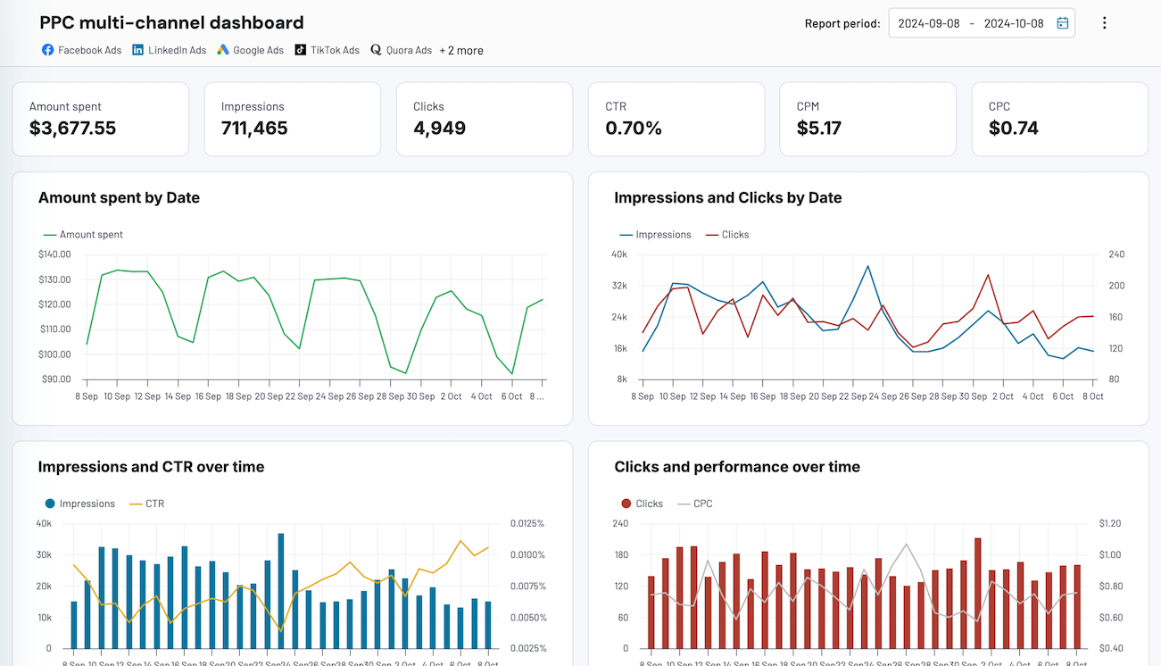
These reports consolidate data from paid advertising, organic search, social media, email campaigns, and content channels into a unified view. By tracking impressions, clicks, cost per click, and click-through rates alongside Google Analytics attribution data, they reveal how each marketing channel contributes to traffic volume and revenue generation. This integrated perspective helps teams identify which channels deliver the strongest return on investment and where budget reallocation would improve overall marketing efficiency.
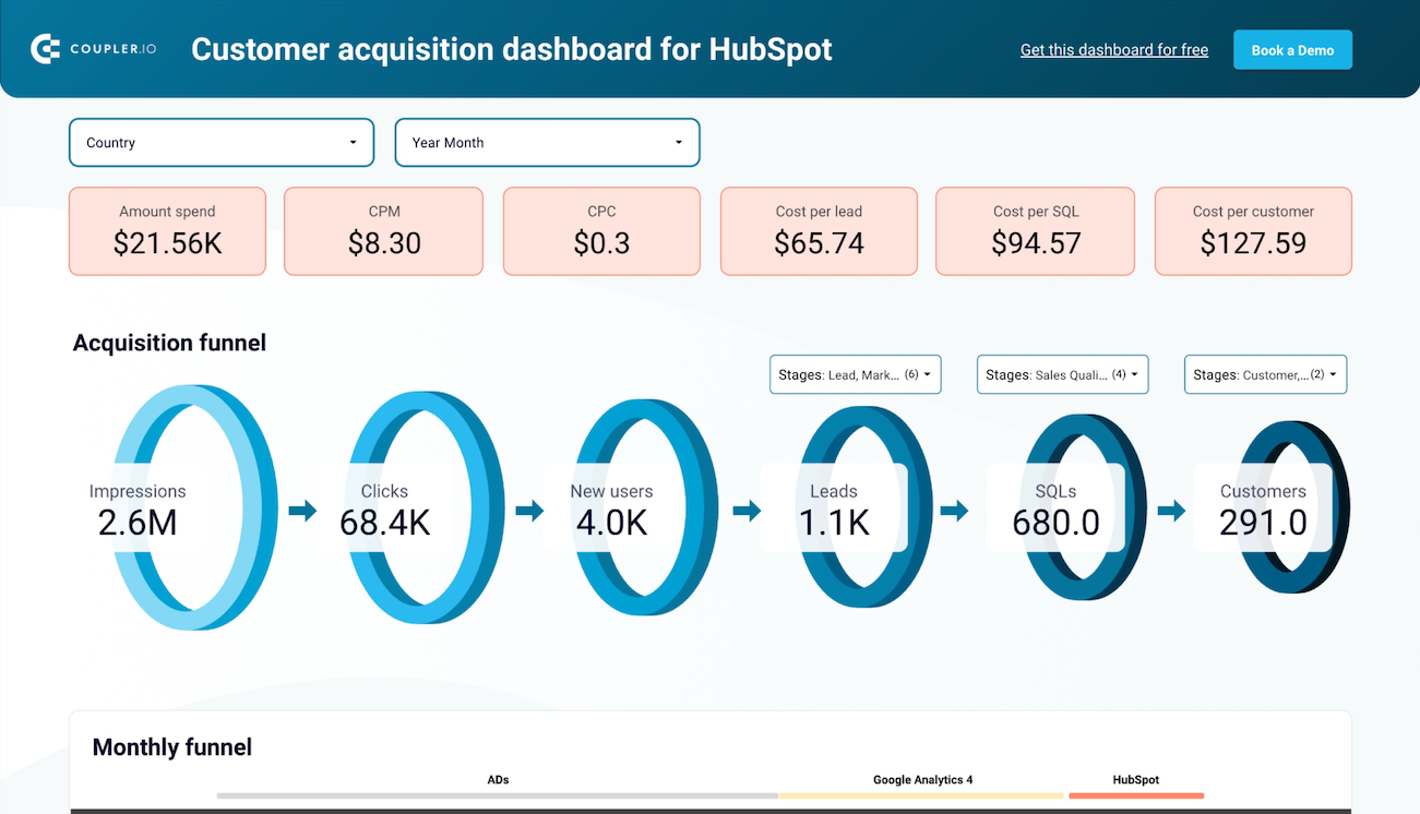
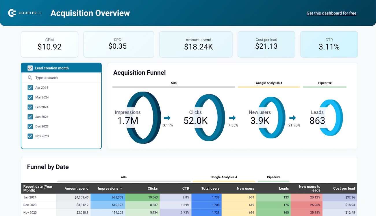
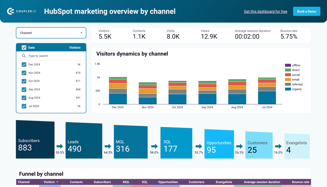
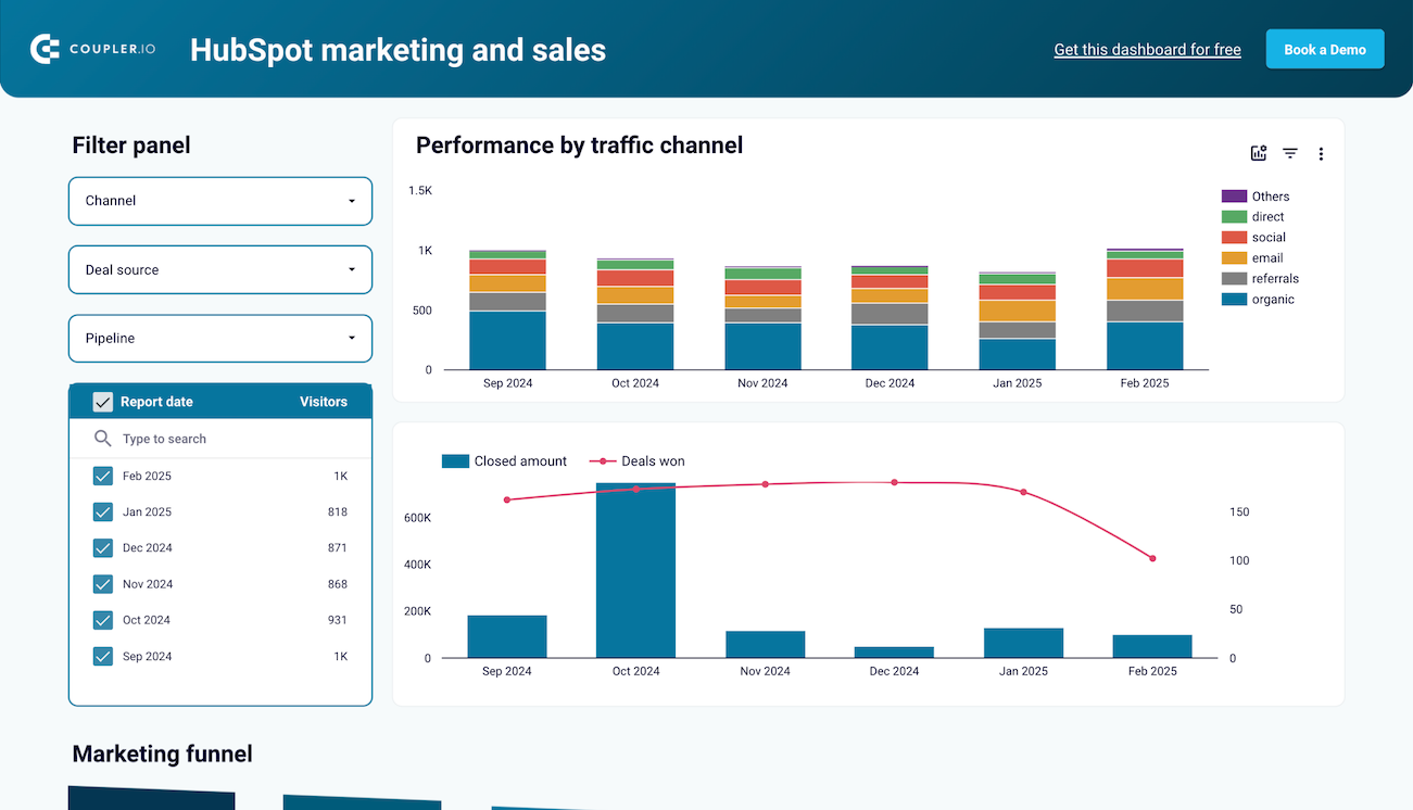
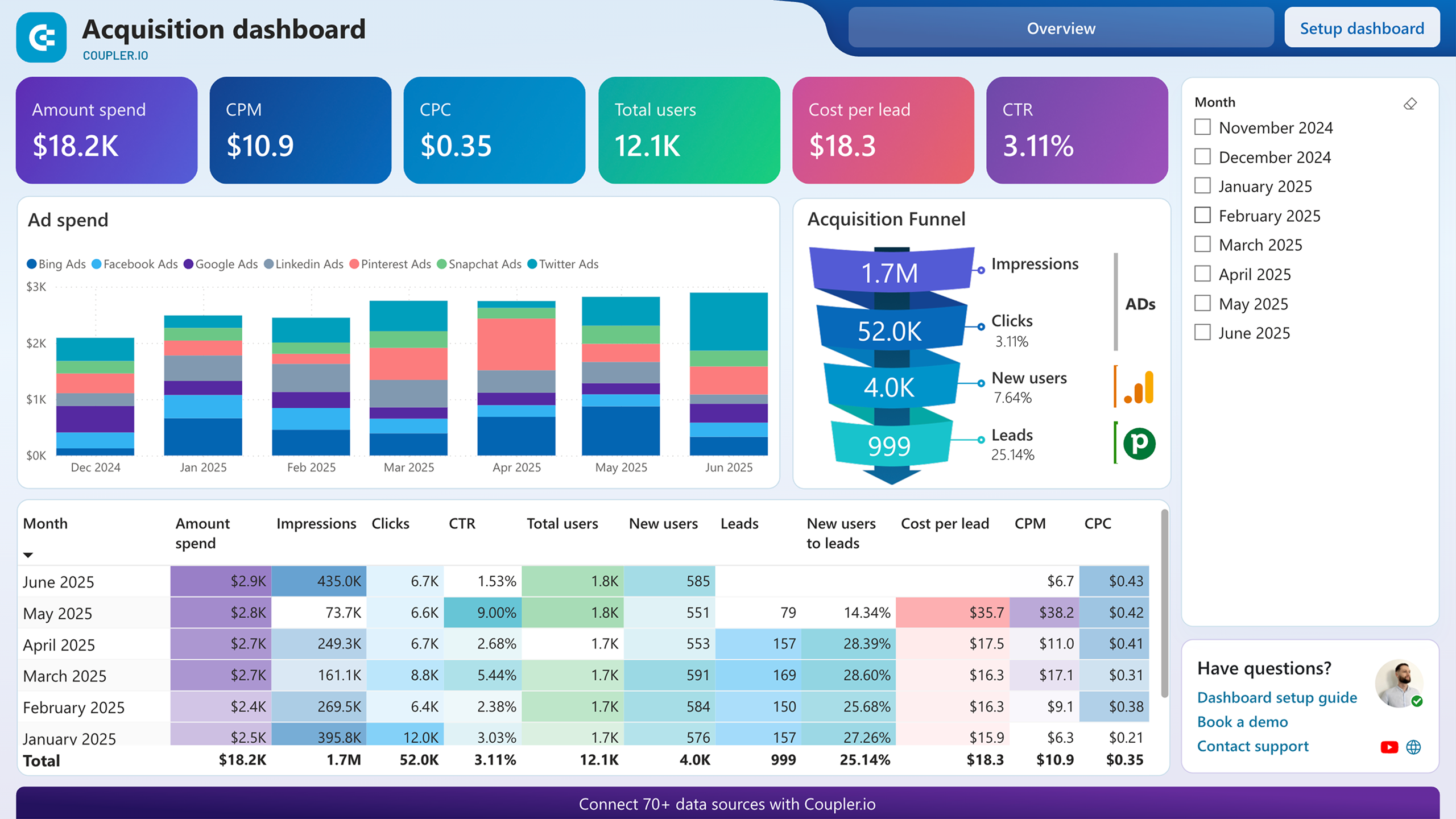
Funnel reports map the complete journey from initial ad exposure through website visits to CRM conversions. By connecting advertising spend with website traffic metrics and lead generation data, they calculate conversion rates at each funnel stage and reveal where potential customers drop off. Month-over-month funnel analysis uncovers performance trends that correlate with specific campaigns, seasonal patterns, or market conditions.
An SaaS product dashboard should enable you to monitor high-value user actions that signal genuine business impact rather than surface-level engagement. Trial signups, demo requests, feature activations, and purchases represent conversion milestones that directly connect to revenue outcomes. Daily updates on conversion volume and rates segment performance by traffic source, user demographics, and behavioral patterns.
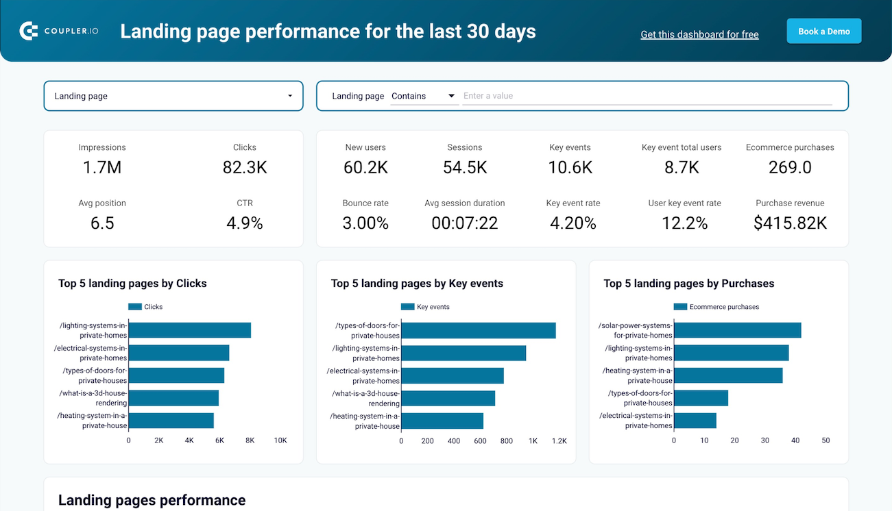
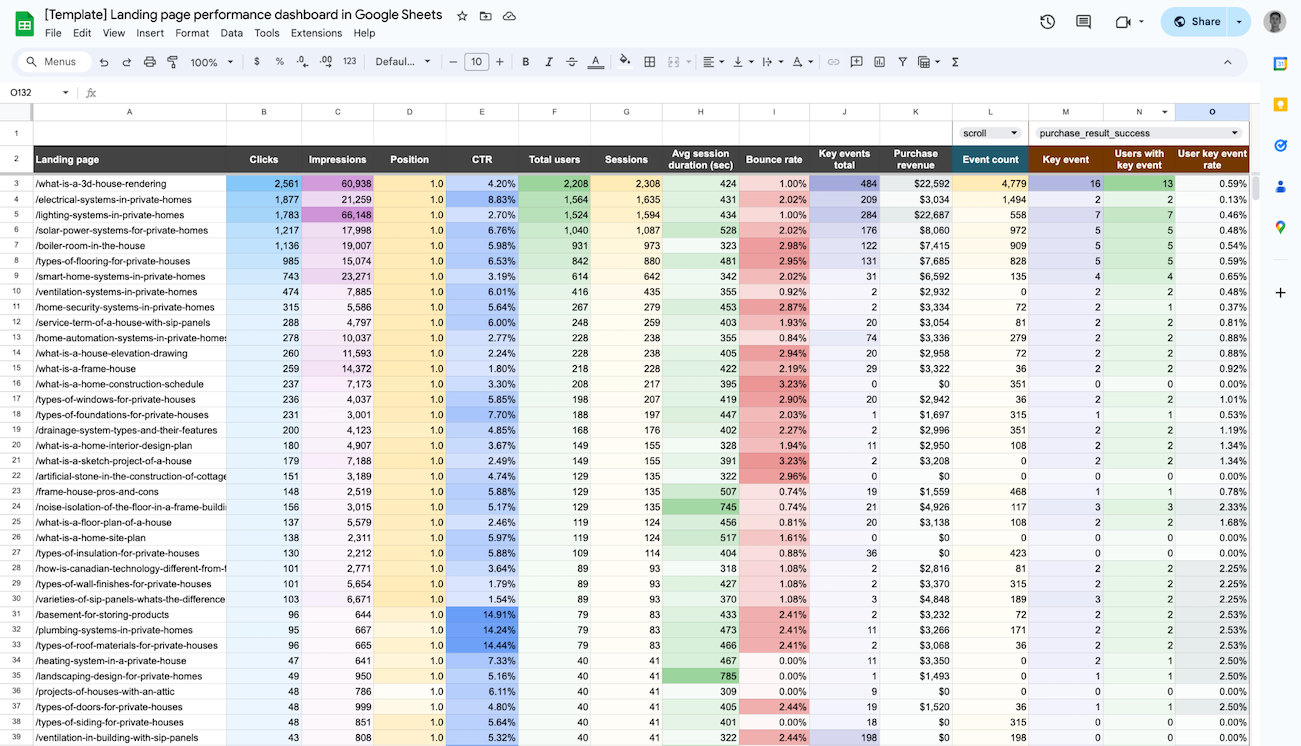
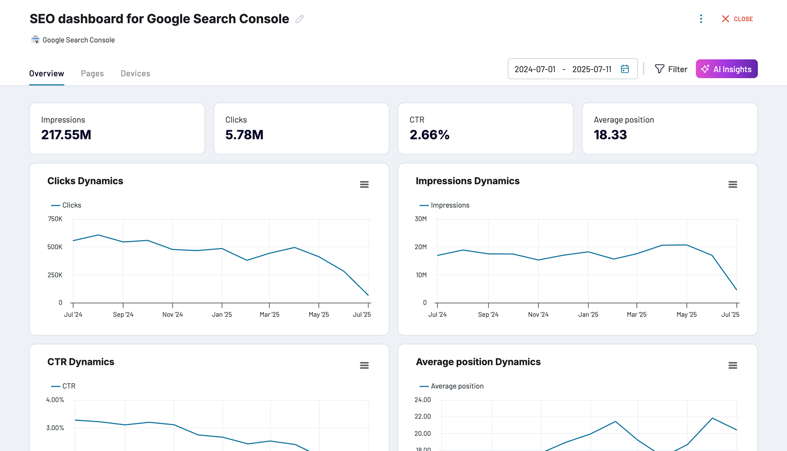
Page-level reports evaluate individual page effectiveness by merging search visibility data with user behavior and conversion metrics. Combining Google Search Console information on impressions and rankings with Google Analytics data on engagement and key events creates a complete picture of performance. These reports on an SaaS analytics dashboard identify pages that attract search traffic but fail to convert visitors, suggesting content alignment issues, while highlighting pages with strong conversion rates that deserve increased SEO investment.
What insights you can get with the SaaS reporting dashboard
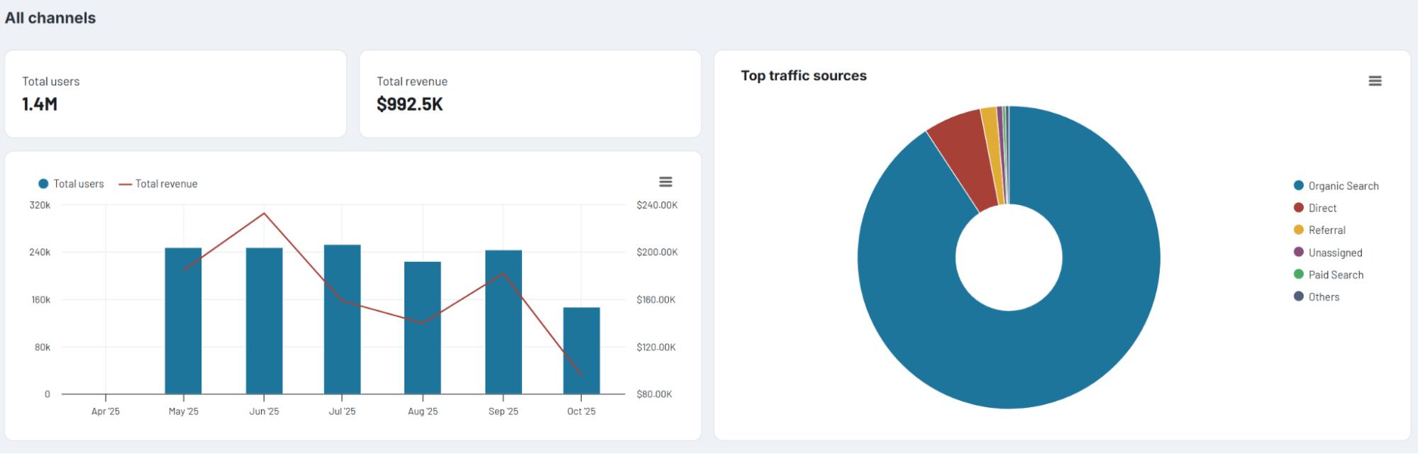
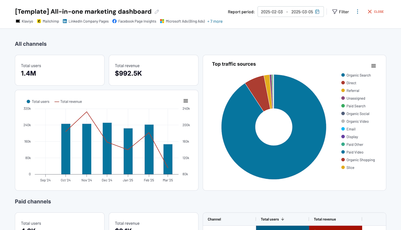
View high-level performance summaries across paid advertising, organic search, social media, email campaigns, and video content through pie chart visualization. The dashboard shows each channel's share of total traffic and revenue compared to your overall marketing mix. You can identify channel concentration risks, discover reallocation opportunities, and assess which channels deliver the strongest return on marketing investment.
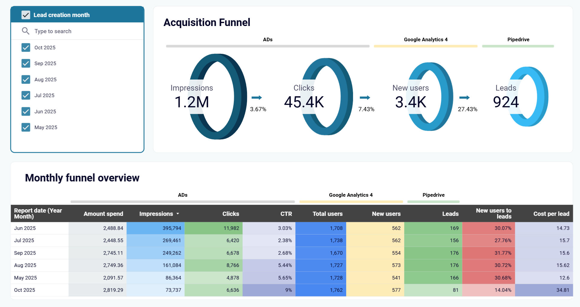
Monitor month-over-month trends in advertising spend, impressions, clicks, website users, and CRM conversions to uncover performance patterns. The dashboard identifies best-performing months and links them to specific campaigns, budget shifts, or seasonal factors. You can replicate successful strategies, allocate resources effectively, and use historical data to support revenue forecasting and resource planning.
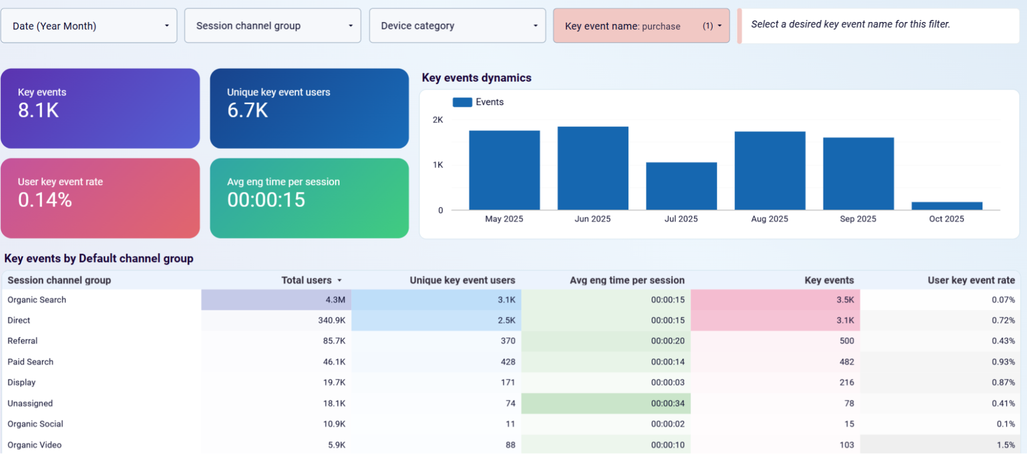
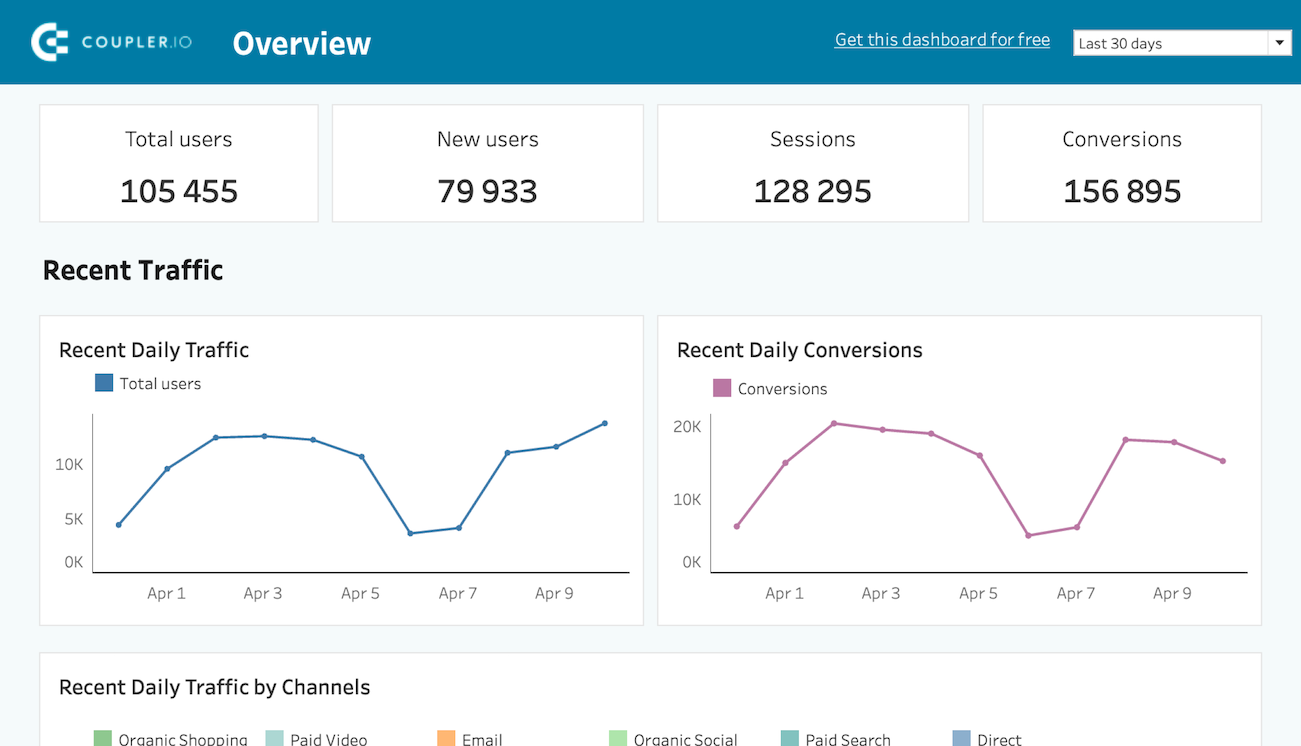
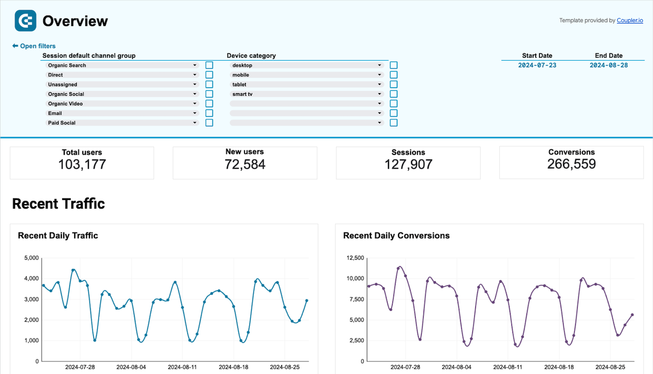
Track key event volume, unique users who completed events, and user key event rates with daily trend analysis. The dashboard displays event dynamics over time and breaks down performance by channel groups, including organic search, paid search, referral, and direct traffic. You can filter by specific key event names to analyze individual conversion actions and compare average engagement time across different traffic sources.
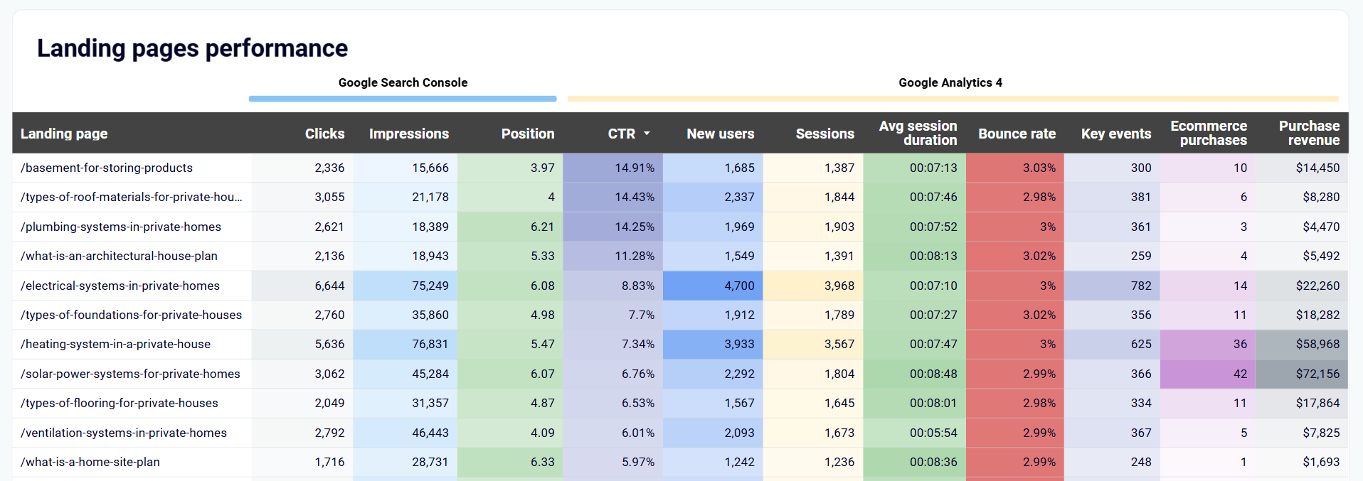
Analyze users with key events, user key event rates, and purchase revenue per page to identify which pages generate the most business value. The dashboard pinpoints high-performing pages that drive revenue and highlights underperforming ones. You can guide decisions about optimization investment, focus content improvements, and adjust internal linking to guide users toward high-converting pages.
How to create a SaaS dashboard?

Metrics you can track with an SaaS dashboard template
Impressions measure how many times your ads or content appeared across advertising platforms and search results. This top-of-funnel metric indicates brand visibility and campaign reach. High impressions with low clicks suggest messaging or targeting problems, while growing impressions alongside stable click rates indicate successful audience expansion.
Clicks represent the number of times users engaged with your ads or search results by visiting your website. This metric bridges awareness and consideration stages, showing how effectively your messaging motivates action and which platforms drive the most engaged traffic to your SaaS product.
CTR calculates the percentage of impressions that result in clicks, measuring how compelling your ads and search listings are to your target audience. This quality indicator helps identify underperforming campaigns that need creative refreshes or targeting adjustments to reduce customer acquisition costs.
CPC measures how much you pay each time someone clicks on your paid advertisements across platforms like Google Ads, Facebook Ads, or LinkedIn Ads. This efficiency metric directly impacts customer acquisition costs. Monitor CPC trends to detect increasing competition, ad fatigue, or bidding strategy problems.
Total users counts unique individuals who visited your website during a specific period, combining new and returning visitors. This metric represents overall audience reach and product interest level. Track total users by acquisition source and geographic region to identify growth opportunities in specific markets.
New users measures first-time visitors to your website, indicating the effectiveness of your top-of-funnel marketing activities. This acquisition metric shows how successfully you attract potential customers who haven't previously interacted with your product. Compare new user volume across channels to identify the most effective campaigns.
Sessions represent individual visits to your website, with a single user potentially generating multiple sessions over time. This engagement metric indicates how frequently users return to explore your product or content. Track sessions per user to reveal engagement depth and product interest levels.
Average session duration calculates how long users typically spend on your website during each visit, measuring content engagement and product exploration depth. Longer sessions generally indicate strong interest and thorough product evaluation. Track session duration by traffic source to identify which channels attract engaged users.
Key events track completion of specific high-value actions like trial signups, demo requests, feature activations, or subscription purchases that directly impact business outcomes. Monitor key event volume, conversion rates, and trends over time to assess marketing effectiveness and product-market fit across different acquisition sources.
Purchase revenue measures the actual monetary value generated from subscription purchases, upgrades, or other paid conversions tracked through Google Analytics. This ultimate success metric connects marketing investment to business impact. Attribute revenue to specific marketing channels, campaigns, and landing pages to calculate return on spend.