Power BI employee performance dashboard examples and reporting templates
Monitor team productivity, sales outcomes, and individual contributions by connecting your CRM and time-tracking tools to Power BI through Coupler.io. These automated dashboard templates pull data on a schedule you set, so you always work with recent numbers without manual exports or copy-pasting between platforms.
Power BI employee performance dashboard examples for every need


about your case. It doesn't cost you a penny 😉
Choose your Power BI employee performance dashboard template to kick off
What is a Power BI employee performance dashboard?
Coupler.io automates the data load into these Power BI templates on a recurring schedule. Once configured, the Power BI employee performance dashboards refresh without manual work, keeping your team's performance data ready for weekly reviews, quarterly planning, or ad hoc investigation.

What reports should be included in a Power BI employee performance dashboard?
Four report types cover the full picture of how your team spends time and closes deals. Based on the Power BI employee performance dashboard examples available through Coupler.io, these reports address the most common blind spots.
Billable hours that don't match earnings signal a problem nobody talks about until it's too late. This report surfaces monthly dynamics of tracked hours and billable amounts across projects and clients. A calendar view breaks down each team member's daily logged hours, making it simple to spot someone averaging five hours against a 40-hour contract or another person routinely exceeding nine hours a day. Use it to start workload conversations grounded in data rather than gut feelings.
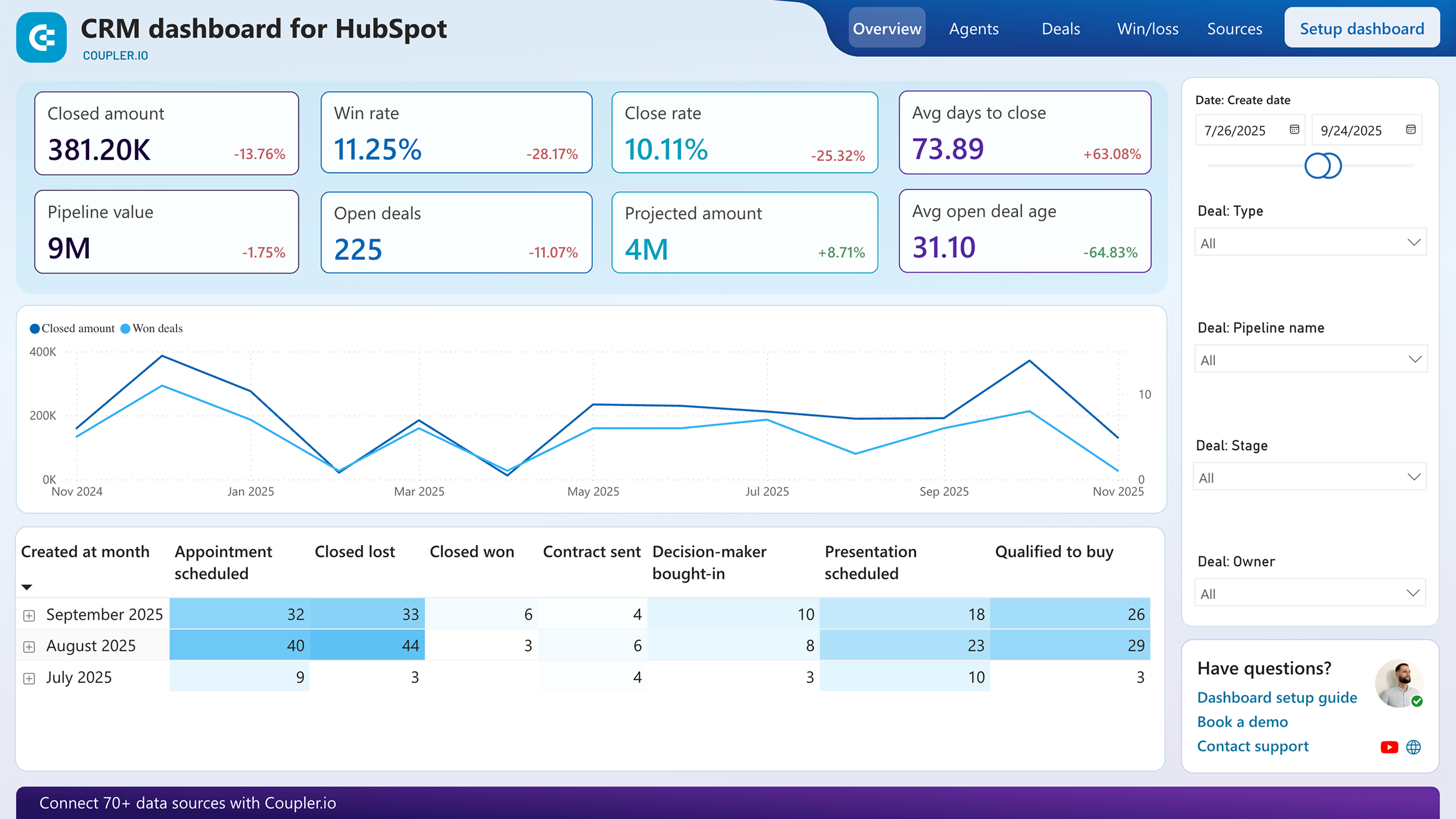
Unclosed deals pile up when nobody watches the middle of the funnel. This report segments open deals by owner, stage, revenue, and win probability so you can see exactly where negotiations stall. It also flags how long deals have remained inactive, giving you a measurable threshold for when follow-up becomes urgent rather than optional. Sales managers can use these signals to reassign stalled deals or adjust engagement tactics before opportunities go cold.
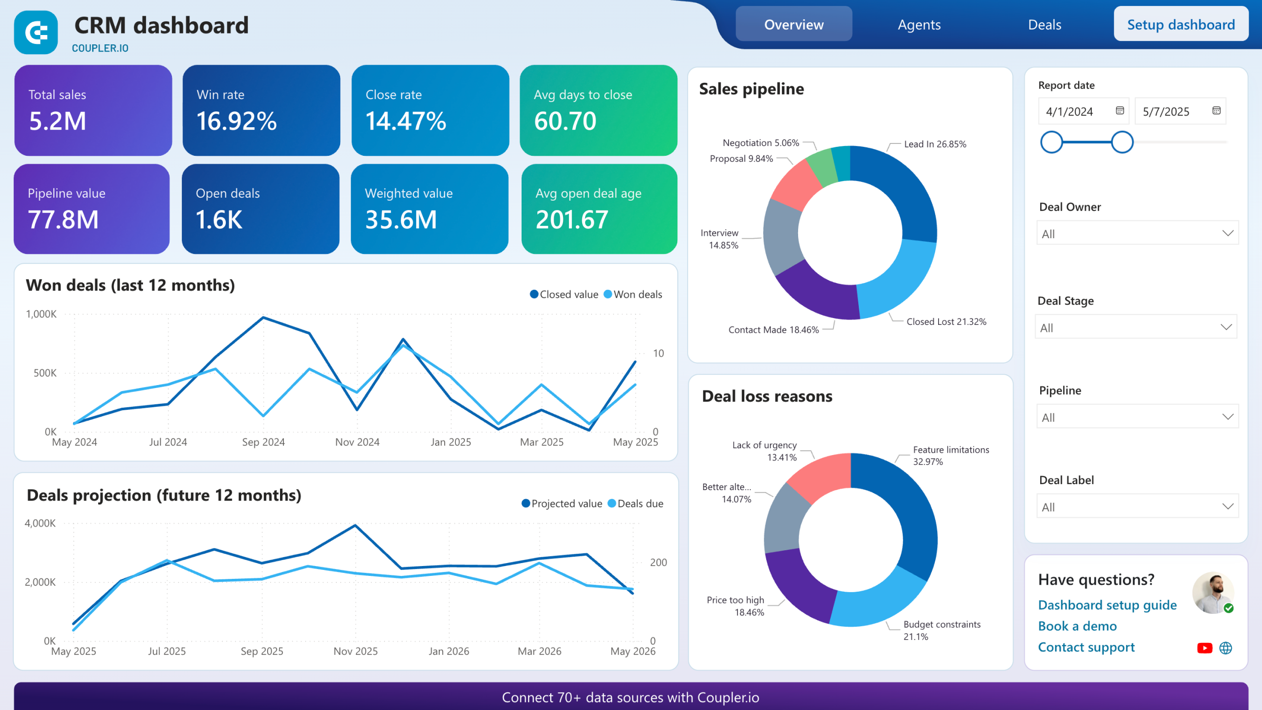
Winning patterns hide in closed-deal data. This report breaks down your best-won deals by company type, industry, and decision-maker role, revealing what high-value wins share in common. On the flip side, you get a clear view of lost and blocked deals with the reasons behind each outcome. Pairing the two tells you where to double down and what to stop repeating in your sales approach.
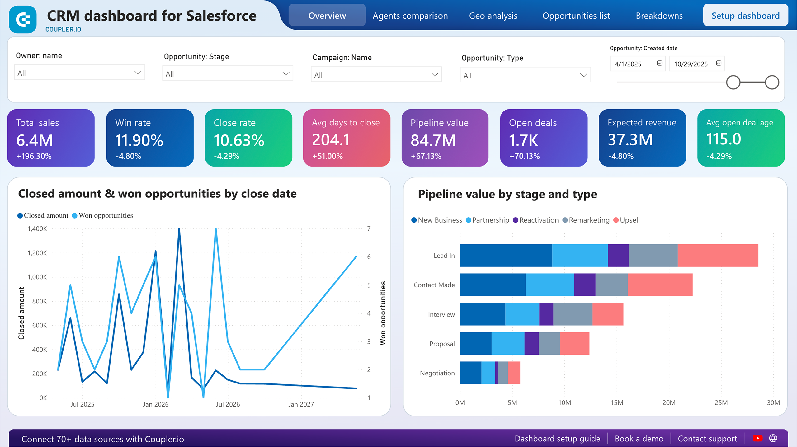
Not every rep handles the same deal types, so raw win counts mislead. This report compares team members by win rate, close rate, and average time to close, with pipeline progress charted per person. Segment by deal type or region to understand whether performance gaps reflect skill differences or deal allocation imbalances. It also surfaces which reps move deals through negotiation fastest, useful context when distributing high-priority opportunities.
What insights you can get with the Power BI employee performance dashboards
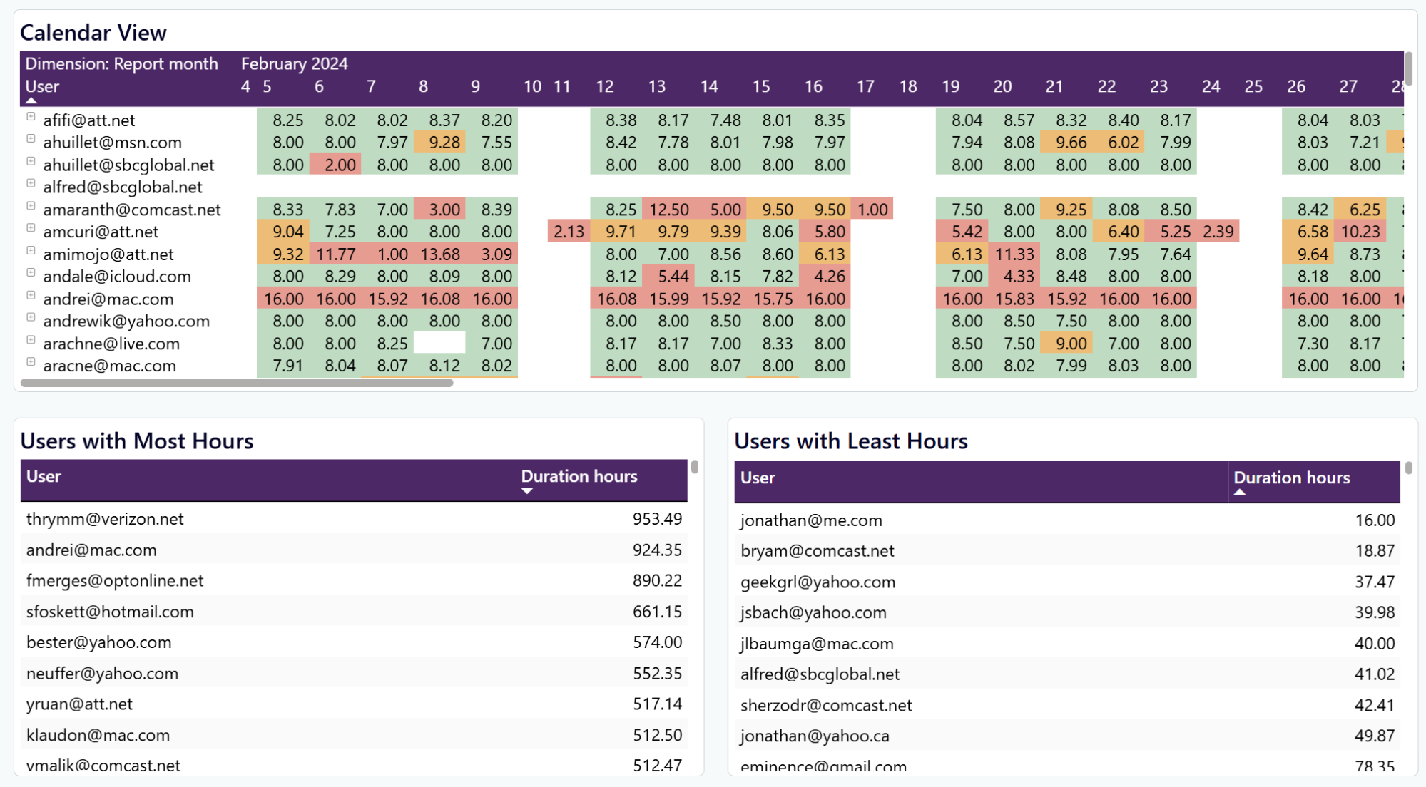
Isolate a specific team member in the calendar view and scan their daily hours across the full month. Someone consistently logging nine-plus hours on a 40-hour contract is a burnout risk. Someone averaging five hours a day may need a workload adjustment or a conversation about engagement. Catching these patterns early prevents turnover surprises.
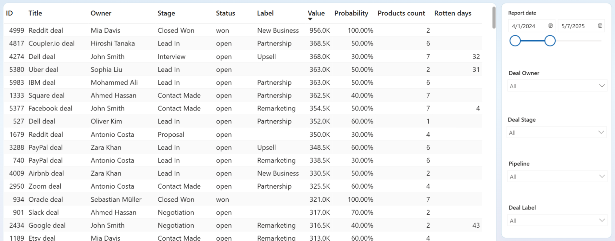
Filter unclosed deals by owner and sort by rotten days to compare how each rep manages open opportunities. One rep with 15 deals under 10 rotten days runs a tight pipeline. Another with 8 deals averaging 30-plus rotten days is losing momentum without noticing. This per-person view turns a vague "follow up more" directive into a specific coaching conversation.
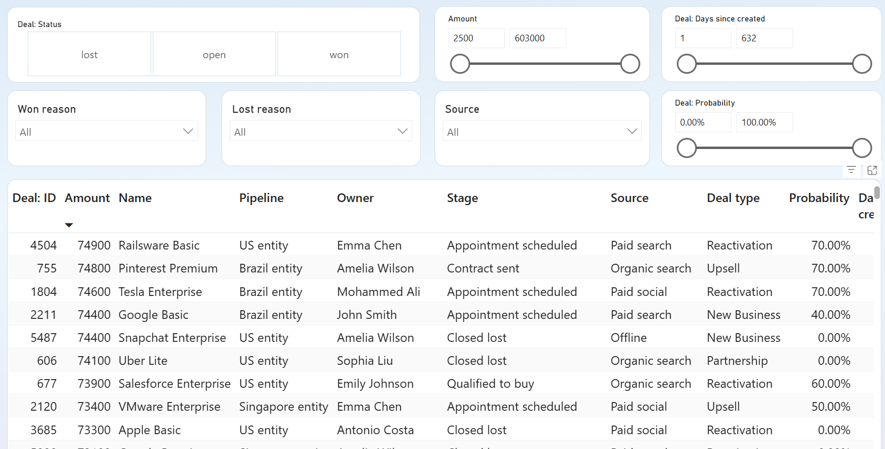
Filter by Deal Status to isolate won deals and sort by owner to see which reps close the highest-value opportunities. Cross-reference with deal type, source, and pipeline to spot patterns. If one rep wins Reactivation deals from paid search at double the rate of others, that strength is worth replicating across the team.
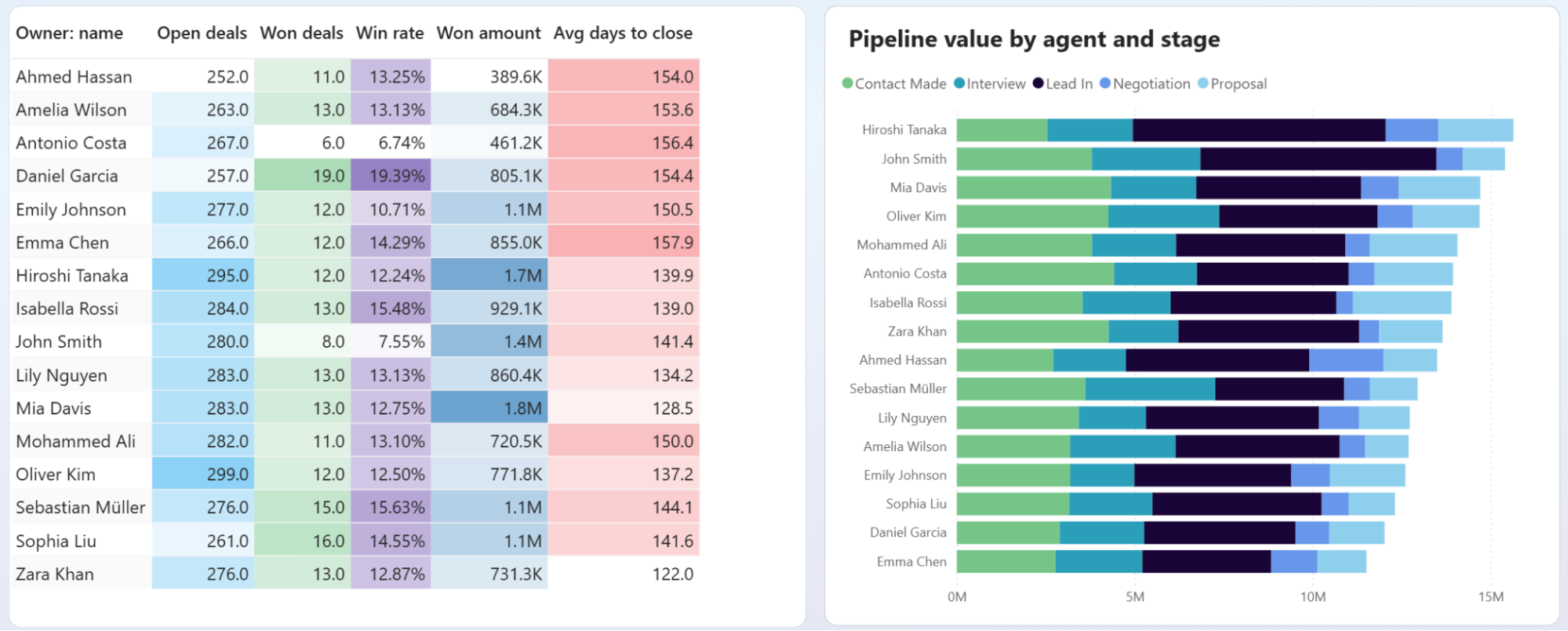
Compare team members side by side on closed amount, win rate, average days to close, and pipeline stage distribution. A rep with high deal volume but low win rate may be qualifying poorly. Another with few deals but fast close times might be ready for a larger territory. This breakdown replaces gut-feel assessments with measurable performance gaps.
How to create a Power BI employee performance dashboard template?

Metrics you can track with the Power BI employee performance dashboard
The total hours logged by each team member during a selected period. Comparing individual totals against contracted hours reveals who is overloaded and who has capacity, so you can rebalance workload before deadlines slip.
Revenue attributed to tracked time, broken down by project and client. When billable amounts drop while hours stay flat, something is absorbing your team's time without generating income. That gap is worth investigating before it widens.
The percentage of deals closed as won versus total deals. Segmenting win rate by owner shows which reps convert most consistently and where coaching might close the gap between top and bottom performers.
Total revenue from closed-won deals over a given period. Tracking this per rep alongside deal count distinguishes reps who close many small deals from those who land fewer but larger ones.
Open deals sitting in the pipeline without a resolution. A rising count of unclosed deals relative to total activity suggests either qualification problems at the top of the funnel or follow-up gaps in the middle.
Average elapsed time from deal creation to close. Long close times often correlate with specific deal types or stages. Filtering by owner helps you see whether speed differences reflect process discipline or deal complexity.
Expected revenue from upcoming opportunities weighted by win probability. This metric connects pipeline volume to forecasted outcomes, making it easier to judge whether your team's activity levels will hit quarterly targets or fall short.
The count of successfully closed deals in a period. Pairing this with revenue totals reveals average deal size, and tracking it over time shows whether your team's closing velocity is accelerating or flattening. Any Power BI employee performance dashboard template that tracks sales outcomes should include this metric.