Power BI cost analysis dashboard examples and reporting templates
Monitor advertising costs, revenue expenses, and campaign efficiency from a single interface. Coupler.io automates the data load from your ad platforms and accounting tools, so your Power BI cost analysis dashboards stay fresh on schedule without manual exports or copy-paste routines.
Power BI cost analysis dashboard examples for every need


 +4
+4


 +2
+2
about your case. It doesn't cost you a penny 😉
Choose your Power BI cost analysis dashboard template to kick off
What is a Power BI cost analysis dashboard?
Coupler.io connects these sources to Power BI and refreshes your data on a set schedule. You can start with a prebuilt Power BI cost analysis dashboard template or customize your own layout. Once configured, your Power BI cost analysis reporting dashboard stays up to date without manual file imports. You spend less time assembling reports and more time acting on what the numbers reveal.

What reports should be included on a meaningful Power BI cost analysis dashboard?
The best Power BI cost analysis dashboard examples combine data from advertising platforms, website analytics, accounting tools, and time-tracking apps. Effective Power BI cost analysis reporting dashboards include these four report types to surface the cost data most teams need.
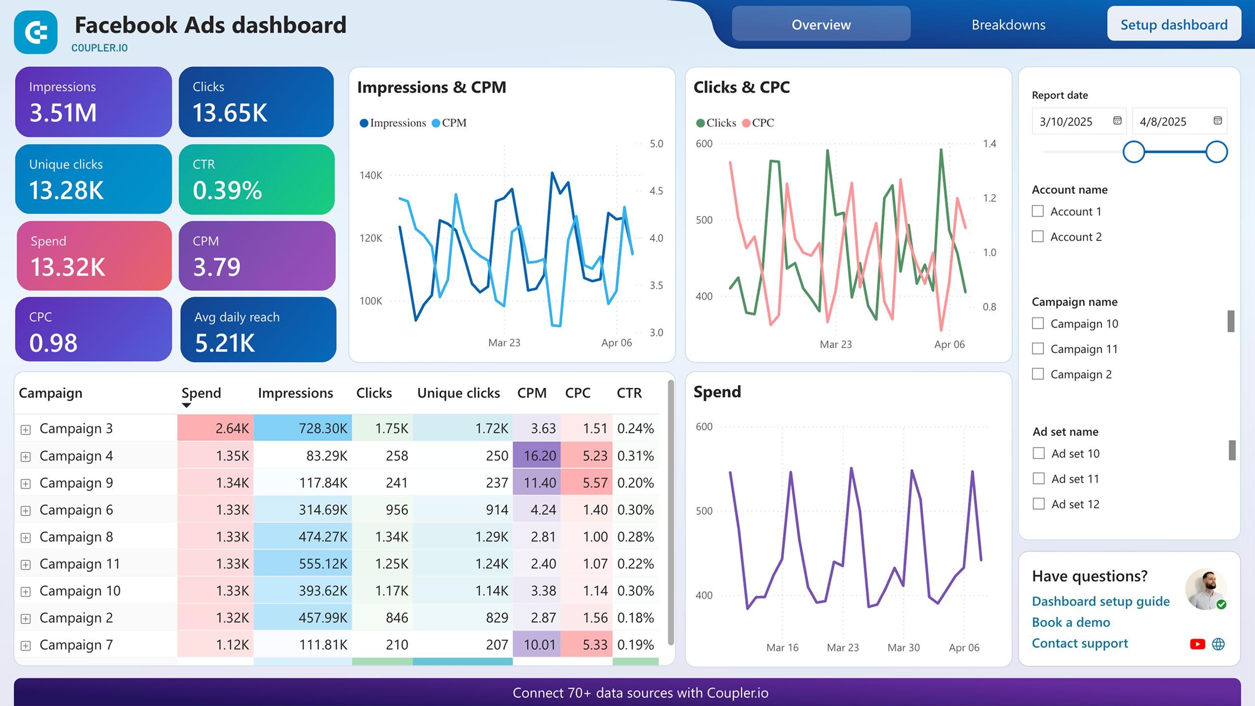
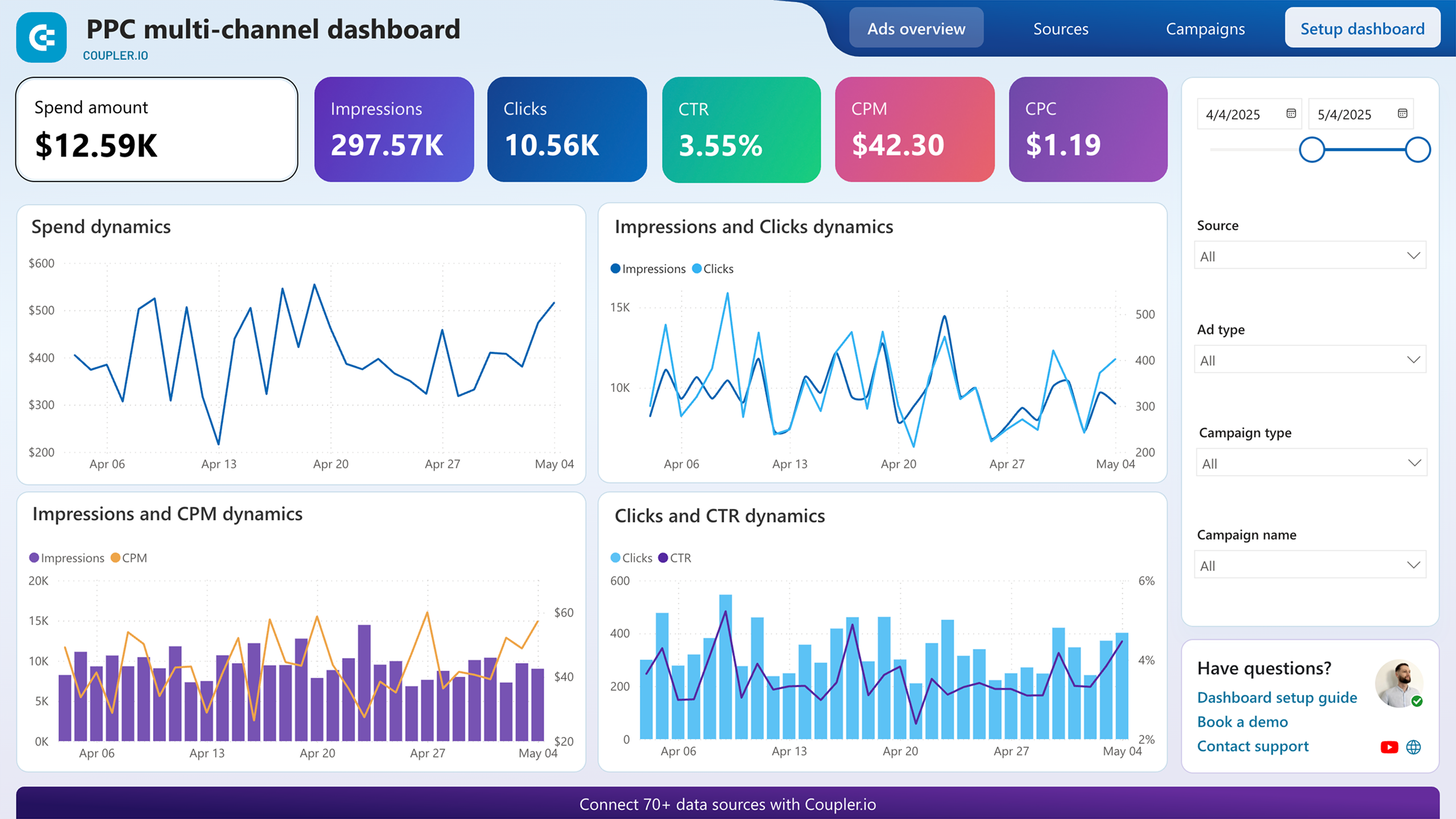
Your ad budget is split across multiple platforms, and each one reports spend differently. This report unifies cost data from every connected channel into a single table with impressions, clicks, spend, CTR, CPC, and CPM per source. Daily spend and CPC trend charts sit below, broken out by platform. Instead of logging into each ad account separately, you compare cost efficiency across all channels at once and catch overspending the day it happens.
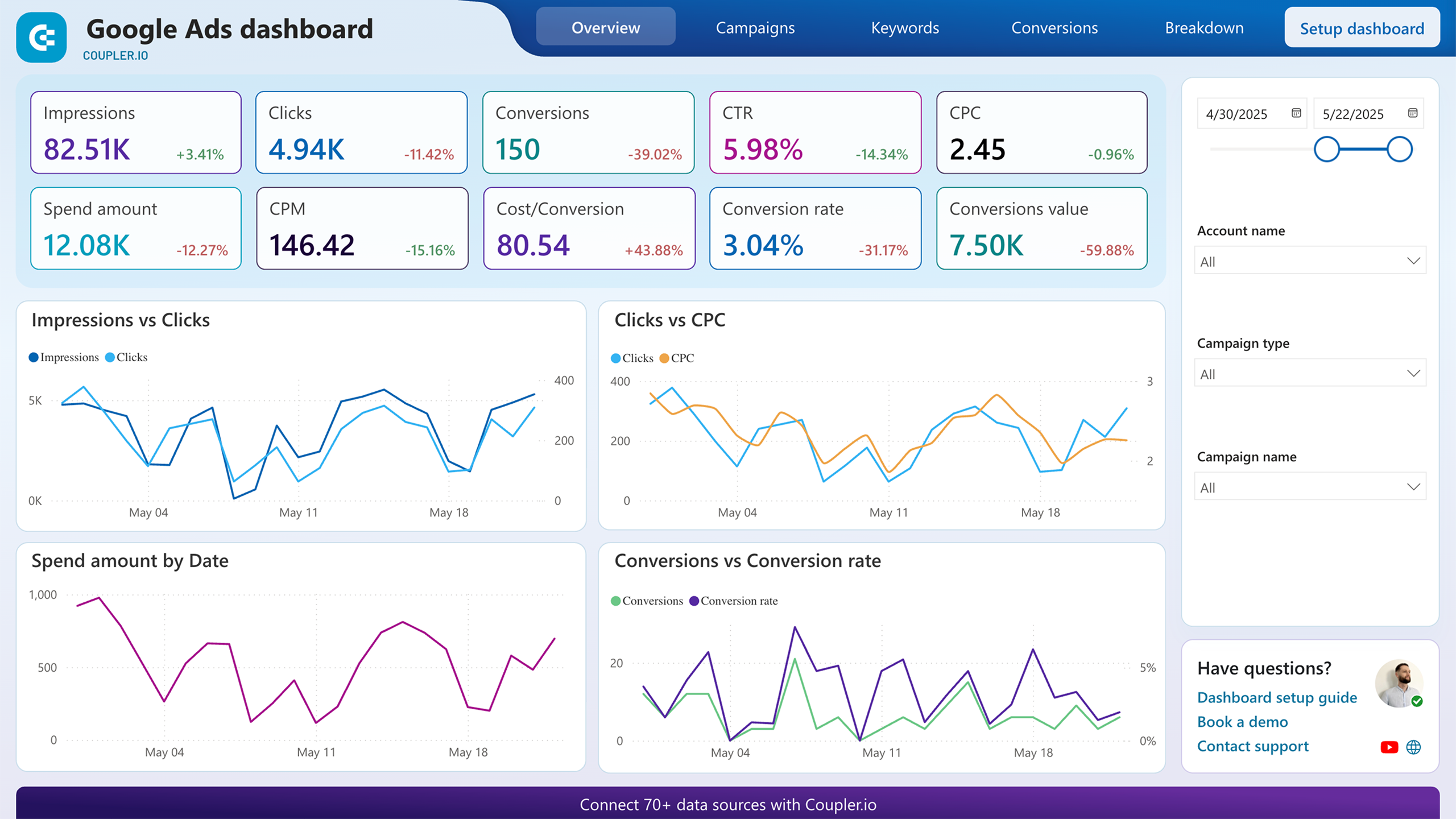
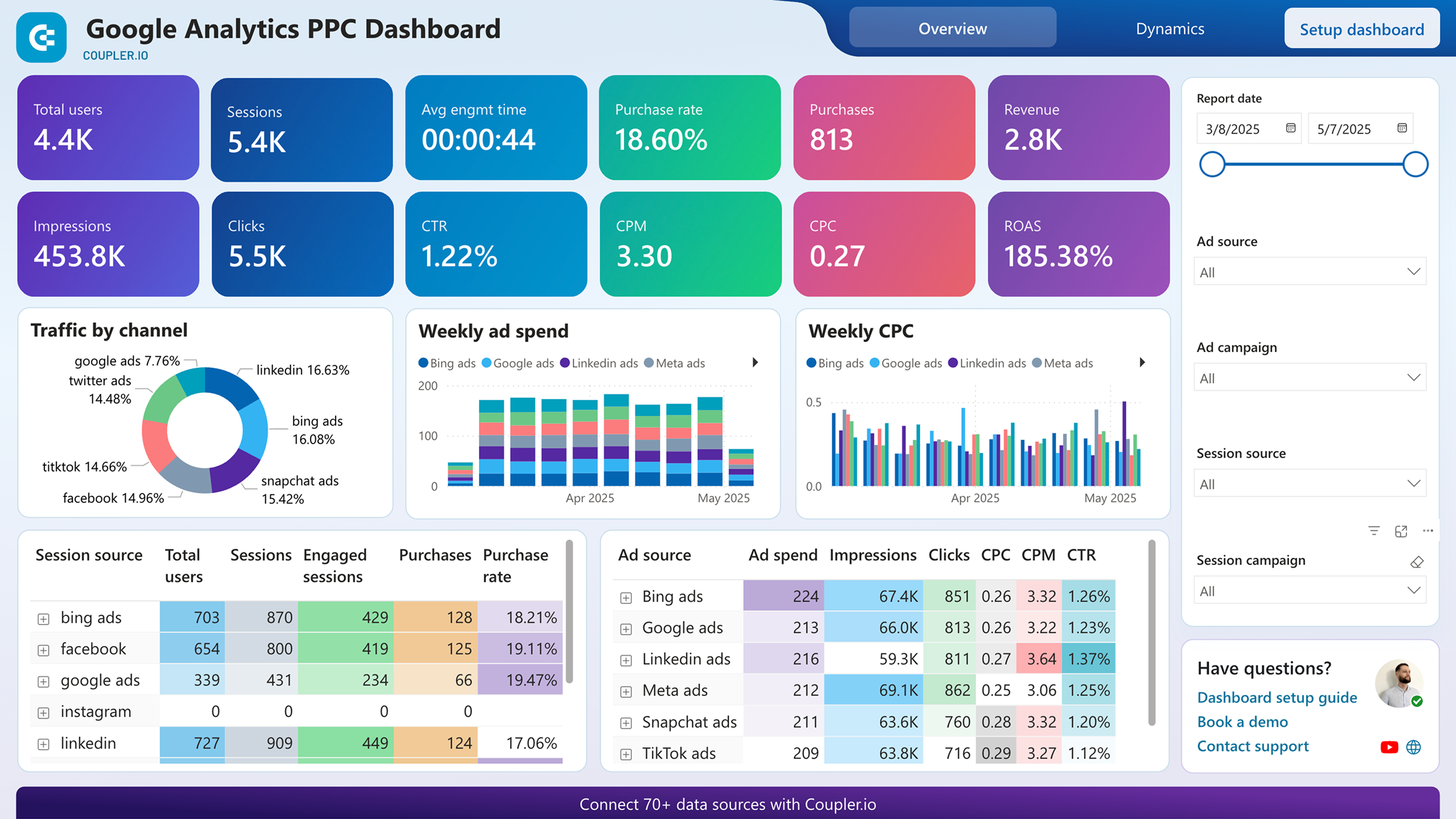
Ad clicks mean little if they never turn into purchases. This report pairs advertising metrics with website behavior tracked by your analytics platform. Scorecards display total users, sessions, purchases, revenue, and ROAS side by side with impressions, clicks, and CPC. Weekly spend and CPC charts break performance down by channel. When ROAS drops while spend stays flat, you know the problem is conversion quality, not budget size.
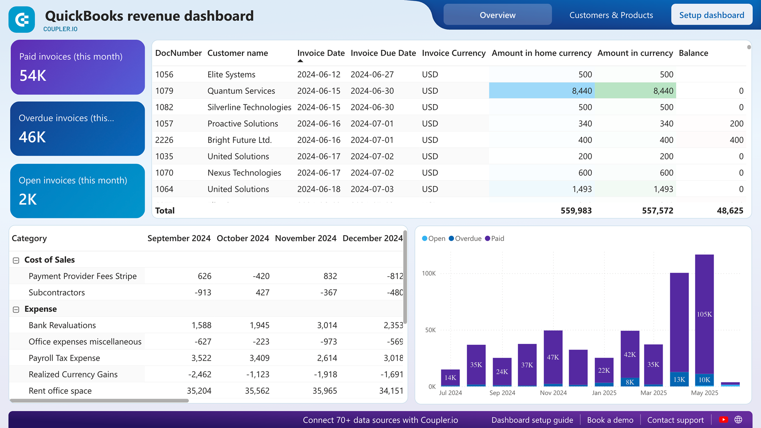
Revenue numbers alone hide the story underneath. This report shows monthly expenses by category, from payroll and rent to cost of sales and bank fees, next to invoice status breakdowns of paid, overdue, and open amounts. Watching a specific expense line climb over several months while revenue stays flat tells you exactly which cost center to investigate before margins collapse.
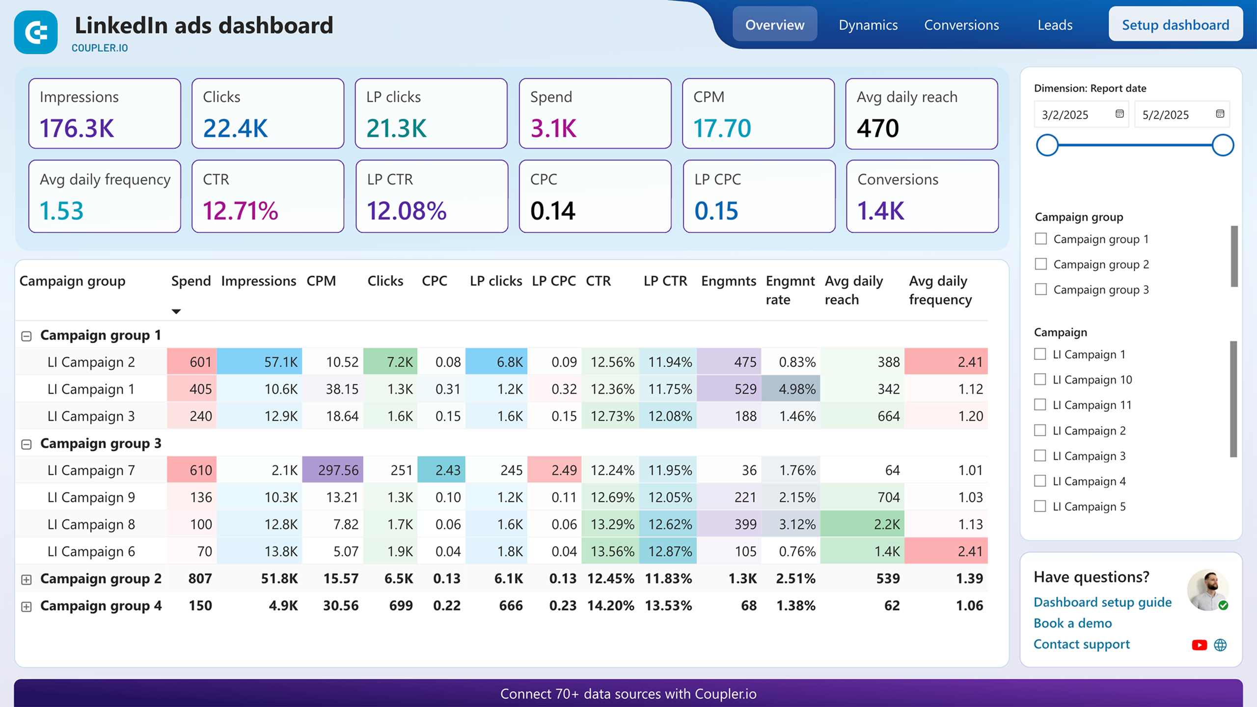
Not all conversions cost the same. This report tracks spend, total conversions, and cost per conversion for each campaign group. It also separates post-click from post-view conversions, so you can distinguish campaigns that drive direct action from those that influence decisions indirectly. The conversion trend line reveals whether costs are rising or stabilizing, giving you a clear signal on when to shift budget between campaign groups.
What insights you can get with Power BI cost analysis dashboards
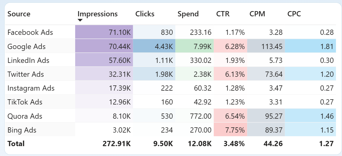
Compare CPC for every connected ad platform on a single screen. The Sources page ranks each channel by impressions, clicks, spend, CTR, CPM, and CPC in one table. A platform with a CPC three times higher than the rest stands out immediately, letting you investigate or reallocate before the gap widens.
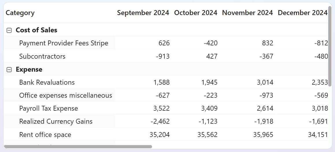
Trace how individual expense categories shift month over month. The expense table breaks costs into line items such as payroll, rent, and payment provider fees across consecutive months. A category that jumped 20% in a single period is easy to miss in a general ledger but impossible to overlook when four months sit side by side.
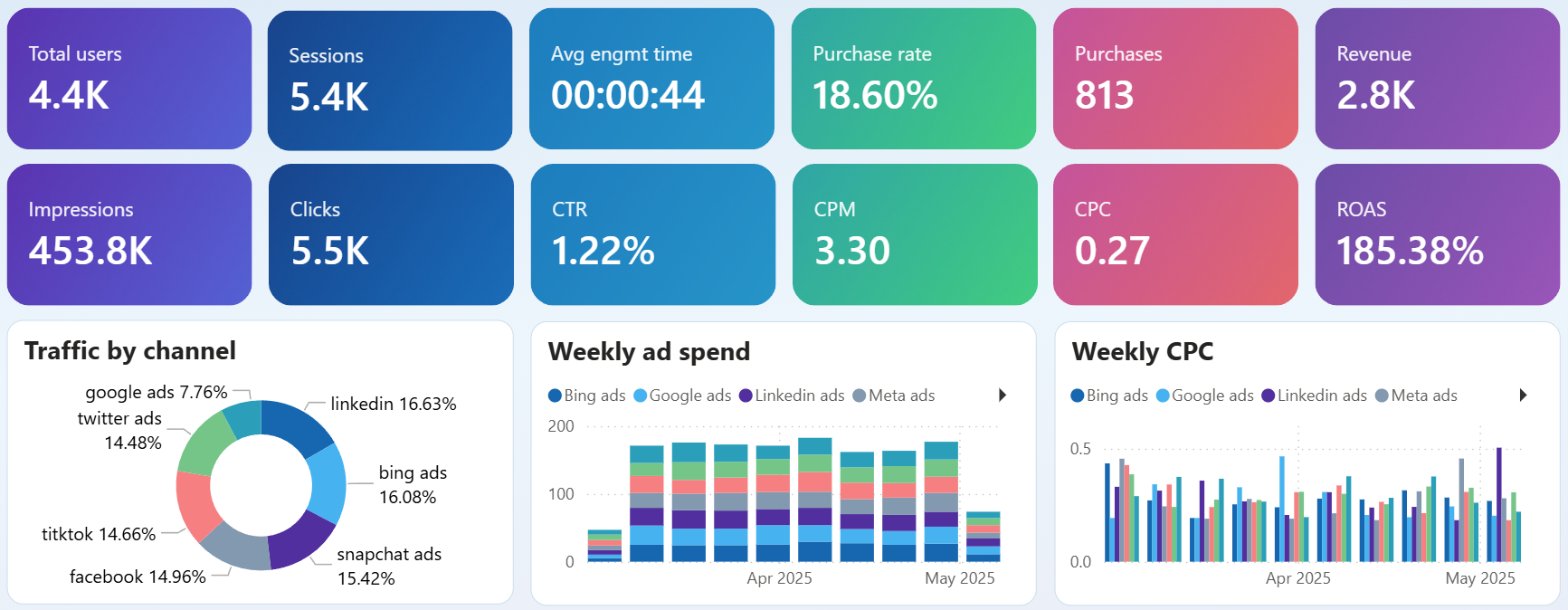
Match weekly ad spend against purchases and revenue to spot the moment ROAS starts declining. The overview page shows a stacked spend chart by channel alongside purchase count and revenue scorecards. When spend climbs but purchases flatten, you know the added budget is no longer converting at the same rate.
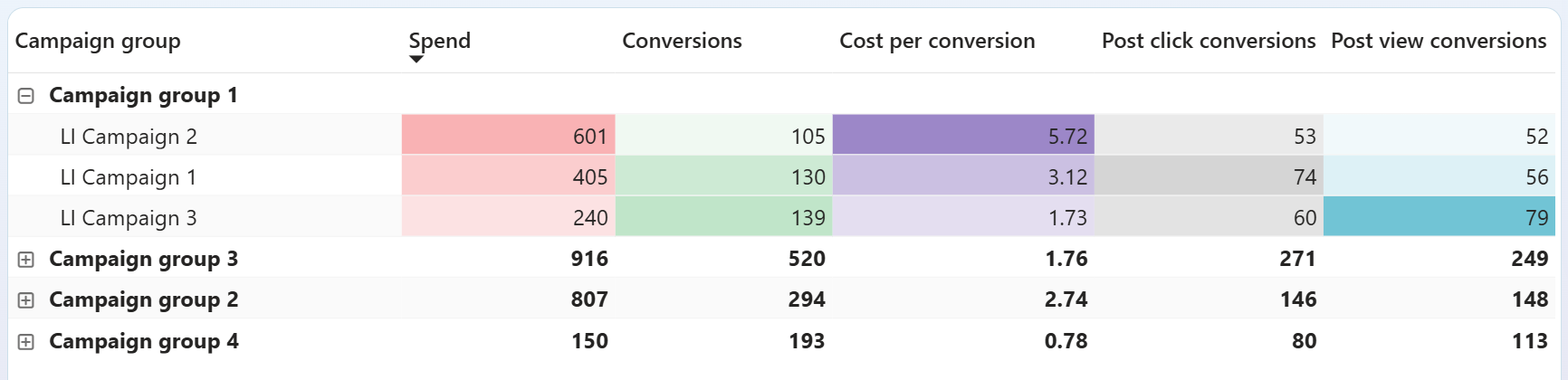
Rank campaign groups by cost per conversion to decide where your next dollar goes. The conversions table lists each group's spend, conversion count, and cost per conversion. A group delivering conversions at half the cost of another is a clear candidate for more budget, while the expensive one needs creative or targeting changes.
How to create a Power BI cost analysis dashboard?

Metrics you can track with the Power BI cost analysis dashboard template
The total money spent on advertising across all connected platforms during the selected period. Tracking this number alongside results like clicks or conversions prevents budget drift, where small daily overages compound into significant monthly overruns.
The price you pay each time someone clicks your ad. Comparing CPC across platforms and campaigns reveals which channels deliver traffic cheaply and which ones charge a premium for the same type of visitor.
The cost to generate one thousand ad impressions. A rising CPM with stable click-through rates means you are paying more for the same visibility, a signal to review audience targeting or shift to less competitive placements.
The percentage of people who click after seeing your ad. A low CTR paired with high CPM suggests the ad is reaching people but failing to engage them, pointing to a creative or messaging problem rather than a targeting one.
Revenue generated for every unit of currency spent on advertising. A ROAS above 100% means campaigns are profitable on ad spend alone. Watching this number weekly catches efficiency drops before they eat into monthly results.
The ad spend required to produce one conversion action. Comparing this figure across campaign groups shows which audiences convert affordably and which ones need targeting, bidding, or creative adjustments to justify continued investment.
Total income recognized for the selected period from your accounting platform. Placing revenue next to advertising and operating costs in the same view shows whether growth in sales is outpacing growth in spending.
The monetary value of hours logged as billable during the selected period. When billable amounts drop while total tracked hours stay the same, it signals that team effort is shifting toward non-revenue work and project margins may be shrinking.