Payroll dashboard examples and reporting templates
Track your payroll costs, monitor team productivity across roles, and spot budget overruns before they happen with a payroll reporting dashboard that updates automatically. Stop exporting timesheets manually and start making smarter workforce decisions with real-time labor analytics.
Specifically visualized for

Looker Studio
Sources used
-
 Harvest
Key metrics:
- Payroll cost
- Average cost per user
- Tracked hours
- Total users
- Billable vs non-billable hours
- Payroll cost by role
- Hours distribution by employee
- Monthly payroll trends
- Role-based cost percentages
- Project-specific labor costs
Three challenges our payroll dashboard template helps resolve
- Budget overruns: Catch payroll expenses exceeding planned budgets before month-end by monitoring real-time spending against targets, with automatic calculations showing percentage of budget consumed and remaining balance across roles and individuals.
- Resource imbalance: Identify team members working excessive hours while others are underutilized through calendar heatmaps and daily hour tracking, enabling better workload distribution and preventing burnout or inefficiency.
- Hidden labor costs: Uncover which roles, projects, or clients consume disproportionate payroll resources by analyzing cost breakdowns and hourly rates, revealing opportunities to optimize team structure and project assignments.
What you will learn from the payroll reporting dashboard
This payroll analytics dashboard gives you complete visibility into your workforce costs by pulling data using the Coupler.io connector. You'll discover exactly how much you're spending on payroll across different roles, which employees are logging the most hours, and more.
- Which roles consume the most payroll budget? See a breakdown of spending by position—from tech specialists and strategy directors to product managers and data analysts. This will let you understand where your labor investments are concentrated and make informed staffing decisions.
- How do individual team members impact payroll costs? Track each employee's hours, cost per hour, and total contribution to your payroll budget. The calendar view reveals daily work patterns, helping you spot overwork, underutilization, or time-tracking errors that need correction.
- What are your monthly payroll trends? Monitor how labor costs change over time with trend charts showing both total costs and hours worked. Compare current spending against previous periods to catch budget overruns early and forecast future payroll needs based on historical patterns.
- How do different projects affect your labor costs? Link payroll expenses to specific clients and projects to understand true project profitability. See which initiatives require the most labor investment and whether your team allocation matches business priorities.
What reports you get with our payroll dashboards
A comprehensive payroll management dashboard should give you immediate answers about your labor costs, team productivity, and spending patterns without requiring you to dig through multiple reports or export data manually.
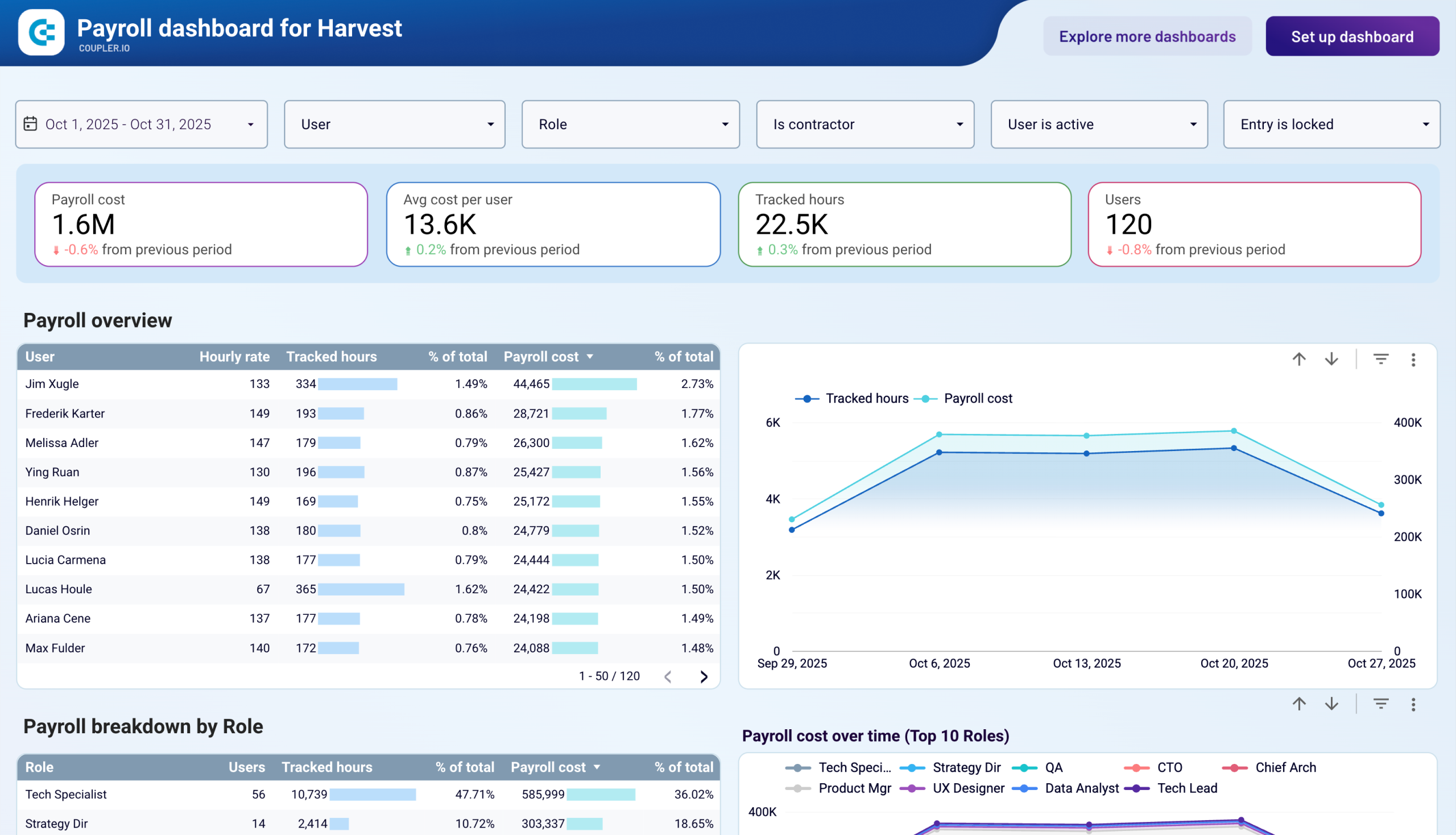
Payroll overview by employee
The foundation of any payroll metrics dashboard is a detailed breakdown showing each team member's tracked hours, hourly rate, percentage of total payroll, total cost, and percentage of hours worked. This report, featured in the Harvest payroll dashboard template, lets you instantly identify your highest-cost employees, spot utilization imbalances, and verify that compensation aligns with actual work patterns. When you notice someone contributing 3.14% of total hours but consuming 2.44% of payroll budget, you can evaluate whether rates match productivity.
Role-based cost analysis
Understanding how payroll expenses distribute across positions helps with strategic planning and budget allocation. The payroll reporting dashboard breaks down costs by role—showing which positions (tech specialists, strategy directors, product managers) drive the most spending and what percentage each represents of your total budget. This view reveals whether your team composition matches business needs and highlights opportunities to optimize through hiring, outsourcing, or restructuring.
Calendar view with daily tracking
A monthly calendar heatmap showing each employee's logged hours by day transforms abstract payroll data into actionable patterns. This report helps you identify mistakes (like 47-hour single-day entries), chronic underwork (averaging 5-6 hours when contracted for 8), or burnout risks (consistent 9+ hour days). The visual format in the payroll KPI dashboard makes pattern recognition immediate, enabling proactive management interventions before small issues become major problems.
Detailed timesheet breakdown
The granular details table showing user, email, role, contractor status, hourly rate, date, client, project, task, tracked hours, and payroll cost per entry gives you forensic-level visibility into every dollar spent. This report in the payroll metrics dashboard lets you drill down from high-level summaries to individual timesheet entries, perfect for auditing specific projects, verifying billing accuracy, or understanding exactly how team members allocate time across different work streams.
How to create a payroll dashboard?
Step 1
1
Go to the Readme tab where you can see instructions on how to set up the payroll dashboard template.
Step 2
2
Click the button to set up the Coupler.io connector for your data source account.
Step 3
3
Follow the instructions to prepare and load data to the dashboard.
Step 4
4
Go back to Coupler.io to configure the schedule for the data refresh of your payroll reporting dashboard.
