MRR, ARR dashboard examples and reporting templates
Track monthly and annual recurring revenue with an automated MRR, ARR dashboard that consolidates subscription data into actionable insights. Monitor plan performance, identify churn patterns before they impact revenue, and optimize pricing strategies with visibility into subscription growth rates, customer retention metrics, and ARPU trends across all billing cycles.
Specifically visualized for

Coupler.io Dashboard

Looker Studio
Sources used
-
 Stripe
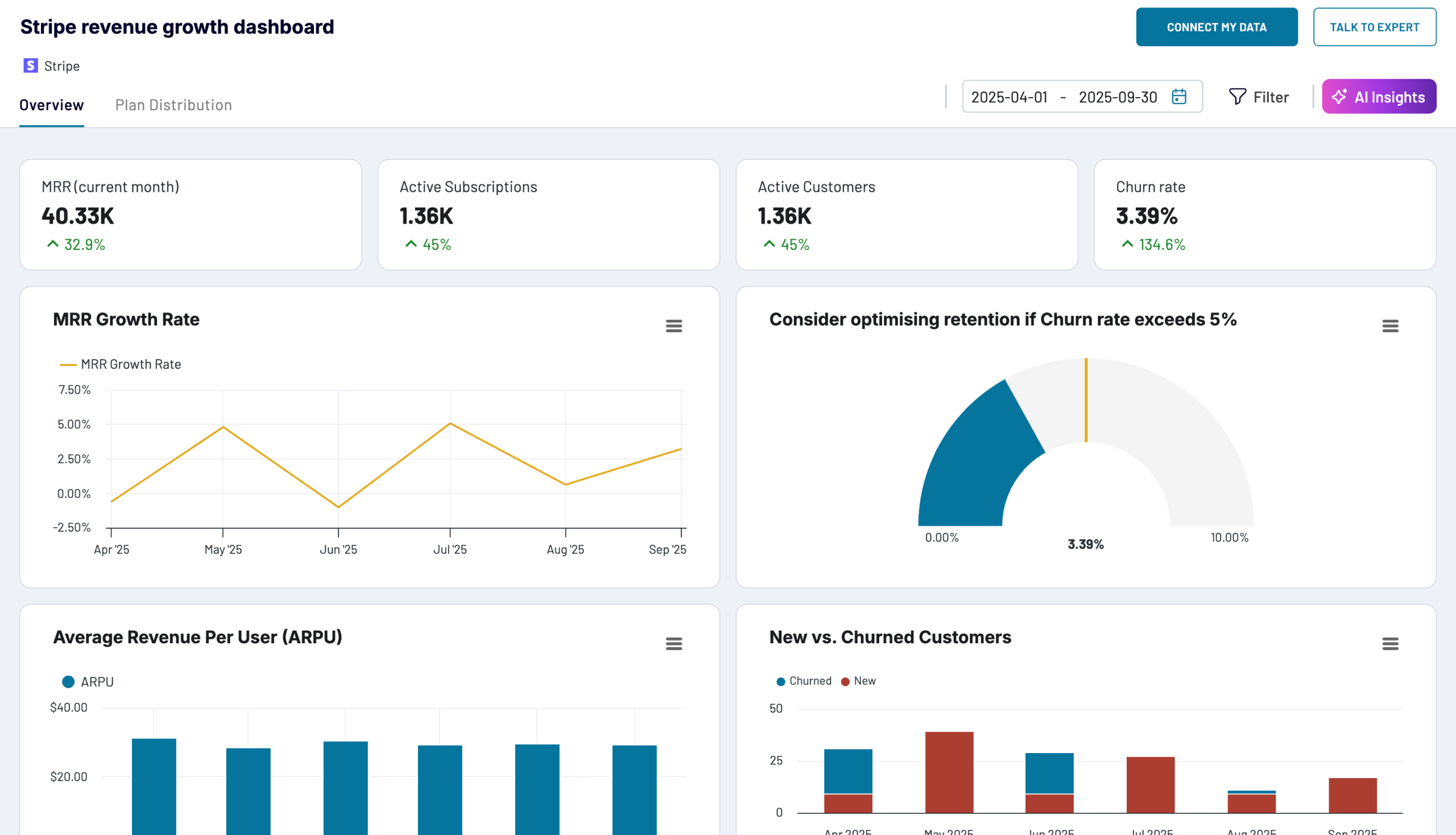
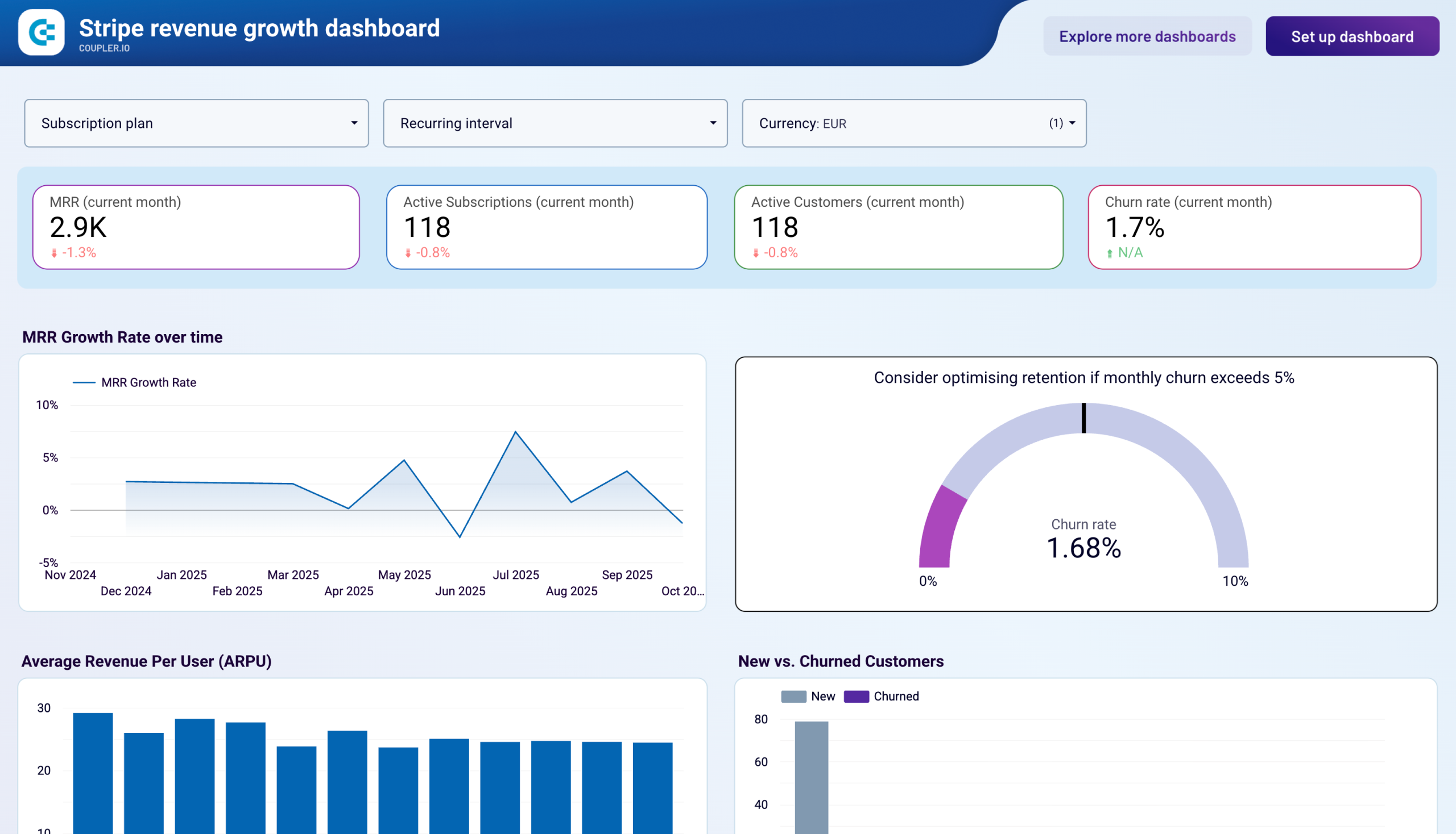
Key metrics:
- Monthly Recurring Revenue (MRR)
- Average Revenue Per User (ARPU)
- MRR Growth Rate
- Active Subscriptions
- Active Customers
- Churn Rate
- New Customers
- Churned Customers
Three challenges our MRR, ARR dashboard template helps resolve
- Unpredictable revenue forecasting: Track MRR growth rate patterns and subscription momentum to create accurate revenue projections based on historical performance rather than guesswork, enabling confident financial planning and investor reporting with data-backed growth narratives.
- Hidden churn problems eroding growth: Identify retention issues before they damage revenue by monitoring new versus churned customer ratios monthly, correlating churn spikes with specific business events to implement targeted retention campaigns that prevent accelerating customer loss.
- Unclear pricing strategy effectiveness: Determine which subscription tiers generate sustainable revenue growth by analyzing plan-level MRR trends and revenue distribution, revealing underutilized pricing tiers with strong momentum that deserve priority in marketing and sales efforts.
What you will learn from the MRR, ARR dashboard
You can use this MRR dashboard to measure subscription business performance and track recurring revenue patterns across different billing cycles. The dashboard helps you understand which factors drive revenue growth and where retention challenges exist. Simply connect your data source account using Coupler.io, and you'll learn:
- Which subscription plans generate the most sustainable revenue? Track MRR over time by plan to identify which pricing tiers drive consistent growth versus those showing stagnation. The plan distribution analysis reveals whether revenue concentration in lower-tier subscriptions limits expansion potential, helping you prioritize upselling strategies and product development efforts for high-value tiers.
- How does customer acquisition balance against churn? Monitor new versus churned customers monthly to determine if growth momentum is sustainable or if retention problems are eroding your customer base. The Stripe ARR dashboard correlates churn spikes with specific business events, price changes, or seasonal patterns, enabling proactive retention campaigns before customer loss accelerates.
- Is revenue growth driven by more customers or higher-value customers? Compare ARPU trends alongside customer count changes to understand whether expansion comes from volume growth or increased customer value. This insight informs whether to focus marketing budgets on acquisition campaigns or invest in expansion and upselling programs that increase revenue per existing customer.
- What revenue can you forecast based on current subscription momentum? Analyze MRR growth rate patterns to create accurate revenue projections for investor reporting and strategic planning. Consistent growth trends combined with subscription retention data enable confident forecasting of when specific revenue milestones will be reached.
What reports you get with our MRR, ARR dashboard examples
An effective MRR, ARR dashboard should provide visibility into both revenue health and the underlying subscription dynamics driving that revenue. The following reports transform raw billing data into actionable insights for subscription business management.
MRR growth rate and plan performance trends
The revenue growth dashboard displays MRR over time by plan through multi-line charts showing revenue trends for each subscription tier, combined with percentage distribution pie charts revealing current revenue composition. By tracking how different subscription plans contribute to total revenue over months, you can identify which pricing tiers drive consistent growth and prioritize product development for high-value tiers.
New versus churned customer analysis
The Stripe MRR dashboard presents new versus churned customers through stacked bar charts comparing monthly acquisition against cancellations, making retention issues immediately visible. The accompanying monthly table includes churn rate percentages and absolute customer numbers, allowing correlation of churn spikes with specific business events to enable targeted retention campaigns before customer loss accelerates.
Average revenue per user tracking
The Stripe ARR dashboard displays ARPU through monthly bar charts showing revenue per customer trends, combined with detailed tables presenting ARPU alongside customer counts and MRR. This report reveals whether revenue growth stems from acquiring more customers or increasing existing customer value, informing strategic decisions between scaling acquisition campaigns or investing in expansion programs.
Subscription plan distribution breakdown
The MRR, ARR dashboard templates include plan performance tables showing monthly MRR breakdown by subscription type with grand totals, enabling identification of revenue concentration risks. By analyzing which subscription tiers represent the largest revenue percentages and strongest growth rates, you can optimize marketing spend toward high-performing plans and eliminate underperforming pricing options.
How to create an MRR, ARR dashboard?
Step 1
1
Go to the Readme tab where you can see instructions on how to set up the MRR, ARR dashboard template.
Step 2
2
Click the button to set up the Coupler.io connector for your data source account.
Step 3
3
Follow the instructions to prepare and load data to the dashboard.
Step 4
4
Go back to Coupler.io to configure the schedule for the data refresh of your MRR, ARR dashboard.
