MailerLite dashboard examples and reporting templates
Monitor your email marketing performance with automated MailerLite dashboards that consolidate campaign engagement, automation workflow data, and segment-level metrics. Track deliverability health, compare how different subscriber groups respond to your messaging, and follow subscriber progress through every automation step without manual exports.
MailerLite dashboard examples for every need


about your case. It doesn't cost you a penny 😉
Choose your MailerLite dashboard template to kick off
What is a MailerLite dashboard?
You can track how campaigns perform from send to click, monitor subscriber progress through automation sequences, and compare engagement across audience segments. No need to switch between separate MailerLite reports or exporting data manually. Coupler.io connects to your MailerLite account and refreshes the data on a schedule, so the MailerLite dashboard always reflects recent activity without extra effort on your end.

What reports should be included in MailerLite dashboards?
Email marketing performance breaks down into several distinct areas, which must be covered in a MailerLite dashboard. Each requires its own report to surface the right level of detail. Here are four reports that cover the most actionable parts of MailerLite analytics.
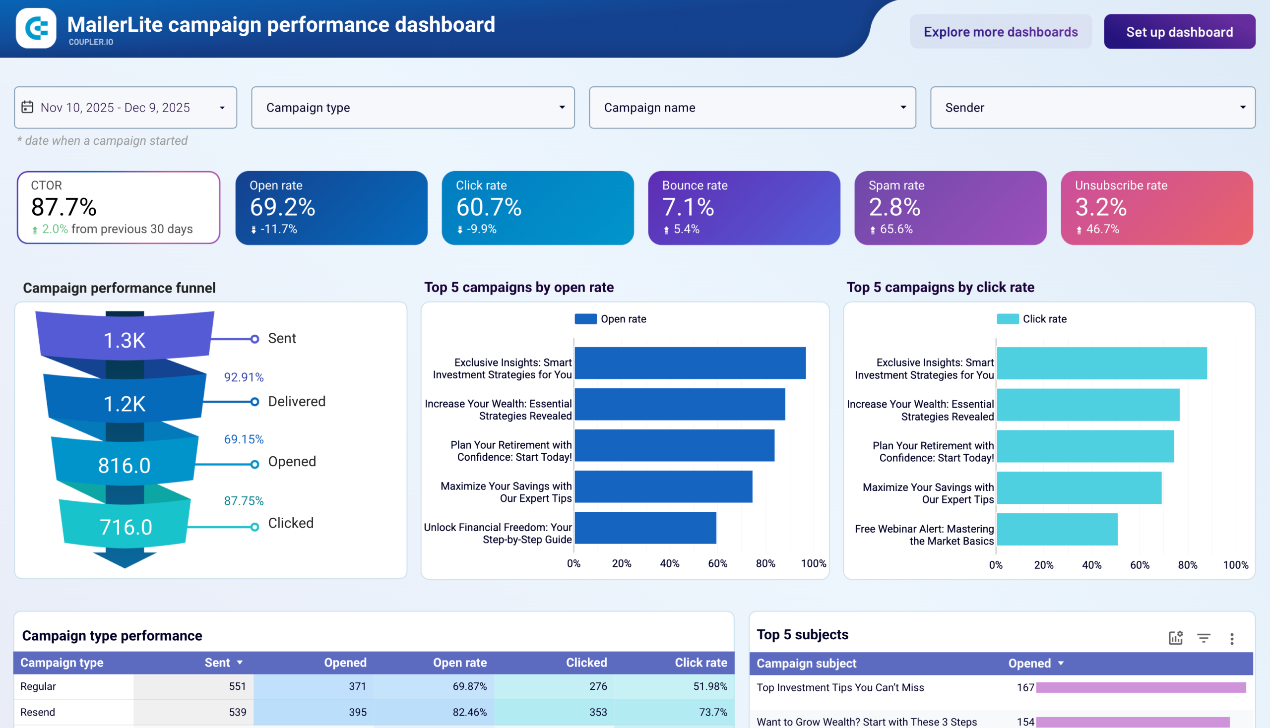
This report tracks engagement across all your MailerLite campaigns, showing a funnel from emails sent through delivered, opened, and clicked. It surfaces top-performing campaigns by open rate and click rate, compares results across campaign types (regular, resend, A/B split), and ranks subject lines by engagement. The campaign details table flags deliverability issues like elevated bounce, spam, or unsubscribe rates per send, so you can catch problems before they affect sender reputation.
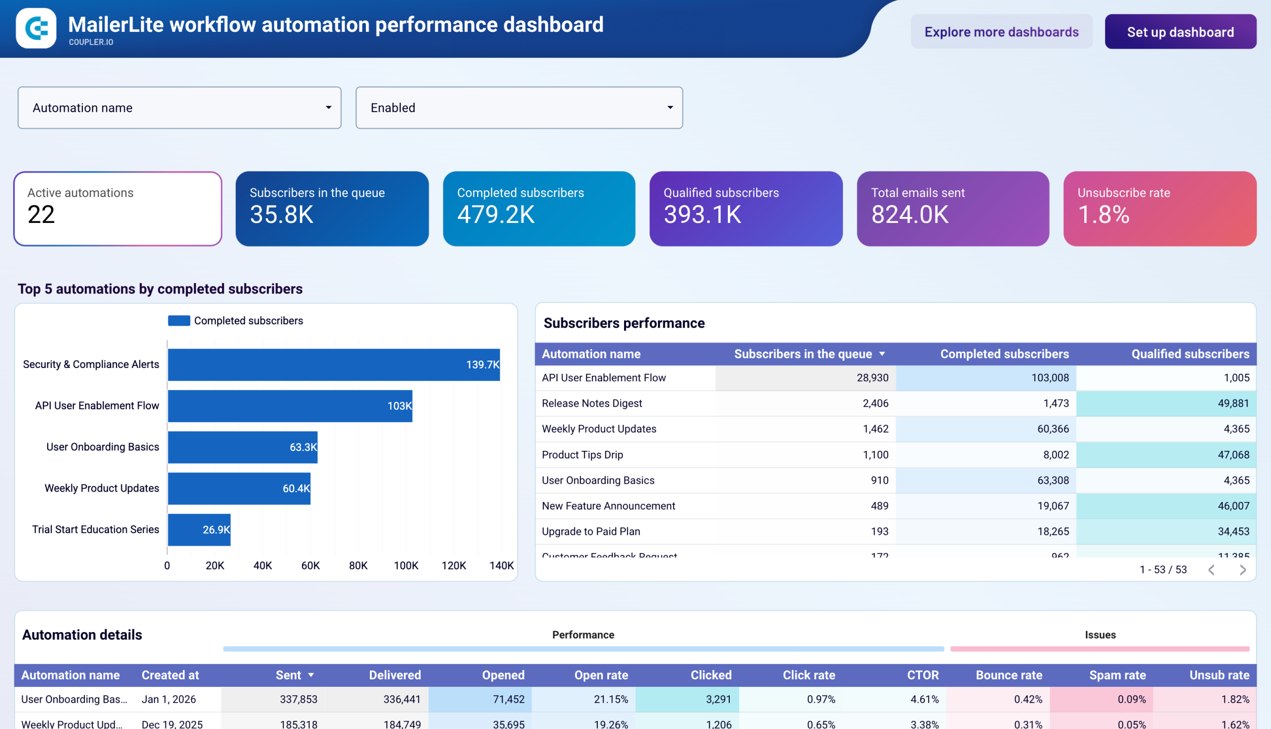
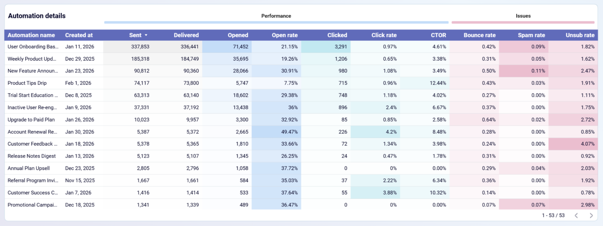
The automation report monitors every active workflow in your account, showing how many subscribers are queued, completed, and qualified in each sequence. KPI cards display totals for active automations, emails sent, and unsubscribe rate across all workflows. A ranking of top automations by completed subscribers helps you identify which sequences are driving the most throughput. Delivery and engagement columns — including open rate, click rate, CTOR, and bounce rate — reveal which automations need content or timing adjustments.
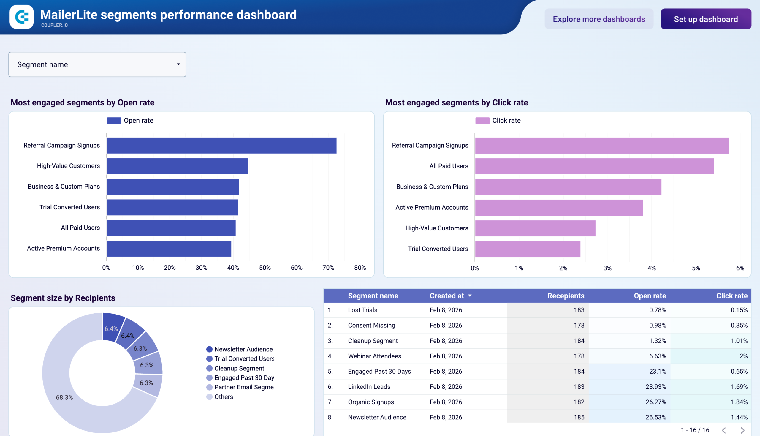
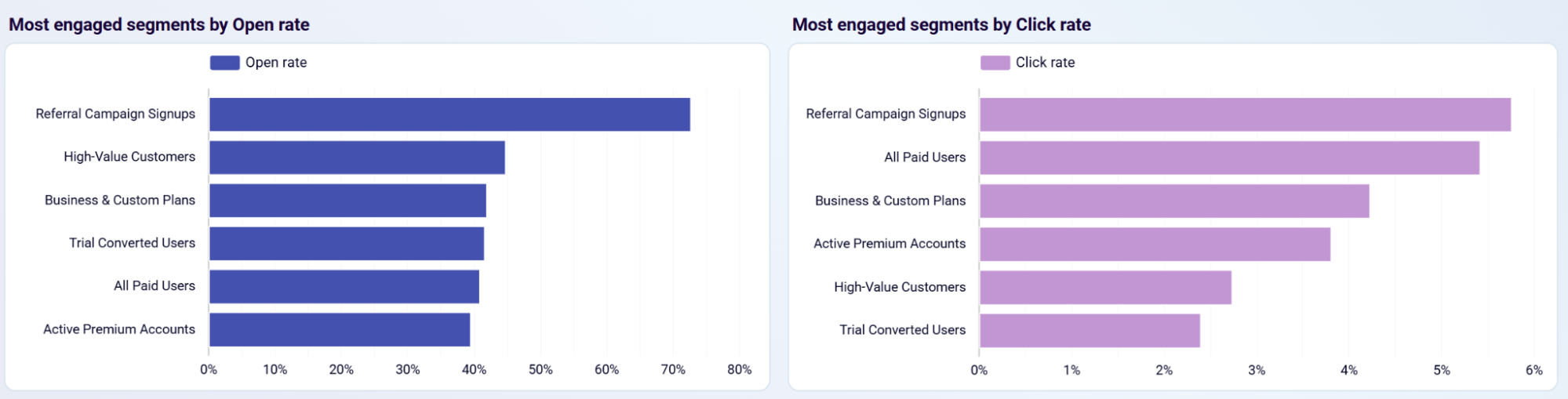
This report compares how different subscriber segments respond to your campaigns. Side-by-side bar charts rank segments by open rate and click rate, while a donut chart shows each segment's share of your total recipient base. The segment details table lists creation date, recipient count, and engagement metrics for every segment. This view helps you separate high-value audiences from underperforming groups and decide where to invest content resources or run re-engagement campaigns.
Deliverability data is spread across both the campaign and automation reports. Campaign-level metrics flag individual sends with high spam complaints or bounce rates. Automation-level metrics highlight workflows where unsubscribe rates exceed your internal thresholds. Together, these reports give you a unified view of sender reputation risks and list hygiene issues — from isolated campaign problems to systemic patterns across your automation program.
What insights you can get with a MailerLite reporting dashboard
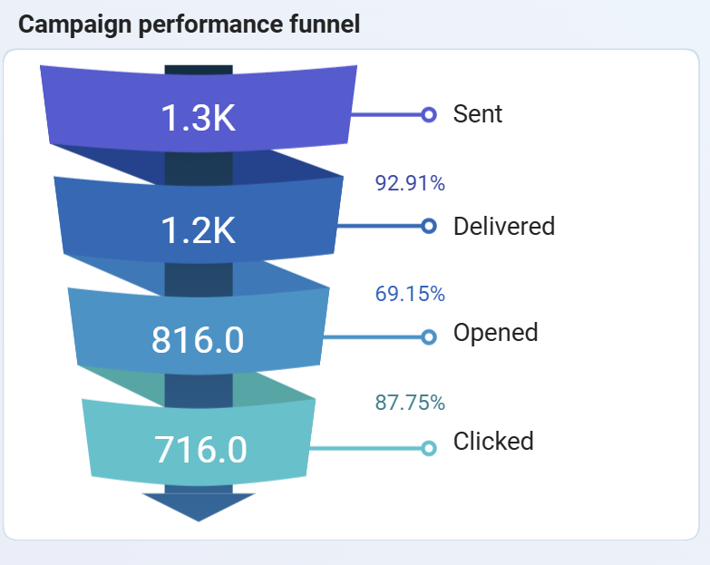
The subscriber journey breaks into four stages — sent, delivered, opened, and clicked — each with a conversion rate to the next. If the biggest loss happens between delivered and opened, the problem is likely in your subject lines. When opens are strong but clicks are weak, body content and CTAs need revision. This clarity removes guesswork from campaign optimization.
Every workflow tracks how many subscribers entered, completed, and qualified, meaning they reached a defined goal like clicking a link or making a purchase. Workflows with high completion but low qualification signal that the sequence finishes without driving action, while the opposite pattern points to drop-off issues worth investigating.
Not all segments contribute equally to your email program. Some deliver strong open and click rates but represent a small share of your list, while others cover a large audience with minimal engagement. Seeing both dimensions together helps you decide where to allocate dedicated content and which groups need re-engagement or suppression.
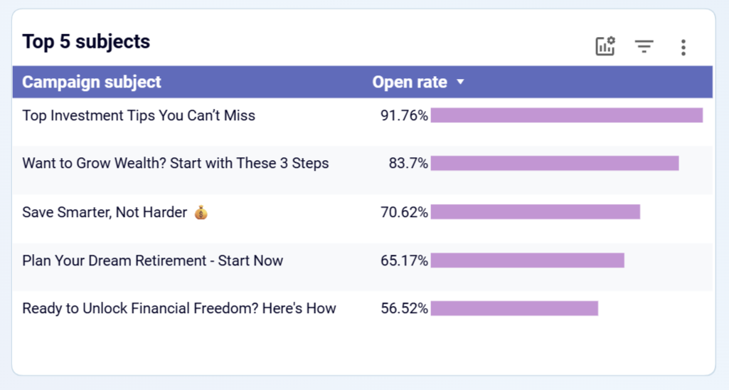
Campaign subjects ranked by open rate reveal which language patterns, topic framing, and formatting choices resonate with your audience. Over time, this shows whether benefit-driven, curiosity-based, or urgency-focused lines perform best. This gives your content team a data-backed foundation for future campaign briefs.
How to create a MailerLite dashboard?

Metrics you can track with a MailerLite dashboard template
The percentage of delivered emails that recipients opened. This metric reflects how well your subject lines, sender name, and send timing work together to earn attention in the inbox. Tracked at both the campaign and segment level.
The percentage of delivered emails that received at least one click. Click rate measures the combined effectiveness of your email content, layout, and call-to-action in driving subscriber action beyond the open.
Clicks divided by opens, isolating how well your email body and CTAs perform once a subscriber has already opened the message. A low CTOR with a healthy open rate points to content or CTA issues rather than subject line problems.
The percentage of sent emails that failed to reach the recipient's inbox. A rising bounce rate across campaigns or automations signals stale contacts, invalid addresses, or domain-level deliverability problems that need list cleanup.
The percentage of delivered emails marked as spam by recipients. Most email providers flag accounts that consistently exceed 0.1–0.3%, making this a critical metric for protecting sender reputation and inbox placement.
The percentage of recipients who opted out after receiving an email. Tracked per campaign and per automation, this metric signals when your content frequency, relevance, or audience targeting is misaligned with subscriber expectations.
The total number of subscribers who finished all steps in an automation workflow. This metric shows how many people experienced the full sequence and helps you gauge which automations successfully carry subscribers through to the end.
Subscribers who met a defined goal condition within an automation — such as clicking a link or completing a purchase. This metric measures how effectively each workflow converts subscribers toward a specific business outcome.
The count of subscribers currently waiting for the next step in any automation. Monitoring queue size relative to completions helps you detect stalled workflows, broken conditional steps, or capacity issues before they affect engagement.