Intercom dashboard examples and reporting templates
Transform your Intercom data into actionable insights with automated Intercom reporting dashboards that consolidate conversation metrics, agent performance, and customer interaction patterns. Optimize your support operations through real-time visualization of response times, workload distribution, and communication channel effectiveness.
Intercom dashboard examples for every need


about your case. It doesn't cost you a penny 😉
Choose your white label Intercom dashboard to kick off
What is an Intercom dashboard?
Intercom reporting dashboards eliminate the need for manual data extraction by automatically pulling conversation data, response times, and team performance metrics into visual formats. Through automated data synchronization via Coupler.io, these Intercom dashboard templates ensure your team always works with current information while providing historical trend analysis that supports strategic support planning and resource allocation decisions.

What reports should be included in Intercom dashboards?
Building effective Intercom reporting dashboards requires strategic selection of reports that address core support management challenges. Our analysis of successful Intercom implementations reveals four fundamental report categories that maximize operational visibility and decision-making capability.
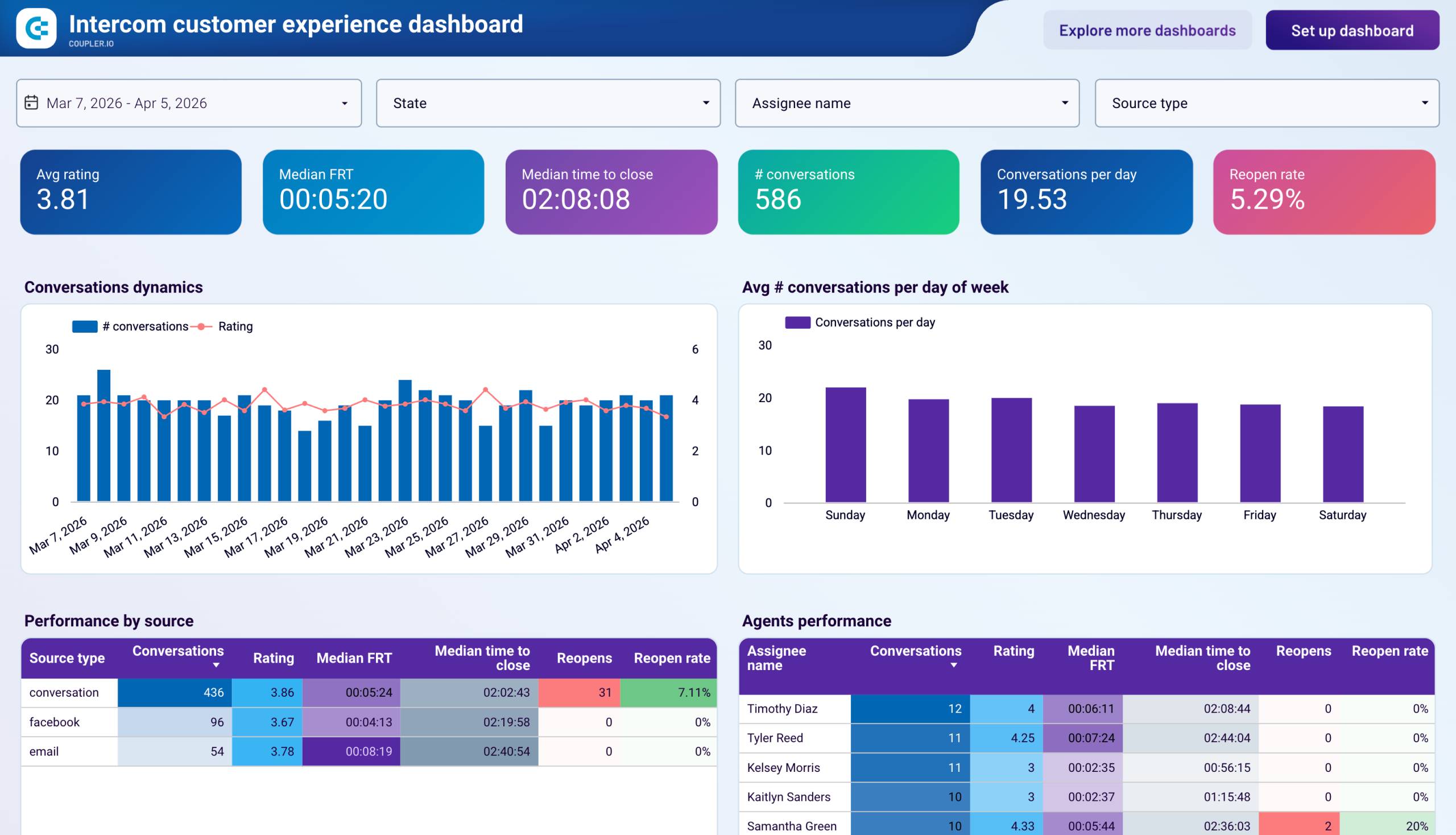
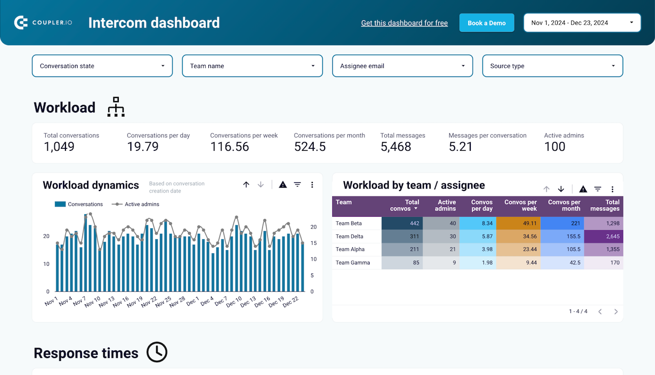
Your Intercom dashboard template should prominently feature conversation volume analysis that tracks incoming request patterns across time periods. This report reveals demand fluctuations, seasonal trends, and sudden spikes that require immediate attention. The visualization includes total conversation counts, new conversation rates, and conversation distribution across different time frames. By monitoring these patterns, support teams can anticipate busy periods, adjust staffing levels proactively, and maintain consistent response quality even during high-demand situations. This foundational data drives all other operational decisions within your support organization.
Agent performance tracking forms the backbone of effective Intercom dashboards, providing granular visibility into individual and team productivity metrics. This report displays conversation handling capacity, response speed variations, and workload balance across team members. The analysis includes average conversations per agent, response time consistency, and workload distribution equity measures. These insights help managers identify top performers, spot agents who need additional support, and ensure fair task distribution that prevents burnout while maintaining service quality standards throughout your support operations.
Response time monitoring delivers critical insights into service delivery speed and quality consistency across your support channels. This report tracks first response times, resolution speeds, and service quality indicators that directly correlate with customer satisfaction levels. The analysis includes trend identification for response performance, quality metric tracking, and comparative analysis across different time periods. These metrics enable teams to maintain service level agreements, identify process bottlenecks, and implement targeted improvements that enhance overall customer experience and satisfaction rates.
Channel analysis provides essential insights into customer preferences and channel-specific performance variations within your Intercom reporting dashboard. This report examines conversation distribution across email, chat widgets, social media integrations, and other communication methods. The analysis includes channel-specific response times, resolution rates, and customer satisfaction scores for each communication method. Understanding channel performance helps optimize resource allocation, improve response consistency, and ensure customers receive excellent service regardless of their preferred contact method.
What insights you can get with the Intercom dashboard
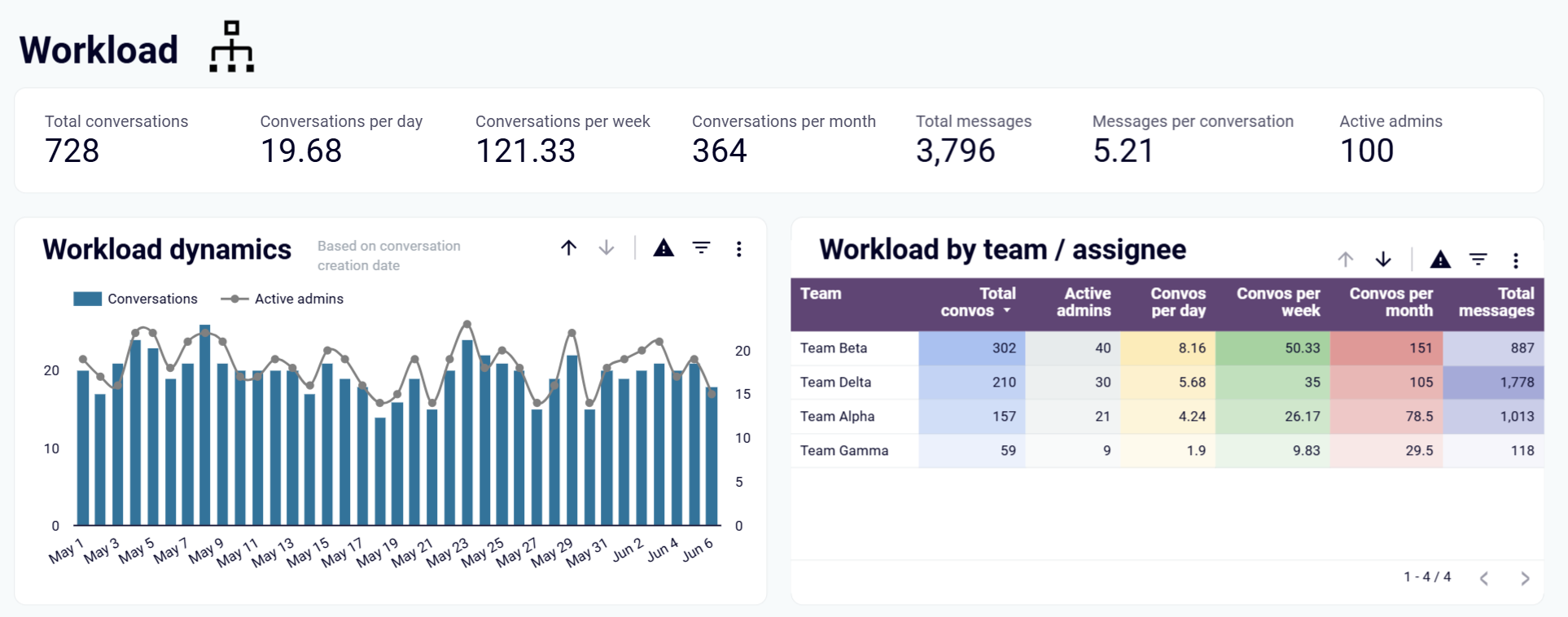
Transform raw Intercom conversation data into strategic workforce insights that reveal hidden patterns in support demand and team capacity constraints. This analysis exposes the relationship between incoming request volumes and your team's ability to handle fluctuating workloads, enabling proactive staffing decisions before service quality deteriorates.
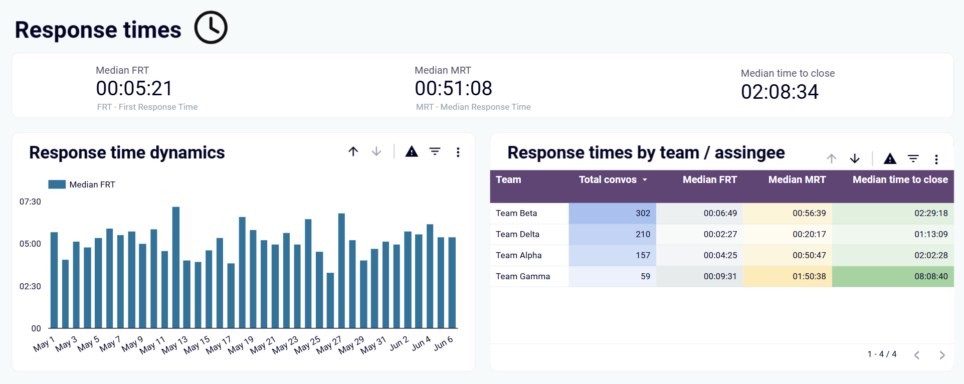
Discover critical performance gaps by examining how quickly your agents respond across different conversation types and time periods. This insight reveals which factors slow down your response times and provides concrete data for implementing process improvements that directly enhance customer satisfaction scores.
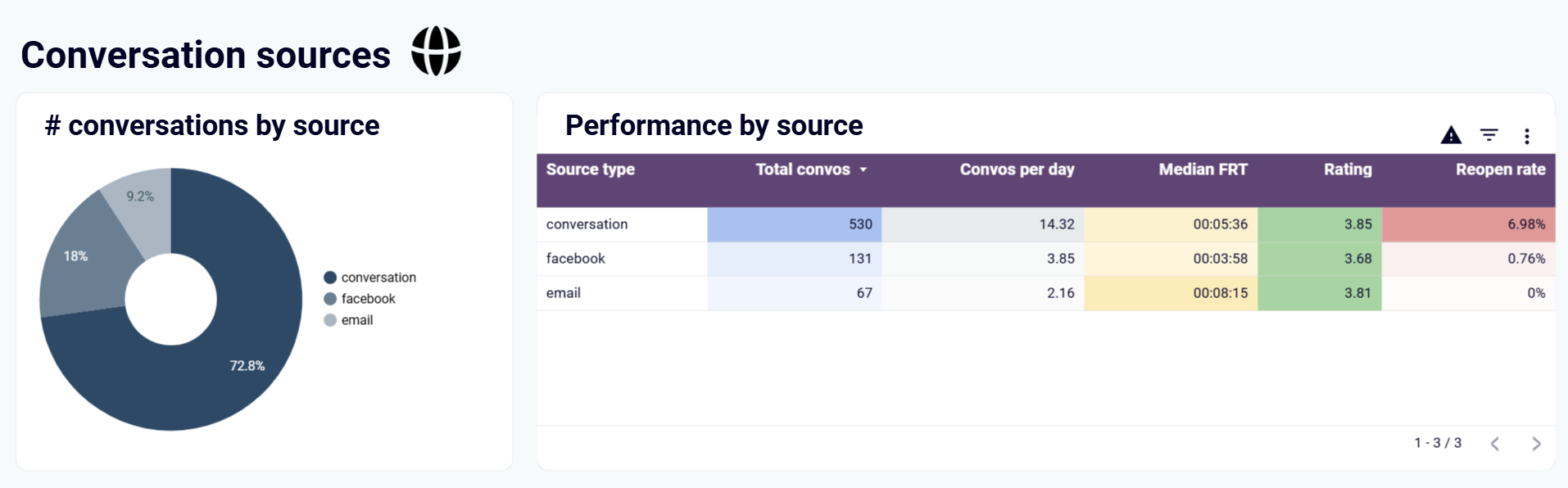
Uncover customer behavior patterns by analyzing which communication channels drive the highest engagement and satisfaction rates. This intelligence helps you understand where customers naturally gravitate for different types of issues, allowing you to optimize resource allocation and create channel-specific service strategies.
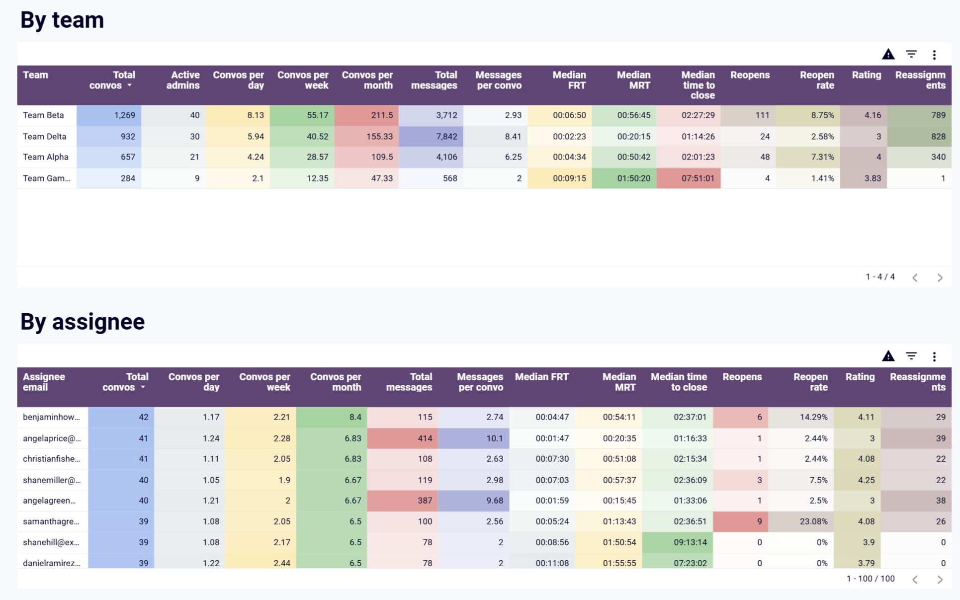
Identify the specific performance characteristics that separate your top performers from those needing development support. This analysis reveals not just who performs well, but why they excel, providing actionable intelligence for coaching programs and performance improvement initiatives across your entire support team.
How to create an Intercom dashboard?

Metrics you can track with the Intercom dashboard templates
Unlock workforce planning intelligence by tracking conversation volumes that reveal seasonal demand fluctuations and growth trends affecting your support capacity. This foundational metric transforms raw activity data into strategic insights for budget planning and hiring decisions.
Discover service delivery bottlenecks through response time analysis that exposes the true cost of delayed customer interactions. This performance indicator reveals operational inefficiencies and provides concrete targets for process optimization that directly impact customer retention rates.
Eliminate performance disparities by visualizing how conversation loads impact individual agent productivity and job satisfaction. This equity metric exposes hidden imbalances that cause burnout and turnover while identifying opportunities for fair task redistribution across your team.
Transform customer behavior data into strategic channel investment decisions by analyzing conversation distribution patterns across communication methods. This intelligence reveals which platforms deliver the highest customer satisfaction and operational efficiency for your specific audience.
Convert resolution success rates into actionable quality improvement strategies that strengthen customer relationships and reduce repeat contacts. These effectiveness metrics expose training gaps and process weaknesses that impact your team's ability to solve problems permanently.
Identify hidden service gaps through resolution failure analysis that reveals why customers return with unresolved issues. This quality metric uncovers systematic problems in your support process and provides clear targets for first-contact resolution improvements.
Anticipate demand surges through temporal pattern recognition that reveals when your customers need support most. This predictive intelligence enables proactive resource allocation and prevents service degradation during critical business periods.
Accelerate team development by identifying the specific behaviors and approaches that drive exceptional support outcomes. This benchmarking metric reveals best practices that can be replicated across your entire team to elevate overall performance standards.