Clockify dashboard examples and reporting templates
Turn scattered time entries into strategic workforce insights with automated Clockify reporting dashboards that reveal productivity gaps, detect overwork patterns, and balance team capacity across projects and clients.
Clockify dashboard examples for every need


about your case. It doesn't cost you a penny 😉
Choose your white label Clockify dashboard to kick off
What is a Clockify dashboard?
Our Clockify dashboard templates make complex workforce data accessible through interactive charts that highlight when team members are logging unrealistic hours, struggling with chronic underutilization, or approaching dangerous burnout thresholds. Through automated data integration via Coupler.io, these Clockify dashboards maintain current visibility into time allocation patterns without manual report generation, enabling proactive workforce management decisions based on concrete performance data rather than assumptions.

What reports should be included in Clockify dashboards?
Creating effective Clockify reporting dashboards requires a strategic combination of multiple analytical views that together illuminate different aspects of workforce productivity and project economics. Each report type within these Clockify dashboard templates serves a specific diagnostic purpose while contributing to an overall understanding of organizational time management effectiveness.
The workforce utilization report examines how team members allocate time between billable and non-billable activities while identifying capacity constraints that limit productivity. This report tracks individual performance against contracted expectations, revealing when team members consistently underperform their agreed hours or exceed healthy working limits. The analysis includes breakdowns by skill type and project category to understand where expertise is being deployed most effectively. Capacity planning components help managers forecast resource needs and identify when additional hiring or workload redistribution becomes necessary to maintain service quality.
The project economics report evaluates the financial return on time investment across different client relationships and project types. This analysis compares actual time spent against budgeted estimates to identify projects that consistently exceed scope or deliver exceptional value efficiency. Client value assessment components rank relationships by profitability per hour invested, helping prioritize account management efforts and pricing negotiations. The report includes trend analysis showing how project economics change over time, enabling strategic decisions about service offerings and client portfolio optimization.
The performance consistency report tracks reliability patterns in time logging and work output quality across team members and project phases. This analysis identifies team members who demonstrate consistent productivity versus those whose performance varies significantly, helping with task assignment and development planning. Quality monitoring components examine the relationship between time invested and deliverable outcomes, revealing whether additional time correlates with better results or indicates efficiency problems. The report includes comparative analysis across similar project types to establish performance benchmarks.
The risk detection report monitors early warning signals for workforce problems, including burnout indicators, chronic underperformance, and project scope creep that threatens deadlines. This analysis examines logging patterns that suggest work-life balance issues or unrealistic project expectations before they impact team morale or client relationships. Intervention planning components prioritize risk areas requiring immediate attention and suggest resource adjustments to prevent problems from escalating. The report includes predictive elements that forecast potential issues based on current trajectory patterns.
What insights you can get with the Clockify dashboard
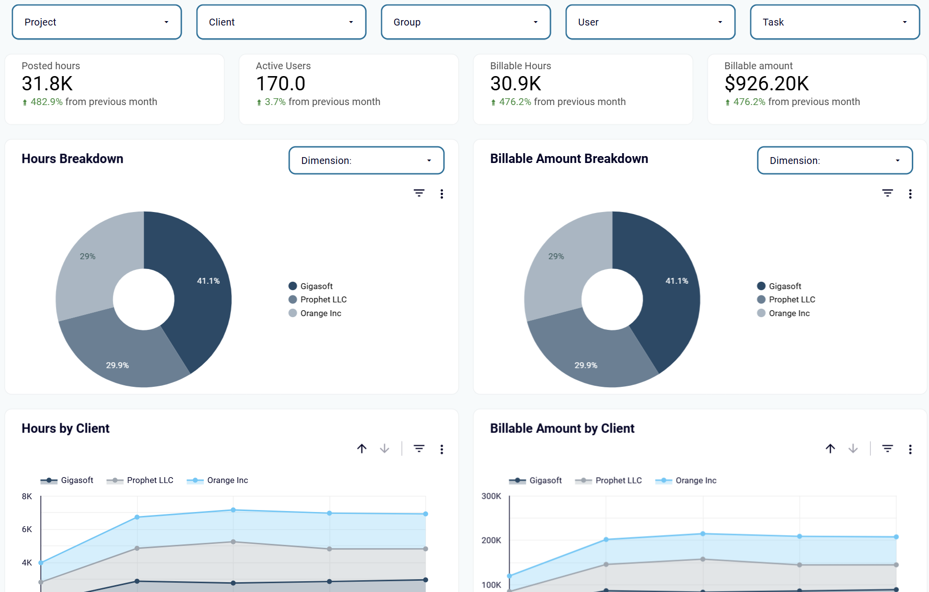
Client and project analysis within your Clockify reporting dashboard reveals billable amount distribution and hour allocation across different engagements. This enables managers to identify the most profitable client relationships and optimize resource allocation. The dashboard tracks monthly trends in both hours and revenue generation, helping you understand which clients provide consistent value and which projects may need pricing adjustments.
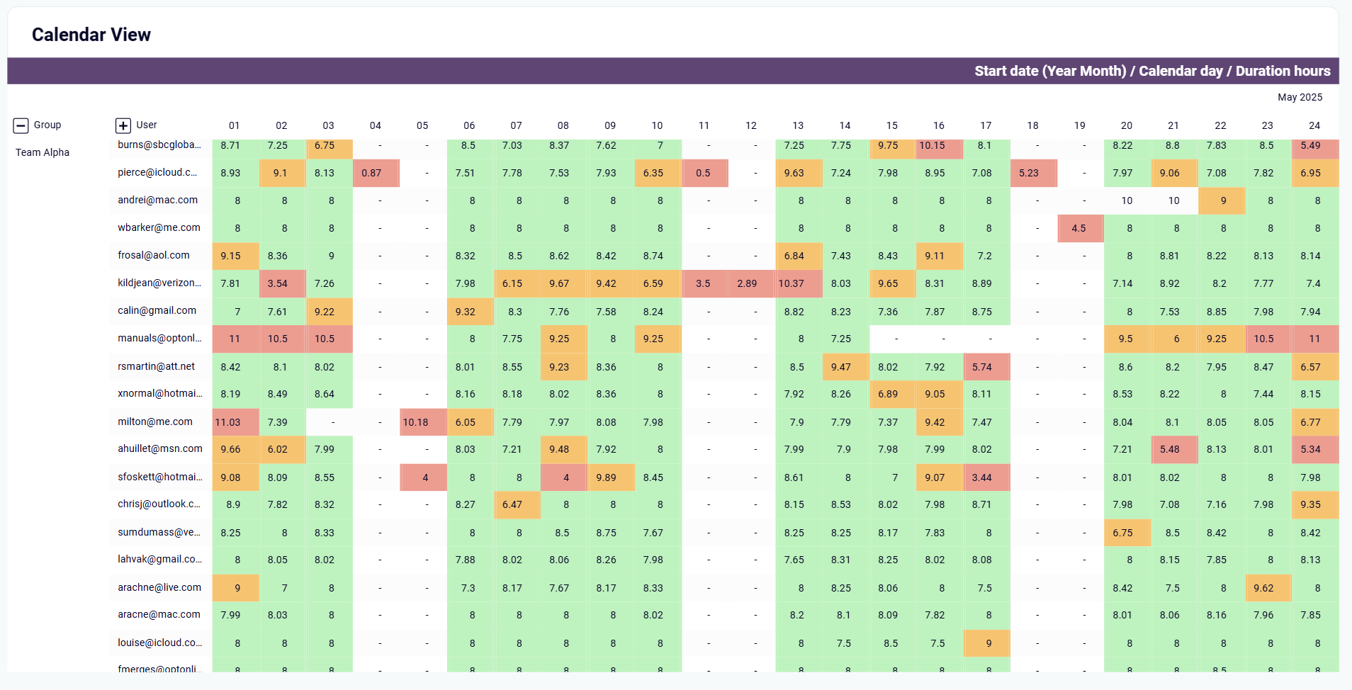
Calendar view analysis in your Clockify dashboards provides daily performance visibility with color-coded patterns that reveal productivity trends and potential workload issues across your team. This granular tracking enables managers to spot irregular work patterns, ensure sustainable working hours, and maintain consistent productivity levels.
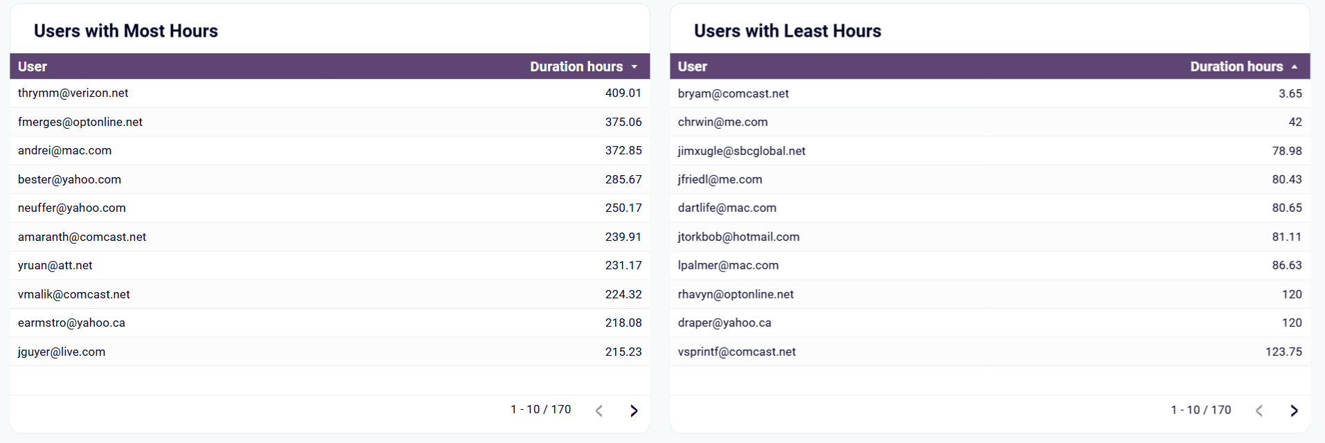
Side-by-side comparison tables within Clockify dashboard templates highlight significant differences between team members' logged hours, revealing workload distribution issues that require immediate attention. This analysis helps managers redistribute tasks to prevent overwork among high performers while addressing the underutilization of other team members.
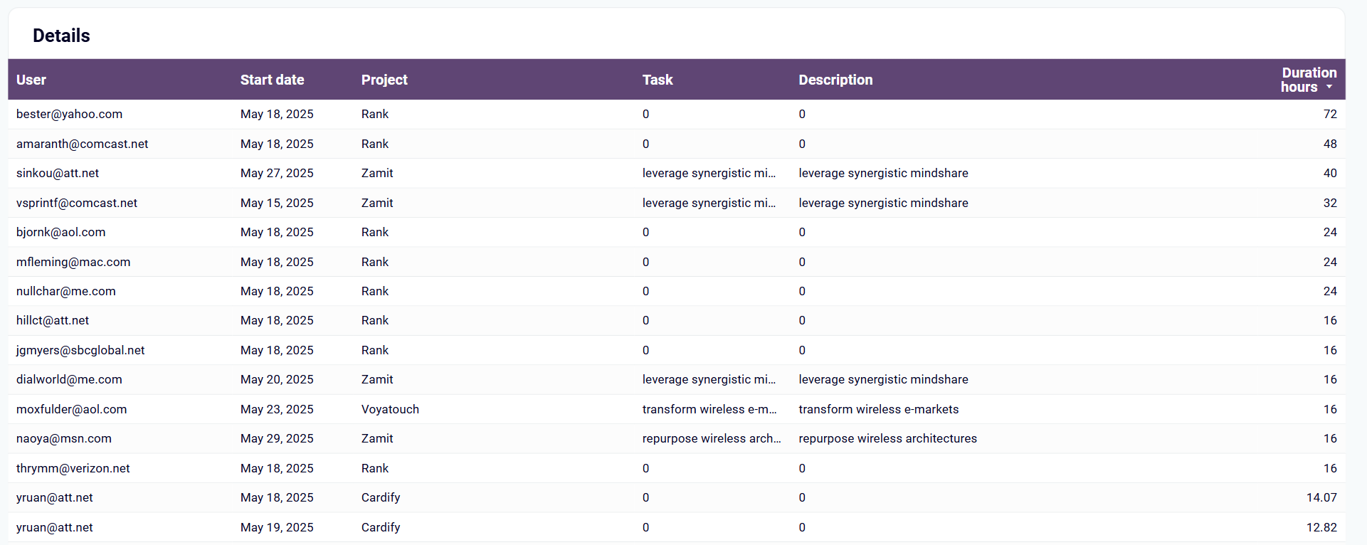
Comprehensive project details within your Clockify reporting dashboards provide complete transparency into team activities with start dates, project assignments, task descriptions, and duration tracking. This detailed breakdown enables precise project costing, accurate client billing, and identification of tasks that consistently require more time than estimated.
How to create a Clockify dashboard?

Metrics you can track with Clockify dashboard templates
Track the complete time investment across all projects, clients, and team members to understand overall workload distribution and capacity planning through your Clockify reporting dashboards. This metric provides a comprehensive view of how your team's time is allocated and helps identify periods of high or low activity that may require resource adjustments or workload rebalancing.
Monitor how many team members are actively logging time during specific periods using Clockify dashboard templates to assess team engagement and utilization rates. This metric helps identify when additional resources may be needed or when team members might be underutilized across different projects, enabling better workforce planning and capacity management decisions.
Measure time that can be charged to clients versus internal or administrative work within your Clockify dashboards to optimize revenue-generating activities. This metric helps distinguish between profitable work and overhead tasks, enabling better project selection and team allocation decisions for maximum billing efficiency and improved profitability.
Calculate total revenue generated from tracked time by applying hourly rates to billable hours across projects and clients through Clockify reporting dashboard analytics. This metric directly connects time investment to financial outcomes, allowing you to measure the monetary value of your team's work and identify the most profitable activities and client relationships.
Analyze the actual time spent on specific tasks, projects, or client work using Clockify dashboard templates to evaluate efficiency and accuracy of time estimates. This metric enables better project scoping and helps identify tasks that consistently take longer than expected, improving future planning accuracy and enabling more precise client proposals and project budgeting.