Connect your data source
Link Google Ads, Meta, LinkedIn, TikTok, or GA4 to your AI chatbot.
Turn your AI tool into a paid media analyst. Connect Google Ads, Meta, LinkedIn, and TikTok, then ask about all the metrics that matter in simple English. The skill runs against your live data, so the numbers are real — not guessed.
 Claude
 ChatGPT
 Gemini
 Cursor
 Perplexity
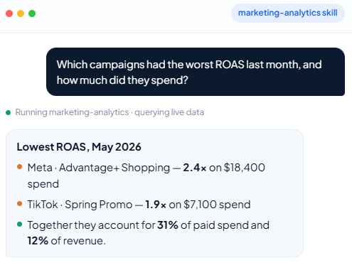


You'll get a cross-team performance snapshot with the key numbers checked and surfaced — so you know what to act on before the next leadership call.
Start for freeYou'll see exactly which campaigns are losing money and where spend is pacing off target, across Google Ads, Meta, LinkedIn, and TikTok in one answer.
Start for freeYou'll get a clear view of which channels are generating pipeline and which aren't — so budget conversations are backed by data, not gut feel.
Start for freeYou'll receive a blended cost and return breakdown with attribution gaps flagged, so the figures you present to the board are accurate and traceable.
Start for freeAnalyze marketing performance across channels using data from Coupler.io dataflows. This skill guides you through retrieving data, computing key metrics, detecting anomalies, and presenting actionable insights — all in language a marketing manager can act on.
Every analysis starts by connecting to the user’s data through Coupler.io MCP tools.
Call list-dataflows to see what marketing data the user has connected. Each dataflow represents a data pipeline (e.g., “Google Ads → Claude”, “Mailchimp Campaigns”, “GA4 Traffic”).
The number of available dataflows determines how you present the selection:
Fewer than 5 dataflows: List them all by name and source type. Ask the user to confirm which ones to include in the analysis.
5–20 dataflows: Group them by apparent channel or source (the dataflow names usually encode this — “google_ads_campaigns”, “mailchimp_weekly”, etc.). Present the groups with counts. Let the user select entire groups or individual flows.
More than 20 dataflows: Do not list them all. Instead, infer which are relevant from the user’s request (e.g., “budget allocation” → look for flows with spend/cost columns). Present only the candidates — up to 5–7 — with a one-line rationale for each:
I found 3 dataflows likely relevant to your budget question (out of 24 total):
  1. google_ads_campaigns — has spend and conversion columns
  2. meta_ads_weekly — has spend, impressions, and ROAS columns
  3. linkedin_sponsored — has cost and lead columns

Should I include all three, or add/remove any?
The key: present your reasoning for the selection, not just the options. “I picked these because your question is about conversions and these are the only flows with conversion-related columns” gives the user something to correct. A raw list of 20 dataflow names gives them homework.
This is a hard gate: do not proceed to Step 1c until the user has confirmed which dataflows to include. The reason this matters: if you pick the wrong dataflows, the entire analysis is wasted work — and the user won’t realize until the end that you analyzed the wrong data. A 10-second confirmation here prevents a 5-minute redo later. Even if you’re confident you know which dataflows are right, present your selection and ask. The only exception is if there’s exactly 1 dataflow and the user’s request unambiguously refers to it.
For each selected dataflow, call get-dataflow with its ID. This returns:
last_successful_execution_id — needed for querying dataschedule — how often the data refreshes (mention this to the user so they know how fresh the data is)sources — details about what’s connected and whether it’s healthyCall get-schema with the executionId (from last_successful_execution_id). This returns column definitions. Pay attention to:
columnName — the actual column name used in SQL queries (typically col_0, col_1, etc.)label — the human-readable name (e.g., “Campaign Name”, “Impressions”, “Spend”)Build a mental mapping between labels and columnNames. You’ll use columnNames in SQL but labels when communicating with the user.
Always start with a sample query per dataflow:
SELECT * FROM data LIMIT 5
This verifies column contents match expectations before running complex queries. If anything looks off (empty columns, unexpected formats), flag it to the user before proceeding.
Key SQL rules:
columnName values (col_0, col_1, …) in SQL, not human-readable labelsdata|| for string concatenation, no ILIKE)date(), strftime(), julianday() for date arithmeticCAST(col_X AS REAL) when aggregating numeric columns that may be stored as textFor error handling guidance (empty results, stale executions, schema mismatches), read references/error-handling.md.
Always compute metrics via SQL in get-data rather than doing arithmetic in-context. The reason: floating-point aggregations over thousands of rows in-context are unreliable and slow. The Coupler.io SQL engine handles this correctly and efficiently.
For each channel present in the data, compute the relevant metrics. Read references/channel-metrics.md for the full catalog of metrics by channel, including definitions, formulas, and benchmark ranges.
Combining datasets: get-data reads one dataset at a time and cannot join across them. Query each separately and synthesize when you are comparing side by side or pulling something small. When the user wants to repeat an analysis that needs a real join (matching rows across datasets, or aggregating over the combined result), build it with create-dataset so it re-runs on every refresh; its inputs must all live in the same dataflow. For a one-off question, combine the results yourself, and if the data is too large for that, say so and suggest create-dataset. Explain what you’re pulling from each source so the user understands the data lineage.
Before generating a full report, present a brief summary of what you found — the 3–5 most important numbers, any anomalies, and which direction the data points. This gives the user a chance to steer you before you invest in formatting and recommendations.
Present it as: “Here’s what I’m seeing in the data. Before I write up the full analysis, does this match your expectations? Anything you want me to dig deeper on?”
Wait for the user’s response before proceeding to the full report.
Based on what the user asked for, follow the appropriate analysis path:
Identify the reporting period (ask the user or infer from context — “last week”, “this month”, “Q1”). Use date columns to filter appropriately.
Structure the report as:
Read references/report-templates.md for weekly, monthly, and quarterly report structures.
For campaign deep-dives, compute spend efficiency (CPA, ROAS, CPM), trace the funnel (impressions → clicks → conversions → revenue), identify the biggest drop-off, and compare creatives/variants side by side. Flag statistical concerns if sample sizes differ significantly.
For historical benchmarking, compare against the same period last month/year, the trailing 3-month average, and any targets the user mentions.
Query each relevant dataflow for the same time period. Normalize metrics to a common basis where possible (same currency, same date format). Build a channel comparison matrix showing investment, results, efficiency, and trend for each channel.
For budget allocation insights: identify channels with the best efficiency that could absorb more spend, flag declining-efficiency channels, and note channels with limited data. Be explicit about limitations — correlation isn’t causation, and channel interactions (e.g., display awareness driving search conversions) mean isolated channel metrics can be misleading.
Any time the analysis involves investigating a change, drop, spike, or anomaly in metrics — whether the user explicitly asks “what’s going on?” or you’re doing a conversion drop investigation, a performance decline analysis, or noticing unusual patterns during a routine report — read references/anomaly-detection.md before presenting findings. It contains the severity classification framework (informational / warning / critical), baseline comparison methods, and root cause investigation steps. Every deviation you report should be tagged with a severity level so the user knows how urgently to act. This applies to all analysis types, not just dedicated anomaly scans.
Read references/output-guidelines.md for presentation principles: lead with the headline, use plain language, ensure every finding has a “So what?” and “Now what?”, and structure for scannability.
For visualization guidance (tables vs. charts, chart type selection, executive summary cards), also consult references/output-guidelines.md.
Before finalizing your output, do a quick pass for abbreviation expansion. The first time you use any abbreviation (CPA, ROAS, CTR, CAC, CPM, MQL, SQL, LTV, etc.), expand it with a brief definition: “cost per acquisition (CPA) — total spend divided by conversions.” After the first use, the abbreviation alone is fine. This is easy to forget when you’re deep in analysis — that’s why it’s called out here at the output step, not just in Rules & Edge Cases. Marketing managers reading your output may not share your abbreviation vocabulary.
If the user confirms the output is good (explicitly, or by not requesting changes), save a copy to references/examples/ with a descriptive filename like weekly-report-2024-03-15.md. Future runs should read 1–2 recent examples from this directory as quality anchors — they show “what good looks like” for this user’s preferences.
If the user flags a recurring problem or states a new constraint:
## Rules & Edge Cases section below.This ensures the skill improves with use rather than repeating the same mistakes.

Add the skill, connect a source, and ask your first question in minutes.
Looking for an AI agent skill tuned to your exact workflow?