Time management dashboard examples and reporting templates
Take control of your time and boost productivity with automated time management dashboard templates that consolidate data from Google Calendar, Clockify, Harvest, and Calendly. Monitor availability patterns, track meeting efficiency, analyze team workload distribution, and maintain healthy work-life balance through real-time insights from your time tracking platforms.
Time management dashboard examples for every need


about your case. It doesn't cost you a penny 😉
What is a time management dashboard?
These analytical tools go beyond basic time tracking by providing visual representations of availability patterns, meeting loads, and workload distribution across teams. Through automated data integration via Coupler.io, your time management dashboard templates stay current without manual updates, ensuring decision-making is based on the most recent productivity data. The result is a comprehensive view that helps individuals and teams optimize their schedules, reduce meeting overload, and create sustainable work habits.

Choose your white label time management dashboard template to kick off
What reports should be included in time management dashboards?
Effective time management requires visibility into multiple aspects of how time flows through your organization. A well-structured time management dashboard template should incorporate four essential report categories that address different dimensions of productivity and time allocation.
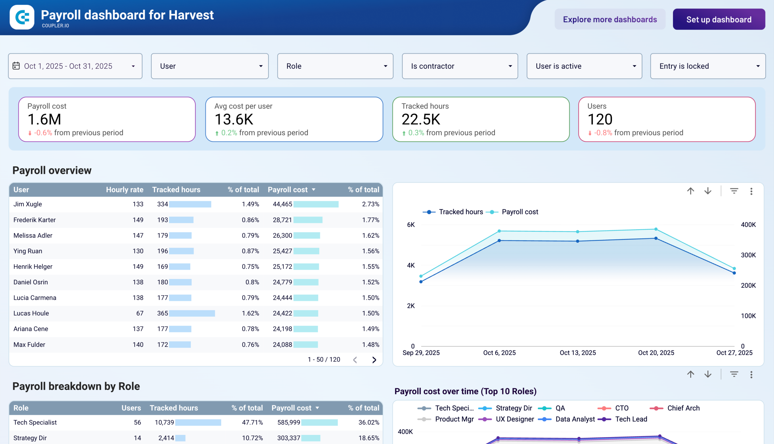
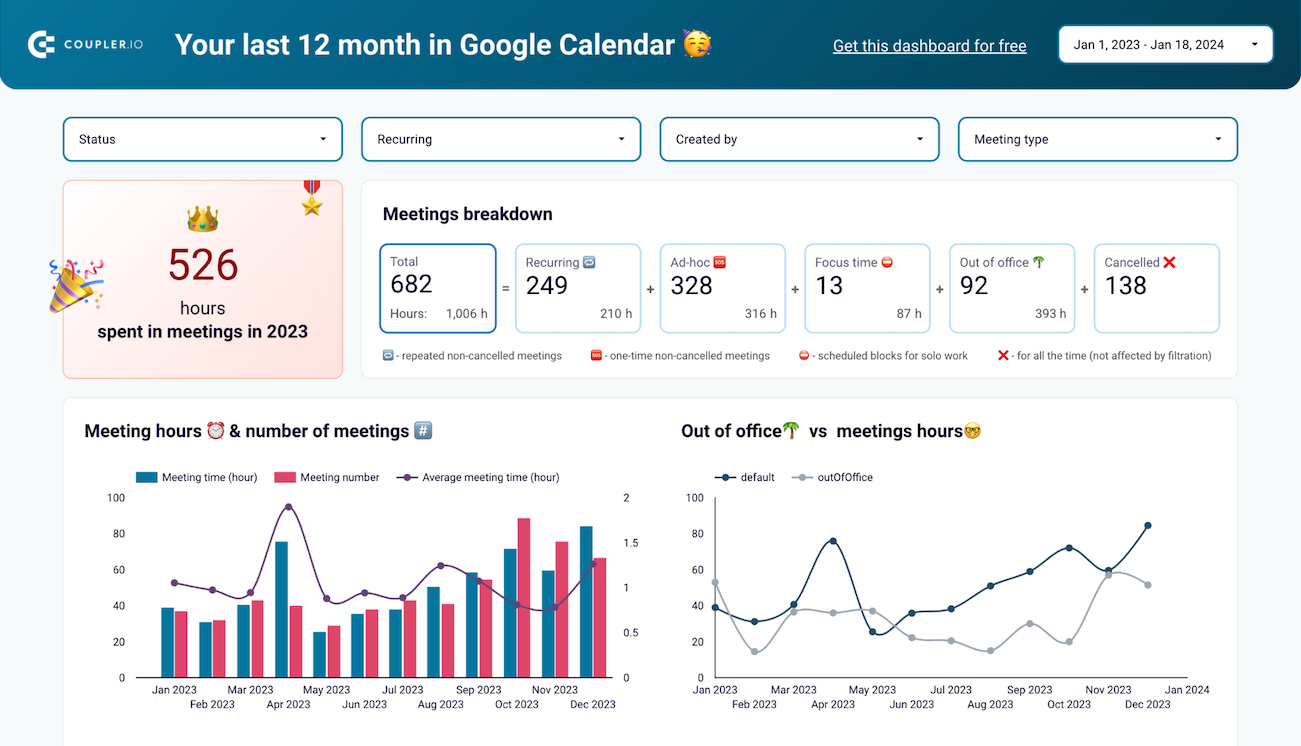
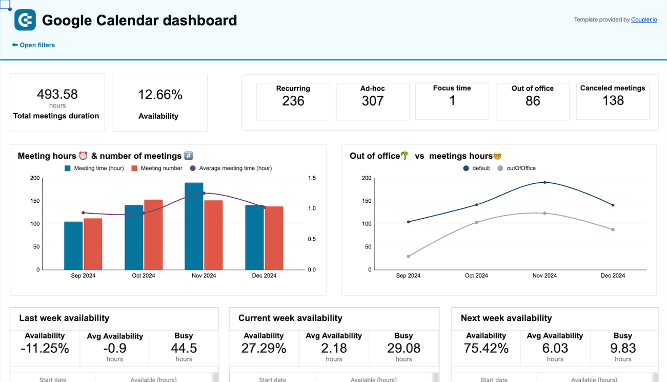
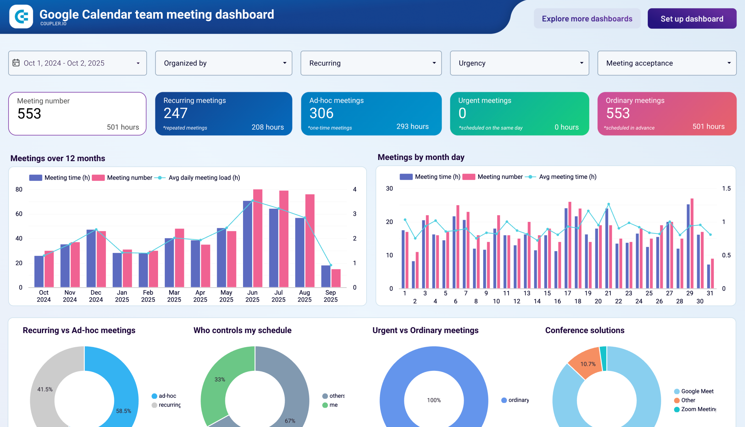
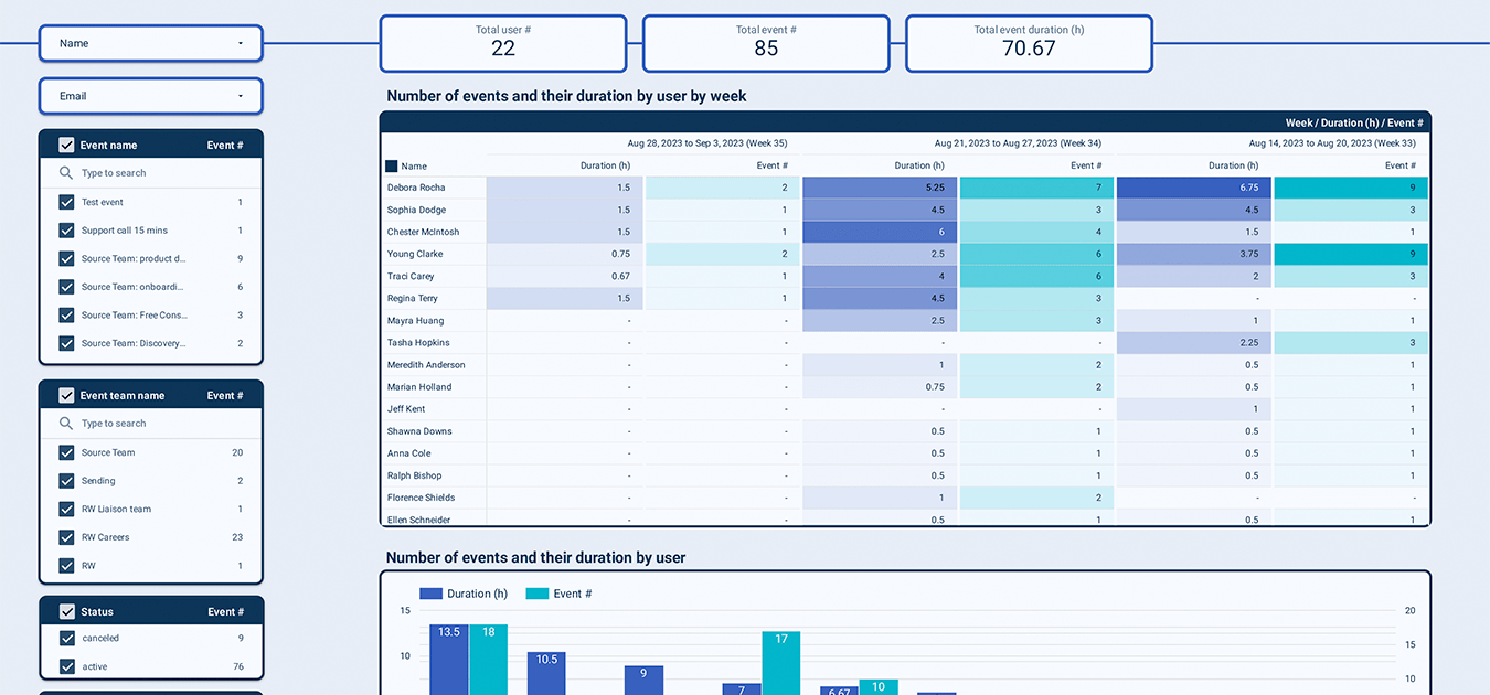
The availability report forms the foundation of time management by tracking the relationship between scheduled commitments and open time slots. This report monitors total meeting duration alongside availability percentages, revealing how much time remains for focused work versus collaborative activities. It includes breakdowns of meeting types—recurring versus ad-hoc sessions—to identify which commitments provide ongoing value versus those that could be streamlined. The visualization helps teams understand whether their calendars support or hinder productivity goals.
Individual performance tracking provides granular visibility into how team members allocate their time throughout each day and week. This report includes calendar view analysis that reveals patterns in work habits, identifies potential time entry errors, and highlights periods of overwork or underutilization. The analysis encompasses both scheduled activities and actual time logged, creating a complete picture of individual productivity patterns that managers can use for coaching and workload optimization.
Team-level analysis ensures balanced resource allocation and prevents burnout across your organization. This report compares workload distribution among team members, tracking weekly event counts, total meeting hours per person, and identifying individuals who may be overloaded or underutilized. The analysis extends to departmental comparisons, showing how different teams spend their time and where capacity constraints might require attention or additional resources.
Sustainable productivity requires monitoring the relationship between work commitments and recovery time. This report compares meeting loads with out-of-office periods month by month, tracking whether team members maintain healthy boundaries between work and personal time. The analysis includes vacation usage patterns, after-hours meeting frequency, and periods of continuous work without breaks, providing early warning indicators for potential burnout situations.
What insights you can get with the time management dashboard
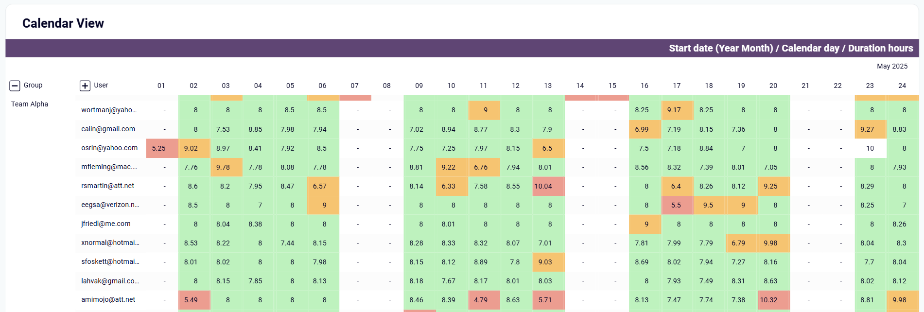
Drill down into individual team member performance over monthly periods to identify productivity patterns, time entry mistakes, and workload imbalances. The calendar visualization reveals when team members log excessive hours on specific days—such as 47+ hours on a Monday indicating data entry errors—or when consistent underwork patterns suggest the need for productivity discussions. This granular view helps managers provide targeted coaching and ensures accurate time tracking across the organization.
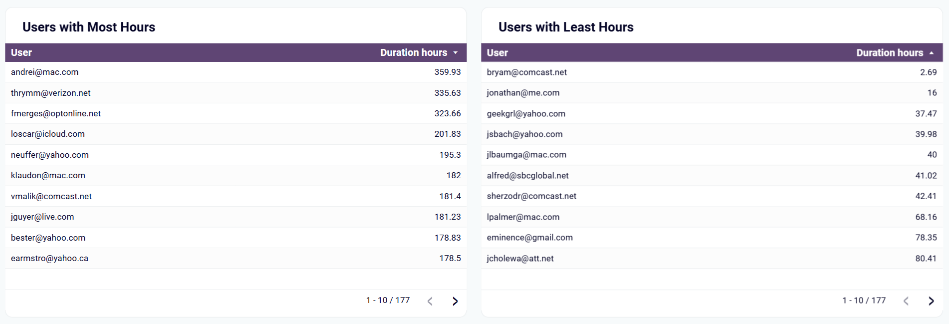
Identify workload imbalances across your team by comparing users with the highest and lowest logged hours to ensure fair distribution of responsibilities. The side-by-side analysis reveals which team members may be overloaded with 300+ hours while others work significantly fewer hours, enabling managers to redistribute tasks and prevent burnout. This comparative view helps optimize resource allocation and ensures no individual carries disproportionate workload burdens.
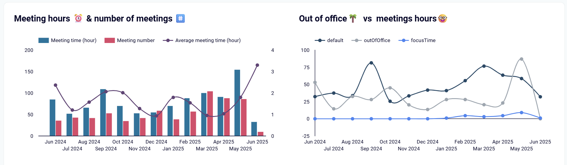
Compare meeting loads with out-of-office time across monthly periods to ensure sustainable work practices and prevent burnout. The analysis tracks vacation usage, continuous work periods without breaks, and after-hours meeting frequency to provide early warning indicators when team members need recovery time. This insight helps organizations build healthier work cultures by identifying when employees have been working nonstop and need scheduled downtime.
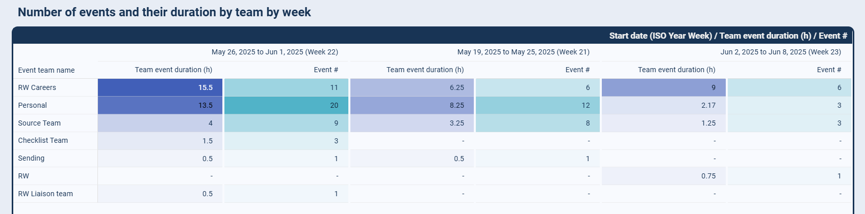
Analyze how work is distributed across team members by tracking weekly event counts, total meeting hours per person, and departmental time allocation patterns. Identify overloaded individuals who consistently handle back-to-back meetings while others remain underbooked, enabling better resource redistribution and workload balancing. This insight extends to understanding capacity constraints across different departments and knowing when to bring in additional support.
How to create a time management dashboard?

Metrics you can track with a time management dashboard template
More Time management Dashboards
Request custom dashboard
From building custom dashboards to setting up data analytics from scratch, we're here to help you succeed. Contact us to discuss your case and possible solutions
Contact us