Calendly dashboard examples and reporting templates
Optimize meeting efficiency and team productivity with automated Calendly reporting dashboards that transform booking data into strategic insights for better schedule management, workload distribution, and calendar optimization.
Calendly dashboard examples for every need


about your case. It doesn't cost you a penny 😉
Choose your white label Calendly dashboard to kick off
What is a Calendly dashboard?
Rather than manually tracking meeting metrics through user interface, our Calendly dashboard templates automatically consolidate booking data and present it through charts, tables, and performance indicators. This gives you immediate visibility into scheduling bottlenecks, team workload imbalances, and opportunities to improve meeting efficiency across your organization.

What reports should be included in Calendly dashboards?
Building an effective Calendly analytics dashboard requires several key reporting components that address different aspects of meeting management and team productivity. These reports work together to provide complete visibility into how your scheduling system performs and where improvements can be made.
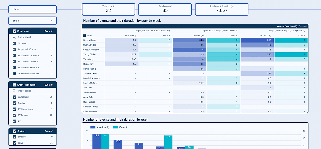
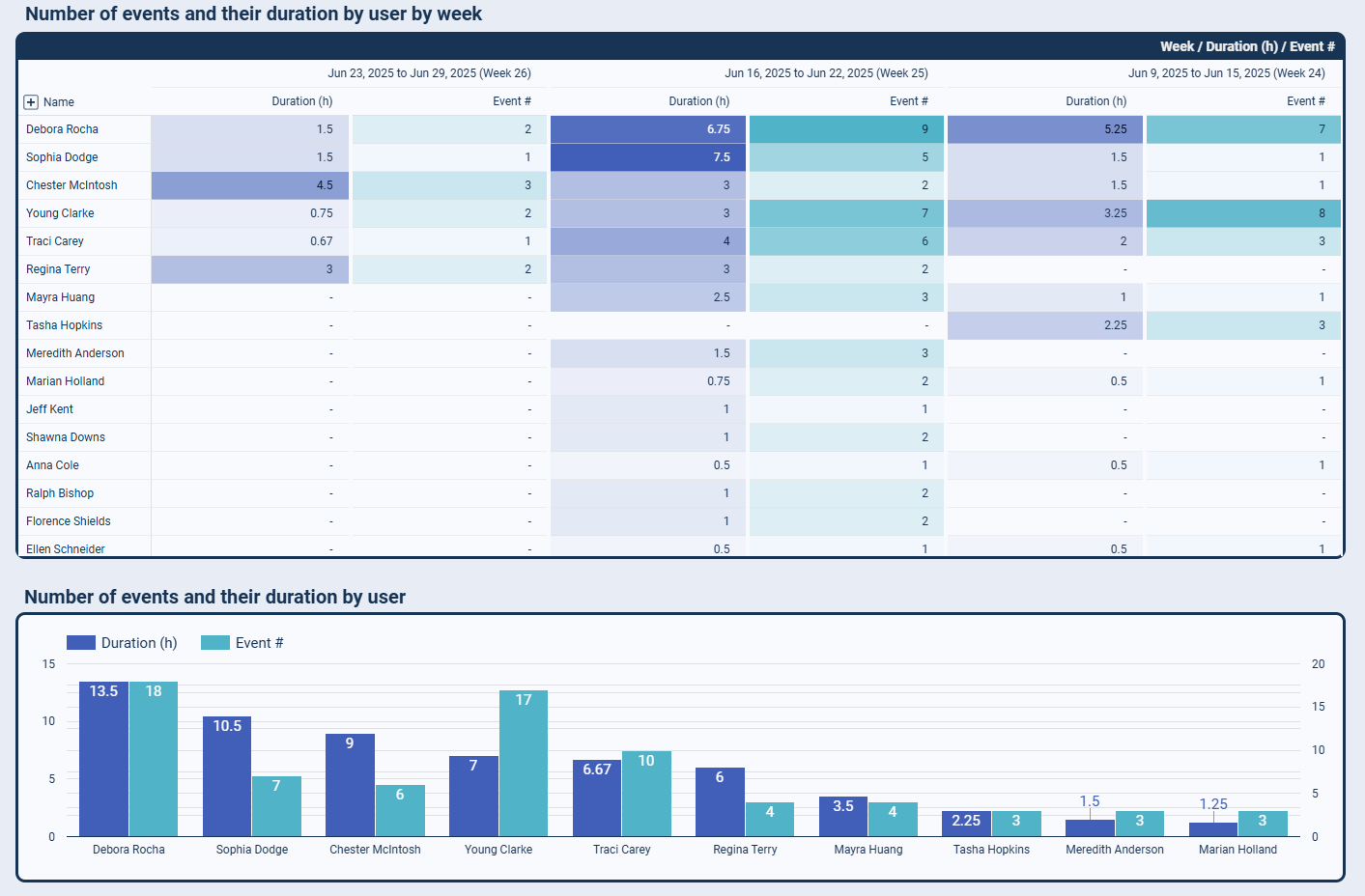
This report analyzes how meeting loads are distributed across team members, showing who handles the most bookings and identifying potential burnout risks. It tracks weekly event counts, total meeting hours per person, and compares workload balance to help managers redistribute responsibilities effectively. The visualization makes it easy to spot team members who are consistently overbooked versus those who might have capacity for additional meetings.
The pattern analysis examines when meetings typically occur throughout the week and month, revealing peak booking times and quiet periods. This report shows which time slots fill up fastest, which days tend to be meeting-heavy, and how booking patterns change over time. Understanding these rhythms helps teams block time for focused work, avoid scheduling conflicts during busy periods, and optimize availability windows for better work-life balance.
This report monitors meeting cancellations, no-shows, and booking changes to identify scheduling inefficiencies. It tracks cancellation rates by team member, time period, and meeting type to reveal patterns that might indicate scheduling problems or communication issues. The data helps teams reduce wasted time from canceled meetings and improve the reliability of their scheduling process.
The optimization report analyzes meeting types, duration patterns, and recurring booking trends to identify opportunities for streamlining schedules. It compares recurring meetings with ad-hoc bookings, tracks average meeting lengths, and highlights repetitive scheduling that might be consolidated or eliminated. This information supports decisions about meeting policies, time slot configurations, and calendar management best practices.
What insights you can get with the Calendly dashboard
Track how meeting loads are distributed across your team with detailed breakdowns of weekly event counts and total meeting hours per person. This insight helps identify team members who are consistently handling back-to-back meetings while others have lighter schedules, enabling better workload redistribution and preventing burnout.
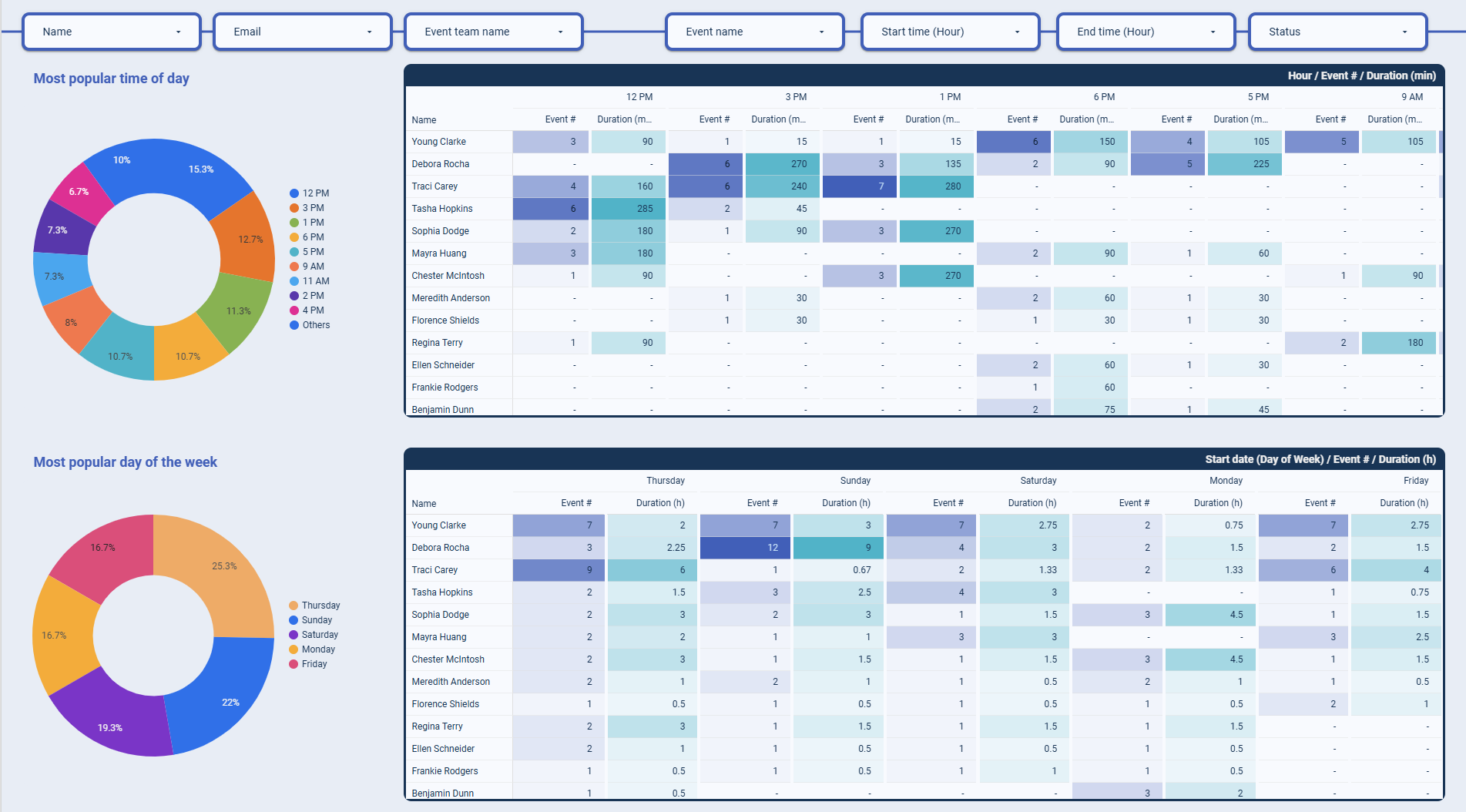
Understand when your team's calendar fills up most quickly by analyzing booking patterns across different time slots, days, and weeks. This data reveals natural busy periods and quieter windows, allowing you to plan important projects, launches, or deep work sessions during times when meeting demands are lower.
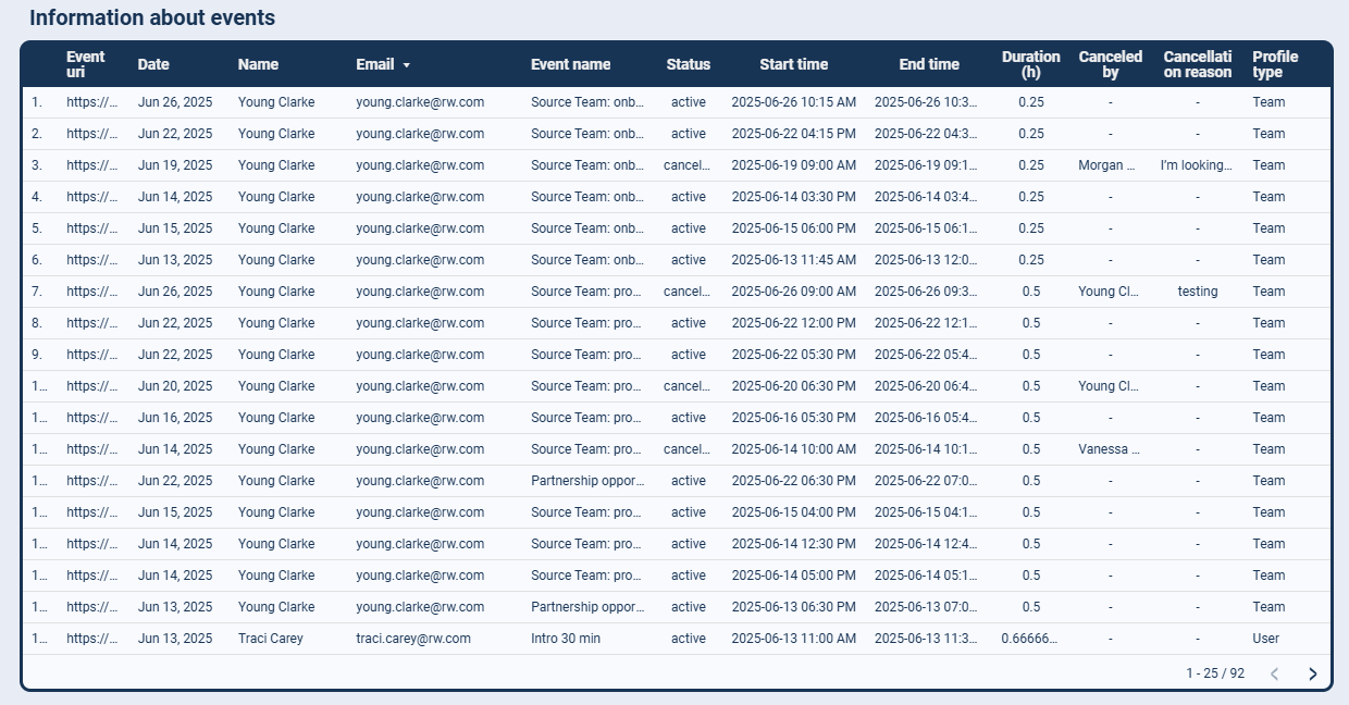
Monitor how often meetings get canceled, rescheduled, or result in no-shows across your team and different time periods. These patterns help identify scheduling problems, communication gaps, or meeting types that frequently get disrupted, enabling you to improve your booking process and reduce time waste.
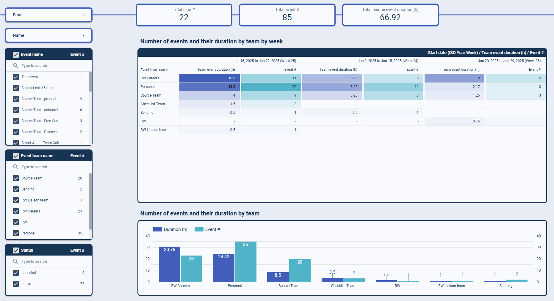
Analyze meeting distribution across different teams and departments to understand capacity constraints and collaboration patterns. This departmental view shows which teams have the highest meeting loads, helping with hiring decisions, resource allocation, and process optimization to support better team productivity.
How to create a Calendly dashboard?

Metrics you can track with Calendly dashboard templates
Monitor how many meetings each team member handles weekly to identify workload imbalances and ensure fair distribution of scheduling responsibilities across your organization.
Track the cumulative time each team member spends in meetings to prevent burnout and maintain a healthy work-life balance while optimizing team productivity.
Measure how frequently meetings get canceled or rescheduled across different days, weeks, and months to identify patterns and improve scheduling reliability.
Analyze the breakdown between recurring meetings and ad-hoc bookings to understand scheduling patterns and identify opportunities for calendar optimization.
Identify which time periods receive the most meeting requests to optimize availability windows and plan focused work time during quieter periods.
Compare meeting loads across different departments or teams to understand capacity constraints and make informed decisions about resource allocation.
Track how meetings are distributed throughout the week to identify the busiest days and plan important work during periods with lighter meeting schedules.
Monitor how long meetings typically last across different team members and meeting types to optimize time allocation and scheduling policies.