Lead generation dashboard examples and reporting templates
Elevate your marketing strategy with automated lead generation dashboards that consolidate data from multiple advertising platforms and CRM systems. Track the complete customer journey from ad impressions to qualified leads, analyze audience demographics, measure campaign effectiveness, and optimize your marketing spend based on real-time insights across all your lead generation channels.
Lead generation dashboard examples for every need


 +6
+6

 +5
+5

 +6
+6


 +5
+5
 +4
+4

 +5
+5
 +5
+5
 +1
+1
 +3
+3
 +3
+3
 +1
+1
 +1
+1
 +2
+2
 +3
+3
 +4
+4
about your case. It doesn't cost you a penny 😉
What is a lead generation dashboard?
Modern lead generation reporting dashboards go beyond basic metrics by incorporating demographic insights, conversion attribution, and campaign performance comparisons. With automated data refreshing through Coupler.io, these dashboards eliminate manual data consolidation and ensure you're always working with the most up-to-date information to optimize your lead generation strategy, improve conversion rates, and maximize marketing ROI.

Choose your Lead generation dashboard template to kick off
What reports should be included on a meaningful lead generation dashboard?
A comprehensive lead generation dashboard should incorporate several key reports that provide visibility into your entire lead acquisition process. Based on our analysis of multi-channel marketing dashboards, we recommend including these four essential report types:
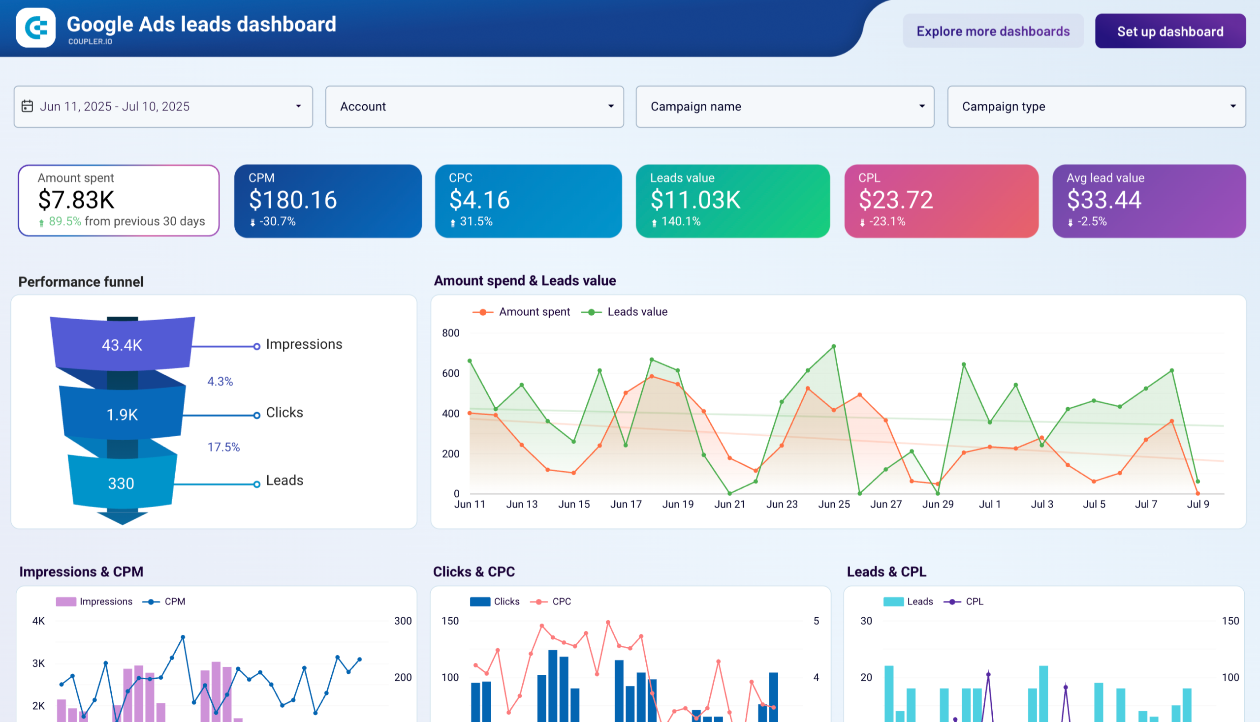
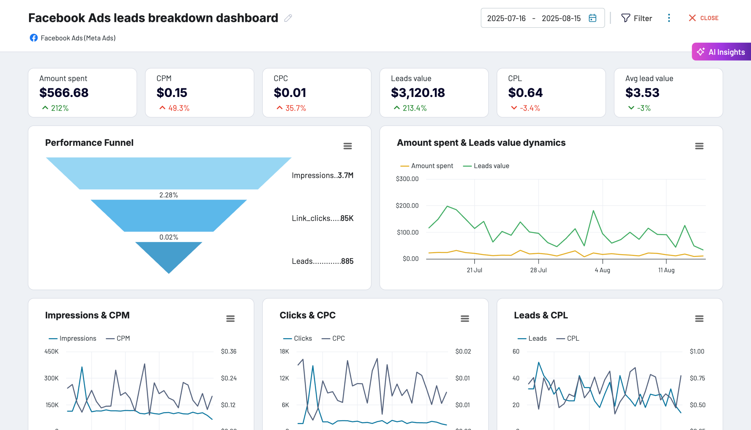
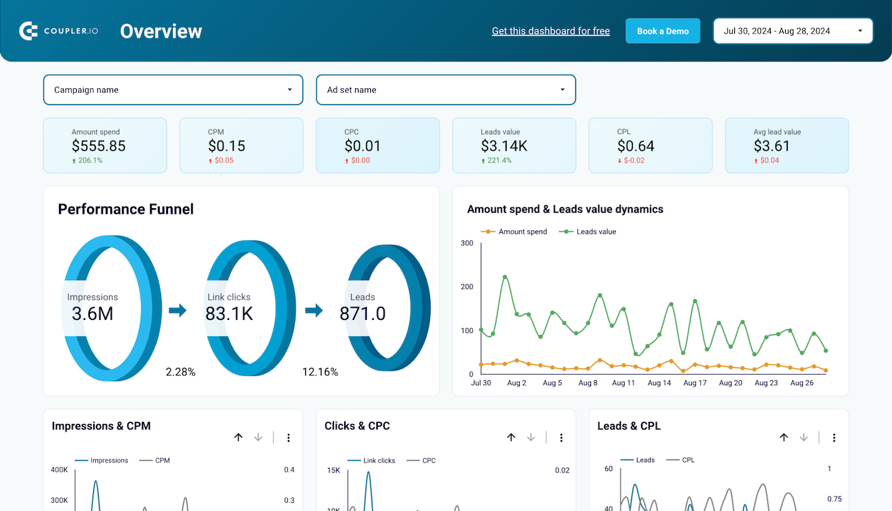
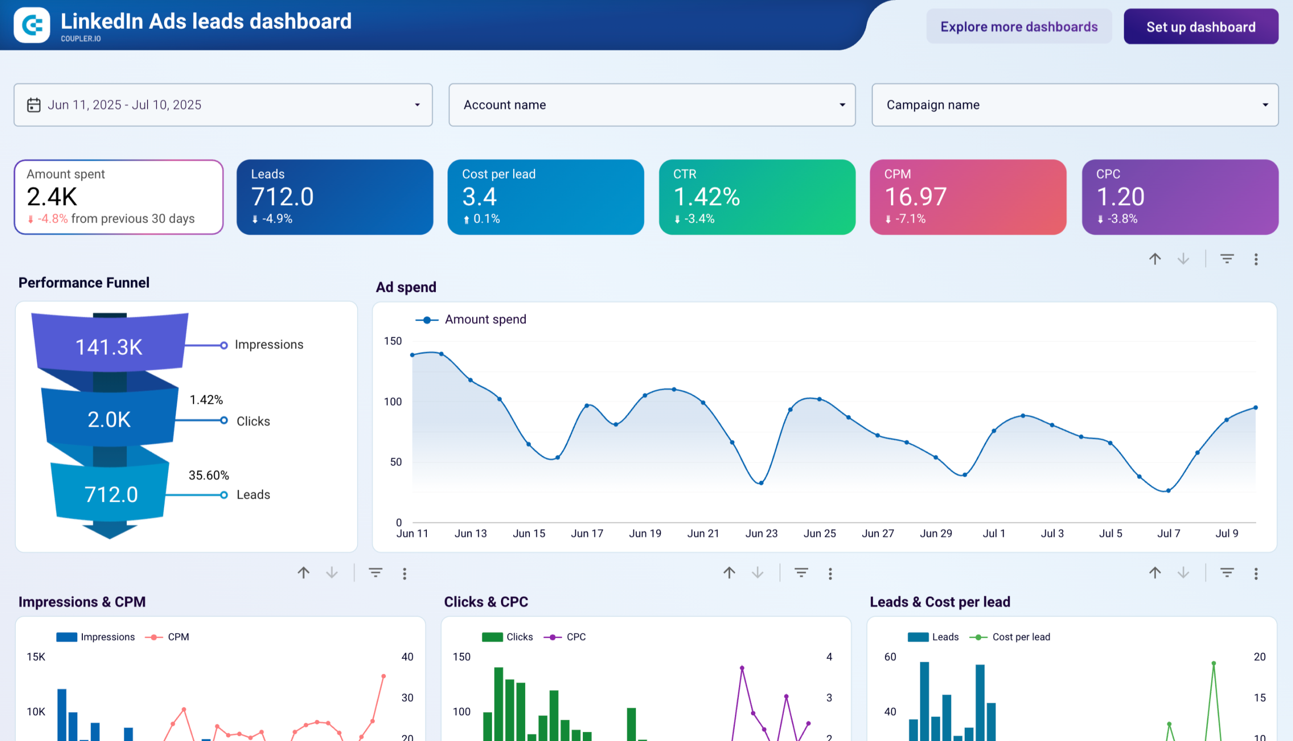
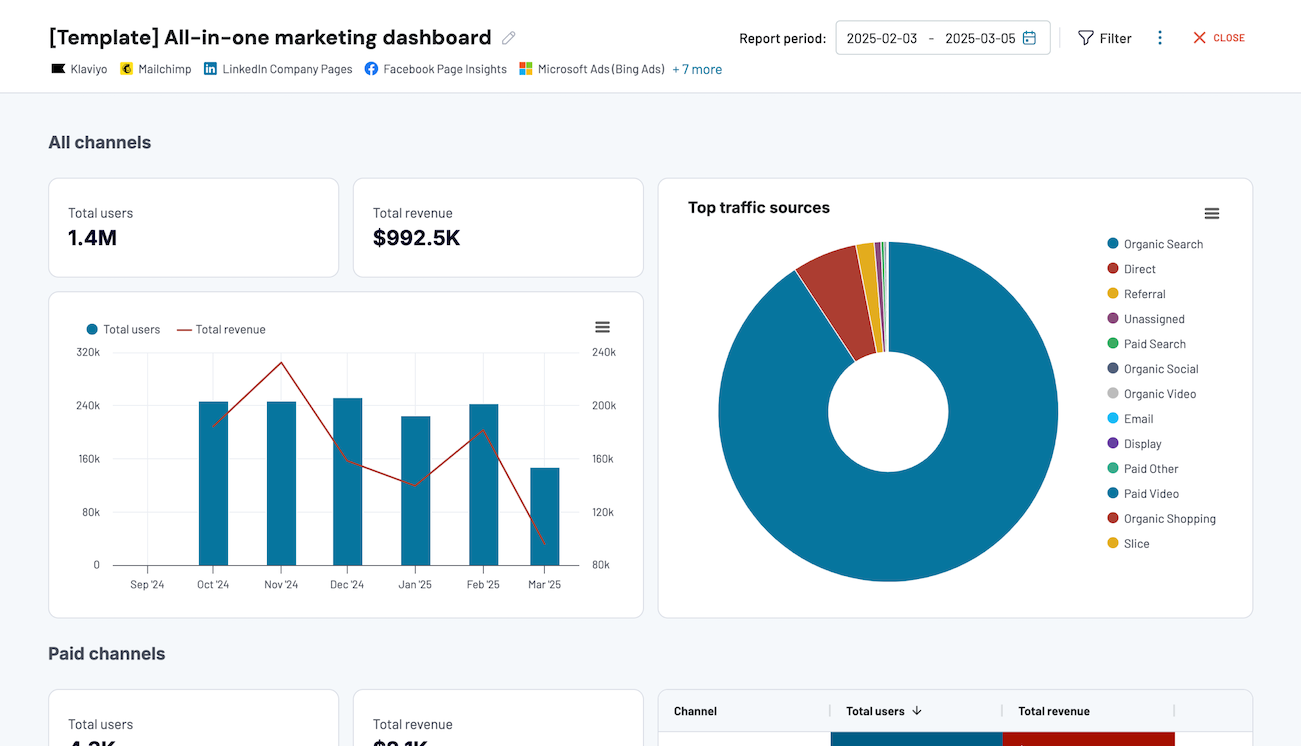
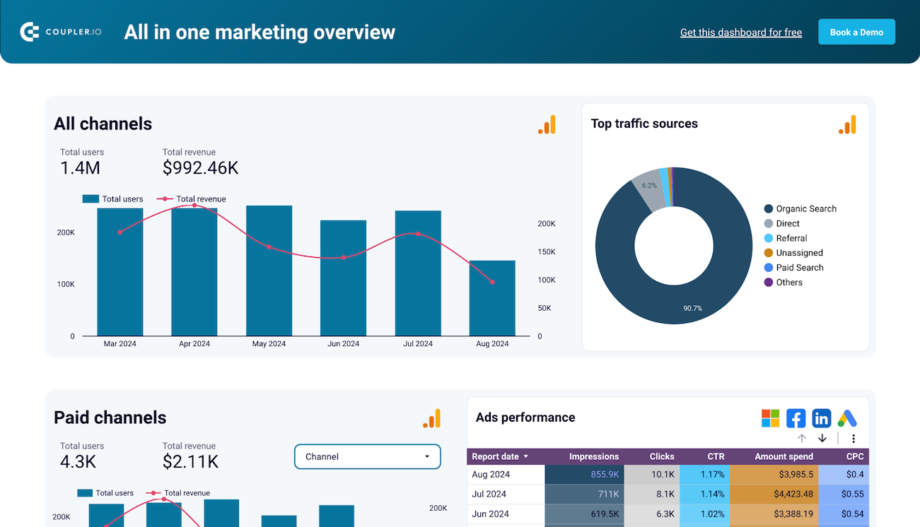
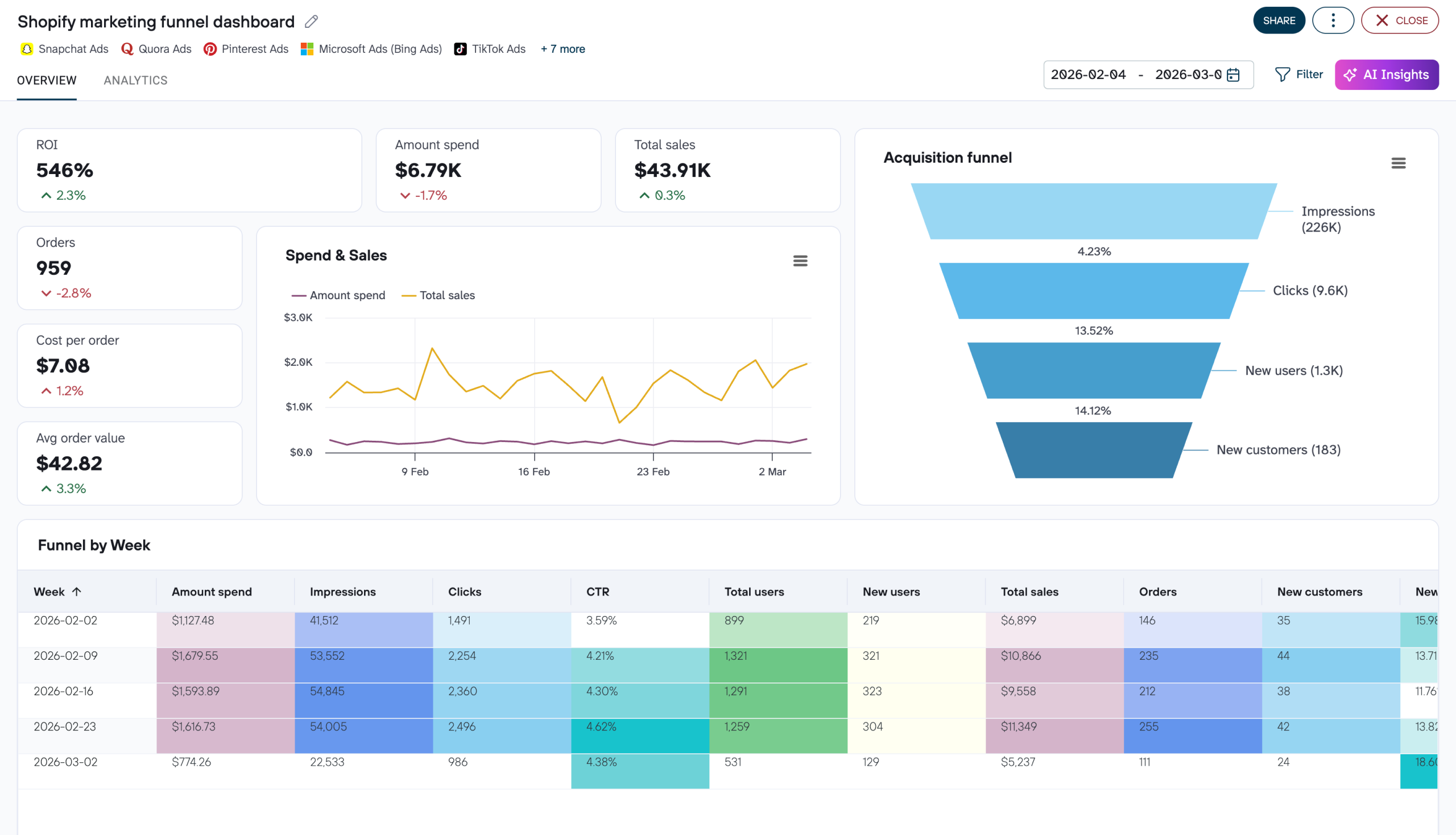
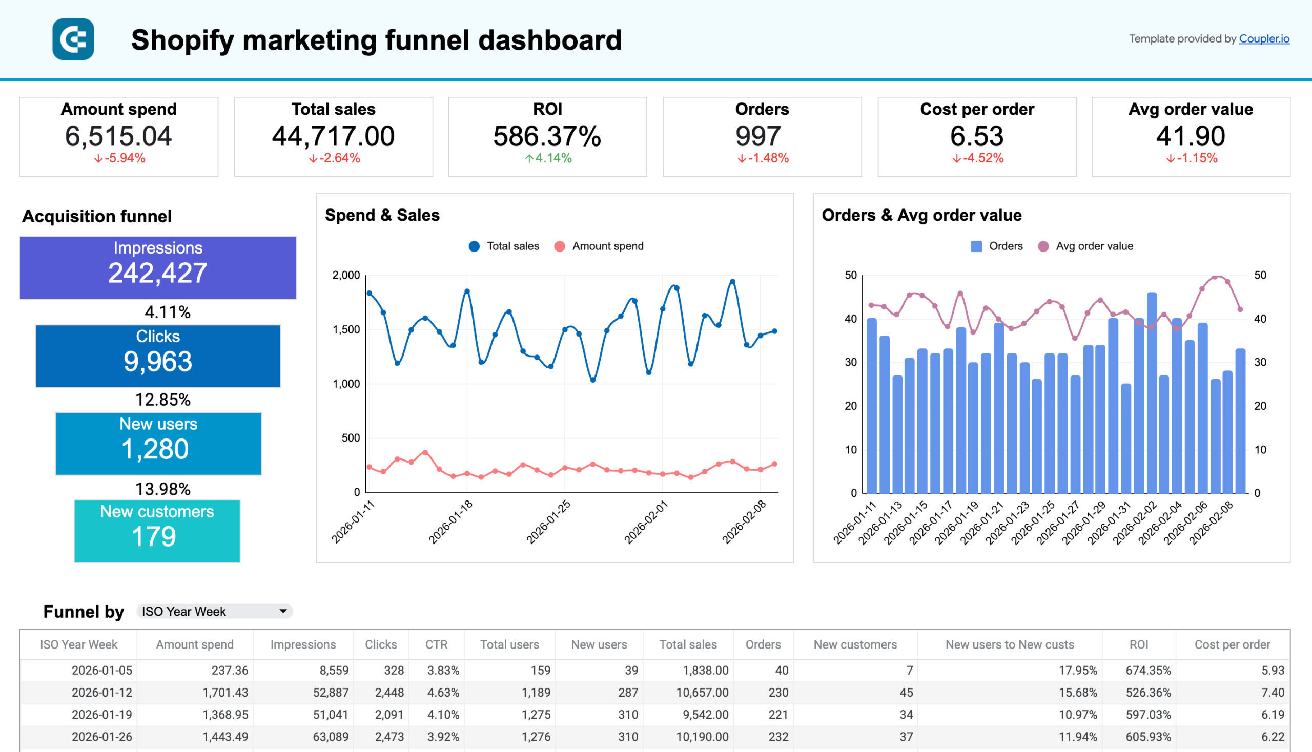
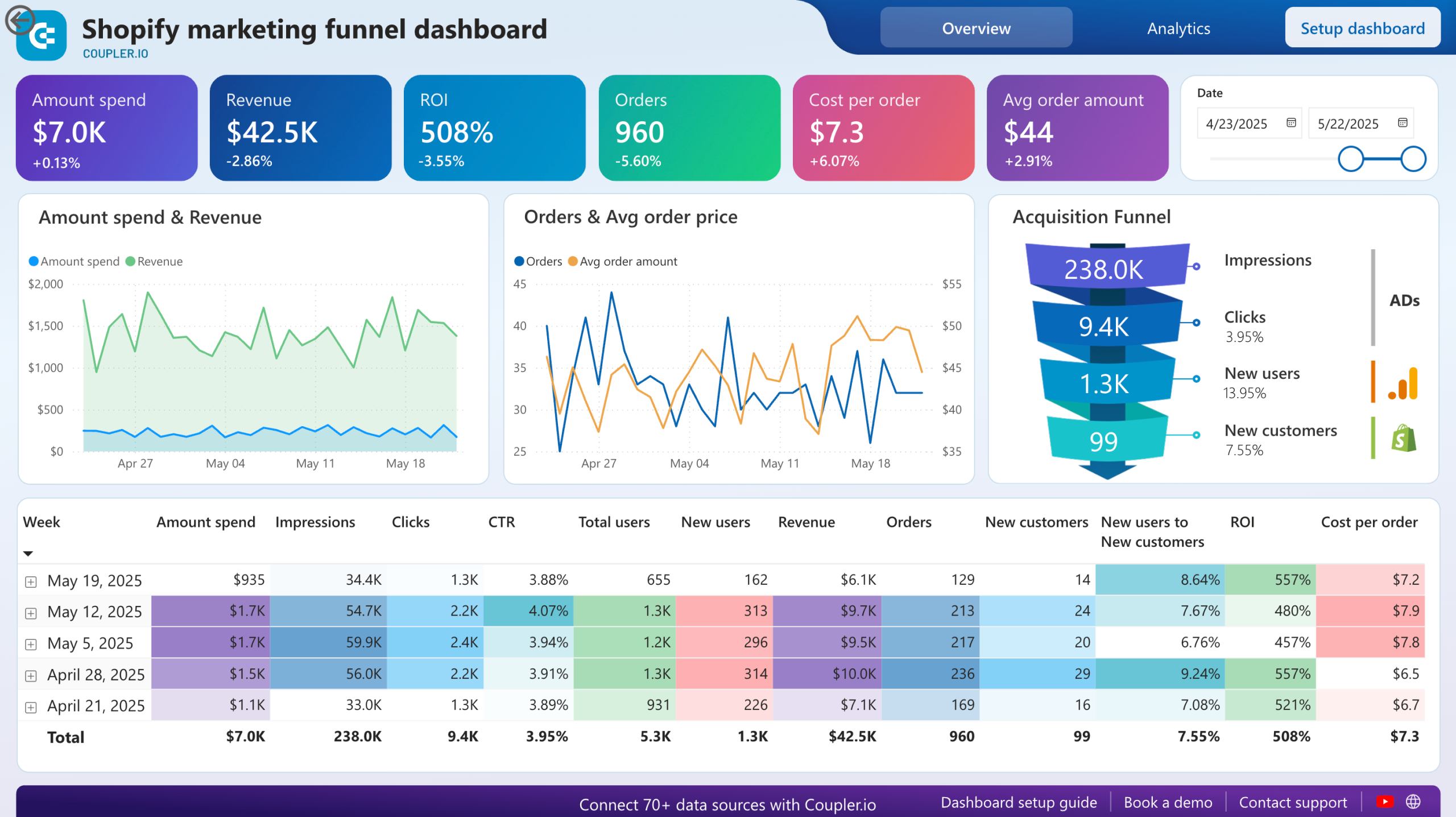
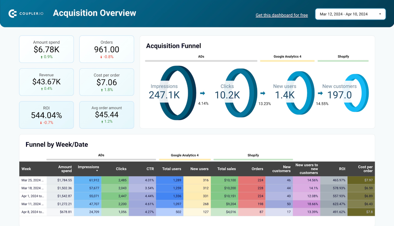
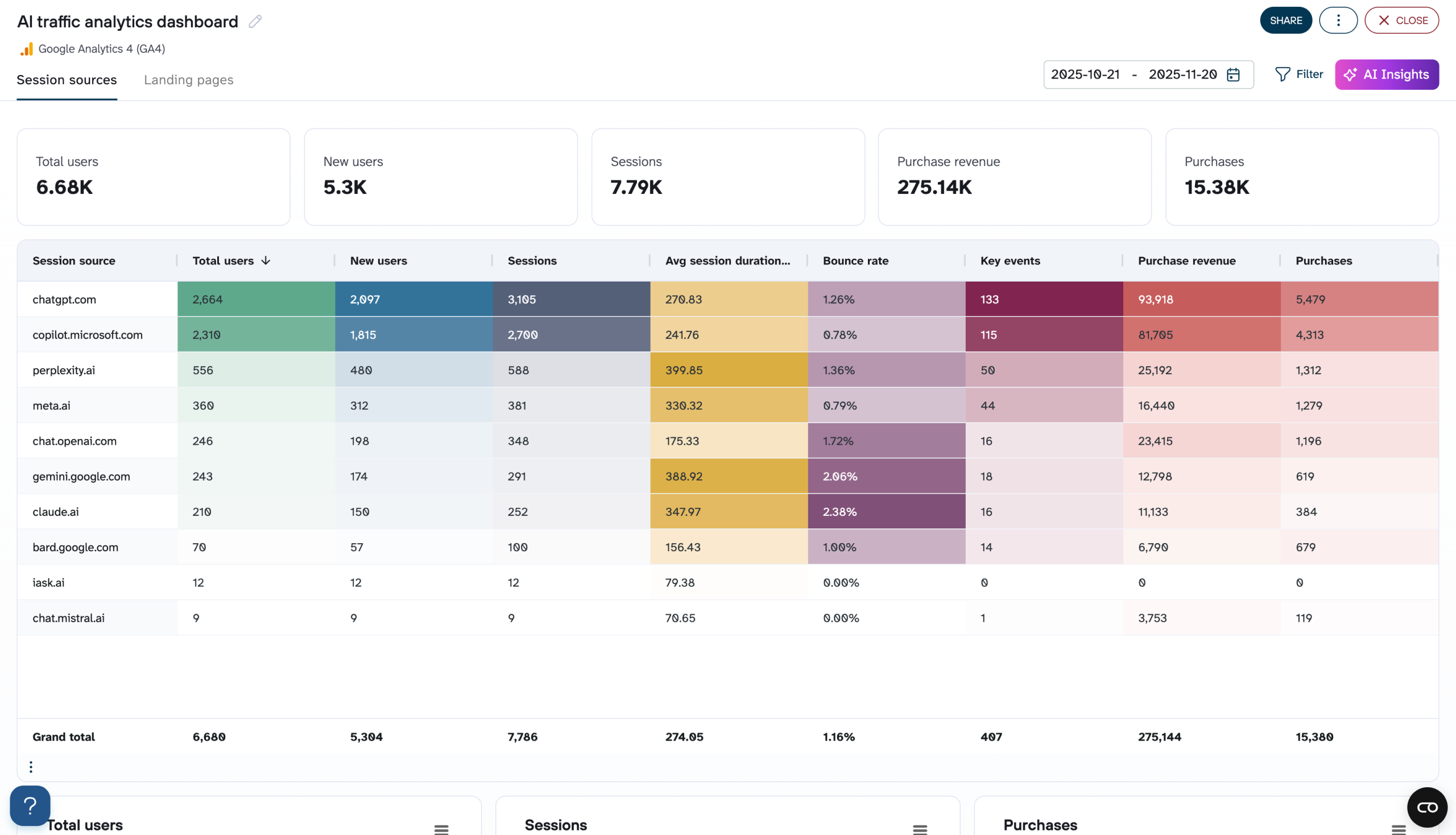
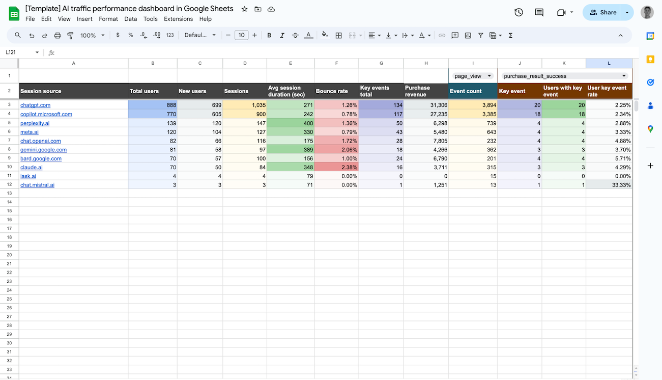
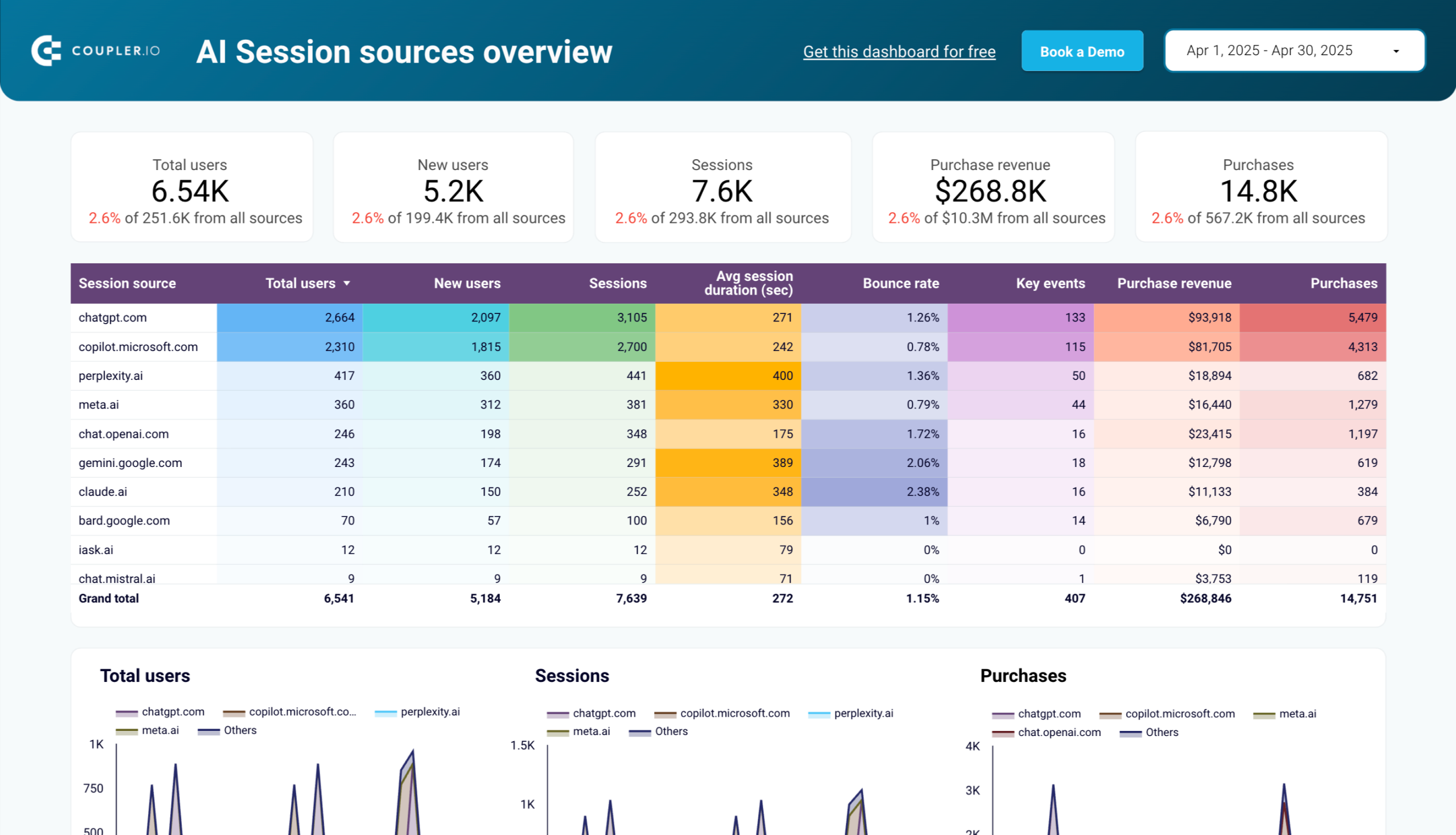
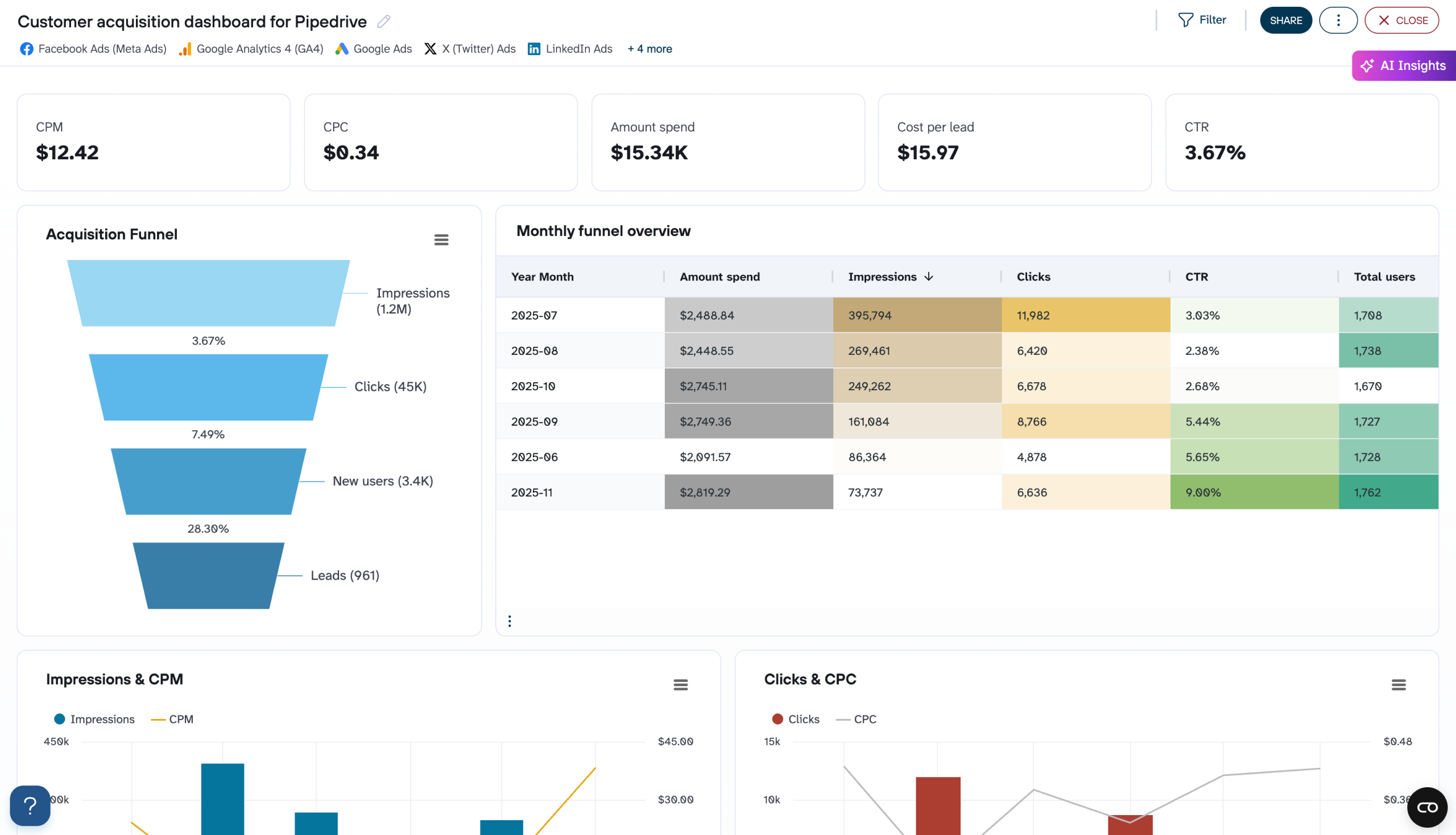
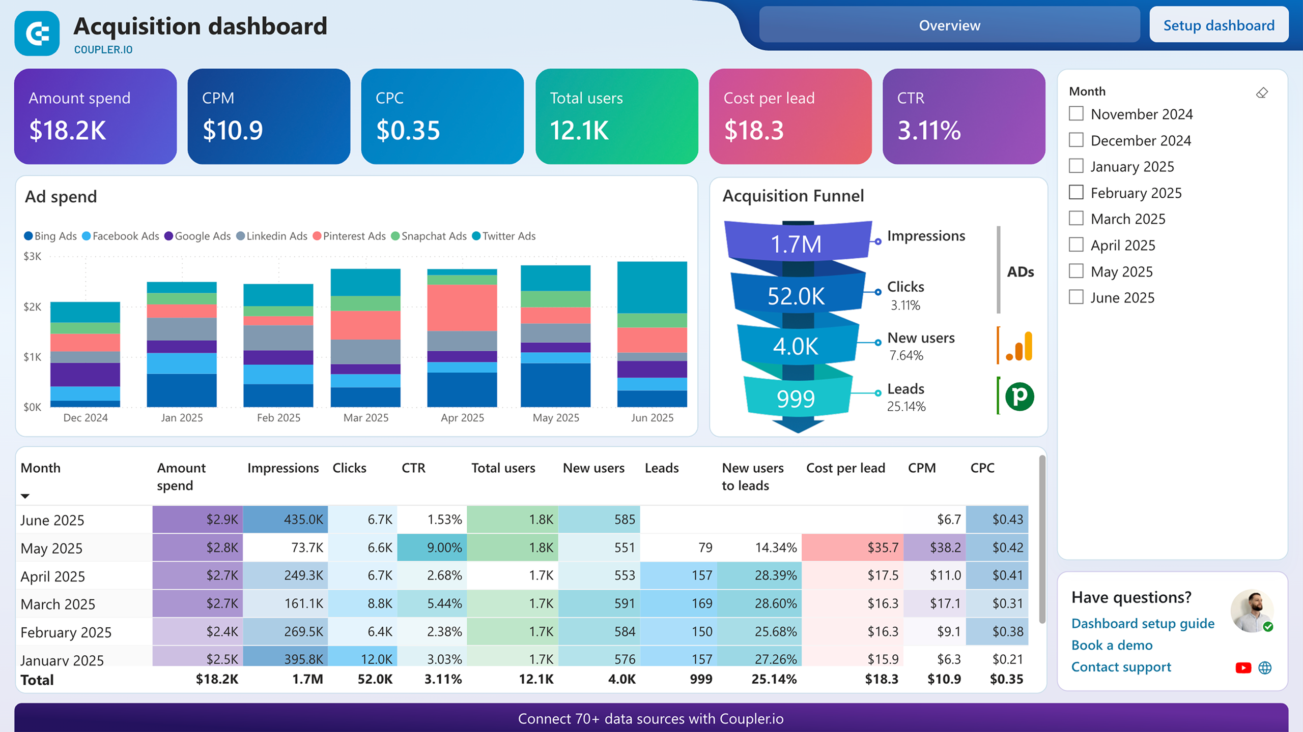
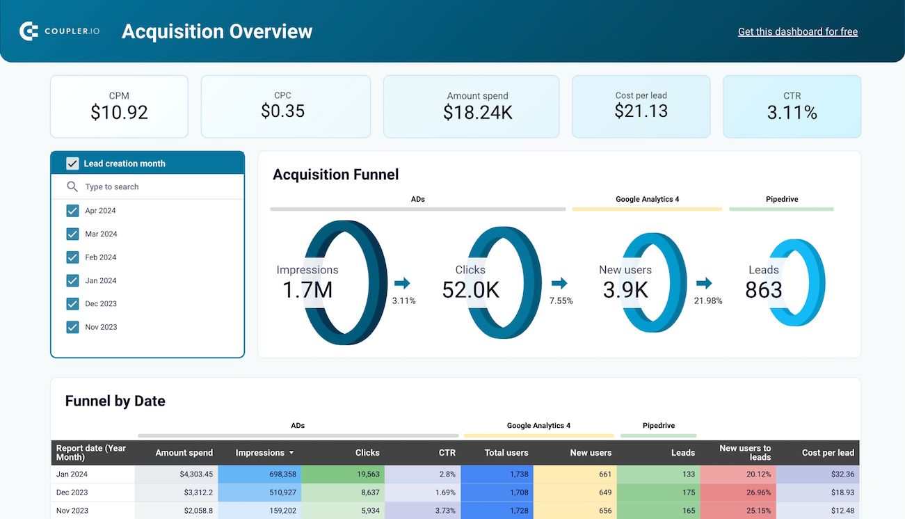
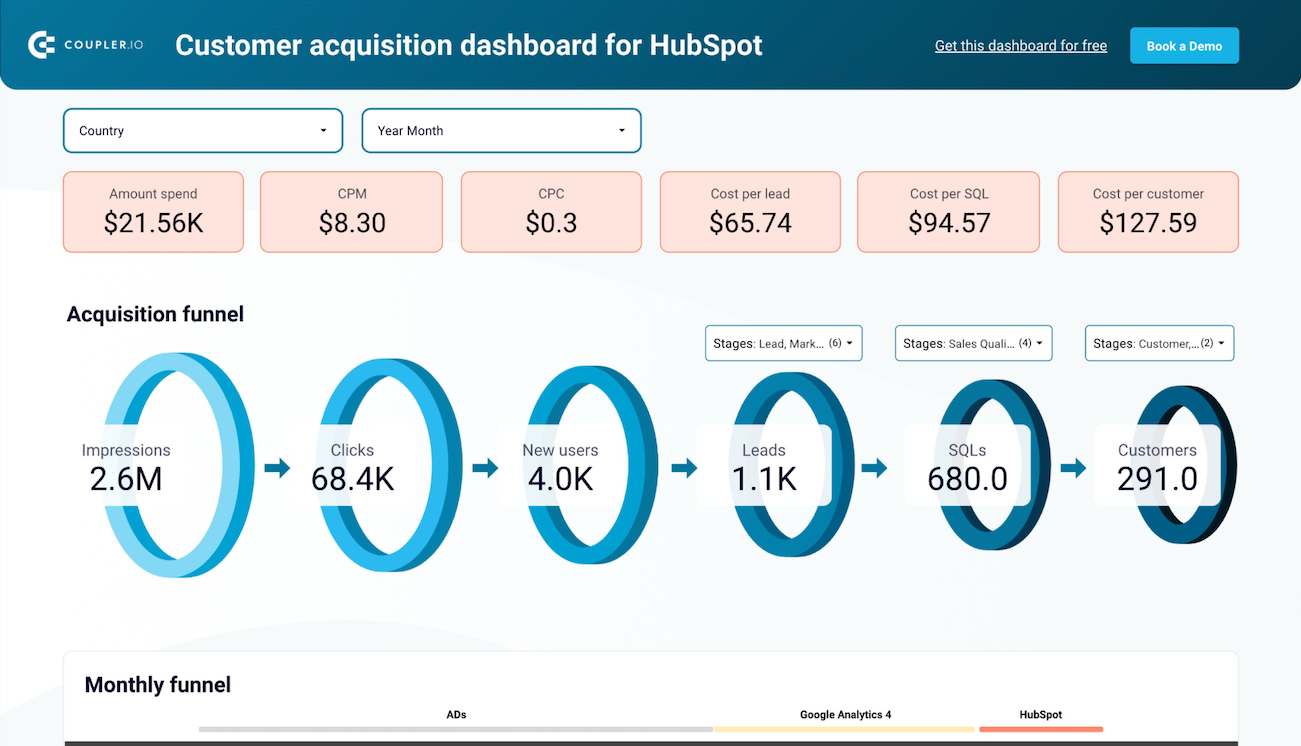
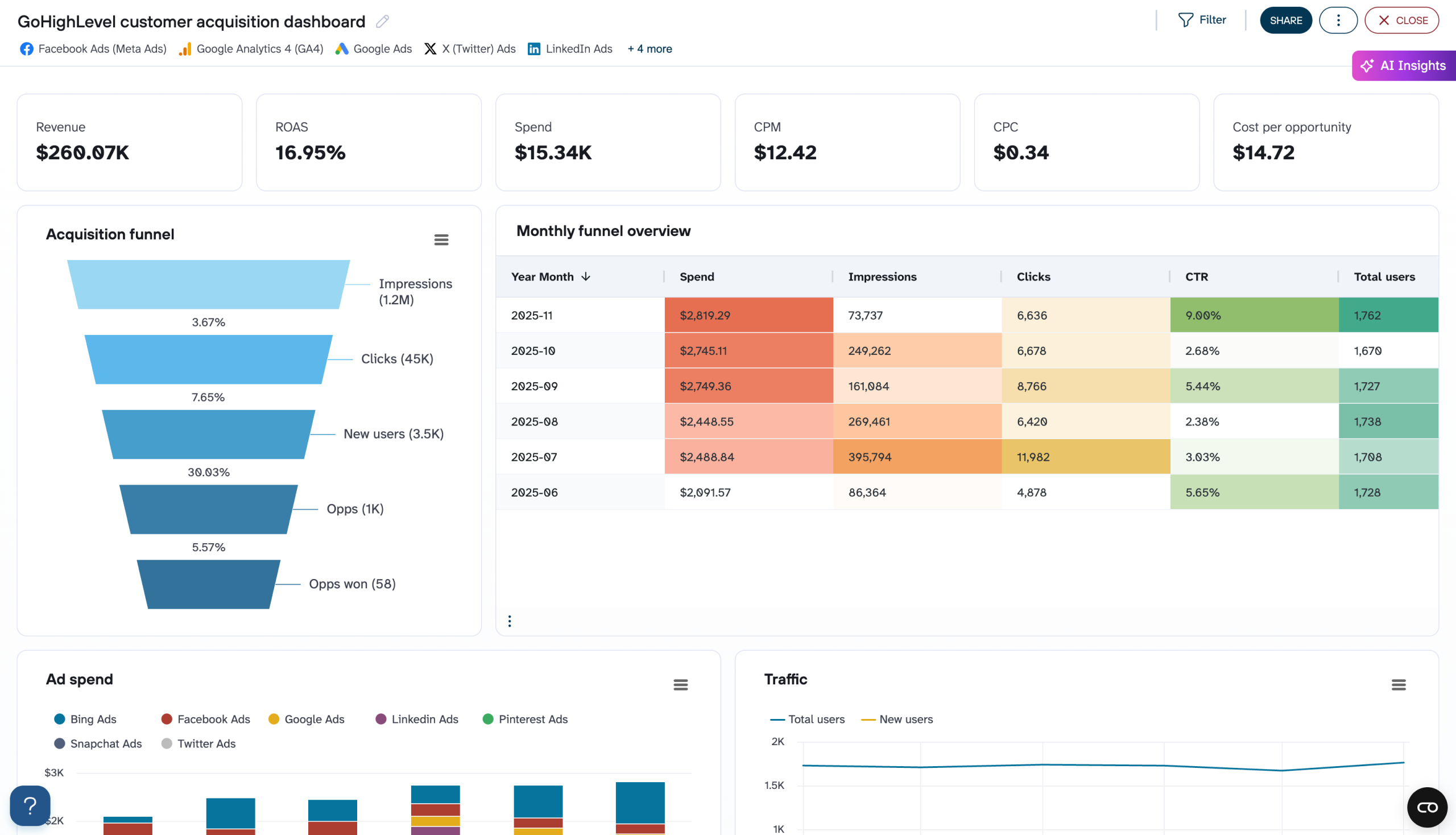
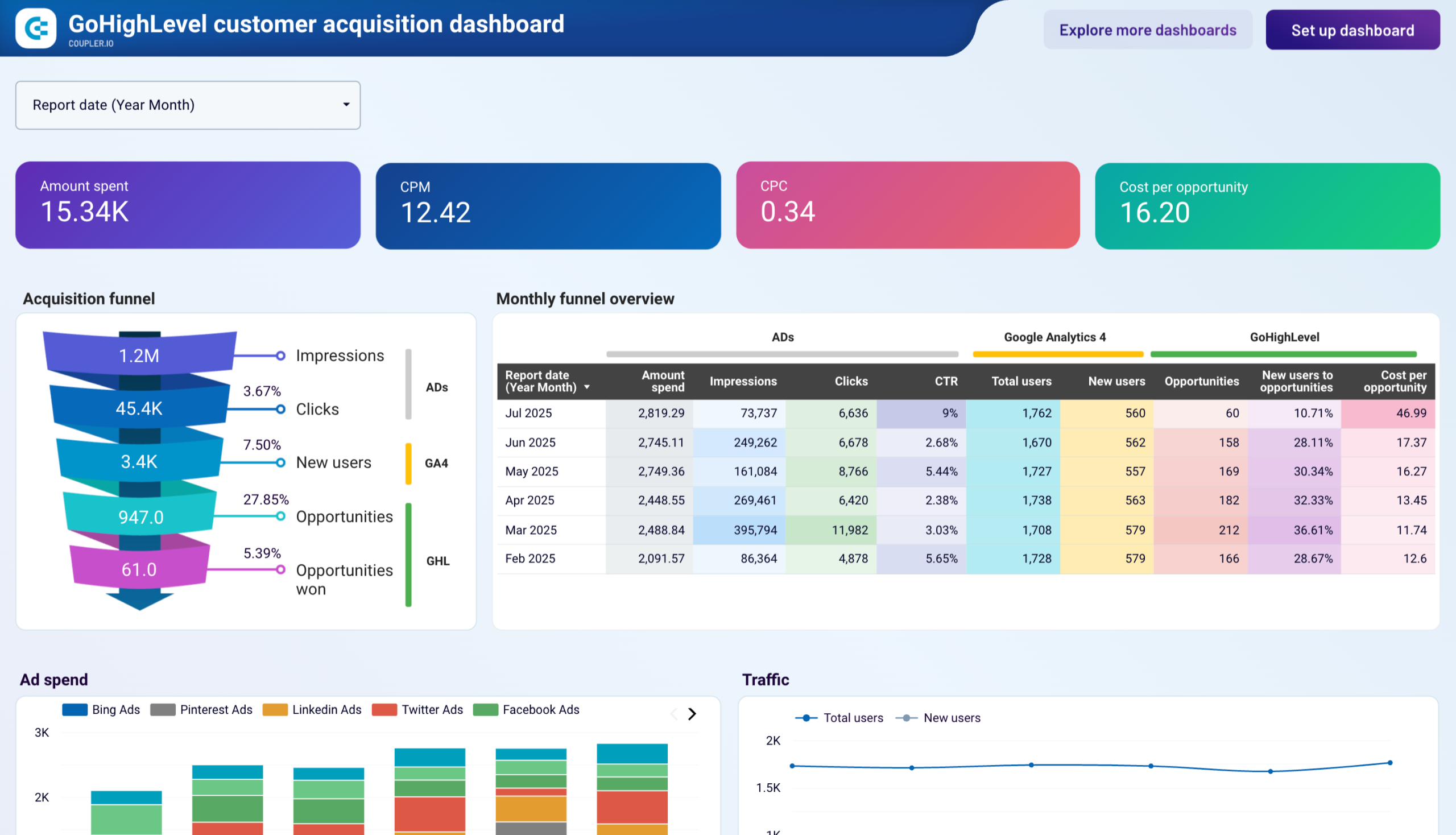
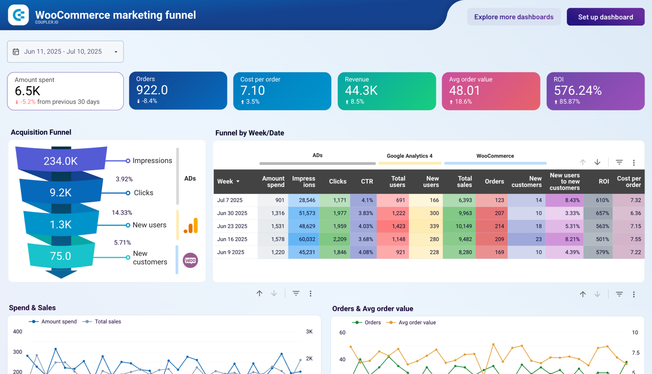
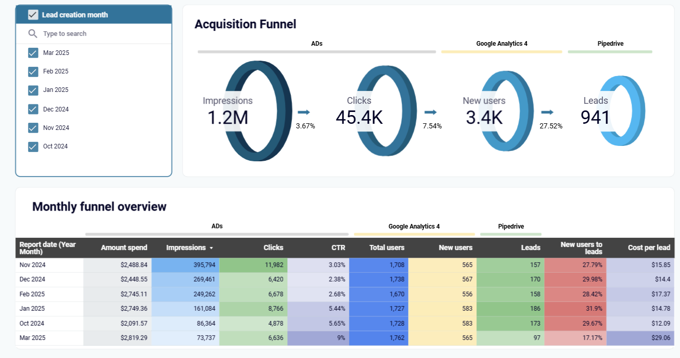
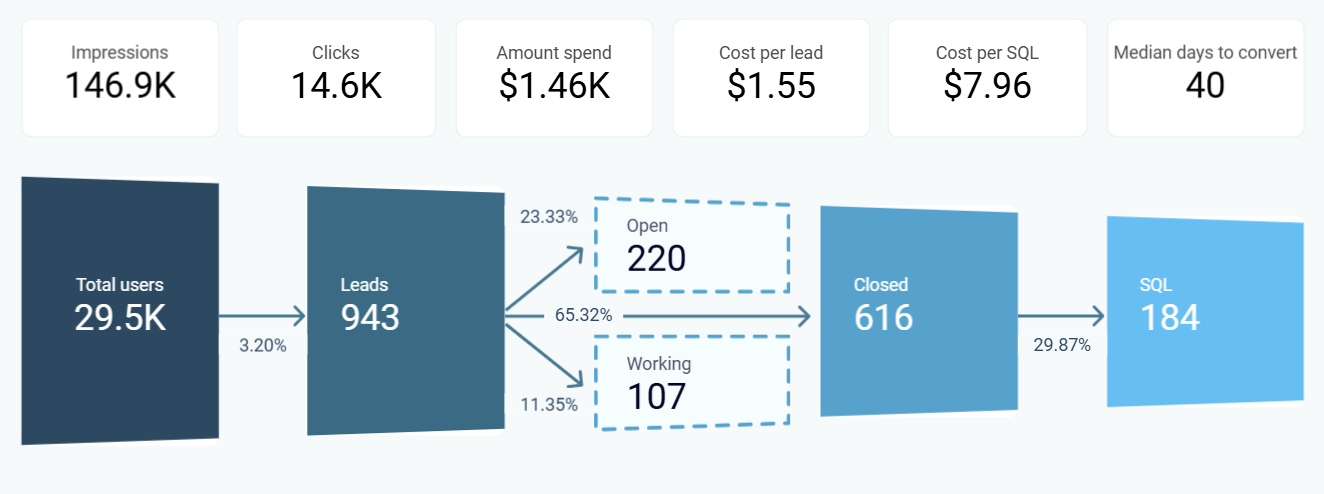
The acquisition funnel report visualizes how potential customers move through each stage of your lead generation process. It tracks metrics from initial ad impressions and clicks to website visits, form submissions, and qualified leads in your CRM. This report reveals conversion rates between stages, helping you identify where potential leads drop off and which channels deliver the highest-quality prospects. By connecting ad platform data with CRM conversions, it provides a transparent view of your entire acquisition journey.
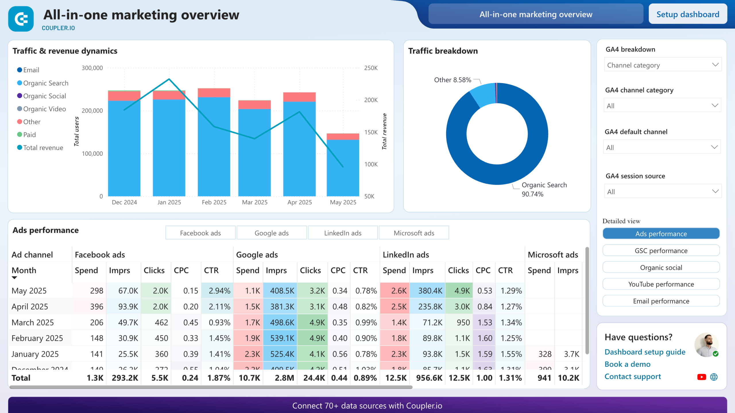
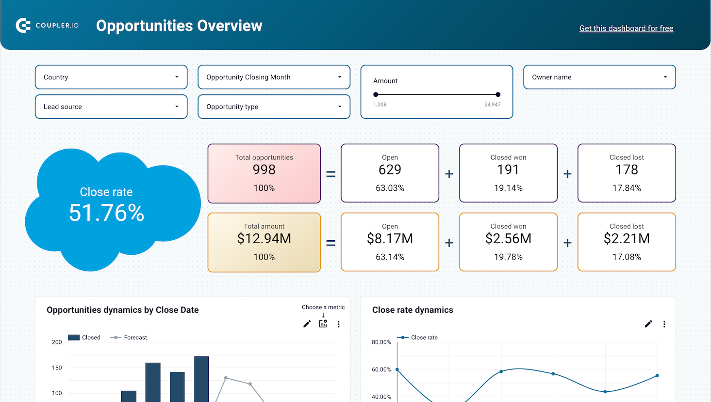
The campaign performance report provides a detailed breakdown of metrics across all your advertising channels, including Facebook Ads, Google Ads, LinkedIn Ads, and others. It displays key metrics like impressions, clicks, spend, CTR, CPC, and CPM alongside lead conversion data. This report allows you to compare campaign effectiveness, identify your most cost-efficient channels, and optimize budget allocation based on actual lead generation results rather than just engagement metrics.
The lead demographics report analyzes the characteristics of users who convert into leads across different channels. It breaks down leads by demographics such as age, gender, location, and device type, revealing which audience segments respond best to your offers. This report helps you refine targeting parameters, customize messaging for high-converting segments, and discover new market opportunities. By comparing demographic conversion rates against campaign spending, you can allocate resources to the most responsive audience groups.
The landing page conversion report evaluates the effectiveness of the pages where potential leads arrive from your marketing campaigns. It tracks metrics like traffic volume, engagement rates, form submissions, and conversion rates for each landing page. This report helps you identify your highest-performing pages, diagnose issues with underperforming ones, and test optimization strategies. By connecting landing page performance with lead quality data from your CRM, you can develop pages that not only convert visitors but generate valuable leads.
What insights you can get with the lead generation reporting dashboard
The lead generation dashboard template visualizes your entire customer acquisition journey, showing how potential leads progress from initial ad impressions to qualified CRM leads. You can track conversion rates at each stage, compare them against industry benchmarks, and identify bottlenecks in your funnel. This complete view helps marketing teams detect opportunities for optimization and forecast lead volume based on upper-funnel metrics.
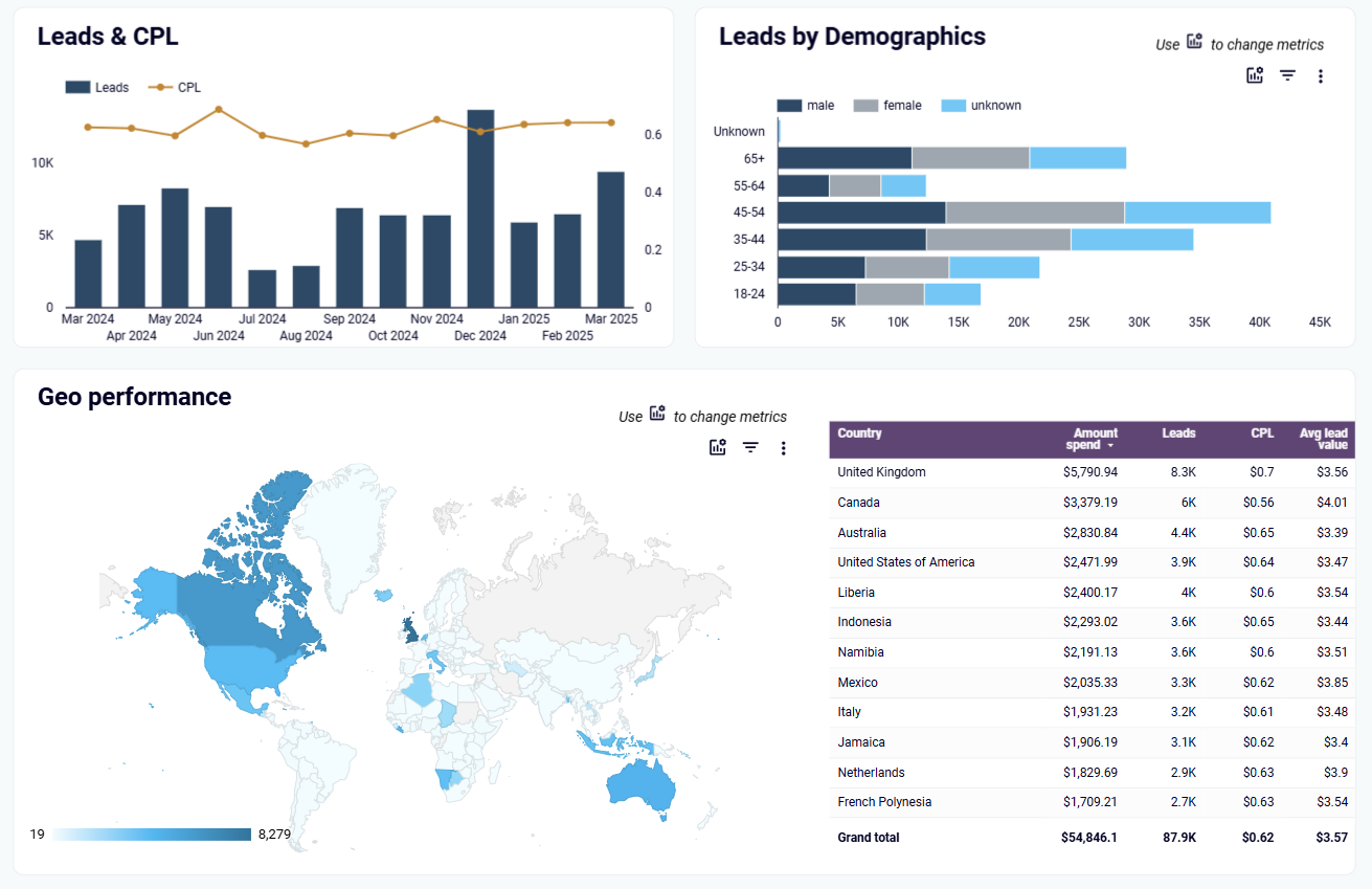
Gain detailed insights into which audience segments generate the most valuable leads across your marketing channels. The dashboard breaks down lead generation by demographics like age, gender, and location, while also calculating the average value of leads from each segment. This data enables precise targeting of high-value audiences and helps allocate marketing spend to the demographic groups that deliver the best ROI.
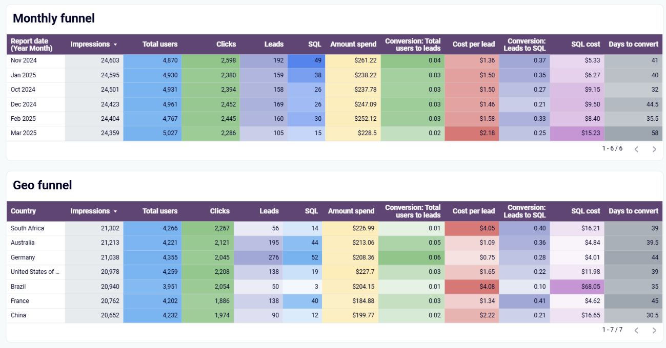
Compare the performance of your lead generation efforts across different time periods and geographic regions using interactive table-view funnels. The dashboard allows you to identify your best-performing segments and correlate them with specific marketing activities or lead generation campaigns. By analyzing these patterns, you can uncover untapped growth opportunities and optimize your strategy for different markets and seasonal variations.
Track your complete sales funnel by combining web analytics and CRM data in one comprehensive view. The dashboard evaluates traffic effectiveness by comparing conversion rates against industry benchmarks, helping you identify underperforming stages that need optimization. With country-level filtering capabilities, you can discover which regions deliver the highest-quality leads and conversion rates, enabling targeted campaign adjustments and market-specific strategies to maximize your lead generation efforts.
How to create lead generation dashboards?

Metrics you can track with the lead generation dashboard template
Request custom dashboard
From building custom dashboards to setting up data analytics from scratch, we're here to help you succeed. Contact us to discuss your case and possible solutions
Contact us