Customer support dashboard examples and reporting templates
Optimize your customer service operations with an automated customer support performance dashboard that consolidates data from support platforms. Monitor response times, track team workload, analyze customer interaction channels, and make data-driven decisions to enhance service quality and customer satisfaction.
Customer support dashboard examples for every need


about your case. It doesn't cost you a penny 😉
What is a customer support dashboard?
Customer support dashboards go beyond simple ticket counting and allow you to track conversation volumes, monitor team workload distribution, analyze response time patterns, and identify customer communication preferences. With automated data refreshing through Coupler.io, our dashboards ensure you're always working with current support metrics without manual data compilation, creating a single source of truth for your customer service performance.

Choose your white label customer support dashboard template to kick off
What reports should be included in customer support dashboards?
Effective customer support dashboard templates should incorporate several key performance reports that provide complete visibility into your support operations. Based on our analysis of customer service platforms, we recommend incorporating these four essential report types.
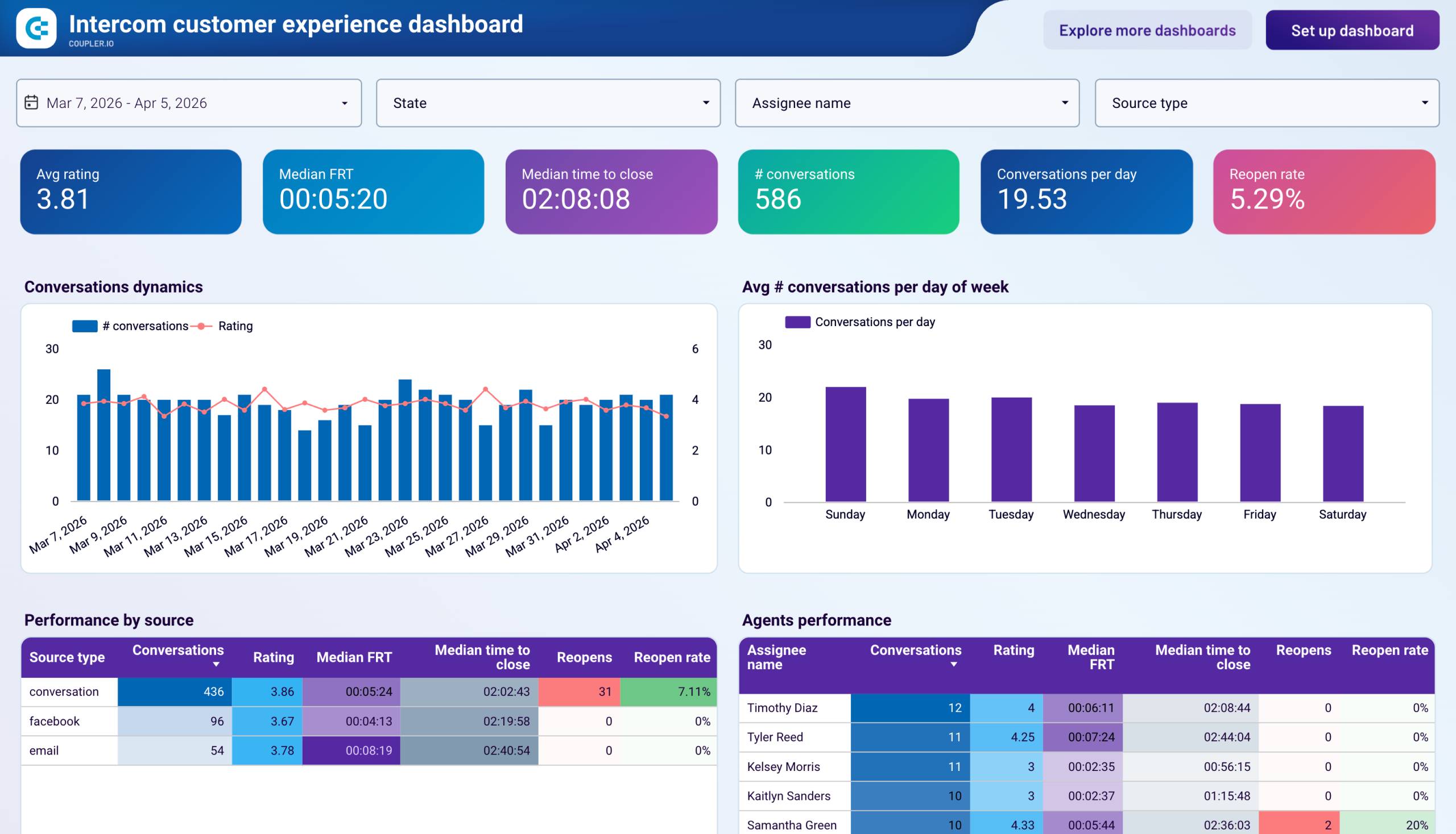
The team performance report delivers detailed insights into individual and collective support team efficiency. This includes response time analysis showing average resolution speeds, workload distribution across team members, and reopen rate tracking to identify quality issues. The report highlights best and worst performing agents by key metrics, enabling targeted coaching and recognition. It also provides conversation handling capacity analysis to optimize staff allocation and prevent burnout while maintaining service quality standards.
The customer interaction report focuses on understanding how customers engage with your support channels. It tracks conversation volumes across different communication methods like email, chat widgets, and social media platforms. As a part of the customer support dashboard, this report reveals customer preferences for contact methods, peak interaction periods, and channel-specific response performance. These insights help optimize resource allocation across channels and ensure customers receive consistent service regardless of their preferred communication method.
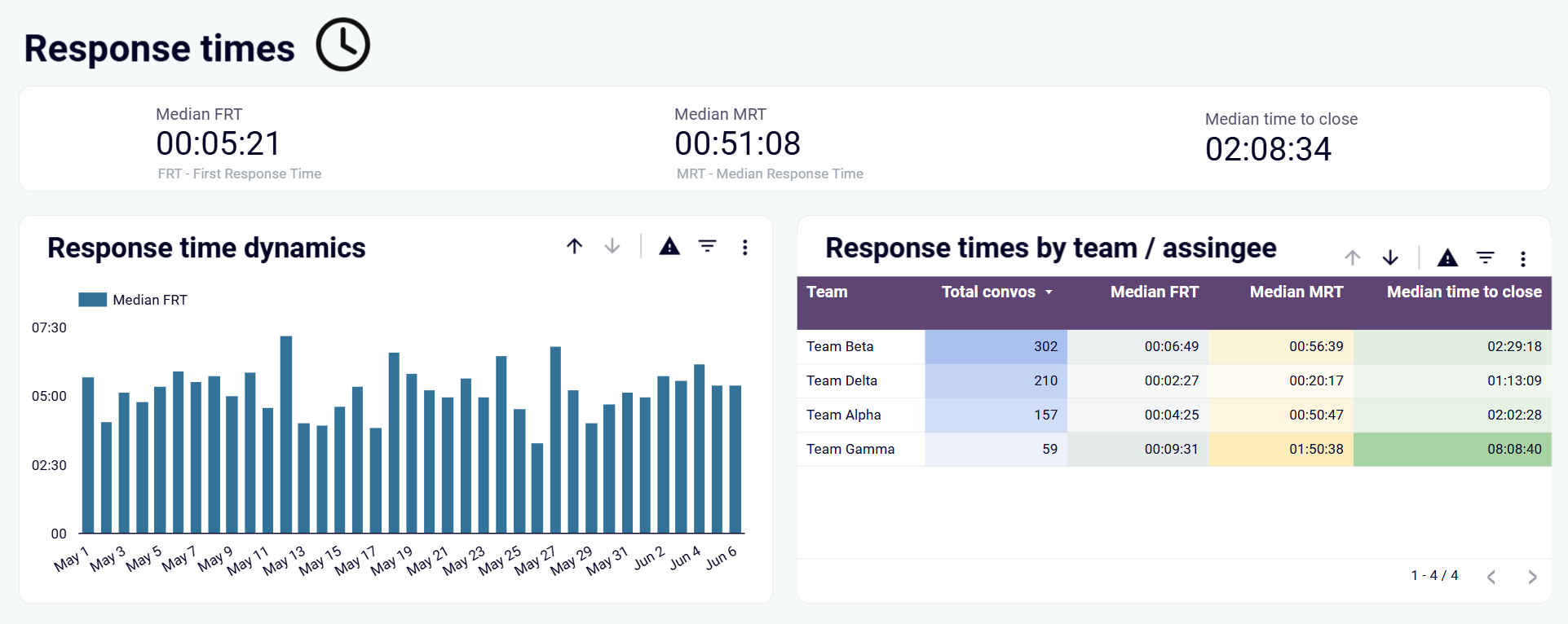
The response time and quality report monitors the speed and effectiveness of your support delivery. It tracks first response times, resolution times, and service quality indicators that directly impact customer satisfaction. The report includes trend analysis to identify patterns in response performance, helping teams maintain consistent service levels. Quality metrics help identify training opportunities and process improvements that enhance overall customer experience.
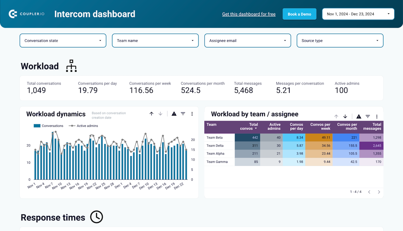
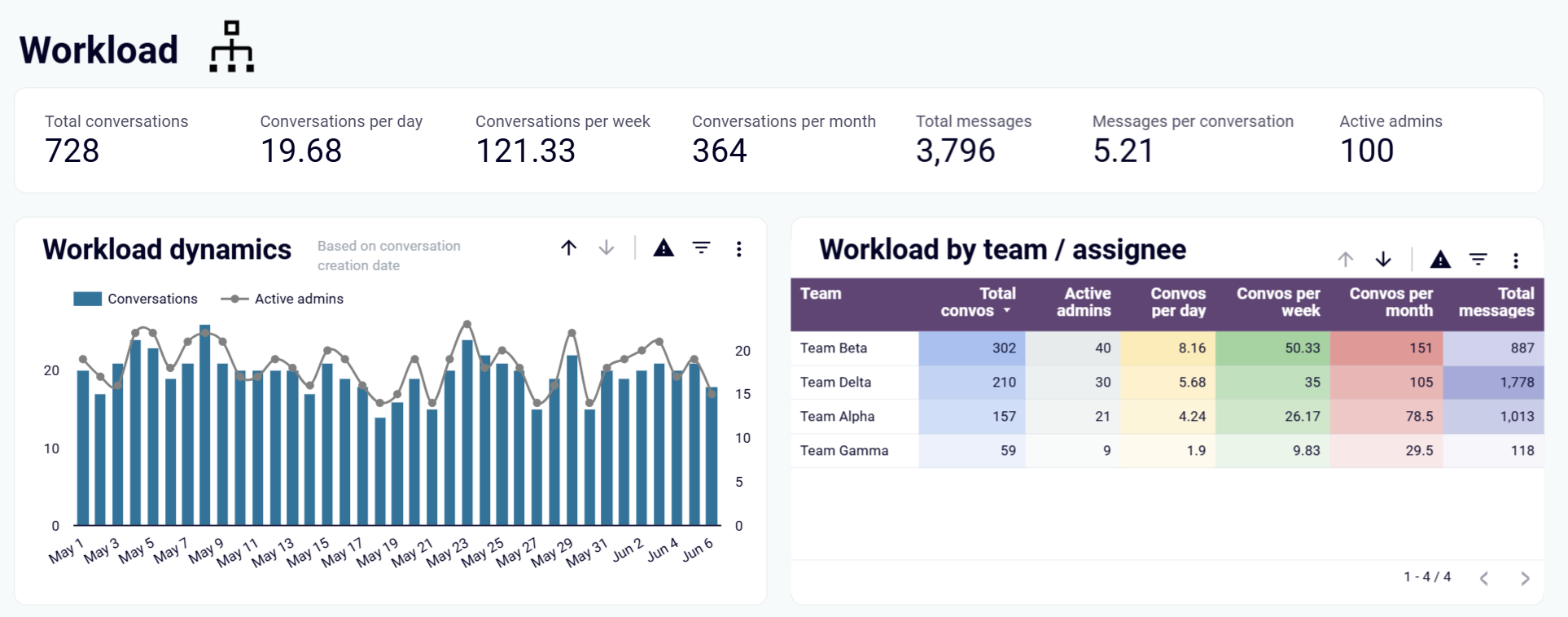
The workload monitoring report in your customer support performance dashboard provides visibility into team capacity and demand patterns. It tracks conversation volumes over time, identifies peak periods that require additional staffing, and monitors team availability during critical hours. This report helps prevent agent overload, ensures adequate coverage during high-demand periods, and supports strategic planning for workforce management and scheduling optimization.
What insights you can get with the customer support dashboard
Monitor overall customer support performance through comprehensive scorecards displaying total conversations, team workload distribution, and service request frequency. Track how support demand fluctuates throughout different periods and identify when additional resources are needed to maintain service quality standards.
Analyze average response times and service quality metrics to ensure customers receive timely, effective support. Identify patterns in response performance and quality indicators that directly impact customer satisfaction, enabling teams to maintain consistent service delivery standards.
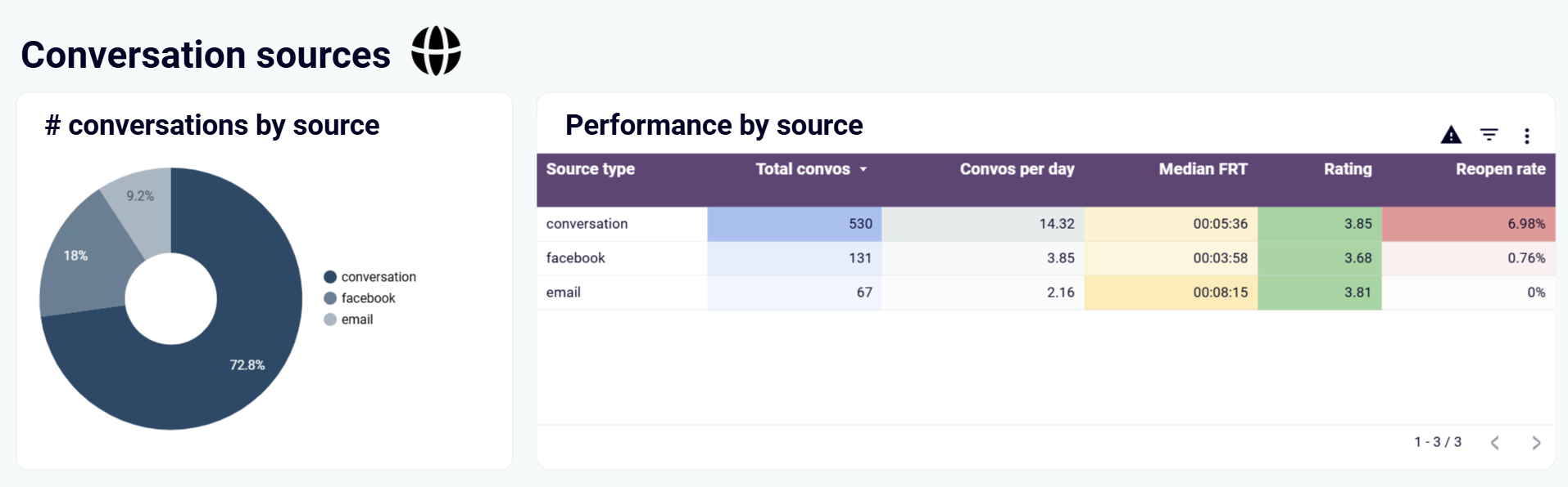
Understand how customers prefer to contact your support team across email, chat widgets, and social media platforms. Analyze channel-specific performance metrics to optimize resource allocation and ensure consistent service quality across all customer touchpoints.
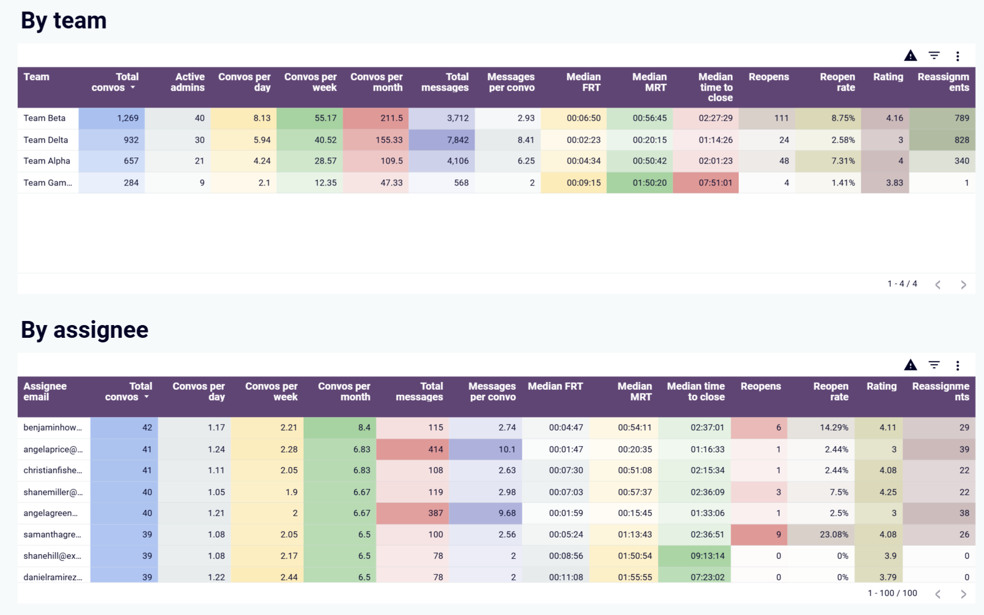
Compare support agent performance using key metrics like response times, conversation handling capacity, and case reopen rates. Identify top performers for recognition and agents who may need additional training or support to improve their service delivery effectiveness.
How to create a customer support dashboard?

Metrics you can track with a customer support dashboard template
More Customer support Dashboards
Request custom dashboard
From building custom dashboards to setting up data analytics from scratch, we're here to help you succeed. Contact us to discuss your case and possible solutions
Contact us